Ever tried explaining a complex dashboard idea to developers only to face blank stares?
Dashboard wireframes solve this communication problem by providing visual blueprints before coding begins.
Struggling with where to start?
Let’s dive into everything you need to create effective wireframes that save time, money, and endless revision cycles.
What Is A Dashboard Wireframe?
A dashboard wireframe functions as a skeletal blueprint that outlines the placement and organization of key elements without focusing on visual styling. Think of it as the architectural drawing of your digital space showing structure without decorative details. When product teams develop dashboard wireframes, they deliberately create low-fidelity representations focusing purely on layout and functionality.
Why does this matter?
Because moving pixels is infinitely cheaper than rewriting code. Your wireframe acts as a crucial communication tool between stakeholders, designers, and developers – aligning everyone’s vision before expensive development begins.
How To Create A Dashboard Wireframe
Starting with clarity makes all the difference when creating effective wireframes. Follow these steps to build your first dashboard wireframe design.
- Identify user needs through interviews or data analysis. Who’s using this dashboard? What decisions will they make with this information? Create simple user personas if needed.
- List essential metrics and elements that must appear. Ruthlessly prioritize what deserves screen space based on user importance, not just what’s available.
- Sketch rough layouts on paper first. Yes, actual paper! Drawing several quick options helps explore possibilities without digital tool constraints.
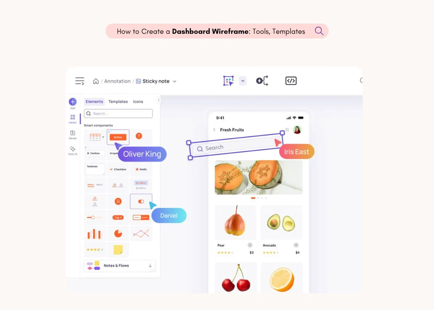
- Choose your wireframing tool based on your needs (more on tools below). For beginners, Visily’s free dashboard wireframe tool offers pre-built components specifically for dashboards.
- Create the basic structure by placing major elements like navigation, header areas, and primary content blocks.
- Add data visualization placeholders showing where charts, graphs, and tables will appear. Label their purpose without designing them fully.
- Include interactive elements like filters, date selectors, and user controls that will affect the dashboard’s behavior.
- Get feedback early from stakeholders and potential users before proceeding to high-fidelity designs.
- Iterate based on feedback, refining the wireframe until everyone agrees on the fundamental structure.
Key Elements Of An Effective Dashboard Wireframe
Information hierarchy determines whether users immediately find what matters or waste time searching. When building a dashboard wireframe for a dashboard, prioritize critical information by placing important metrics in the top-left quadrant where Western eyes naturally begin scanning.
Navigation structure should feel invisible yet intuitive. Your wireframe must clearly define how users will move between different views or sections. Most effective dashboards use minimal navigation – either tabs, a slim sidebar, or simple toggles.
Data visualization placeholders require careful consideration even at the wireframe stage. Don’t just mark “chart goes here” – specify the visualization type (“line chart showing 6-month trend”) and approximate dimensions.
Filter and control areas empower users to manipulate what they see. Designate spaces for date ranges, drop-downs, search fields, and user preferences – each affecting the dashboard’s displayed data.
Responsive considerations cannot be afterthoughts. Modern dashboard design wireframes must account for how layouts will adapt across devices. Will elements stack? Disappear? Condense? Address these questions early.
The Best Free Dashboard Wireframe Tools In 2025
Choosing the right tool dramatically impacts your wireframing speed and output quality. Here’s how the top options truly compare:
| Tool | Learning Curve | Collaboration | Free Plan Value | AI Features | Export Options |
| Visily | Beginner-friendly | Real-time with commenting | Most generous | AI-powered wireframing, text-to-design | Figma, PDF, PNG, JPG |
| Balsamiq | Easy but limited | Basic sharing | Very restricted | None | PNG, PDF only |
| Figma | Moderate learning curve | Good but complex | Limited features | Basic AI assistance | Multiple formats |
| Moqups | Moderate | Basic | Extremely limited | None | PNG, PDF, HTML |
| MockFlow | Easy | Basic | Few screens only | None | Limited options |
Visily stands out for non-designers because it removes technical barriers that other tools maintain. Unlike Figma (which demands design skills) or Balsamiq (with limited components), Visily offers dashboard-specific elements that are ready to use immediately.
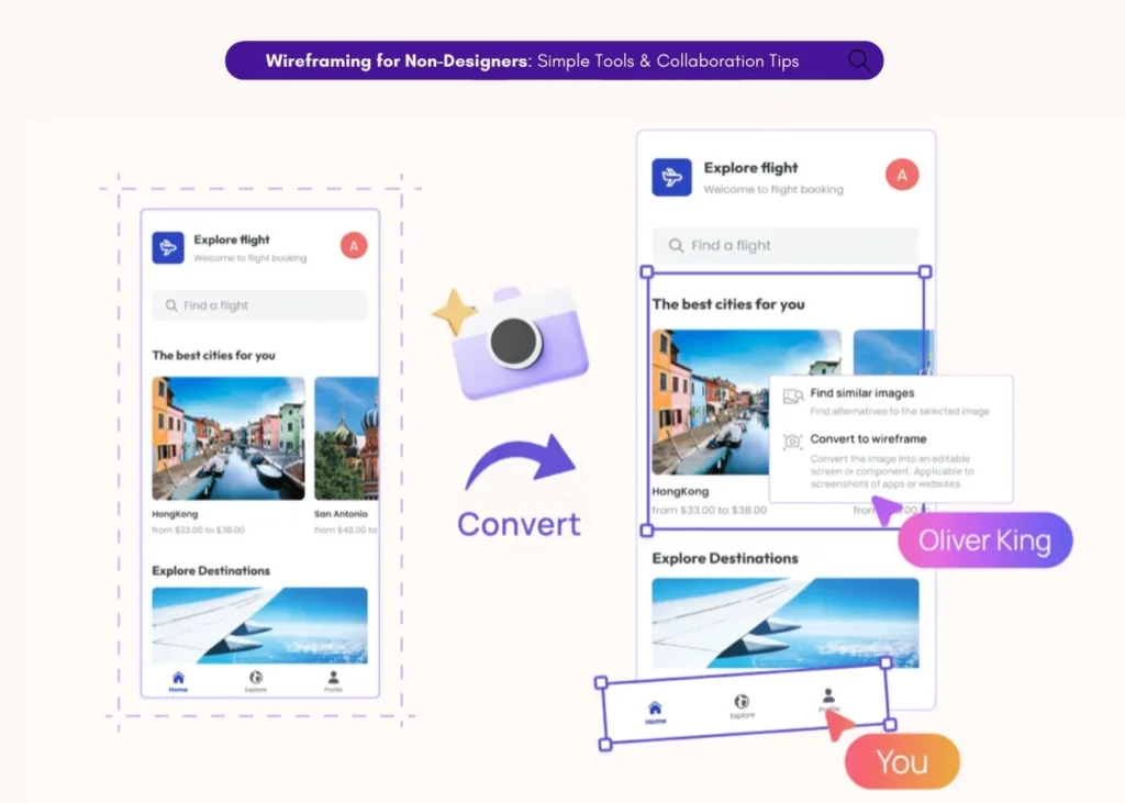
The platform’s AI-powered screenshot-to-wireframe feature lets you transform existing dashboards into editable wireframes instantly – perfect when you see a layout you like but need to adapt it. Similarly, the text-to-design feature generates complete layouts from written descriptions.
For teams working remotely, Visily’s built-in collaboration tools handle feedback directly within wireframes, eliminating the confusion of separate email threads or chat discussions about design elements.
Where To Find Dashboard Wireframe Templates and Examples
Starting with templates saves hours when you need to draw wireframes for dashboards. Quality templates provide more than empty layouts – they offer structural inspiration based on proven patterns.
For SaaS Admin Dashboards, look for templates with robust user management sections, system health metrics, and configuration options. These wireframes typically feature clear navigation hierarchies and progressive disclosure of complex settings.
Checkout dashboard template for a CRM website.
Analytics Platform templates prioritize data visualization space, comparison views, and powerful filtering capabilities. The best examples maintain clarity despite complex data relationships.
Checkout dashboard template for an analytics platform.
Financial Dashboard wireframes organize numerical data with clear hierarchies, trend indicators, and time-based comparisons. Look for templates showcasing different methods of highlighting KPIs versus supporting metrics.
Checkout dashboard template for a payment processing website..
Visily’s template library covers each of these categories with purpose-built starting points you can quickly adapt to your specific needs. Unlike general wireframe templates, these are specifically designed with data visualization spaces proportioned correctly.
Final Thoughts – Wireframe First, Build Smart
Investing time upfront in detailed dashboard wireframe designs prevents expensive changes during development. The process clarifies user needs, business requirements, and technical constraints before committing resources.
Many successful teams maximize their wireframing investment by:
- Involving actual users early to validate assumptions about information hierarchy
- Using wireframes as discussion tools in stakeholder meetings
- Creating interactive wireframe prototypes to test user flows before visual design begins
- Maintaining documentation alongside wireframes explaining key decisions
Ready to create your first dashboard wireframe? Sign up for a free Visily account and see how much faster your process becomes with purpose-built tools.
FAQs
What’s the difference between a dashboard wireframe and a mockup?
A dashboard wireframe shows bare structure and layout while mockups add visual design elements like colors, typography, and styling. Wireframes answer “what goes where and why?” while mockups answer “how will it actually look?” Most teams create wireframes first to validate structure before investing in detailed visual design.
How long should creating a dashboard wireframe take?
For simple dashboards, expect 2-4 hours using specialized tools like Visily. Complex enterprise dashboards might require 1-2 days. Your time investment dramatically decreases when using dashboard-specific tools rather than general design software that requires building components from scratch.
Do I need design skills to create effective dashboard wireframes?
Absolutely not! While designers might create more polished wireframes, anyone can create functional ones using the right tools. Platforms like Visily specifically cater to non-designers by providing pre-built components and intuitive interfaces. Focus on user needs and logical organization rather than artistic skills.
What’s the most effective way to gather feedback on dashboard wireframes?
Structured review sessions yield better results than general feedback requests. Create specific tasks for reviewers to complete using the wireframe (“Find the monthly revenue trend” or “Filter to see only European data”). Watch them attempt these tasks, noting hesitations or confusion. Tools with built-in collaboration features like Visily’s brainstorming capabilities streamline this process by keeping feedback contextual.


