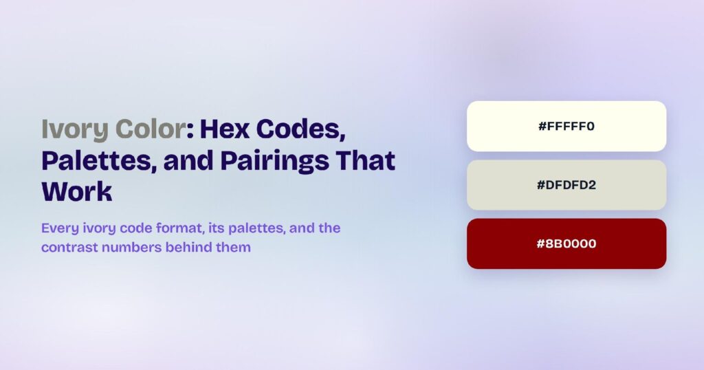
Dark red carries the hex code #8B0000, which resolves to rgb(139, 0, 0) and hsl(0, 100%, 27%). Green and blue both sit at zero while red runs at 139, which places the hue at exactly 0° with full saturation and a low 27% lightness.
Dark red reaches 10.01:1 against white and clears AAA in both directions, which makes it the accessible member of the red family. This page covers every code format, the computed palettes, the four elements where it performs, and why it solves the problem that pure red creates in every interface.
What Is the Color Dark Red?
Dark red sits at 0° with 100% saturation and 27% lightness. The CSS keyword darkred maps to #8B0000 exactly, which makes it a specified value rather than a convention.
The full code set for #8B0000:
- HEX: #8B0000
- RGB: rgb(139, 0, 0)
- RGBA: rgba(139, 0, 0, 1)
- HSL: hsl(0, 100%, 27%)
- HSB: 0, 100, 55
- CMYK: 0, 100, 100, 45
Two channels at zero with red at 139 puts the hue on exactly the same axis as #FF0000. Dark red and pure red are one hue at two lightness levels, which is worth knowing before a design system carries them as separate colors.
The CMYK reading shows the depth. At 45% key coverage a substantial part of this color is black ink, which is why it prints as a dense, restrained red rather than a bright one.
Why Does Dark Red Solve Pure Red’s Problem?
Pure red at #FF0000 reaches 4.0:1 on white, which fails AA for body copy and covers large text only. That single number causes most of the trouble red creates in interfaces.
Dark red fixes it by trading lightness for contrast:
- Red (#FF0000): lightness 50%, 4.0:1 on white, large text only
- Firebrick (#B22222): lightness 42%, 6.68:1, passes AA
- Dark red (#8B0000): lightness 27%, 10.01:1, passes AAA
- Maroon (#800000): lightness 25%, 10.95:1, passes AAA
Nothing above about 42% lightness clears AA on white in the red family. That threshold is the practical dividing line, and dark red sits comfortably past it.
The direction reverses on dark surfaces. Dark red drops to 2.1:1 on black and fails entirely, where pure red reaches 5.25:1 and passes AA, so the two colors swap roles between themes.
That relationship should shape a design system’s error tokens. A light-mode error color and a dark-mode error color are genuinely different values on the same hue, and deriving one from the other by a single step is what produces the failures teams find late.
How Does Dark Red Appear on Digital Screens?
Dark red renders consistently because only one channel is active and it sits well below maximum. It shows none of the clipping pure red produces on some panels.
The measured values invert the pattern pale colors follow:
- #8B0000 on white: 10.01:1, passes AAA
- White text on #8B0000: 10.01:1, passes AAA
- #8B0000 on black: 2.1:1, fails
- Dark variant #680000 on white: 13.22:1, passes AAA
- Bright variant #C30000 on #1D0C0C: 2.99:1, fails
Dark mode is dark red’s weak point rather than its strength. A color this deep has nowhere to go against a near-black surface, and the computed bright variant still fails at 2.99:1.
The tint ramp is the route through. #FF3131 and lighter reach usable ratios on dark surfaces, and those values read as pure red rather than as dark red, which is the theme swap described above.
Panel gamma affects it more than a mid-tone. On an uncalibrated display dark red can flatten toward near-black, so a large surface should be checked before it ships.
What Are the Shades and Tints of Dark Red?
Shades come from mixing black into #8B0000, and the ramp compresses because so little lightness remains:
- #7A0000
- #680000
- #570000
- #460000
- #340000
- #230000
- #110000
By #460000 the color reads as near-black with a red cast. Most design systems need one or two steps below the base and no more.
Tints carry the usable range, which is the reverse of how mid-tone colors behave:
- #B40000
- #DE0000
- #FF0808
- #FF3131
- #FF5A5A
- #FF8484
- #FFADAD
- #FFD6D6
The step at #FF3131 is where dark red crosses into dark-mode territory. Everything above it works against near-black surfaces, and everything at or below the base belongs in light mode.
Named neighbors sit across the deep red range:
- Maroon (#800000): the CSS keyword, marginally deeper, 10.95:1 on white
- Firebrick (#B22222): lighter and less saturated, 6.68:1
- Brown (#A52A2A): lighter and browner, 7.08:1
- Blood red (#660000): deeper, 13.5:1
- Burgundy (#800020): shifted toward purple, 11.1:1
What UI Elements Work Best with Dark Red?
Dark red belongs anywhere on a light surface that needs a red carrying real contrast. At 10.01:1 in both directions it never fails a text check in light mode.
Dark-mode accents, small elements on near-black, and anything needing to separate from a dark surround all fall outside its range. Four element types remain where it genuinely performs.
Error Text and Validation Messages
Text is where dark red does the job pure red can’t. An inline validation message set in #8B0000 on white reaches 10.01:1 and clears AAA, so the error reads at any size.
Field-level errors benefit most. A 12px helper message under an input is exactly the case where pure red at 4.0:1 fails and dark red passes comfortably.
A pale fill completes the pattern. A #FFD6D6 banner background with #8B0000 text gives an error state that’s both readable and unmistakably red.
Destructive Buttons and CTAs
Buttons work in both directions with dark red. White on #8B0000 hits 10.01:1, so a filled destructive button carries any label size, and an outline variant on white clears the non-text requirement several times over.
Hover states come from the shade ramp. A step to #7A0000 keeps the hue stable, where an opacity change alters the effective contrast against whatever sits behind.
The color reads as serious rather than alarming. That register suits delete, revoke, and cancel actions where pure red can feel shrill.
Navigation Bars and Chrome
Navigation covers surface area safely with this color. A dark red top bar hosts white labels at 10.01:1, and every icon on it clears the threshold automatically.
Brand expression comes without a contrast cost. Most saturated navigation colors fail their label contrast, and dark red passes while still reading as a strong color choice.
The boundary against a dark page needs a lightened border. #B40000 as a divider does the separation work that a shadow can’t on a deep surface.
Data Visualizations
Charts use dark red as a series that carries its own labels. Data text can sit directly on a #8B0000 bar at any size, which pure red can’t support.
Negative values and threshold breaches suit it. The color reads as a serious marker rather than an alert, which fits a chart better than a warning color would.
Red-green color vision deficiency remains the constraint. Dark red and a deep green sit at similar luminance, so a direct label or a pattern has to carry the comparison.
What Are the Best Dark Red Color Palettes for UI?
Every palette below comes from rotating hue around #8B0000 at fixed saturation and lightness. Because lightness sits at 27%, these schemes produce deep values that mostly carry text.
Monochromatic
The monochromatic scheme holds hue at 0° and moves lightness: #8B0000, #540000, and #C30000. Three values covering text, deepest shade, and dark-mode accent.
#540000 reaches 14.5:1 on white and passes AAA. Mapping places it on the darkest text, the base on fills and errors, and #C30000 on a light-mode brighter accent.
Analogous
Analogous pulls neighbors 30° in each direction: #8B0000, #8B4600, and #8B0046. A deep amber-brown and a deep rose flanking the base, all at matched depth.
All three pass AA on white. Analogous schemes rarely produce members that all carry body copy, and this one does.
Complementary
Dark red’s complement sits opposite at 180°: #8B0000 paired with #008B8B, the CSS darkcyan keyword. Both are deep and saturated, so the pairing produces hue tension without a luminance clash.
The teal at #008B8B reaches 4.0:1 on white and covers large text. Pairing an error color with a deep teal gives an interface a serious, technical register.
Triadic
The triadic scheme gives you #8B0000, #008B00, and #00008B: dark red, dark green, and navy. Three primaries at matched depth, all of which pass on white.
The red-green pairing needs care. Those two members converge under deuteranopia, so a pattern or a label should separate them in any chart.
Split-Complementary
Split-complementary softens the pairing: #8B0000, #008B46, and #00468B. Dark red with a deep sea green and a deep blue, giving a third value for secondary actions.
This is the most flexible of the five for a full interface. Visily’s theme tools can generate the tint and shade ladder for each value so hover and dark-mode variants come out accessible rather than hand-mixed.
Which Colors Are Similar to Dark Red?
Five named colors sit close enough to #8B0000 to substitute for it:
- Maroon (#800000): the CSS keyword, marginally deeper, 10.95:1 on white
- Blood red (#660000): deeper again, 13.5:1
- Firebrick (#B22222): lighter and softer, 6.68:1
- Brown (#A52A2A): lighter and browner, 7.08:1
- Burgundy (#800020): shifted toward purple, 11.1:1
Maroon is the closest functional relative at 11 points of lightness apart. The two behave almost identically in an interface, which means a design system should carry one rather than both.
Firebrick is the choice when dark red feels too severe. At 6.68:1 it still passes AA for body copy while reading noticeably warmer and less institutional.
Which Colors Pair Best with Dark Red?
White and off-white are dark red’s essential partners. At 10.01:1 and near-identical figures, they let the color carry text, fills, and navigation without compromise.
Deep teal from the complementary scheme is the strongest accent. #008B8B sits opposite at matched depth and covers large text on white, so both colors do real work.
Warm neutrals soften its institutional edge. Cream, sand, and warm gray keep dark red reading as considered, while cool grays push it toward a corporate register.
Muted gold reads as heritage against it. A warm metallic on deep red is the pairing that traditional and premium brands reach for repeatedly.
The 60-30-10 split applies as follows:
- 60% white or off-white: page surfaces and reading areas
- 30% neutral: near-black text, borders, and structural elements
- 10% dark red: errors, destructive actions, and brand accents
Dark red tolerates a larger share than pure red does. Its depth means a 20% presence reads as a brand palette rather than as a screen full of warnings.
Which Colors Should You Avoid Pairing with Dark Red?
Black and near-black surfaces fail first. At 2.1:1 a dark red element on black is effectively invisible, which is the most common dark red mistake when a dark theme gets added to an existing product.
Two computed near-clashes cause trouble in light mode: #8B3A00 and #8B003A. Both sit 25° away at identical lightness, offering hue difference with no luminance difference.
Deep brown is the subtler problem. Dark red and a deep brown sit close in both hue and luminance, so placing them adjacent produces a boundary users can’t see.
Deep green needs a semantic caution rather than a visual one. The two pass contrast together and collapse under red-green deficiency, so a status system built on that pair fails for a substantial share of users.
Does Dark Red Meet Accessibility Standards?
Dark red passes WCAG AAA on white in both directions, which pure red can’t manage. The 10.01:1 measurement clears both the 4.5:1 AA and 7:1 AAA thresholds set by the W3C.
Dark red lands as follows across the common pairings:
- #8B0000 on white: 10.01:1, passes AAA
- White on #8B0000: 10.01:1, passes AAA
- #680000 on white: 13.22:1, passes AAA
- #8B0000 on black: 2.1:1, fails
- #C30000 on #1D0C0C: 2.99:1, fails
Those dark-mode failures are what catch teams out. An error color built on dark red in light mode needs its dark-theme value from the tint ramp at #FF3131 or above.
Red-green color vision deficiency applies in full. Under protanopia dark red dims further toward black, which can drop an error message below the visual weight of the neutral text around it.
Red should never carry a state alone, and dark red is no exception despite its contrast. An icon, the word “error”, or a position preserves the meaning when the hue collapses.
How Can You Convert Dark Red Between HEX, RGB, HSL, CMYK, and Other Color Formats?
Each format describes the same deep red from a different angle:
- HEX #8B0000: the default in design files and CSS
- RGB rgb(139, 0, 0): one channel active, two at zero
- RGBA rgba(139, 0, 0, 1): adds alpha for tinted overlays and scrims
- HSL hsl(0, 100%, 27%): full saturation at low lightness
- HSB 0, 100, 55: the picker model, reporting brightness at 55%
- CMYK 0, 100, 100, 45: magenta and yellow over a heavy black plate
The single-channel structure is the simplest in this cluster. One value between 0 and 255 with two zeros describes every red on the pure hue axis, from #110000 to #FF0000.
The HSL and HSB disagreement matters in handoff. Lightness reports 27% and brightness reports 55% for the same color, so a number copied between models produces a visibly different red.
CMYK reproduces dark red faithfully. The 45% key coverage means much of the color comes from black ink rather than saturated pigment, so the printed version tracks the screen better than a bright red would.
Wrapping Up
Dark red is the red that passes, and it’s the light-mode half of a two-token error system rather than a universal replacement for #FF0000. #8B0000 carries error text, destructive buttons, navigation, and chart labels at 10.01:1 in both directions on white, #680000 gives a second level at 13.22:1, and the dark-theme value has to come from #FF3131 or lighter, since the base disappears against near-black at 2.1:1.
Those two token sets don’t need to be built by hand. Open Visily and use its AI-powered design tools to generate the dark red shade and tint ladders, separate light and dark theme error values, and matched accent pairings across the entire design in one pass.