Subscribe now to get 6,000 credits/month (up from 3,000) for the next 2 months
Data Analytics Website Template
Use Visily's Data Analytics Website Template and customize it the way you want


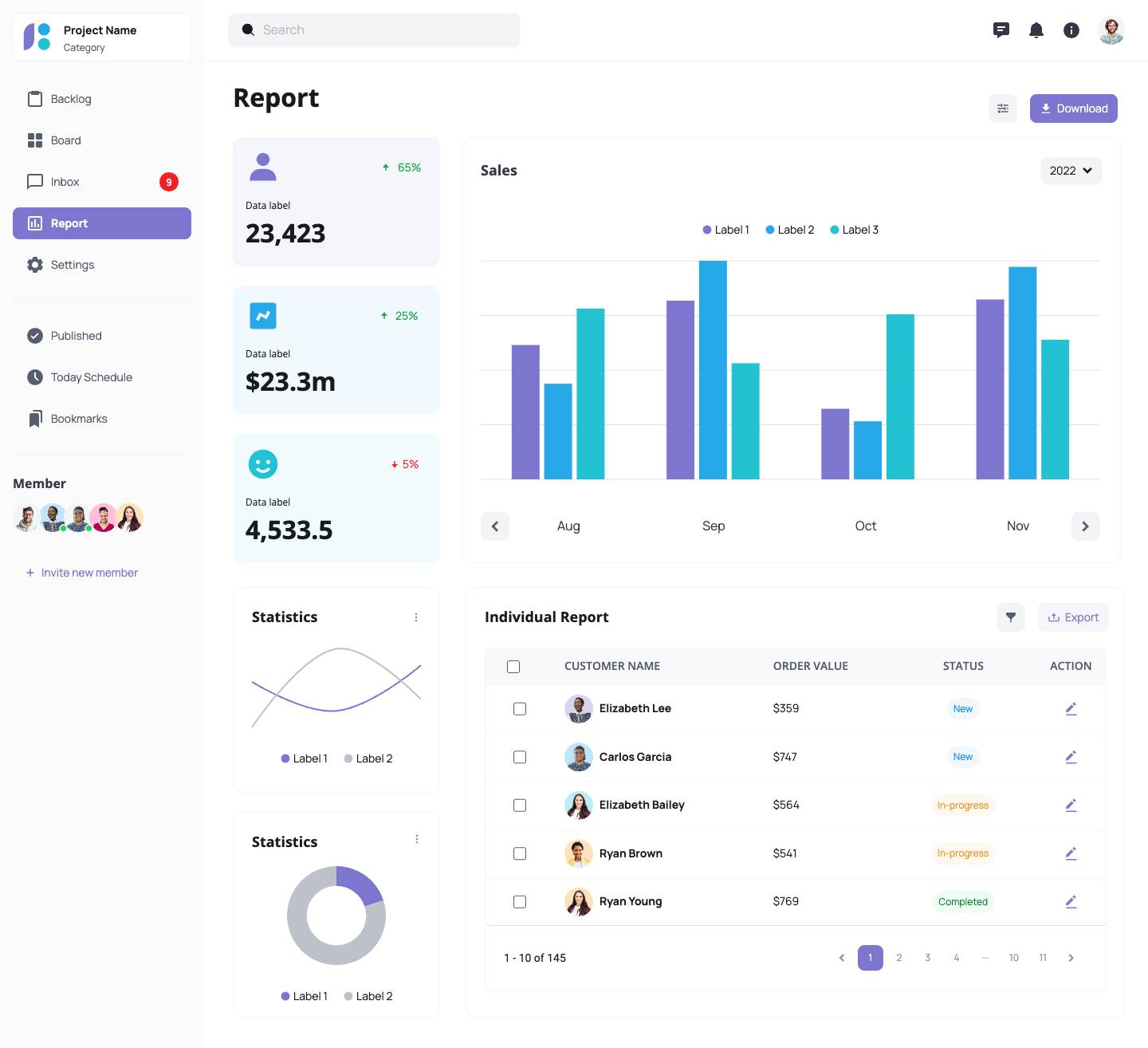
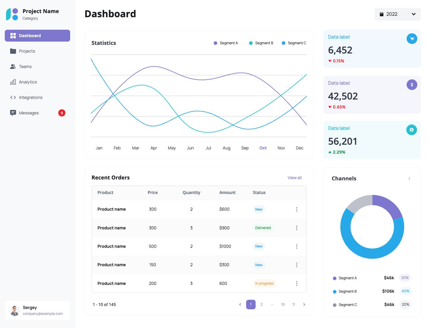
Create a Data Analytics Website Template That Turns Metrics into Insights
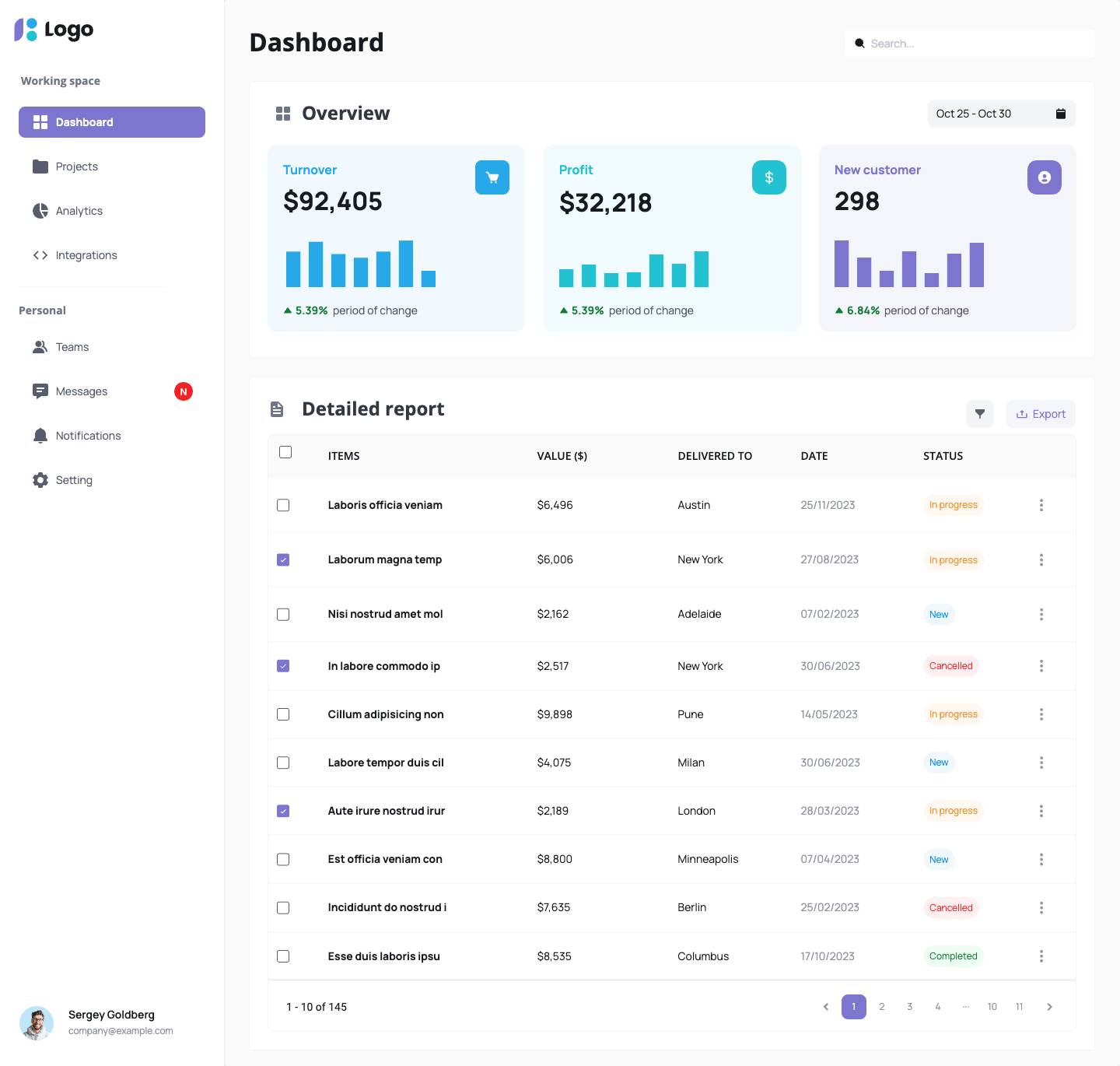
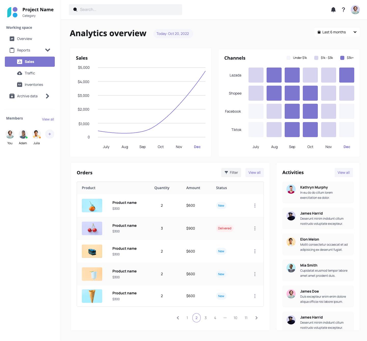
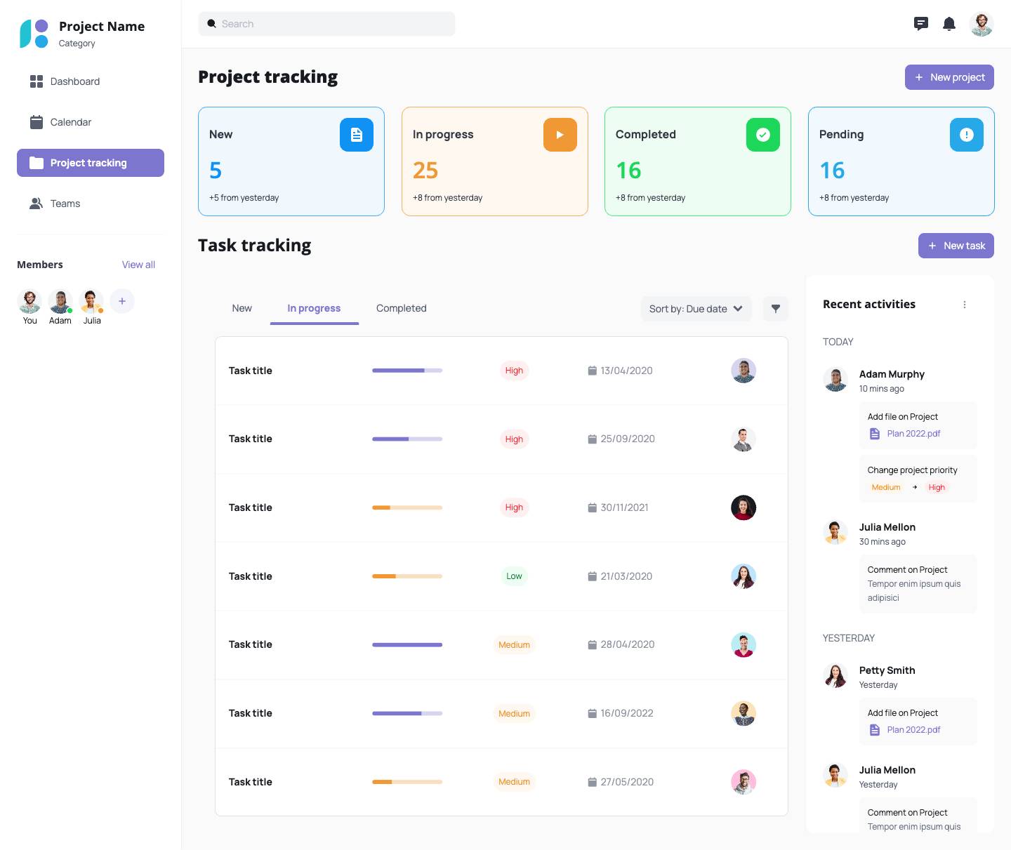
This template helps you present dashboards, trends, and KPIs in a structured, easy-to-interpret layout. Ideal for SaaS analytics tools, internal reporting platforms, or visualization products.
What’s Included in This Data Analytics Website Template
- KPI summary cards and trend visualizations
- Bar, line, and pie chart sections
- Navigation for modules like traffic, revenue, or user behavior
- Interactive filters and tabs
- Built with Smart Components that adapt as you customize.
Who Should Use This Template?
- Product teams building analytics dashboards
- SaaS startups with internal data reporting tools
- Designers exploring data-driven UX
- BI or engineering teams prototyping front ends
Example Use Cases
- Visualize usage metrics or web analytics
- Create financial performance dashboards
- Prototype admin analytics portals
- Test multi-module navigation for BI tools
How to Customize This Template in Visily
- Update charts and metrics for your KPIs
- Add brand fonts and colors with a theme
- Rearrange visual hierarchy and components
- Share versions with data or design teams
Why Use a Visily Template for Your Analytics Tool?
- Saves time structuring dashboard interfaces
- Focused on readability and UX clarity
- Built to scale across modules and user roles
- Great for internal tools, client-facing SaaS, or MVPs
How to Get Started with This Template
1. Click “Use this template”
2. Sign in to Visily
3. Replace visuals and chart placeholders
4. Edit navigation and component logic
5. Share with stakeholders or export
Create stunning designs in a click
Visily's combination of power and simplicity lets anyone design beautiful UI.
