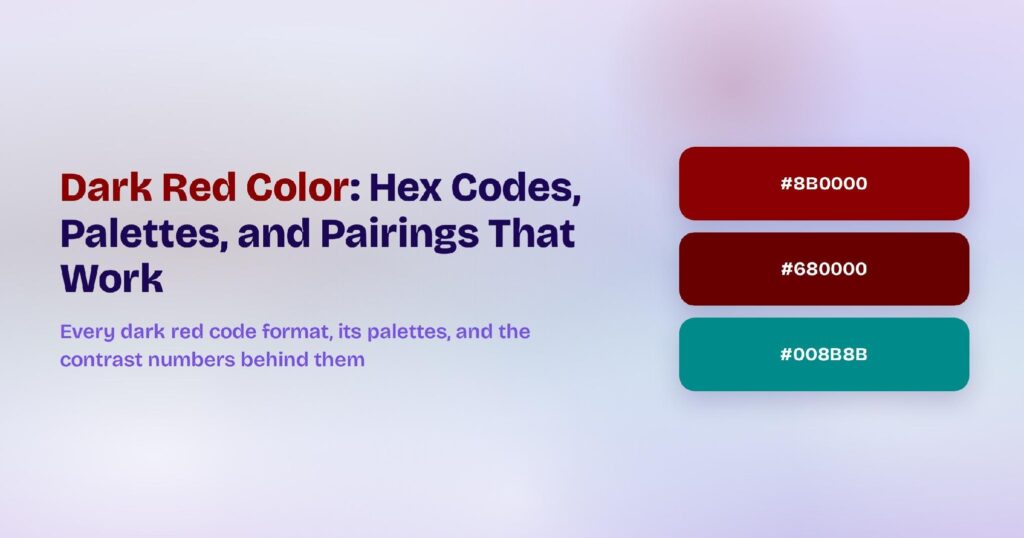
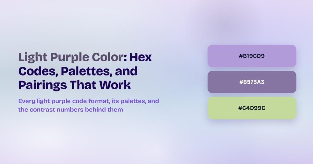
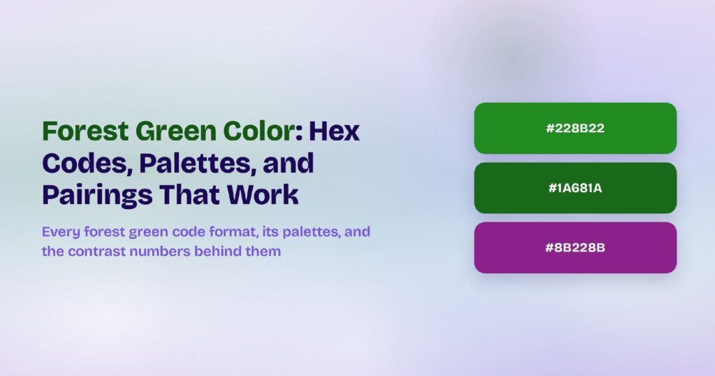
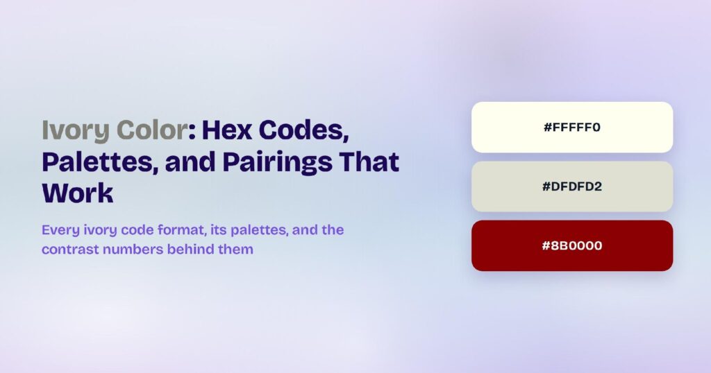
Complementary colors are pairs of colors that sit directly opposite each other on the color wheel, such as blue and orange or red and green. Side by side, they make each other look brighter. Mixed together, they cancel out into gray.
If you pick hues by instinct, you’ll usually fail in one of two ways. The pair either clashes so hard it strains the eye or sits so close it turns to mud, and both outcomes bury your buttons, weaken readability, and make a brand forgettable.
Complementary pairs replace that guesswork with a rule you can apply in seconds: travel 180 degrees across the wheel.
This guide covers the six classic pairs, the models that define them, the science behind their contrast, and the ratios that keep them balanced.
The Definition of Complementary Colors: Opposites That Intensify Each Other
Complementary colors are two hues positioned 180 degrees apart on the color wheel. Designers also call them opposite colors.
No other pairing produces stronger contrast, and placing the two side by side intensifies both.
The same opposition works in reverse when you mix them. Combine complementary paints and the hues cancel each other out, sliding toward gray or brown.
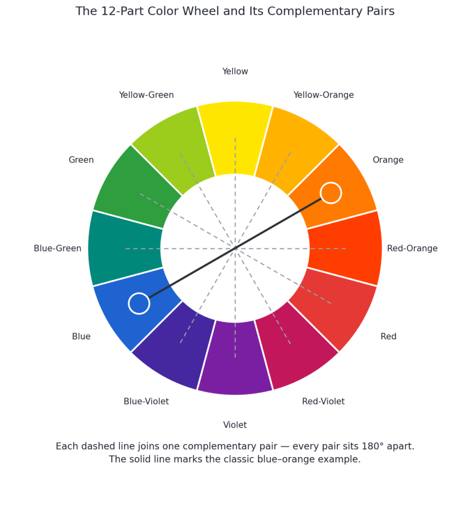
Each color contains exactly what the other lacks: green, for instance, is yellow plus blue, which is everything red is not.
One spelling note saves embarrassment in design reviews: complementary with an “e,” not complimentary with an “i.” These colors complete each other; they don’t hand out compliments.
The 6 Complementary Color Pairs on the 12-Part Color Wheel
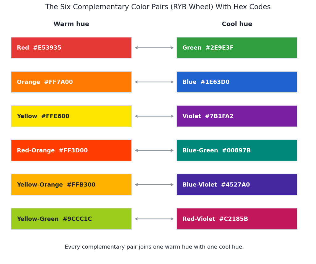
The 12-part artist’s wheel yields exactly six complementary pairs. Three of them join a primary color to a secondary color:
- Red and green
- Blue and orange
- Yellow and violet
The other three join tertiary colors, the hues mixed from a primary and its neighboring secondary:
- Red-orange and blue-green
- Yellow-orange and blue-violet
- Yellow-green and red-violet
Every pair also splits along temperature: one warm hue, one cool hue. That opposite-temperature pairing drives much of the visual tension, since the eye reads warmth and coolness as pulling in different directions.
Complementary Colors Across RYB, RGB, and CMYK Color Models
A color’s complement depends on the color model you’re working in. Designers meet three models most often:
- RYB (paint and pigment, the traditional artist’s wheel): red-green, blue-orange, and yellow-purple.
- RGB (light and screens, an additive model): red-cyan, green-magenta, and blue-yellow. Two full-intensity complements of light combine into white.
- CMYK (print, a subtractive model): magenta-green, yellow-blue, and cyan-red, mirroring the RGB logic in ink.
Screens make the RGB math easy to run yourself. Subtract each pair of hex digits from FF and you get the exact inverse: red #FF0000 flips to cyan #00FFFF.
Most designers still reach for the RYB pairs even in digital work. The warm-cool tension of blue and orange reads as more natural than a mathematically pure red-cyan, which can feel flat on screen.
The Science of Complementary Color Contrast: Warm-Cool Tension and Afterimages
Your visual system treats complementary pairs as opposites. Stare at a green shape for about 30 seconds, then glance at a white wall, and a magenta afterimage appears. The eye’s green-sensitive cells fatigue, so the rested red and blue receptors dominate the next thing you see.
Painters noticed the same wiring long before the biology was mapped. The Impressionists observed that shadows aren’t neutral gray but carry the complement of the light casting them, so yellow sunlight throws violet shadows. Tate points to Claude Monet’s Woman Seated on a Bench, where the shadow pooling at the figure’s feet reads distinctly violet.
The practical takeaway: complementary contrast isn’t a style preference. It’s built into human vision, which is why a complementary accent pulls the eye faster than any other pairing.
How Complementary Colors Work in UI/UX Design: Hierarchy, Focus, and Feedback
Complementary colors do three jobs inside an interface:
- they build hierarchy
- pull the eye toward one action
- mark a change in state
Hierarchy comes first. Place a hue against its opposite and that pair holds the highest contrast on screen, so your eye lands there before anywhere else. One complementary accent reads as one priority.
Attention follows hierarchy. A single orange button on a blue dashboard doesn’t compete with the layout around it. It points, and your gaze snaps to the one element that breaks the field.
State and feedback ride on the same opposition. Opposite hues separate a selected tab from an idle one, an active toggle from an off one, or a success message from an error. The contrast labels the change before the words do.
The warm-cool split adds a spatial cue. Warm hues appear to advance while cool hues recede, so a warm accent on a cool background feels like it steps toward you. That’s the afterimage wiring covered above, now working for your layout instead of against your eye.
The mechanism only holds at one dose: use the complement for a single job per screen, and let the ratios below keep it there.
Complementary Color Schemes in UI and Graphic Design
Complementary schemes are loud by default, so the craft lies in dosage. Three techniques keep the contrast working for you instead of against you.
Technique-1: The 60-30-10 Rule for Balancing a Complementary Palette
Give the dominant color about 60% of the layout, a secondary or neutral color about 30%, and reserve the final 10% for the complement.
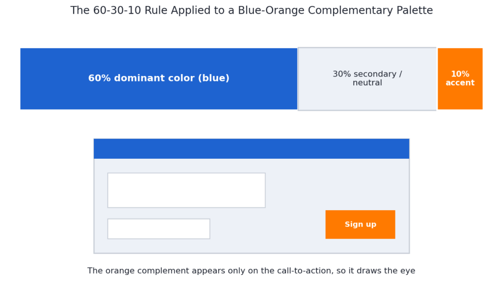
The small dose is the whole point. An accent only reads as a signal when it’s rare, so the 10% ceiling turns your complement into a pointer instead of noise. Push it to 30% and the two hues start fighting for the same attention.
Map the ratio to real surfaces:
- 60% carries your backgrounds and largest surfaces.
- 30% covers secondary panels, cards, and navigation.
- 10% goes to the one thing you want clicked: the primary button, an active state, or a single highlighted metric.
Neutrals do the quiet work between the two charged hues. White, gray, or off-black surfaces give the eye a place to rest, which is why a complementary palette rarely uses the full pair edge to edge.
Technique-2: Split-Complementary Palettes for Softer Contrast
A split-complementary scheme swaps the direct opposite for its two neighbors. Start with a base color, find its complement, then pick the two hues flanking that complement instead of the complement itself. Blue pairs with red-orange and yellow-orange rather than pure orange.
You keep the warm-cool tension but lower the vibration. No two of the three hues sit in direct 180-degree opposition, so the edges stop buzzing and beginners get a more forgiving result.
The third color also gives the palette room to move. Use one flanking hue for your main accent and the other for a secondary accent, which suits dashboards, content-heavy pages, and any brand that needs more than one highlight color.
Technique-3: Accessibility Limits of Complementary Text Colors
Never set body text in one complement on top of the other. At equal saturation the two edges appear to vibrate, and the effect gets worse at small sizes.
The vibration comes from equal lightness. When both hues share a similar brightness, your eye can’t settle on the boundary between them. The fix is a lightness gap: pair a very light value with a very dark one instead of two saturated mid-tones.
Keep the charged pair for fills, buttons, icons, and section accents. Body text belongs in near-black or near-white, and every text-background combination should clear the WCAG AA ratio before you ship:
- 4.5:1 for normal body text.
- 3:1 for large text (about 18pt, or 14pt bold) and for interface components like icons and input borders.
Color alone can’t carry meaning either. Red-green color blindness is common, so pair every color-coded state with an icon, label, or shape so the message survives without the hue.
Brand Examples of Complementary Color Schemes
Complementary palettes anchor brands you see daily:
- Duolingo builds its interface on green and fires red only to mark a wrong answer, turning the complement into instant feedback the user reads before the text lands.
- The Los Angeles Lakers pair purple with gold, a yellow-violet complement that stays energetic from courtside signage down to the app icon.
- Firefox sets its warm orange logo against cool blue accents, the classic blue-orange pairing that signals both energy and trust.
Each brand runs one hue as the workhorse and saves the complement for punctuation, the same 60-30-10 logic covered above.
Benefits of Complementary Colors: Faster Attention, Stronger Recall, and Fewer Decisions
Complementary colors give you four advantages a single-hue palette can’t.
- Faster attention. The highest-contrast element gets seen first, so a complementary call to action shortens the time a visitor needs to find your primary action (see hierarchy above).
- Stronger recall. High-contrast pairs lodge in memory better than close-hued ones, which is why blue and orange anchor so many posters and app icons. Your brand gets recognized faster on a crowded screen.
- Balanced energy. The warm-cool split keeps a layout lively without the flatness of a one-color scheme, and the two temperatures hold each other in check.
- Fewer decisions. You derive the second color by a rule instead of guessing, so a palette that used to take an afternoon takes one move across the wheel.
Use Cases of Complementary Colors: Buttons, Charts, States, and Wayfinding
Complementary pairs earn their keep in five recurring spots.
- Buttons and CTAs. A complementary button on its opposite field is the most reliable way to make one action unmissable, the pattern behind Duolingo’s red wrong-answer cue (see brand examples above).
- Data visualization. Two opposite hues separate two series or split positive from negative values in a chart, since the contrast reads instantly even at small sizes.
- Form validation. A complementary accent flags the one field that needs attention without recoloring the whole form.
- Wayfinding. An active nav item, the current step in a progress bar, or a pin on a map uses the complement to answer “you are here” at a glance.
- Illustrations and empty states. A pop of the complement in a spot illustration or onboarding graphic adds energy to otherwise quiet screens.
How to Choose Complementary Colors for Your Brand in 5 Steps
Choosing a complementary palette for your brand takes 5 steps.
- Start from your anchor hue. Use your existing brand color as the base, or pick the hue that fits your industry and personality if you’re starting fresh.
- Cross the wheel to its complement. Travel 180 degrees for the opposite hue (see the definition above), and choose your model first: RYB blue-orange reads warmer, while RGB blue-yellow stays truer on screens.
- Assign roles with 60-30-10. Let your brand hue dominate and hand the complement the 10% accent slot (see the 60-30-10 rule above), so the opposite color points instead of shouts.
- Match the temperature to the feeling. A warm accent reads as energetic and urgent, which suits CTAs and promotions; a cool base reads as calm and trustworthy, which suits finance, health, and productivity tools.
- Test accessibility before you lock it. Run every text-on-color pair to the WCAG AA ratio of 4.5:1 (see accessibility limits above), and back up any color-coded state with an icon or label so nobody misses it.
If the direct pair still vibrates, step down to a split-complementary set (see split-complementary above) and keep the softer tension.
Complementary Color Palettes in Visily’s AI Design Tools
Visily removes the manual work of building a complementary palette. Its Magic Theme feature generates a full color scheme four ways: extract it from an image, extract it from a URL, pick a pre-made theme, or generate one from keywords. Spot a website with a blue-orange palette you love, and Magic Theme pulls those colors into your project in one click.
The AI Design Assistant then keeps the scheme usable. It flags common color mistakes, including the contrast problems that make complementary text unreadable, before your design ships.
You can also import your own brand assets, including brand colors and fonts, so every wireframe and mockup starts on-palette.
The Starter plan is free, and finished designs export straight to Figma when you’re ready for pixel-level polish. Try Visily free and put your first pair to work today.
FAQs About Complementary Colors
What’s the complementary color of blue?
Orange on the traditional RYB wheel, which is the pairing most designers mean. In the RGB model used by screens, blue’s mathematical complement is yellow.
What happens when you mix complementary colors?
They neutralize each other. Complementary paints blend into gray or brown, and complementary lights at full intensity combine into white.
How many complementary pairs does the color wheel have?
Six on a 12-part wheel: three primary-secondary pairs and three tertiary pairs.
What’s the difference between complementary and contrasting colors?
All complementary colors contrast, but not all contrasting colors are complementary. The test is position: only hues sitting 180 degrees apart on the wheel qualify as complements.
Which complementary pair is easiest for beginners?
Blue and orange. The pair’s large lightness gap keeps layouts legible, which is why it dominates everything from movie posters to app interfaces.