A cluttered interface usually isn’t a layout problem. It’s a color problem. The 60-30-10 rule fixes it by splitting your interface into three proportions:
- 60% for a dominant color
- 30% for a secondary color
- 10% for an accent color
That’s the whole ratio.
When every color competes for attention, your users can’t tell what matters. Buttons blend into banners, and the one action you want them to take disappears. The 60-30-10 ratio solves this by building visual hierarchy. The accent, used sparingly, becomes the single thing the eye lands on first.
This blog explains how the 60-30-10 ratio creates a clear visual hierarchy, how to apply it to a real UI.
What Is the 60-30-10 Rule in UI Design?
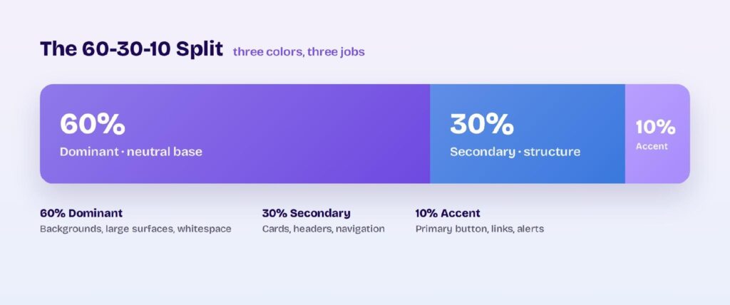
The 60-30-10 rule is a color-proportion guideline: fill 60% of your interface with a dominant color, 30% with a secondary color, and 10% with an accent.
It comes from interior design and color theory, where decorators used the same split for decades to keep a room balanced. The math that stops a living room from feeling chaotic also stops a screen from feeling chaotic.
Three colors is the sweet spot for a reason. Two colors often read as flat and under-designed, while four or more start to compete and blur the hierarchy. The 60-30-10 split gives you enough range to feel finished and enough restraint to stay readable.
Each number maps to a distinct job.
The 60% Dominant Color
The dominant color is your neutral base. It covers backgrounds, large surfaces, and whitespace, and it’s usually white, off-white, or light gray. Its job is to stay calm and let everything else read clearly. You barely notice it, which is the point.
The 30% Secondary Color
The secondary color supports the base and gives the layout structure. It covers cards, headers, navigation bars, and section dividers. This color is still visible, but it never shouts over the accent.
The 10% Accent Color
The accent color is the standout. You reserve it for the elements you want your user to act on: the primary button, active links, and key badges or notifications. Because it appears rarely, it reads as important the moment it shows up. Spend it in too many places and it stops meaning anything, which is why the 10% ceiling matters more than the exact hue you pick.
Why Does the 60-30-10 Ratio Create Clear Visual Hierarchy?
The ratio works because rarity signals importance. When a color covers only 10% of the screen, the eye treats it as the exception and lands on it first. Proportion does the work that a bright color alone can’t.
Visual hierarchy is the order in which a user notices things on a screen. A strong hierarchy sends the eye to the primary action before anything else.
The 60-30-10 split builds that order automatically:
- the calm 60% recedes
- the 30% frames the content
- the 10% pulls focus to the one place you want a tap or click.
This also lowers cognitive load. Your user doesn’t have to scan a wall of competing colors to find the button.
Take a typical SaaS dashboard. The white background and light-gray panels are your 60%. The slate navigation bar and content cards are your 30%. A single blue “Upgrade” button is your 10%. A user’s eye jumps to that blue button because it’s the only saturated thing on the screen, and the ratio, not a tooltip, tells them where to click.
Now flip it. Give three buttons the same bright blue and the hierarchy collapses. The eye has nowhere to land, so it lands nowhere, and your primary action loses the advantage the accent was supposed to give it.
According to the Nielsen Norman Group, you should reserve the accent color for what you want to stand out most, such as the primary call to action. When the accent maps cleanly to the main action, the interface guides the eye without a single instruction.
How Do You Apply the 60-30-10 Rule to a UI in 5 Steps?
Start in grayscale, then add color by proportion. Building the layout in neutrals first forces you to solve structure before decoration, so color reinforces hierarchy instead of faking it.
Follow these 5 steps:
- Build the layout in grayscale. Lay out every screen in shades of gray so spacing and structure carry the hierarchy on their own.
- Assign the 60% dominant color. Apply your neutral base to backgrounds and large surfaces.
- Layer the 30% secondary color. Add it to cards, headers, and navigation so content blocks read as groups.
- Reserve the 10% accent for the primary action. Paint only the main button, active links, and critical alerts.
- Test the palette in light and dark mode. Check that the accent still stands out and that contrast holds in both themes.
This grayscale-first order keeps the ratio honest. If a screen looks flat in gray, more color won’t save it. Designers who skip the gray stage often use color to patch weak spacing and contrast, which buries the real problem under a coat of paint. Solve structure first, and the 60-30-10 split has something solid to sit on.
How Do You Choose Each Color in the 60-30-10 Palette?
Pick the dominant for calm, the secondary for structure, and the accent for contrast. Each slot has a different selection rule.
Dominant (60%). Choose a neutral: white, off-white, or a light gray. Neutrals give the eye a place to rest and make the other two colors pop without effort.
Secondary (30%). Choose your brand color or a hue that complements the dominant. This is where personality enters. A muted or mid-tone works best here so it supports the accent instead of fighting it.
Accent (10%). Choose the most vibrant, highest-contrast color in your set. It has to separate cleanly from both the base and the secondary, since its whole job is to grab attention.
You can stretch a three-color palette further with tints and shades of the same hues. Lightening or darkening a color adds depth without introducing a fourth color that muddies the ratio.
What Mistakes Break the 60-30-10 Rule in UI Design?
The rule breaks the moment your accent stops being rare. A few patterns undo the hierarchy the ratio is meant to create:
- Overusing the accent. When every button is bright, nothing stands out, and the 10% swells past its budget. Reserve the accent for one primary action per screen.
- Ignoring contrast. A pretty accent that fails accessibility is a broken accent. Meet the WCAG AA ratio of 4.5:1 for normal text so every user can read it.
- Letting the ratio drift across screens. A settings page that uses a different split from your home screen feels like a different product. Hold the same proportions everywhere.
- Treating the split as an exact law. The numbers are a guideline, not a measurement. Aim for roughly 60-30-10 by visual weight, not to the pixel.
- Forgetting that neutrals are still color. Your 60% base sets the mood before the accent ever appears. A cold gray and a warm beige send different signals, so choose the neutral as deliberately as the accent.
Consistency is the thread through all five. The ratio only pays off when it repeats across every screen in your product.
How Does Visily Help You Build a 60-30-10 Color Palette?
Visily builds your palette and holds it steady across every screen, so the 60-30-10 ratio stays consistent without manual color math. Its Project Theme stores your colors, fonts, spacing, shadows, and border radius as a design system, then applies them automatically to every component, template, and screen in the project.
You don’t have to start from a blank swatch. Visily’s App Themes generates a full, editable theme four ways:
- from a few keywords describing your app,
- from a prebuilt theme in the library,
- from a screenshot of an app you like, or
- from a URL you paste in.
Once you have a base, the Color Assistant and UI Presets pair balanced color palettes with matching fonts, so your dominant, secondary, and accent colors stay in proportion. The eyedropper lets you pull an exact color straight off the canvas, and one-click restyle plus AI chat let you re-map colors across an entire design in seconds. You describe the change, and Visily updates the theme everywhere at once.
Because every color lives in the theme as a token, tweaking your accent updates every button that uses it. Change the green to blue once, and every primary action across every board switches with it. The ratio never drifts, and you never hunt for a stray button that missed the memo.
This matters most as a product grows. A ten-screen app has a hundred chances for the accent to leak into a place it shouldn’t. A shared theme closes every one of them, so the 60-30-10 balance you set on day one still holds on screen fifty.
The 60-30-10 ratio turns a cluttered interface into a clear hierarchy that sends the eye straight to the action that matters. Visily’s Project Theme applies your dominant, secondary, and accent colors consistently across every screen, so the balance holds as your product grows. Sign up for Visily’s free plan and build your first 60-30-10 palette today.