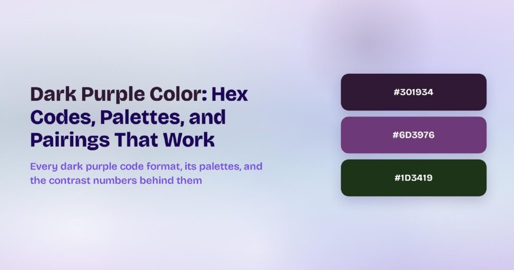
Lavender’s HEX code is #E6E6FA. It sits at hue 240 — the blue-violet side of the wheel — with 67% saturation and a striking 94% lightness, which makes it one of the palest named colors in the CSS palette. Screens use it where softness matters: wellness apps, meditation products, beauty brands, and any interface that wants calm without the sterility of plain white.
Below you get every lavender code format, the five computed harmony palettes, and exact WCAG contrast ratios against white, black, and dark surfaces. Every value comes straight from the hex through color math, not from eyeballing a swatch, so you can drop the numbers into your design tokens without second-guessing them.
What Is the Color of Lavender?
Lavender is the CSS named color lavender, mapped to #E6E6FA. Its RGB is rgb(230, 230, 250): red and green sit level at 230 while blue edges ahead at 250, and that 20-point blue lead is the entire personality of the color. Remove it and you have a light gray; keep it and you have a whisper of violet.
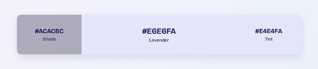
The name comes from the flowering lavender plant, though the CSS color is far paler than the blooms. In interface work, lavender behaves less like a purple and more like a tinted white — a background that adds warmth and character to surfaces that would otherwise read as clinical.
That behavior defines its role. Lavender isn’t a brand color you build buttons from; it’s an atmosphere color you build rooms from. The saturated work gets delegated to deeper purples pulled from the same hue family.
Is Lavender Purple or Lilac?
Lavender is a pale purple on the blue side; lilac is a pale purple on the pink side. Lavender’s hue sits at 240 — squarely in blue-violet territory — while lilac (#C8A2C8) sits near hue 300 with a warm, pinkish cast. Put them side by side and lavender reads cool and airy while lilac reads soft and rosy.
The two get swapped constantly in product copy, so a practical rule helps: if the swatch leans toward periwinkle and sky, it’s lavender; if it leans toward rose and mauve, it’s lilac. Your design tokens should commit to one and name it precisely, because a lavender-labeled token that renders lilac will frustrate every developer who inspects it.
Is Lavender Blue or Violet?
Lavender is technically a violet, but only just. Hue 240 marks the border where blue hands over to violet, and lavender’s tiny saturation (8% in HSB terms) keeps the violet character faint. Under warm lighting or next to strong blues, most people will call it blue; next to grays, the violet cast becomes obvious.
For design system taxonomy, file lavender under your purple or violet family rather than blue. Its natural darker companions — the colors you’ll reach for when lavender needs a saturated partner — all live on the violet side of the wheel.
How Does Lavender Appear on Digital Screens?
On white, lavender manages only 1.23:1 — a hard fail for any text role, which is exactly what you’d expect from a 94%-lightness color. On black it soars to 17.06:1, passing AAA with more headroom than almost any color in the CSS set.
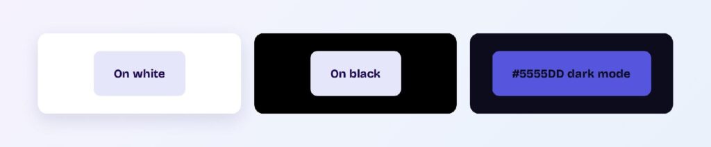
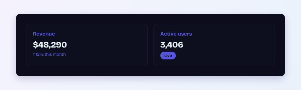
Those two numbers tell you everything about deployment: lavender is a background and a dark-surface text color, never a light-surface text color. For interactive elements that need a lavender identity on white, the computed bright variant #5555DD carries the hue at usable depth, reaching 3.43:1 on the dark surface #0C0C1D — enough for large text and icons.
Dark mode is where lavender shines unexpectedly. Lavender text on near-black surfaces delivers AAA contrast while keeping the interface soft, which is why sleep and meditation apps lean on exactly this pairing.
What UI Elements Work Best with Lavender?
Lavender’s extreme lightness makes it a surface color first. It performs where a tinted background adds mood without competing with content.
Backgrounds and Cards
A #E6E6FA background with dark text creates a calm, premium surface for onboarding screens, empty states, and settings panels. Dark ink like #1F1F2E hits well above AA against it, so body copy stays fully readable while the surface does the emotional work.
Status Badges
Lavender badges suit gentle, informational states: drafts, scheduled items, and beta labels. Pair a deep violet text with a lavender fill and the badge reads clearly without the urgency of red or the finality of green.

Data Visualizations
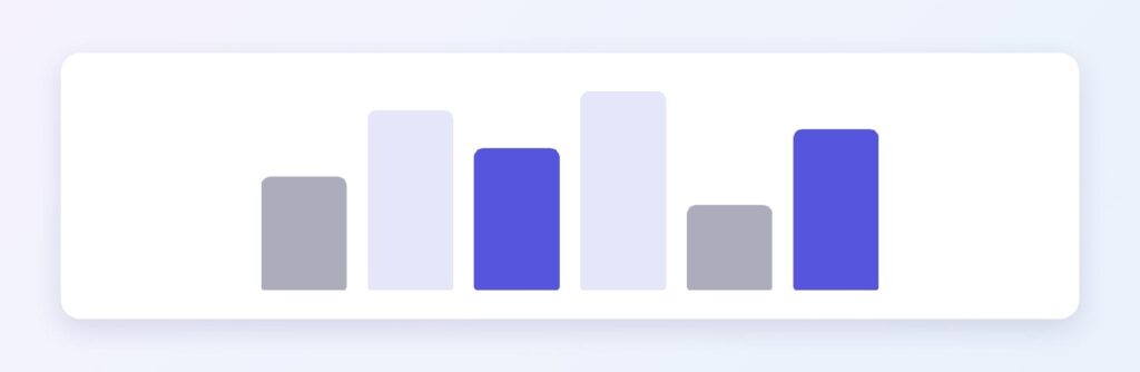
Lavender works as the lightest step in a violet sequential ramp. Run #E6E6FA down through #ACACBC toward saturated violets and you get a scale for heatmaps and progress states that stays legible in both themes. You can use Visily’s Theme feature to apply the ramp across all your chart components at once.
Buttons and CTAs
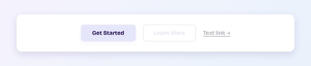
For buttons, skip base lavender — it vanishes on white. Use the bright variant #5555DD for the fill with white label text, and reserve #E6E6FA for the button’s hover halo or a secondary ghost-button background. The pairing keeps the family resemblance while meeting contrast needs.
What Are the Best Lavender Color Palettes for UI?
Five harmony schemes come from lavender’s position at hue 240. Because the base is so light, every companion below shares its pastel character — these are palettes for atmosphere, with saturated accents pulled in separately when needed.
Monochromatic
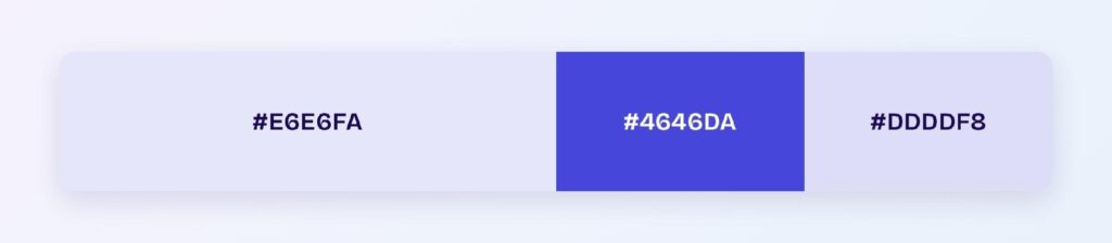
The set: #E6E6FA, #4646DA, and #DDDDF8. This is lavender’s most practical palette because it supplies the saturated partner (#4646DA) the base color lacks. Wellness and productivity tools use the deep violet for interactive elements and the two pales for surfaces.
Analogous
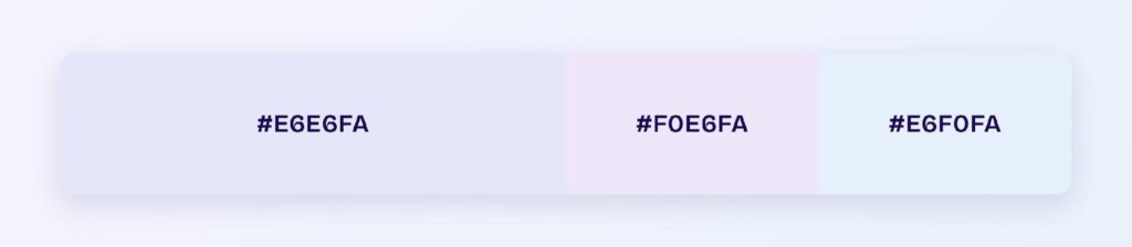
The set: #E6E6FA with #F0E6FA (toward pink-violet) and #E6F0FA (toward blue). Three neighboring pastels create the softest possible gradient territory — hero backgrounds, skeleton loaders, and ambient section breaks.
Complementary
The set: #E6E6FA against #FAFAE6, its computed pale-yellow opposite. At this lightness the complement reads as cream rather than yellow, giving you a warm-cool pairing for alternating content sections that never fights for attention.

Triadic
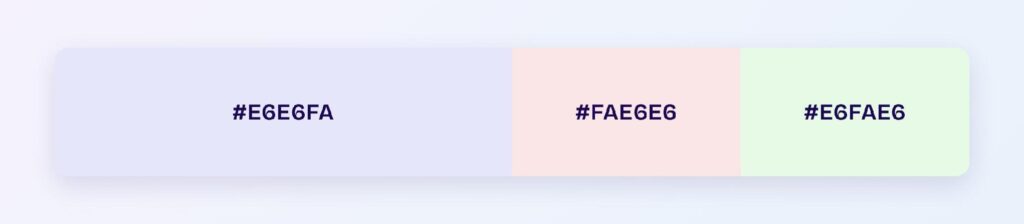
The set: #E6E6FA, #FAE6E6 (pale rose), and #E6FAE6 (pale mint). Three evenly spaced pastels suit category systems in calendars, tags, and kanban boards where each group needs an identity without any group dominating.
Split-Complementary
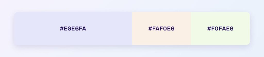
The set: #E6E6FA with #FAF0E6 and #F0FAE6. It softens the complementary pairing further, which makes it the default choice when the cream complement feels too warm against your brand’s neutrals.
Which Colors Are Similar to Lavender?
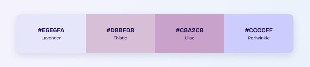
The three closest named colors are thistle (#D8BFD8), lilac (#C8A2C8), and periwinkle (#CCCCFF). Thistle adds gray and a pink lean, lilac goes warmer and more saturated, and periwinkle keeps lavender’s coolness but strengthens the blue. If lavender feels too faint for a component, periwinkle is the nearest step up that preserves the temperament.
Which Colors Pair Best with Lavender?
The best structural partner is a deep violet from lavender’s own hue family — #4646DA from the monochromatic set — because it supplies the contrast lavender lacks while keeping one hue story. For accents, the pale-yellow complement #FAFAE6 warms the palette, and charcoal grounds it.
Apply the 60-30-10 split: 60% white or lavender surfaces, 30% deep violet for structure and interactive elements, 10% warm accent. Gold and soft peach also work in the accent slot for premium and lifestyle brands.
Which Colors Should You Avoid Pairing with Lavender?
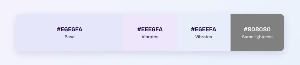
Avoid the near-neighbors #EEE6FA and #E6EEFA. They sit within a few degrees of lavender at the same lightness, so boundaries between them dissolve completely — panels built from these pairs read as one smudged surface.
White is the other trap. At 1.23:1 against white, lavender is nearly invisible, so lavender-on-white components lose their edges unless you add a border. Every avoid call here comes from measured contrast, not taste.
Does Lavender Meet Accessibility Standards?
As a background, yes; as text on light surfaces, no. Lavender fails on white at 1.23:1, far below the WCAG AA threshold of 4.5:1. On black it passes AAA at 17.06:1, making lavender text on dark surfaces one of the most accessible pastel options available.
Color blindness barely affects lavender since its identity comes from lightness rather than strong hue. Still, never let the tint alone carry meaning — pair lavender-coded states with labels or icons.
How Can You Convert Lavender Between HEX, RGB, HSL, CMYK, and Other Color Formats?
All six formats describe the same color. Pick by task:
- HEX #E6E6FA — the default for CSS and design tokens.
- RGB rgb(230, 230, 250) — use RGBA when you need alpha for overlay tints.
- HSL hsl(240, 67%, 94%) — the format for programmatic shifts; darker family members are one lightness change away.
- HSB 240, 8, 98 — what Figma’s and Photoshop’s pickers show; note the low saturation reading.
- CMYK 8, 8, 0, 2 — for print; lavender survives CMYK conversion nearly intact because it uses so little ink.
Wrapping Up
Lavender (#E6E6FA) earns its place in UI as an atmosphere color: AAA contrast as text on dark surfaces, a background tint that softens interfaces without stealing attention, and a hue family that supplies saturated partners whenever components need real contrast. Every ratio and palette above is computed, so the system will behave in production exactly as it reads here.