Red carries the hex code #FF0000, which resolves to rgb(255, 0, 0) and hsl(0, 100%, 50%): the red channel at maximum with green and blue at zero. That purity makes it the loudest color available in sRGB and the hardest one to place responsibly in an interface.
Full-strength red also hits only 4.0:1 against white, so it fails the AA threshold for body text and clears the bar for large type alone. You’ll get every code format, the computed palettes, the pairings that survive a contrast check, and the numbers that decide where red actually belongs.
What Is the Color Red?
Red sits at 0° on the color wheel, the origin point every other hue is measured from. The CSS keyword red maps to #FF0000 exactly, so when someone asks whether #FF0000 counts as red, it’s not just red, it’s the reference red the entire sRGB space is built around.
Here’s the full code set for #FF0000:
- HEX: #FF0000
- RGB: rgb(255, 0, 0)
- RGBA: rgba(255, 0, 0, 1)
- HSL: hsl(0, 100%, 50%)
- HSB: 0, 100, 100
- CMYK: 0, 100, 100, 0
Saturation reads 100% and lightness reads 50%, which puts red at the outer edge of the gamut with no white or black mixed in. Almost no product ships this value as a brand color.
Most teams pull back from pure red because it clips on cheap displays and vibrates against text. Figma’s own color reference lists red as #FF2C2C rather than #FF0000, and that small retreat from the edge is typical of production palettes.
What Does Red Symbolize, and Why Does It Feel So Powerful?
Red reads as urgency in interfaces because convention trained it that way, not because the hue carries meaning on its own. Error states, destructive actions, and stop signals have used red for decades, so users arrive already primed to treat it as a warning.
The physics helps. Red occupies the longest visible wavelengths, roughly 625 to 750 nanometers (Wikipedia), sitting at the far edge of what the eye registers before light drops out of sight entirely.
That learned meaning breaks across borders, and it breaks in ways that matter for product work.
Financial interfaces are the clearest case. Western markets color losses red and gains green, while markets in China, Japan, South Korea, and Taiwan invert it, because red signals a rising price. Ship a trading dashboard into those regions without flipping the semantic tokens and you’ll tell every user the opposite of what happened.
Red also loses meaning fast when you overuse it. If your dashboard paints every non-ideal metric red, nothing on the screen ranks above anything else, and the alert color stops functioning as an alert.
How Does Red Appear on Digital Screens?
Pure red renders differently on every panel because it drives a single subpixel at full power. On an OLED display, only the red subpixel fires, which produces a saturated result that can bloom slightly against black backgrounds.
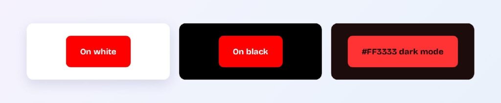
The contrast numbers explain the rest:
- #FF0000 on white: 4.0:1, large text only
- #FF0000 on black: 5.25:1, passes AA
- White text on #FF0000: 4.0:1, large text only
Red performs better against dark surfaces than light ones, which inverts the habit most designers bring from light-mode work. On the computed dark surface #1D0C0C, the bright variant #FF3333 reaches 5.2:1 and clears AA comfortably.
Small red text on white is the single most common failure. At 4.0:1 it looks fine to the person who designed it and turns illegible for anyone with reduced contrast sensitivity.
The fix is a shade, not an opacity change. Dropping to #BF0000 lifts you to 6.53:1 on white while keeping the hue identity intact.
What Are the Shades of Red?
Shades of red come from mixing black into #FF0000, which drops lightness while holding hue at 0°. Eight computed steps give you a complete token ramp:
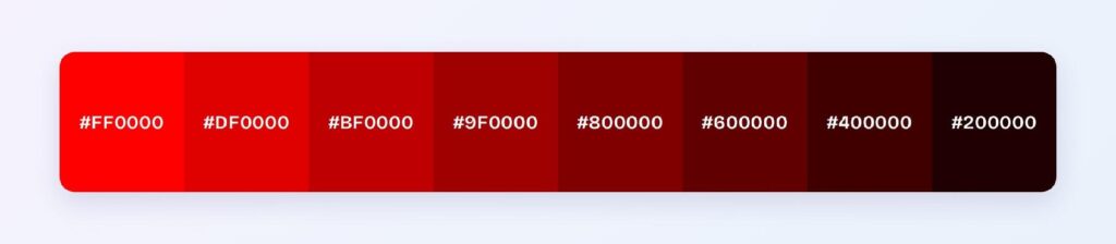
- #FF0000
- #DF0000
- #BF0000
- #9F0000
- #800000
- #600000
- #400000
- #200000
Tints run the other direction by raising lightness: #FF1B1B, #FF3636, #FF5050, #FF6B6B, #FF8686, #FFA1A1, #FFBBBB, and #FFD6D6. Those pale steps carry the red signal into backgrounds, banner fills, and hover surfaces where full saturation would shout.
Tones sit between the two, mixing gray into the base to produce #EA1515, #D52B2B, #C04040, #AA5555, and #956B6B. Muted reds like these read as considered rather than alarming, which suits editorial and brand contexts more than system alerts.
Named shades map onto this ramp closely. Maroon lands at #800000, exactly the midpoint of the computed shade sequence, and dark red #8B0000 sits a hair above it.
What UI Elements Work Best with Red?
Red belongs on small, high-salience elements and nowhere near large text-bearing surfaces. The contrast math decides this: at 4.0:1 in either direction, red can’t carry body copy on white and can’t host white body copy on itself.
That rules out navigation bars, page backgrounds, and content surfaces. Four element types are left where red genuinely performs.
Destructive Buttons and CTAs
Destructive actions are red’s clearest job in a product. Delete, revoke, cancel subscription, and remove member all benefit from a color the user recognizes before reading the label.

Use #BF0000 rather than #FF0000 for the filled variant, since white text on the darker shade clears 6.53:1 instead of scraping 4.0:1. Outline variants can keep the brighter value because the border is a non-text element, which only needs 3:1.
Keep exactly one red button per view. A second one removes the first one’s meaning.
Status Badges and Error States
Badges hand red its best structural fit: short text, large enough to qualify for the 3:1 large-text allowance, and semantically loaded by default. Failed, blocked, overdue, and expired all read instantly in red.

Pair a filled red badge with a soft tint background for lower-severity states. A #FFD6D6 fill with #BF0000 text gives you a second severity level without adding a new hue to the palette.
Always attach an icon or a word to the color. Users with red-green color vision deficiency can’t rely on the hue alone to separate a failure badge from a success badge.
Data Visualizations
Charts use red to mark the exception, not the series. A single red bar among neutral bars pulls the eye exactly where you want it, which is the entire point of the color.
Reserve it for negative deltas, threshold breaches, and out-of-range values. If red becomes one of six categorical series colors, you’ve spent its alarm value on a legend entry.
Check the region before you ship the semantics. The red-means-down convention flips across several Asian markets, as covered above.
Dark Mode Accents
Dark mode is where red stops fighting you. The bright variant #FF3333 on the computed dark surface #1D0C0C reaches 5.2:1 and passes AA, so red can carry small text and icons that would fail in light mode.
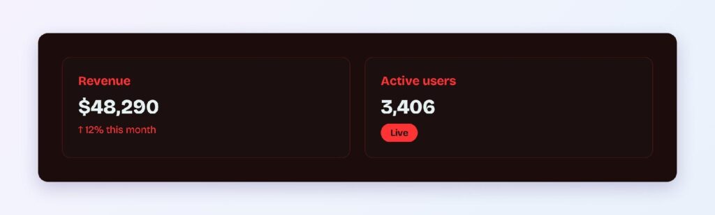
Lift saturation slightly when you move a red token into dark mode. The same hex that looks aggressive on white reads muted against near-black, and matching the light-mode value exactly makes the dark theme feel washed out.
What Are the Best Red Color Palettes for UI?
Every palette below comes from rotating hue around #FF0000 at fixed saturation and lightness, so each scheme is computed rather than curated. Pick the scheme by how much tension your product needs, then sample the accent contrast before committing it to a token.
Monochromatic
The monochromatic scheme holds hue at 0° and moves lightness: #FF0000, #990000, and #FF6666. Product teams reach for this when red is the brand color and the interface needs depth without a second hue competing for attention.
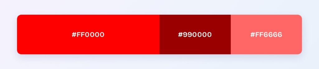
Map the dark step to text and the light step to fills. That split gives you an accessible pairing straight out of the scheme.
Analogous
Analogous red pulls its neighbors 30° in each direction: #FF0000, #FF8000, and #FF0080. Warm and coherent, this palette suits marketing surfaces where energy matters more than hierarchy.
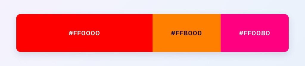
Analogous schemes carry a known risk. Hues this close at identical lightness blur into each other at small sizes, so keep the three values on separate, well-separated elements.
Complementary
Red’s complement sits directly opposite at 180°: #FF0000 paired with #00FFFF. The maximum-tension option, this scheme puts a single accent against the base with nothing in between.
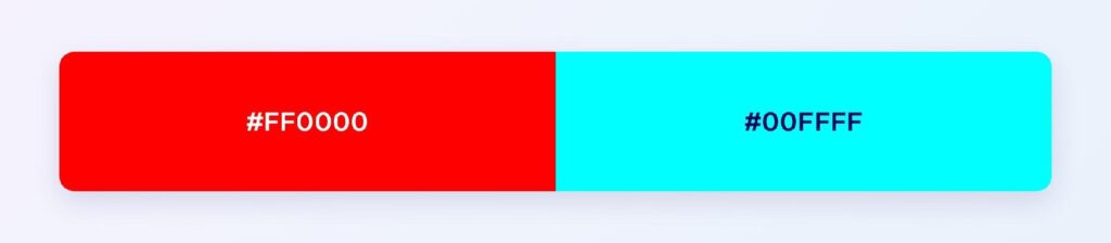
Cyan at full strength fails on white, so treat #00FFFF as a dark-mode or fill color rather than a text color. You can also apply the pairing through Visily’s theme settings and let the generated palette handle the tint and shade steps for you.
Triadic
The triadic scheme lands on the RGB primaries themselves: #FF0000, #00FF00, and #0000FF. Balanced in theory and difficult in practice, since all three sit at maximum saturation.
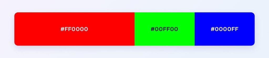
Use one as the dominant, mute the other two into tones, and the scheme becomes workable. Left at full strength, it reads as a test pattern.
Split-Complementary
Split-complementary softens the head-on clash: #FF0000, #00FF80, and #007FFF. You keep the opposition of a complementary scheme while gaining a third value that can carry links and secondary actions.
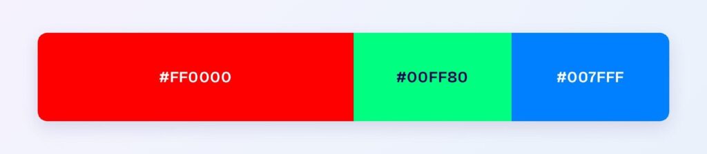
This is the safest of the five for product interfaces. The azure step at #007FFF gives you a functional interactive color that red can’t provide on its own.
Which Colors Are Similar to Red?
Four named colors sit close enough to #FF0000 to be mistaken for it, and each one behaves differently under a contrast check:
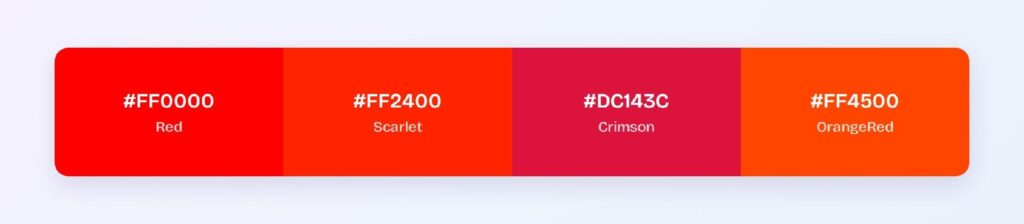
- Scarlet (#FF2400): the nearest neighbor, warmed slightly toward orange, at 3.82:1 on white
- Crimson (#DC143C): cooled toward pink, and the only one of the four to clear AA on white at 4.99:1
- OrangeRed (#FF4500): pushed further toward orange, 3.44:1 on white
- Firebrick (#B22222): a muted, darker red at 6.68:1 on white
Crimson is the practical substitute when a design calls for red but the layout needs accessible small text. It reads as red to the eye and passes AA where #FF0000 doesn’t.
Firebrick trades vibrancy for legibility and works well as a text color across long-form content. The difference between these named values isn’t decorative, since each one moves you into or out of compliance.
Which Colors Pair Best with Red?
Azure #007FFF is red’s strongest accent partner in product work. It sits far enough away to create separation, carries the interactive meaning red can’t hold, and doesn’t compete for the alarm role.
Neutrals do the heavy lifting around it. Warm grays keep red looking intentional, while pure #808080 flattens it, and off-white surfaces like #FAFAFA stop the red from bleeding visually the way it does on stark white.
Apply the 60-30-10 split when you build the screen:
- 60% neutral: backgrounds, surfaces, and cards
- 30% secondary: navigation, headers, and structural fills
- 10% red: the destructive action, the failing metric, the badge that matters
Red almost never earns more than 10%. When it creeps past that share, every element wearing it drops in perceived priority.
Which Colors Should You Avoid Pairing with Red?
Two computed near-clashes cause the most trouble: #FF6A00 and #FF006A. Both sit 25° from red at identical lightness, which makes the boundary between them shimmer and forces the eye to refocus.
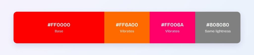
Same-lightness pairings fail for a related reason. Gray at #808080 shares red’s 50% lightness, so the two lose edge definition entirely when placed side by side and become indistinguishable in grayscale.
Green deserves its own warning. Red and green at similar lightness sit on the axis that red-green color vision deficiency collapses, so a red-versus-green status system reads as a single color to roughly 8% of men.
Avoid stacking red text on any mid-tone. Red at 50% lightness needs a partner well above or well below it, and mid-range backgrounds leave you with a ratio that satisfies nobody.
Does Red Meet Accessibility Standards?
Red at #FF0000 fails WCAG AA for normal text on white. The measured ratio is 4.0:1 against the 4.5:1 threshold set by the W3C, and it falls well short of the 7:1 AAA bar.
Here’s where red lands across the common pairings:
- #FF0000 on white: 4.0:1, large text only, fails AA for body copy
- White on #FF0000: 4.0:1, large text only
- #BF0000 on white: 6.53:1, passes AA, misses AAA
- #FF0000 on black: 5.25:1, passes AA
- #FF3333 on #1D0C0C: 5.2:1, passes AA in dark mode
Large text gets a lower bar of 3:1, which is why red headlines and red badge labels survive where red paragraph text doesn’t.
Color vision deficiency is the second constraint, and it’s the more serious one. Protanopia reduces red sensitivity, which dims #FF0000 toward a dark olive and can drop a red alert below the visual weight of the neutral text around it.
Never encode meaning in red alone. Pair it with an icon, a label, a position, or a pattern so the signal survives when the hue doesn’t.
How Can You Convert Red Between HEX, RGB, HSL, CMYK, and Other Color Formats?
Each format describes the same red differently, and the one you reach for depends on what you’re doing to the color. Red converts as follows:
- HEX #FF0000: the default in design files and CSS, compact and copy-paste friendly
- RGB rgb(255, 0, 0): the same three channels in decimal, needed when a value gets calculated at runtime
- RGBA rgba(255, 0, 0, 1): adds an alpha channel for overlays, scrims, and hover fills
- HSL hsl(0, 100%, 50%): separates hue from saturation and lightness
- HSB 0, 100, 100: the picker model in most design tools, where brightness replaces lightness
- CMYK 0, 100, 100, 0: subtractive ink percentages for print
HSL is the format that earns its keep in code. Because hue, saturation, and lightness are independent, you can generate an entire hover-and-active state ladder by changing one number, which is impossible in HEX without recalculating every channel.
CMYK is where red loses ground. The 0, 100, 100, 0 mix produces a red that print can reach, but the screen version at #FF0000 sits outside the achievable CMYK gamut, so anything you proof will come back slightly duller than the display promised.
Convert to HSL before you build a scale, then export to HEX for handoff. That order keeps the math readable and the output compatible with everything downstream.
Wrapping Up
Red works as an interface color when you treat it as a signal rather than a surface — small, rare, and always paired with a second cue. The contrast numbers point the same direction every time: use #BF0000 when text is involved, #FF3333 in dark mode, and keep pure #FF0000 for fills and accents where nothing has to be read on top of it.
Build the palette instead of guessing at it. Open Visily and apply these red values with the AI-powered theme tools to generate accessible tints, shades, and component states across your entire design in one pass.