




Black carries the hex code #000000, which resolves to rgb(0, 0, 0) and hsl(0, 0%, 0%), with every channel switched off. It’s an achromatic color, meaning it holds no hue and no saturation at all, which is why the standard color-wheel rules stop applying the moment you try to build a palette around it.
Black also delivers the highest contrast ratio available on a screen: 21:1 against white, the ceiling of the WCAG scale. You’ll get every code format, the shade names that actually differ, the palettes that work when a color has no hue to rotate, and the reason most design systems avoid pure #000000 for surfaces.
What Is the Color Black?
Black is the absence of emitted light, which on a display means all three subpixels sit at zero output. Nothing renders darker than #000000 on a given panel, so it functions as the fixed floor of the entire tonal range.
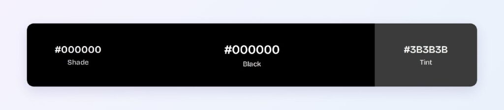
The full code set for black:
- HEX: #000000
- RGB: rgb(0, 0, 0)
- RGBA: rgba(0, 0, 0, 1)
- HSL: hsl(0, 0%, 0%)
- HSB: 0, 0, 0
- CMYK: 0, 0, 0, 100
The HSL reading explains black’s odd behavior in design tools. Hue reports 0° only because the value is undefined and has to report something, while saturation reads 0% and lightness reads 0%. Rotate the hue by any amount and you get #000000 back, which is exactly why analogous and triadic schemes collapse on it.
CMYK tells the print story instead. At 0, 0, 0, 100 you’re printing with the key plate alone, and that single-ink black looks flat next to a rich black that mixes cyan, magenta, and yellow underneath.
Is #000000 True Black?
Yes, #000000 is true black in the sRGB space, and that’s precisely why most design systems don’t use it for large surfaces. Pure black is a mathematical endpoint, not a comfortable one.
Material Design specifies #121212 as its dark theme surface rather than #000000, and the reason is depth. Elevation in a dark UI gets communicated by lightening a surface, and if your base is already at absolute zero, you have nowhere below it to sit and every shadow disappears.
The second reason is halation. Pure white text on pure black at 21:1 produces a visible bloom around letterforms for many readers, especially those with astigmatism, which makes long passages harder to read despite the perfect ratio.
OLED panels add a third wrinkle. A true black pixel is a pixel that’s fully powered off, so scrolling across regions of #000000 causes visible smearing as pixels switch on and off, and the power saving comes with that trade.
Off-black surfaces solve all three at once. Both #121212 and #1B1B1B hold above 17:1 against white text while giving you room to build an elevation ladder underneath.
Keep #000000 for text, borders, and icons where the shape is small and the contrast is doing real work.
What Does Black Represent, and Why Does It Feel So Powerful?
Black reads as authority and precision in interfaces because it removes information rather than adding it. With no hue to interpret, the eye processes only shape and weight, which is why black type feels more decisive than colored type at identical size.
Its cultural associations split sharply: Western contexts tie black to mourning and formality at once, while Japanese aesthetics treat kuro as a color of dignity rather than absence. None of that symbolism does much work in a product interface.
What black actually signals on screen is hierarchy. Your darkest available value goes to your most important text, and every step you lighten from there reads as a demotion, which gives you a legibility system without spending a single hue.
Black also carries no semantic load, and that’s a feature. Red means error and green means success, but black means nothing in particular, so it can carry the neutral majority of your interface without implying a state.
How Does Black Appear on Digital Screens?
Black renders differently depending on panel technology, and the gap is larger than for any other color. On OLED, #000000 switches the pixel off entirely and produces genuine darkness with effectively infinite contrast against a lit neighbor.

LCD panels can’t do that. A backlight stays on behind the whole display, so #000000 arrives as a very dark gray with visible glow, and the difference between #000000 and #121212 becomes nearly invisible on cheaper screens.
Ambient light shifts the result again. The same dark interface that reads as elegant in a dim room turns into a mirror under office lighting.
Three contrast values anchor the practical decisions:
- #000000 on white: 21:1, passes AAA with the maximum possible ratio
- White text on #000000: 21:1, passes AAA
- #3B3B3B on white: 11.2:1, passes AAA and gives you a secondary text step
Test your dark theme on an LCD before shipping. A surface hierarchy tuned on an OLED laptop can flatten into a single indistinguishable tone on a budget monitor.
What Are the Shades of Black Called?
Black has no shades in the technical sense, because mixing black into black returns black. What people call shades of black are tints, produced by adding white and raising lightness through the neutral axis.
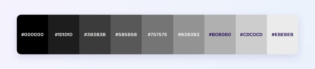
The computed tint ramp gives you eight usable steps:
- #1D1D1D
- #3B3B3B
- #585858
- #757575
- #939393
- #B0B0B0
- #CDCDCD
- #EBEBEB
Named blacks map onto the low end of that ramp:
- Rich black (#010203): near-identical to pure black, 20.77:1 on white
- Eerie black (#1B1B1B): the standard off-black surface, 17.22:1
- Raisin black (#242124): slightly warmer, 15.93:1
- Jet (#343434): 12.45:1
- Onyx (#353839): faintly cool, 11.82:1
- Charcoal (#36454F): a blue-leaning near-black at 9.9:1
Charcoal is the outlier worth knowing. At #36454F it carries real blue saturation, so it isn’t achromatic and behaves like a desaturated navy rather than a black.
Pick your off-black by undertone, not by name. A warm near-black beside a cool one on the same screen reads as a mistake even when neither is identifiably wrong on its own.
What UI Elements Work Best with Black?
Black earns its place wherever contrast matters more than color, which covers most of the structural layer of an interface. At 21:1 in both directions, it’s the only value that never fails a text contrast check.
It’s a poor fit for categorical data visualization, since black can’t encode series identity, and for status badges, where the whole point is a semantic hue. Four element types are where black genuinely performs.
Body Text and Typography
Text is black’s highest-value job. At 21:1 on white, #000000 clears AAA at every size and weight, which is why it stays the default for documentation, long-form reading, and dense data tables.
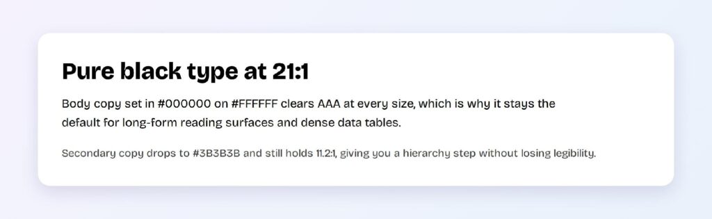
Build a two-step hierarchy rather than using opacity. Primary text at #000000 and secondary at #3B3B3B gives you 21:1 and 11.2:1 respectively, both comfortably above AAA, while opacity-based grays shift unpredictably over tinted backgrounds.
Primary Buttons and CTAs
Black buttons work because they inherit authority without claiming a brand color. White text on #000000 hits 21:1, so the label stays legible at any weight, and the button reads as primary through sheer tonal weight.

The trade is that a black button can’t signal type. You lose the ability to distinguish primary from destructive through color alone, so pair it with an explicit label or reserve a hue for the destructive path.
Navigation Bars
Navigation is where black carries the most surface area safely. A black top bar or sidebar frames colored content without competing with it, and every label and icon placed on it clears AAA automatically.

Watch the boundary between a black nav and a dark page background. Without a visible border or elevation shift, the two merge and the navigation loses its edge, which is a common failure in dark themes.
What Are the Best Black Color Palettes for UI?
Black has no hue, so rotating the color wheel around it returns black every time and the five classic schemes collapse into a single value. The working method is to anchor black as the neutral and derive the harmony from an accent hue instead.
Every palette below uses #3A78DD as that accent, chosen because it holds 4.91:1 against black and passes AA. Swap in your own brand hue and the same structure applies.
Monochromatic
Monochromatic is the one scheme black computes natively, since it runs on lightness alone: #000000, #1D1D1D, #3B3B3B, #939393, and #CDCDCD. Product teams use this when the interface needs depth and zero color commitment.

Assign each step a job: base surface, raised surface, border, muted text, and primary text map onto the five values in order.
Analogous
Analogous pulls the accent’s neighbors 30° in each direction: #3A78DD, #4D39DE, and #39CADE, all anchored on black. Cool and cohesive, this palette suits data-heavy products where several related states need distinguishing without visual noise.
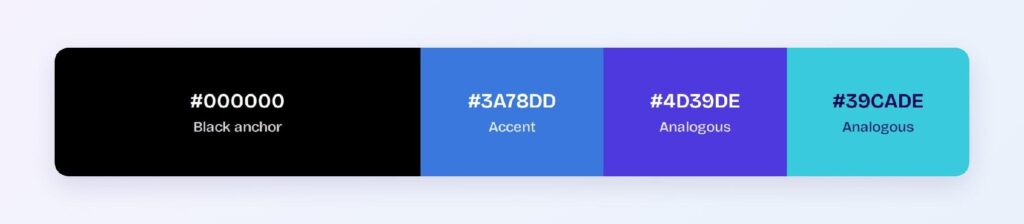
Black does the separating here, since three analogous blues stay readable on a near-black surface when they’d blur together on white.
Complementary
The complementary scheme pairs the accent with its opposite: #3A78DD against #DE9F39, on a black base. Maximum tension with only two hues, which keeps a dark interface from feeling monotonous.

Amber at #DE9F39 reads clearly against black and poorly against white. Reserve it for dark surfaces or drop its lightness before using it in a light theme.
Triadic
Triadic gives you three evenly spaced hues on the black anchor: #3A78DD, #DE3978, and #78DE39. Useful for categorical charts, where each series needs an identity and the dark background keeps all three legible.
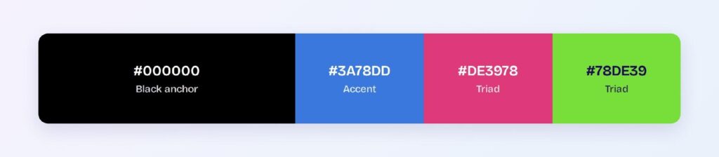
Green at #78DE39 fails badly on white at 1.71:1 but reaches 12.31:1 against black. That inversion is the whole argument for building chart palettes against your actual background rather than a blank canvas.
Split-Complementary
Split-complementary softens the head-on pairing: #3A78DD with #DE4D39 and #CADE39, over black. You keep the contrast of a complementary scheme and gain a third value for warnings or secondary actions.
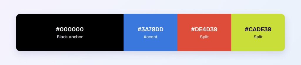
This is the most flexible of the five for dark product interfaces. Visily’s theme tools can generate the full tint and shade ladder for each of these three values, so you get accessible hover and active states without hand-mixing them.
Which Colors Are Similar to Black?
Six near-blacks sit close enough to #000000 to substitute for it, and each one buys you something different:
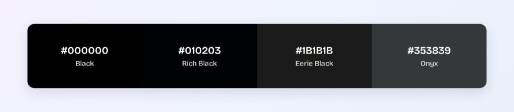
- Rich black (#010203): functionally identical, 20.77:1 on white
- Licorice (#1A1110): warm undertone, 18.56:1
- Eerie black (#1B1B1B): neutral off-black, 17.22:1
- Raisin black (#242124): faintly purple, 15.93:1
- Ebony (#2E2E2E): neutral mid-dark, 13.58:1
- Onyx (#353839): cool undertone, 11.82:1
Every one of these clears AAA against white, so the choice comes down to undertone and elevation headroom rather than accessibility.
Eerie black is the safest default for a dark surface. It’s neutral enough to sit under any accent hue and light enough to leave room for a shadow beneath it.
Which Colors Pair Best with Black?
Black pairs with everything, which makes the real question one of proportion rather than selection. Its strongest partner is a single saturated accent doing all the color work while black handles structure.
Warm off-whites outperform pure white as the companion neutral. A #F5F5F5 or #EBEBEB surface next to black softens the transition and holds 19.26:1 and 17.62:1 respectively, so you lose almost nothing in contrast.
Apply the 60-30-10 split when black is your base:
- 60% black or near-black: backgrounds and primary surfaces
- 30% neutral: off-white text, borders, and raised surfaces
- 10% accent: the one saturated hue carrying interactive meaning
Black is the rare color that can hold the 60% slot without fatiguing the eye, provided the remaining 40% has enough tonal separation to keep the layout readable.
Which Colors Should You Avoid Pairing with Black?
Anything within about 2:1 of black fails as a pairing. Both #1B1B1B and #1D1D1D sit at 1.22:1 and 1.25:1 against pure black, which is invisible as a border and useless as a surface boundary.

Deep saturated hues are the next problem. Navy at low lightness, deep purple at #5B21B6, and dark green all fall below the 4.5:1 mark against black, so any text set in them disappears against a black background.
Pure white deserves a caveat rather than a ban. The 21:1 pairing is technically perfect and practically harsh, producing halation in long passages, so drop to #EBEBEB for body copy and reserve full white for headings.
Avoid stacking black on mid-grays too. At #757575 you get 4.56:1, which passes AA on paper and reads as murky in practice.
Does Black Meet Accessibility Standards?
Black meets every accessibility standard against light backgrounds and fails completely against dark ones. On white it reaches 21:1, the maximum defined by the W3C and well past both the 4.5:1 AA and 7:1 AAA thresholds.
Here’s how black measures across the pairings that matter:
- #000000 on white: 21:1, passes AAA
- White on #000000: 21:1, passes AAA
- #000000 on #EBEBEB: 17.62:1, passes AAA
- #000000 on #757575: 4.56:1, passes AA only
- #000000 on #1B1B1B: 1.22:1, fails
Color vision deficiency doesn’t affect black at all, and that’s its real accessibility strength. Because the signal is carried by luminance rather than hue, black stays fully legible under protanopia, deuteranopia, and tritanopia alike.
Watch contrast sensitivity instead. Older users and readers with astigmatism often find pure white on pure black harder than a slightly softened pairing, so an off-black surface with off-white text serves them better despite the lower measured ratio.
How Can You Convert Black Between HEX, RGB, HSL, CMYK, and Other Color Formats?
Black converts cleanly between every format because all of its values are boundary values. Nothing rounds, and nothing drifts:
- HEX #000000: the default in design files and CSS, shortenable to #000
- RGB rgb(0, 0, 0): all three channels at zero
- RGBA rgba(0, 0, 0, 1): the format that actually matters for black, since alpha turns it into a scrim
- HSL hsl(0, 0%, 0%): hue is undefined and reports 0°
- HSB 0, 0, 0: brightness at zero, the picker model in most design tools
- CMYK 0, 0, 0, 100: the key plate alone
RGBA is the format doing the most work in real interfaces. Black at partial alpha produces every shadow, overlay, and scrim in a typical design system, and rgba(0, 0, 0, 0.5) over an image is how most modal backdrops get built.
CMYK is where black splits into two different things. The 0, 0, 0, 100 mix prints as flat single-ink black, while rich black adds cyan, magenta, and yellow underneath for depth, which means the #000000 on your screen and the black on your printed page aren’t the same object at all.
Use HSL to generate the neutral ramp. Holding hue and saturation at zero while stepping lightness produces the entire gray scale faster than picking hex values by eye.
Wrapping Up
Black is the highest-contrast tool you have and the one most easily overused. Reserve #000000 for text, icons, and borders where 21:1 does real work, build your dark surfaces from #121212 or #1B1B1B so elevation has somewhere to live, and let a single saturated accent carry the color while black handles structure.
Put those values to work instead of hand-mixing them. Open Visily and use its AI-powered design tools to generate a full neutral ramp, accessible dark-mode surfaces, and matched accent states across your whole interface in one pass.











