Brown’s HEX code is #964B00. Under the hood it’s hsl(30, 100%, 29%) — which reveals the secret most designers never learn: brown is simply dark orange. Full saturation at hue 30, compressed to 29% lightness, produces the earthy warmth that coffee brands, craft marketplaces, and heritage products build their identities on.
Below you get every brown code format, the shade family from tan to espresso, the five computed harmony palettes, and exact WCAG contrast ratios — plus the naming quirk in CSS that trips up developers. Every value is computed from the hex, so the numbers drop into design tokens without guesswork.
What Are the Colors for Brown?
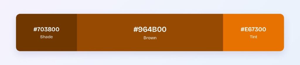
Brown’s most cited hex is #964B00, with RGB rgb(150, 75, 0): red at 150, green at exactly half that, blue at zero. That 2:1 red-green ratio with no blue is the orange fingerprint — darken any orange and you arrive at brown.
One warning for developers: the CSS named color brown resolves to #A52A2A, a reddish auburn that most people would call brick or chestnut, not brown. It’s one of the oldest naming anomalies on the web. If your stylesheet says color: brown, you’re shipping a red — anchor tokens to a hex instead.
Brown’s associations are the earth’s: stability, reliability, warmth, and craft. It’s the color of wood, leather, coffee, and soil, which is why organic, artisanal, and heritage brands claim it almost by default.
Which Two Colors Make Brown?
In pigment, the honest answer is three: red, yellow, and blue in unequal parts — or more elegantly, any color plus its complement, since opposites neutralize each other’s hue and collapse toward brown. Orange plus blue is the classic two-color recipe.
On screens the mechanism is simpler: brown is orange with the brightness pulled down. There is no separate brown light — your monitor produces it by rendering dim orange, and your brain, comparing it against brighter surroundings, names it brown. It’s the only common color that exists purely by contrast.
What Are the Names of Different Shades of Brown?
Eight working shades cover the family:
- Tan (#D2B48C) — the palest usable surface brown
- Camel (#C19A6B) — warm and fashion-forward
- Caramel (#D26900) — brown’s computed bright variant, glowing and appetizing
- Brown (#964B00) — the anchor
- Saddle Brown (#8B4513) — leather-toned classic
- Chestnut (#A52A2A) — the reddish CSS brown
- Chocolate (#7B3F00) — deep and rich
- Espresso (#5A2D00) — brown’s computed shade, near-black warmth
The ladder runs light-to-dark like a coffee menu, and that’s exactly how food and beverage brands deploy it.
What Does the Color Brown Symbolize?
Brown symbolizes groundedness: dependability, honesty, comfort, and connection to the natural world. Psychology research consistently ties it to stability and resilience — the visual promise that a thing is solid, handmade, and durable.
The shadow side is dullness: overused, brown can read as plain or dated. Interfaces solve this the way fashion does — pair brown with cream for warmth, with gold for luxury, or with a bright accent for energy, and the earthiness becomes an asset instead of a ceiling.
How Does Brown Appear on Digital Screens?
Brown is one of the better-behaved text colors in this series: #964B00 on white scores 6.36:1, a comfortable AA pass. On black it manages 3.3:1 — large text only.
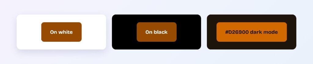
The computed dark variant #703800 reaches 9.31:1 on white — AAA — making espresso-toned text a fully compliant alternative to black in warm-branded products. In dark mode, the caramel variant #D26900 on the warm surface #1D140C delivers 4.98:1, an AA pass that keeps brown’s identity alive at night.
That spread makes brown a rare full-stack color: compliant text on light themes, compliant accent on dark themes, and a surface family at every lightness in between.
What UI Elements Work Best with Brown?
Brown performs wherever warmth and trust are the message.
Text and Headings
Espresso #703800 at 9.31:1 replaces black for body text in warm-branded products — the entire reading experience softens without losing a compliance tier. Reserve #964B00 for headings and emphasis.
Buttons and CTAs
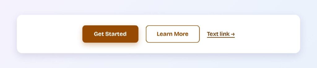
White text on #964B00 passes AA at 6.36:1, with #703800 as a natural pressed state at AAA. The pairing ships a fully compliant interactive set from just two tokens. You can use Visily’s Theme feature to roll the pair across your wireframes at once.

Status Badges
Brown badges own the artisanal and archival categories: handmade tags, legacy items, and heritage labels. Espresso text on a tan fill reads as crafted rather than computed.

Data Visualizations
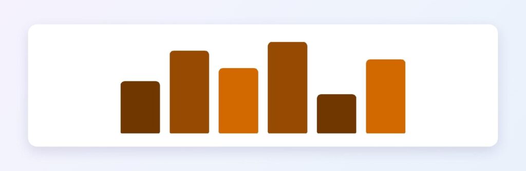
The ramp from tan through #964B00 to #5A2D00 gives sequential charts a topographic, natural-material feel — the natural fit for agriculture, coffee, logistics, and real-estate dashboards.
Dark Mode Surfaces
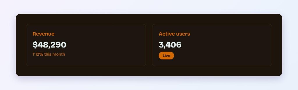
The #1D140C surface is warmer than neutral black and pairs with caramel #D26900 accents at AA strength. Coffee-shop apps and reading modes use exactly this recipe for its candlelight comfort.
What Are the Best Brown Color Palettes for UI?
Five harmony schemes come from brown’s position at hue 30. Every value below is computed from #964B00.
Monochromatic
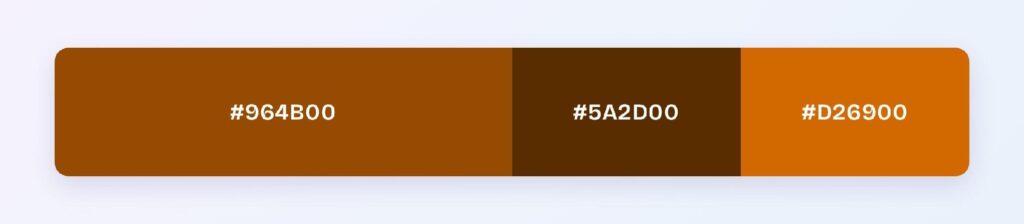
The set: #964B00, #5A2D00, and #D26900. Espresso, brown, and caramel — the coffee-menu ramp. One hue at three depths builds a complete warm system with hierarchy from lightness alone.
Analogous
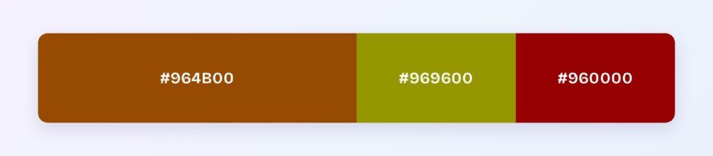
The set: #964B00 with #969600 (olive) and #960000 (deep red). Three earth tones at matched depth formalize the autumn palette — harvest brands, outdoor products, and heritage editorial.
Complementary
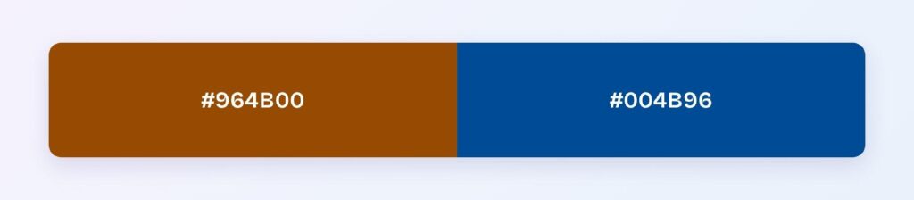
The set: #964B00 against #004B96 — cobalt blue, its exact opposite. Earth against sky at matched depth is one of the most balanced complementary pairs available: neither dominates, and the blue hands you a trustworthy interaction color inside a warm system.
Triadic
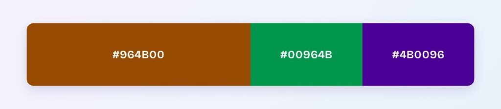
The set: #964B00, #00964B (jade green), and #4B0096 (indigo violet). Three evenly spaced hues at identical depth suit rich multi-category products — marketplaces, libraries, and editorial platforms.
Split-Complementary
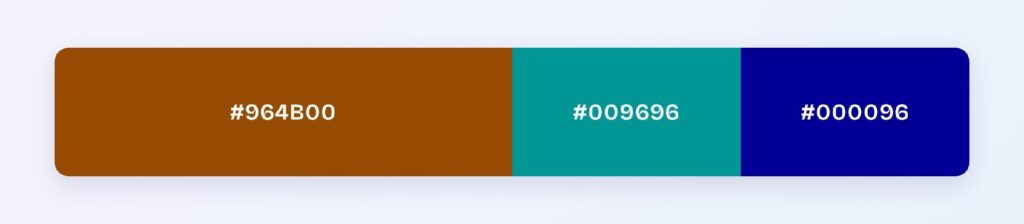
The set: #964B00 with #009696 (teal) and #000096 (deep blue). You keep the sky-contrast with two cooler landings — teal for freshness, deep blue for authority, brown holding the warm center.
Which Colors Are Similar to Brown?
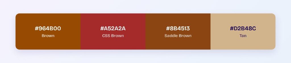
The three closest named colors are CSS brown (#A52A2A), saddle brown (#8B4513), and tan (#D2B48C). CSS brown shifts red toward brick, saddle brown deepens the leather register, and tan lifts the family to surface duty. Saddle brown is the drop-in when #964B00 feels too orange for the brand.
What Is the Prettiest Shade of Brown?
Caramel takes the crown in most brand work — the computed #D26900 has enough orange glow to feel alive while keeping brown’s warmth. It photographs well, converts well on food products, and bridges naturally to gold. For interfaces, prettiest is a pair: caramel for the glow, espresso for the text.
Which Colors Should You Avoid Pairing with Brown?
Avoid the near-neighbors #968900 and #960C00. Both sit within 45 degrees at brown’s exact lightness, so edges against #964B00 blur into mud.
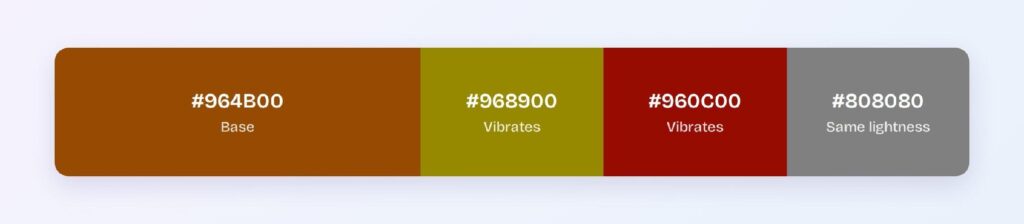
Mid-grays at brown’s lightness merge with it, and pure black backgrounds are weak at 3.3:1 — use the warm dark surface instead, where the caramel accent restores compliance.
Does Brown Meet Accessibility Standards?
Yes, unusually well: #964B00 on white passes WCAG AA at 6.36:1, and the espresso variant #703800 clears AAA at 9.31:1. Few warm colors offer a compliant two-tier text system straight from the wheel.
Brown’s hue-30 position keeps it legible across red-green color vision deficiency, which affects roughly 1 in 12 men, though it can compress toward olive and dark green for some users. Keep brown-versus-green distinctions labeled rather than color-only.
How Can You Convert Brown Between HEX, RGB, HSL, CMYK, and Other Color Formats?
All six formats describe the same color:
- HEX #964B00 — the default for CSS and design tokens; never use the named keyword brown.
- RGB rgb(150, 75, 0) — the 2:1 red-green signature; use RGBA for warm scrims.
- HSL hsl(30, 100%, 29%) — the dark-orange truth; every shade of brown is a lightness move on hue 30.
- HSB 30, 100, 59 — what Figma’s and Photoshop’s pickers show.
- CMYK 0, 50, 100, 41 — half magenta, full yellow, heavy black; proof prints, as brown shifts easily on paper.
Wrapping Up
Brown (#964B00) earns its place as the most dependable warm color in the system: AA text on white at 6.36:1, an AAA espresso tier at 9.31:1, a compliant caramel accent for dark themes, and a cobalt complement that balances perfectly at matched depth. Remember the two secrets — brown is dark orange, and the CSS keyword lies — and the whole family falls into place. Every number above is computed.
Put it to work in Visily‘s Theme feature: load the coffee-menu ramp, set the cobalt accent, and ship a warm, grounded interface today.