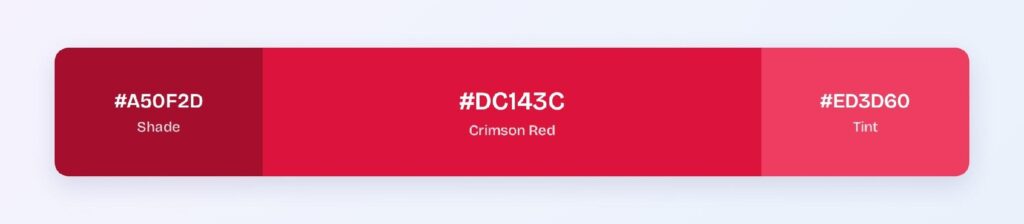
Crimson red’s HEX code is #DC143C. It sits at hue 348 — just 12 degrees off pure red toward magenta — with 83% saturation and 47% lightness, which gives it that blue-tinged depth that separates it from fire-engine red.
Below you get every crimson code format, the five computed harmony palettes, and exact WCAG contrast ratios against white, black, and dark surfaces. Every value is computed from the hex, not estimated, so you can drop them straight into your design tokens.
What Is the Color of Crimson Red?
Crimson red is the CSS color #DC143C: a high-saturation red with a cool blue undertone. Its RGB is rgb(220, 20, 60), with the red channel doing most of the work and blue adding just enough warmth to push the hue toward rose.
That blue lean is what separates crimson from scarlet (#FF2400), which tips orange instead. In interfaces, crimson carries urgency and emotion — error states, destructive actions, and brand accents where you need a red with more personality than a flat #FF0000.
Is Crimson Closer to Red or Burgundy?
Crimson is closer to red. Its lightness sits at 47%, roughly double burgundy’s depth, so it reads as a vivid red with a cool cast, not a darkened wine. Burgundy (#800020) lives at hue 345 with only 25% lightness, which makes it feel muted and earthy. Crimson stays punchy.
In a design system, crimson works where burgundy wouldn’t: CTAs, alerts, and interactive highlights that need to command attention rather than recede into a background.
What Two Colors Make Crimson Red?
On screen, crimson is already a single mixed value: red 220, green 20, blue 60. You don’t mix two CSS colors to produce it; you set those three channels.
In HSL terms, start at pure red hsl(0, 100%, 50%) and rotate the hue 12 degrees toward magenta while pulling lightness down to 47%. That one adjustment lands you at hsl(348, 83%, 47%), which is #DC143C.
How Does Crimson Red Appear on Digital Screens?
On white, crimson passes WCAG AA at 4.99:1 for normal text. On pure black it manages only 4.21:1, enough for large text but not body copy.
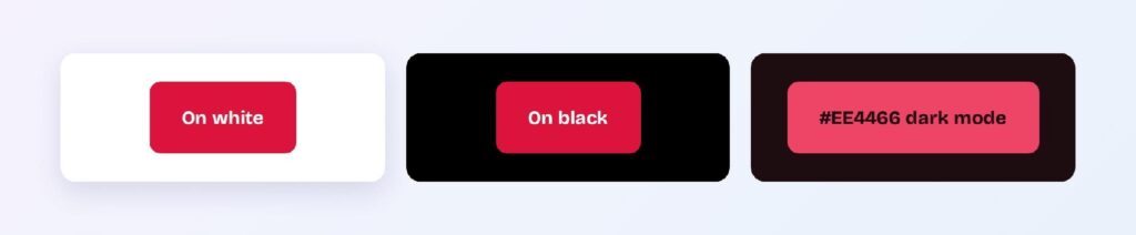
Dark mode needs the brightened variant #EE4466 on a red-cast dark surface #1D0C10, where it reaches 5.08:1 — a solid AA pass. Use two tokens: crimson-brand for light themes and crimson-brand-dark for dark themes.
What UI Elements Work Best with Crimson Red?
Crimson performs in high-attention spots where its hue signals urgency or importance. Its 4.99:1 ratio against white clears AA, so white text on crimson buttons and badges stays legible.
Buttons and CTAs
White text on a #DC143C button passes AA at 4.99:1. Use the darker variant #A50F2D for hover states — it jumps to 7.76:1 (AAA) without shifting the hue.

Status Badges
Crimson is the natural destructive/error color. Pair #A50F2D text on a light crimson tint background for alerts that read instantly.

Data Visualizations
Crimson’s shade ramp from #DC143C through #A50F2D and #8A0C26 gives you a ready-made sequential scale for negative movement in charts — losses, declines, and at-risk indicators.

Dark Mode Surfaces
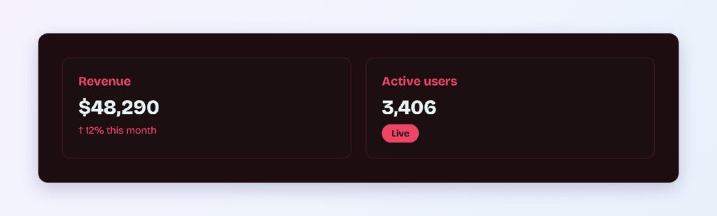
The #1D0C10 surface with #EE4466 accents keeps crimson alive in dark themes at 5.08:1. Reserve the brighter variant for icons, large text, and data marks.
What Are the Best Crimson Red Color Palettes for UI?
Five harmony schemes come from crimson’s position at hue 348. You can load any of these into Visily’s Theme feature and let the Color Assistant apply the scheme across your screens.
Monochromatic
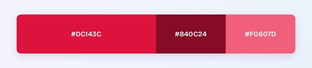
The set: #DC143C, #840C24, and #F0607D. One hue at three values gives you a cohesive brand look — editorial sites, fashion apps, and premium food brands use this to keep energy without adding hue complexity.
Analogous
The set: #DC143C with #DC5014 (toward orange) and #DC14A0 (toward pink). Neighboring hues create warmth, making this scheme ideal for lifestyle, beauty, and entertainment products.

Complementary
The set: #DC143C against #14DCB4, its direct opposite. Maximum hue contrast makes the teal-green ideal for the 10% accent layer: success states in an otherwise red-primary system.

Triadic
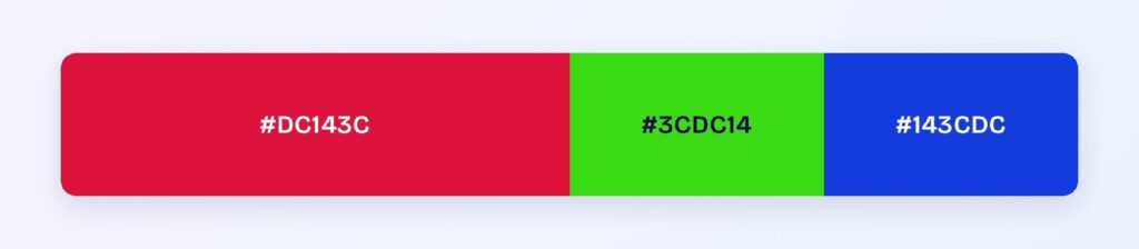
The set: #DC143C, #3CDC14 (green), and #143CDC (blue). Three evenly spaced hues at matched saturation suit categorical data or gamified interfaces where each category needs its own identity.
Split-Complementary
The set: #DC143C with #14DC50 and #14A0DC. You get complementary-level energy without the head-on collision, so teams pick this when full complementary feels too stark.

Which Colors Are Similar to Crimson Red?
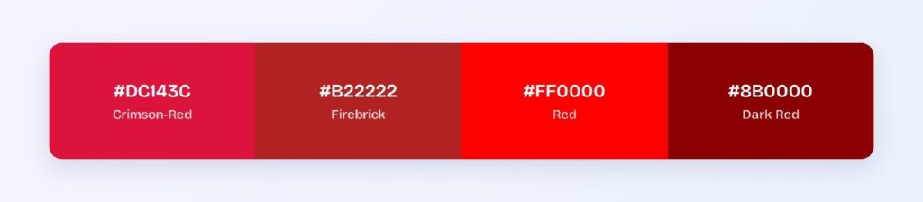
The three closest named colors are firebrick (#B22222), pure red (#FF0000), and dark red (#8B0000). Firebrick is deeper and slightly earthier, pure red is brighter with no blue lean, and dark red trades lightness for a near-maroon feel.
Is Crimson Red or Scarlet?
Crimson leans cool (hue 348, toward blue), and scarlet leans warm (hue ~14, toward orange). Both are vivid reds, but they sit on opposite sides of pure red on the wheel. In interfaces, crimson reads as sophisticated and slightly muted, while scarlet reads as energetic and aggressive. Pick crimson for premium brands, scarlet for high-energy or sport-adjacent ones.
Which Colors Pair Best with Crimson Red?
The single best accent partner is #14DCB4, crimson’s computed complement. For neutrals, warm off-whites and light grays let crimson stay the star, and gold accents lean into its premium associations.
Apply the 60-30-10 split: 60% neutral background, 30% crimson for structure and primary components, and 10% accent for the moments that need attention.
Which Colors Should You Avoid Pairing with Crimson Red?
Avoid the near-neighbors #DC4014 and #DC148F. They sit 15 to 45 degrees away at the same lightness, so boundaries between them and #DC143C vibrate instead of separating.
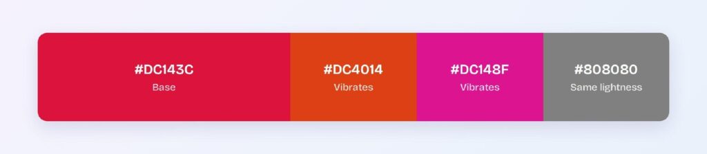
Mid-brightness orange and hot pink fail for the same reason: they match crimson’s energy level, which makes edges blur. None of these are taste calls — each comes from hue distance or contrast failure.
Does Crimson Red Meet Accessibility Standards?
Yes, at AA level: #DC143C on white scores 4.99:1, passing the WCAG AA threshold of 4.5:1 for normal text. It narrowly misses the AAA bar of 7:1, so switch to the dark variant #A50F2D (7.76:1) when AAA compliance matters.
One color blindness note: crimson sits in the red range affected by protanopia and deuteranopia, which affect roughly 1 in 12 men. Never let red alone carry meaning — pair error states with an icon or label.
How Can You Convert Crimson Red Between HEX, RGB, HSL, CMYK, and Other Color Formats?
All six formats describe the same color. Pick by task:
- HEX #DC143C — the default for CSS and design tokens.
- RGB rgb(220, 20, 60) — use RGBA when you need alpha for overlays.
- HSL hsl(348, 83%, 47%) — the format for programmatic shifts; hover states are one lightness change away.
- HSB 348, 91, 86 — what Figma’s and Photoshop’s color pickers show.
- CMYK 0, 91, 73, 14 — for print brand collateral; expect slightly duller output.
Wrapping Up
Crimson red (#DC143C) earns its place in UI as a high-energy primary: AA-level contrast on white, a built-in urgency semantic, and a cool lean that separates it from generic reds. The palettes and ratios above are computed, so they’ll behave identically in production.
Put them to work in Visily‘s Theme feature: pick the harmony that fits your product and ship a crimson interface today.