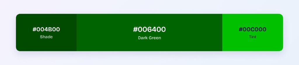
Dark green’s HEX code is #006400. It sits at hue 120 on the color wheel at full saturation and only 20% lightness, which is why it reads as forest, money, and old wealth rather than fresh lawn. You’ll find it anchoring finance dashboards, wellness apps, and premium brand systems.
Below you get every dark green code format, the five harmony palettes computed from its hue, and the exact WCAG contrast ratios against white, black, and dark surfaces. Every value comes from color math, not eyeballing, so you can drop the numbers straight into your design tokens.
What Is the Color of Dark Green?
Dark green is the web color #006400: a pure green hue with no blue or yellow lean, darkened to 20% lightness. Its RGB value is rgb(0, 100, 0), so the green channel does all the work at less than half its full strength.
That restraint is what separates it from standard web green (#008000). Standard green feels energetic and signal-like; dark green feels stable and grounded, which is why product teams reach for it to signal growth, security, and sustainability.
In interfaces, it carries the same semantic weight as green (success, positive, go) with a quieter voice that holds up as a brand primary.
What Color Is the Darkest Green?
The darkest usable greens in UI sit at the bottom of dark green’s shade ramp: #001900 and #000C00, the last two steps before the green channel hits zero. Both read as green-tinted black rather than green.
For dark mode work, the practical answer is #0C1D0C. It’s dark enough to serve as a surface color yet keeps a green cast that ties the theme to the brand. Anything past #001900 loses its hue on most screens, so treat that as the floor.
How Does Dark Green Appear on Digital Screens?
On white, dark green looks crisp and authoritative, and the numbers back that up: #006400 hits a 7.44:1 contrast ratio against #FFFFFF. On pure black it muddies, managing only 2.82:1, so the hue nearly disappears on OLED-black backgrounds.

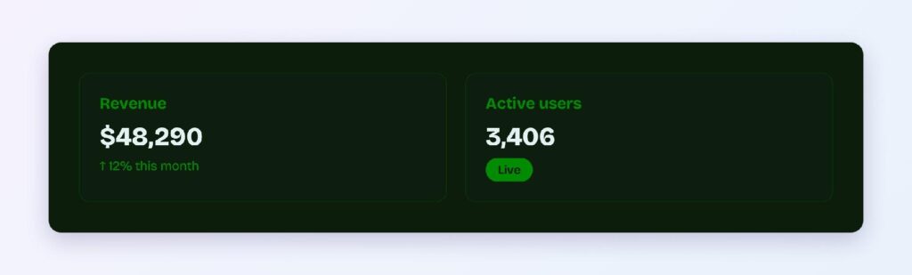
Dark mode needs a swap, not the same token. Use the brightened variant #008C00 on a green-cast dark surface like #0C1D0C, where it reaches 3.97:1, enough for large text and icons.
This is a classic two-token setup: green-brand for light themes, green-brand-dark-mode for dark themes.
What Colors Make Dark Green?
On screen, dark green is made from a single channel: red 0, green 100, blue 0 out of 255. There’s no mixing involved, only a green channel held at 39% of its maximum.
Programmatically, you make dark green by darkening pure green in HSL. Start at hsl(120, 100%, 50%) and pull lightness down to 20%, and you land exactly on hsl(120, 100%, 20%), which is #006400.
In pigment, the recipe is different: mix blue and yellow to get green, then add small amounts of black until the value deepens. Keep the two models separate, because paint intuition (adding black) desaturates on screens if you apply it to RGB sliders instead of the HSL lightness channel.
What UI Elements Work Best with Dark Green?
Dark green performs where its 7.44:1 ratio against white can do the heavy lifting: filled components with white labels and light backgrounds with dark green text. The five placements below are where the math and the hue’s temperament line up.
Buttons and CTAs
White text on a #006400 button passes WCAG AAA at 7.44:1, so your primary CTA stays legible at any size. Use the darker #004B00 for hover states to keep the pressed feel without losing contrast.
Navigation Bars
A dark green navbar anchors a page the way near-black does, but with brand color built in. White labels and icons clear AAA against it, and active items can drop to the #004B00 shade for a subtle selected state.

Data Visualizations
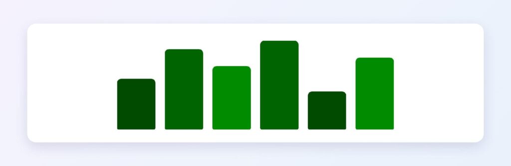
Dark green’s shade ramp gives you a ready-made sequential scale: #006400 down through #004B00, #003200, and #001900 for increasing values. It also matches the near-universal convention of green for positive movement in finance charts.
Dark Mode Surfaces
The #0C1D0C surface with #008C00 accents keep a green identity alive in dark themes. Reserve #008C00 for large text, icons, and data marks, since its 3.97:1 ratio doesn’t clear the 4.5:1 bar for body copy.
Status Badges
Dark green is the natural success color. Set #004B00 text on a pale green tint background for a badge that reads instantly, and remember the same shade delivers 10.47:1 on plain white.

What Are the Best Dark Green Color Palettes for UI?
Five harmony schemes come straight out of dark green’s position at hue 120, and each one solves a different product problem. Every value below is computed from #006400. You can load any of them into Visily’s Theme feature and let the Color Assistant apply the scheme across your screens in one pass.
Monochromatic
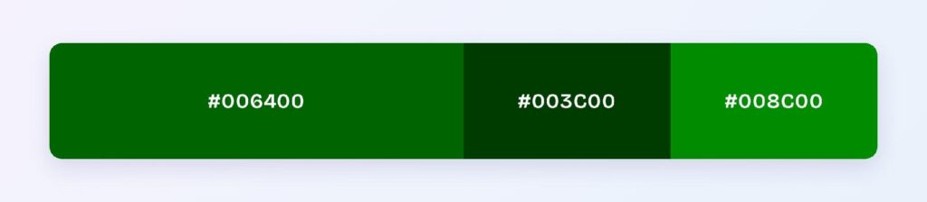
The set: #006400, #003C00, and #008C00. One hue at three values gives you a disciplined, single-brand look, which is why fintech dashboards and B2B admin panels pick it. Hierarchy comes from lightness alone, so nothing competes with your data.
Analogous
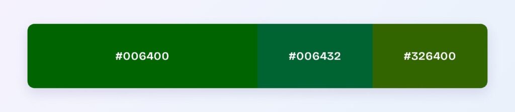
The set: #006400 with #006432 (toward teal) and #326400 (toward olive). Neighboring hues stay calm together, so wellness, sustainability, and outdoor products use this scheme to feel organic without adding visual noise.
Complementary
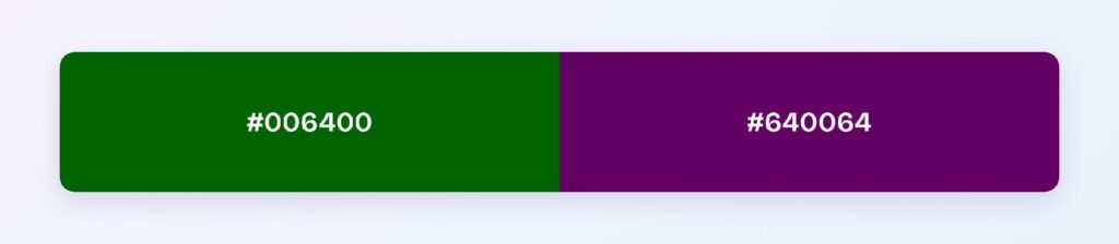
The set: #006400 against #640064, its direct opposite. Maximum hue contrast makes the purple ideal for the 10% accent layer: promo banners, highlight states, and marketing moments that must pull the eye off the green.
Triadic
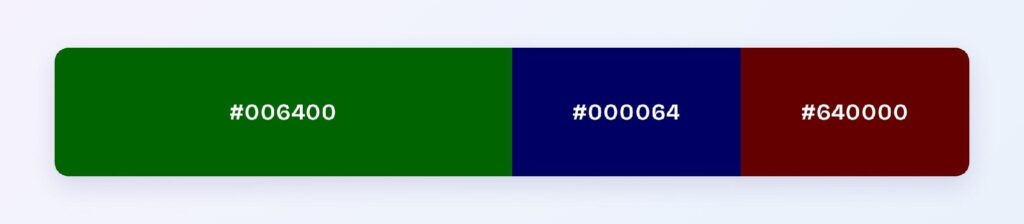
The set: #006400, #000064 (navy), and #640000 (deep red). Three evenly spaced hues at matched depth suit categorical data, where each series needs its own identity but equal visual weight.
Split-Complementary
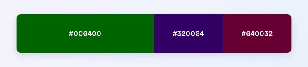
The set: #006400 with #320064 and #640032. You keep most of the complementary scheme’s energy while softening the head-on collision, so teams pick it when a full complementary scheme feels too loud for a product surface.
Which Colors Are Similar to Dark Green?
The three closest named colors are forest green (#228B22), web green (#008000), and hunter green (#355E3B). Forest green is lighter and slightly yellowed, web green is the same hue one step brighter, and hunter green trades saturation for a muted, gray-washed depth.
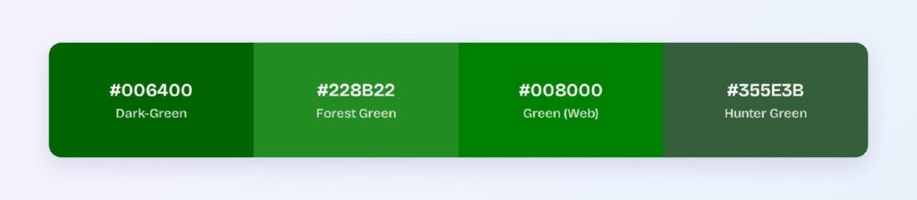
Pick between them by job: web green for signal-like accents, forest green for friendlier nature themes, and hunter green for heritage or luxury looks. Blue-leaning lookalikes such as dark teal belong to a different hue family, covered two sections down.
What Are the 10 Shades of Green?
Designers usually name ten workhorse greens, running from near-black to near-white:
- Dark green — #006400
- Hunter green — #355E3B
- Forest green — #228B22
- Kelly green — #4CBB17
- Sea green — #2E8B57
- Emerald — #50C878
- Olive — #808000
- Lime green — #32CD32
- Sage — #9CAF88
- Mint — #98FF98
The three nearest to #006400 are compared in the similar-colors section above. The rest sit far enough away in lightness or hue to work as supporting tints and accents rather than substitutes.
What Color Is Dark Teal Green?
Dark teal green is a deep blue-green, not a shade of dark green. Teal sits at hue 180 with equal green and blue channels (#008080 at full form), while dark green sits at hue 120 with zero blue, so the two are 60 degrees apart on the wheel.
If you’re hunting for colors darker than teal, the named options are pine green (#01796F) and dark slate gray (#2F4F4F). Both keep teal’s blue-green balance at a lower value, where dark green would instead pull the mix warm.
What Is the Dark Green Color Called?
In CSS, the color is literally named darkgreen, mapped to #006400. In everyday design language it also answers to forest green, hunter green, bottle green, pine green, and British racing green (#004225), each a nearby variant rather than an exact synonym.
Design systems skip the nicknames entirely. There it usually lives as green-800 or green-900, the deep end of a green token scale.
Which Colors Pair Best with Dark Green?
The single best accent partner is #640064, dark green’s computed complement, because no other hue creates more separation at the same depth. The harmony palettes above own the full schemes; this is about the day-to-day supporting cast.
For neutrals, warm off-whites and light grays let dark green stay the star, and gold accents lean into its premium, heritage associations. Skip mid-gray, which the avoid section below explains.
Apply the 60-30-10 split: 60% neutral background, 30% dark green for structure and primary components, and 10% accent for the moments that need attention.
Which Colors Should You Avoid Pairing with Dark Green?
Avoid the near-neighbors #00642A and #2A6400. They sit 15 to 45 degrees away at the same lightness, so edges between them and #006400 vibrates instead of separating.
Mid-gray (#808080) fails for a different reason: it matches dark green’s lightness, so boundaries between the two blur even though the hues differ. Pure black backgrounds fail on the math alone, since #006400 manages only 2.82:1 against #000000.
None of these are arbitrary taste calls. Each one comes from hue distance or a failed contrast ratio.
Does Dark Green Meet Accessibility Standards?
Yes, and comfortably in its main role: #006400 on white scores 7.44:1, passing both the WCAG AA threshold of 4.5:1 and the AAA threshold of 7:1 for normal text. White text on a dark green fill passes at the same ratio.
The failures are just as clear. Dark green on black (2.82:1) fails for any text, and the dark mode variant #008C00 on #0C1D0C (3.97:1) qualifies for large text only.
One color blindness note: dark green sits inside the red-green confusion range that affects roughly 1 in 12 men with deuteranopia or protanopia. Never let green alone carry meaning; pair success states with an icon or label so the message survives without the hue.
How Can You Convert Dark Green Between HEX, RGB, HSL, CMYK, and Other Color Formats?
All six formats describe the same color; you pick by task:
- HEX #006400 — the default for CSS, design tokens, and handoff. Compact and universal.
- RGB rgb(0, 100, 0) — the same channels spelled out; switch to RGBA rgba(0, 100, 0, 1) when you need alpha for overlays.
- HSL hsl(120, 100%, 20%) — the format for programmatic shifts, since hover and pressed states are one lightness change away.
- HSB 120, 100, 39 — what Figma’s and Photoshop’s pickers show, so use it when matching values inside design tools.
- CMYK 100, 0, 100, 61 — the print translation for brand collateral; expect it to render slightly duller than the screen version.
The conversions are lossless between HEX, RGB, and HSL, so store one source of truth in your tokens and derive the rest.
Wrapping Up
Dark green (#006400) earns its place as a UI primary: AAA-level contrast on white, a built-in success semantic, and a shade ramp that covers buttons, charts, and dark mode without leaving the hue. The palettes and ratios above are computed, so they’ll behave the same way in production as they do on this page.
Put them to work in Visily‘s Theme feature: pick the harmony that fits your product, let the Color Assistant apply it across your screens, and ship a dark green interface today.