




Green’s HEX code is #008000. It sits at hue 120 — the exact center of the green section on the color wheel — with 100% saturation and 25% lightness, giving it the depth and authority of a primary brand color while keeping the natural, growth-oriented associations green is known for.
Below you get every green code format, the five computed harmony palettes, and exact WCAG contrast ratios. Every value is computed from the hex, so you can drop the numbers into your design tokens.
What Is the Color of Green?
Green is the CSS named color green, mapped to #008000. Its RGB is rgb(0, 128, 0) — only the green channel is active, at exactly half its maximum. Unlike lime (#00FF00), web green is darkened enough to work as a primary color rather than a signal.
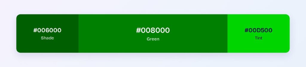
Green carries the strongest nature associations of any color: growth, health, success, and go. Product teams use it as the default success semantic, the positive indicator in charts, and the primary brand color for sustainability-focused products.
What Are the 10 Shades of Green?
Ten commonly referenced shades span the green family:
- Dark Green (#006400) — near-black forest depth
- Green (#008000) — the CSS standard
- Hunter Green (#355E3B) — muted and heritage
- Forest Green (#228B22) — slightly brighter and friendlier
- Sea Green (#2E8B57) — blue-shifted aquatic feel
- Emerald (#50C878) — bright and jewel-toned
- Olive (#808000) — warm, yellow-shifted
- Lime Green (#32CD32) — vivid and energetic
- Sage (#9CAF88) — muted and calming
- Mint (#98FF98) — palest, near-white
What Is the Meaning of Green Color?
Green signals growth, health, and permission in interfaces. It’s the universal success color (checkmarks, completed states, positive values) and the go-to brand color for sustainability, finance, and wellness.
In color psychology, green sits between the calming effect of blue and the energy of yellow, which is why it reads as balanced and reassuring rather than passive or aggressive.
How Does Green Appear on Digital Screens?
On white, green passes WCAG AA at 5.14:1 for normal text. On black it manages 4.09:1 — large text only.
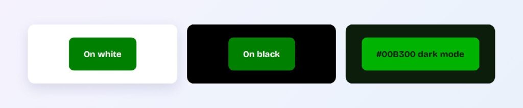
Dark mode uses the brightened variant #00B300 on a green-cast dark surface #0C1D0C, where it reaches 6.22:1, a solid AA pass. Two tokens: green-brand for light themes, green-brand-dark for dark themes.
What UI Elements Work Best with Green?
Green’s 5.14:1 ratio against white and its universal success semantic make it a strong primary for interactive and status-driven components.
Buttons and CTAs
White text on #008000 passes AA at 5.14:1. Use #006000 for hover — it jumps to 7.86:1 (AAA). You can use Visily’s Theme feature to apply these token pairs consistently.

Status Badges
Green is the natural success and completion color. #006000 text on a pale green tint background reads instantly as positive.

Data Visualizations
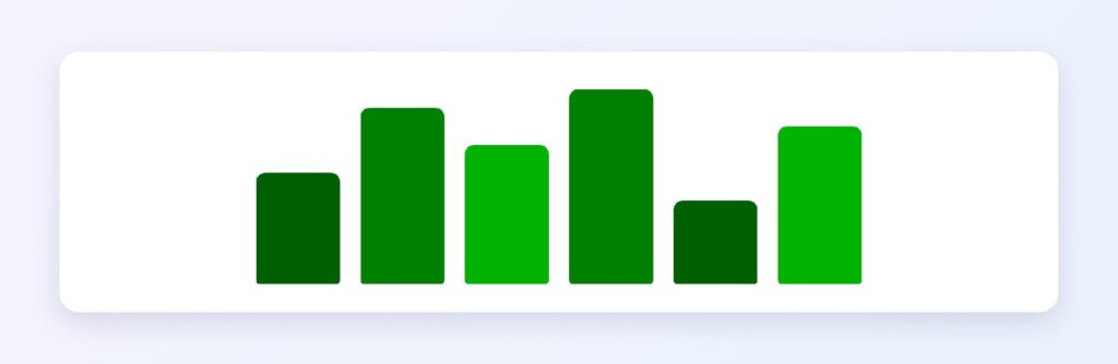
Green’s shade ramp from #008000 through #006000 and #004D00 gives you a sequential scale for positive metrics that matches the universal convention of green = up in finance and analytics.
Dark Mode Surfaces
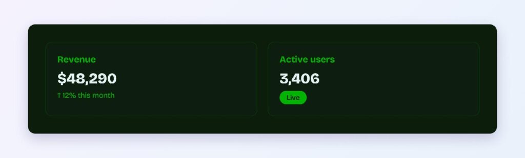
The #0C1D0C surface with #00B300 accents deliver 6.22:1, strong enough for body copy. Green’s dark mode story is clean and on-brand.
What Are the Best Green Color Palettes for UI?
Five harmony schemes come from green’s position at hue 120. Every value is computed from #008000.
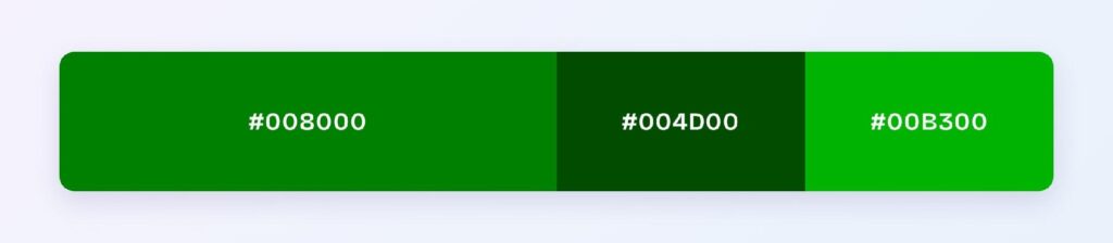
Monochromatic
The set: #008000, #004D00, and #00B300. One hue at three depths gives you a disciplined sustainability or fintech look — hierarchy comes from lightness alone.
Analogous
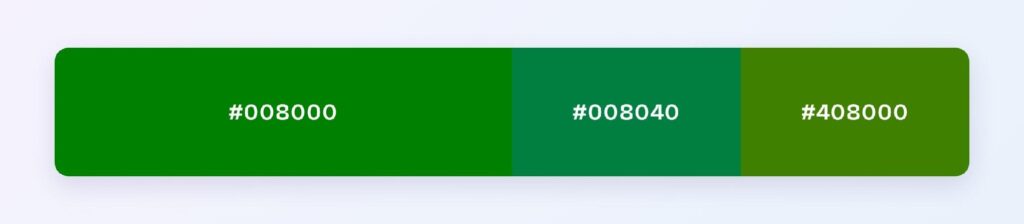
The set: #008000 with #008040 (toward teal) and #408000 (toward olive). Neighboring hues stay natural together, ideal for outdoor, agriculture, and wellness products.
Complementary
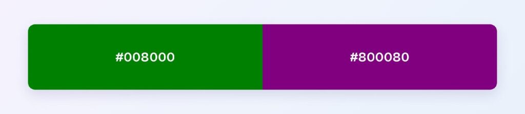
The set: #008000 against #800080 (purple). Maximum hue contrast makes purple ideal for the 10% accent layer: premium badges, featured content, and marketing moments.
Triadic
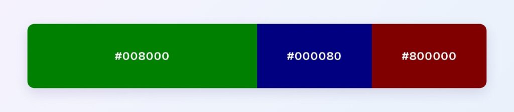
The set: #008000, #000080 (navy), and #800000 (maroon). Three evenly spaced hues at matched depth suit multi-category dashboards and complex reporting tools.
Split-Complementary
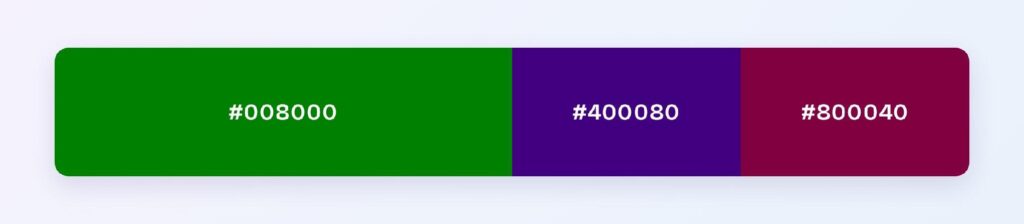
The set: #008000 with #400080 and #800040. You keep the complementary energy softened, making it easier to use purple and magenta accents without overwhelming the green primary.
Which Colors Are Similar to Green?
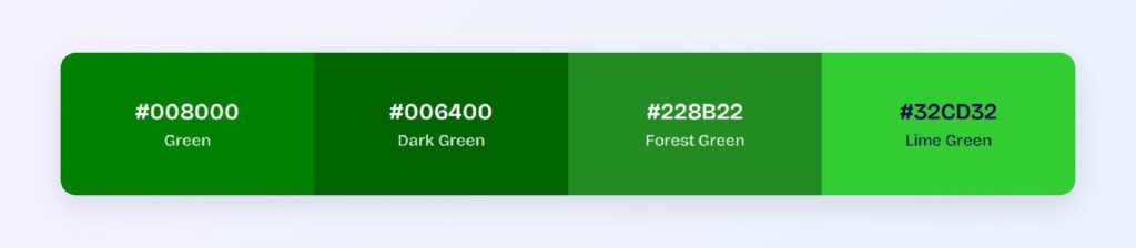
The three closest named colors are dark green (#006400), forest green (#228B22), and lime green (#32CD32). Dark green is one step deeper on the same hue; forest green is lighter and slightly yellowed; lime green jumps to near-full brightness.
What Is the Most Beautiful Green Color?
Beauty is subjective, but emerald (#50C878) consistently ranks highest in design surveys. It’s brighter and more saturated than web green, with a jewel-like quality that reads as luxurious. For UI work, emerald serves as a highlight while web green (#008000) handles the structural duties.
Which Colors Pair Best with Green?
The single best accent is #800080 (purple), green’s computed complement. For neutrals, warm off-whites and natural wood tones let green hold the spotlight. Gold accents lean into green’s finance and premium associations.
Apply the 60-30-10 split: 60% neutral background, 30% green for structure and primary components, 10% purple or warm accent.
Which Colors Should You Avoid Pairing with Green?
Avoid the near-neighbors #008035 and #358000. They sit 15 to 45 degrees away at the same lightness, so edges vibrate.
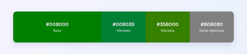
Mid-gray (#808080) fails because it matches green’s lightness, blurring boundaries. Pure black backgrounds are weak at 4.09:1.
Does Green Meet Accessibility Standards?
Yes, at AA level: #008000 on white scores 5.14:1, passing the WCAG AA threshold of 4.5:1. Use the dark variant #006000 (7.86:1) when AAA matters.
Green sits inside the red-green confusion range that affects roughly 1 in 12 men with deuteranopia or protanopia. Never let green alone carry meaning — pair success states with a checkmark icon or text label.
How Can You Convert Green Between HEX, RGB, HSL, CMYK, and Other Color Formats?
All six formats describe the same color:
- HEX #008000 — default for CSS and design tokens.
- RGB rgb(0, 128, 0) — use RGBA for alpha overlays.
- HSL hsl(120, 100%, 25%) — programmatic shifts; hover states are one lightness change away.
- HSB 120, 100, 50 — what Figma’s and Photoshop’s pickers show.
- CMYK 100, 0, 100, 50 — for print; green reproduces with slight muting.
Wrapping Up
Green (#008000) earns its place as a UI primary: AA contrast on white, the universal success semantic, and a dark mode story that delivers 6.22:1 without hue shifts. Every number above is from computed color math.











