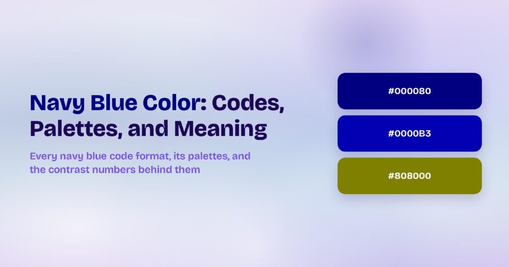
Navy blue’s HEX code is #000080. It sits at hue 240 — pure blue with zero green or red — at 100% saturation and just 25% lightness, which is why it reads closer to black than to a mid-range blue. You’ll find it anchoring corporate dashboards, banking apps, and every enterprise product that needs authority without heaviness.
Below you get every navy blue code format, the five computed harmony palettes, and exact WCAG contrast ratios against white, black, and dark surfaces. Every value comes from the hex, not from eyeballing, so you can drop the numbers straight into your design tokens.
What Is the Exact Color of Navy Blue?
Navy blue is the CSS named color navy, mapped to #000080. Its RGB is rgb(0, 0, 128) — only the blue channel is active, at exactly half its maximum. That single-channel purity is what makes the navy feel authoritative rather than decorative.
The name comes from the British Royal Navy uniforms adopted in 1748. In design systems, navy typically maps to blue-900 or blue-950, the deepest rung of a blue token scale.
Is Navy Blue a Dark Blue?
Yes — navy is one of the darkest usable blues. At 25% lightness, it’s darker than royal blue (57%) and cobalt (44%) but lighter than midnight blue (#191970, at 27% lightness). On most OLED screens, navy is almost indistinguishable from black without a nearby lighter reference.
That near-black quality is exactly why product teams pick it: navy replaces black as a background color without the flatness pure black creates on backlit displays.
What Are the 5 Shades of Navy?
Five commonly referenced shades form a working navy ramp:
- Navy (#000080) — the CSS standard
- Midnight Blue (#191970) — slightly purple-shifted and darker
- Dark Blue (#00008B) — fractionally brighter, same pure hue
- Oxford Blue (#002147) — green-shifted, more teal than purple
- Admiral Blue (#051E55) — muted, grayish, almost denim
Each covers a different mood: midnight for drama, Oxford for heritage, admiral for muted corporate warmth.
How Does Navy Blue Appear on Digital Screens?
On white, the navy delivers an extraordinary 16.01:1 contrast ratio, passing WCAG AAA by a wide margin. On black it fails at 1.31:1 — the two are nearly indistinguishable.
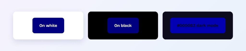
Dark mode is tricky. The brightened variant #0000B3 on a blue-cast dark surface #0C0C1D reaches only 1.52:1, which fails every threshold. Navy’s dark mode story requires a mid-blue accent (#4169E1 or similar) rather than a navy variant.
What UI Elements Work Best with Navy Blue?
The Navy’s 16:1 ratio against white makes it a near-universal text and background color. It works everywhere black would, with more personality.
Backgrounds and Surfaces
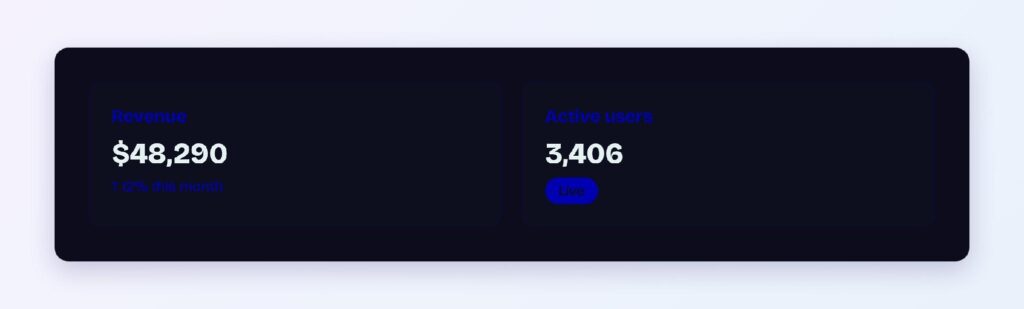
Navy replaces pure black in app shells, sidebars, and hero sections. White text hits AAA at 16.01:1, and all standard UI colors stay readable against it.
Buttons and CTAs
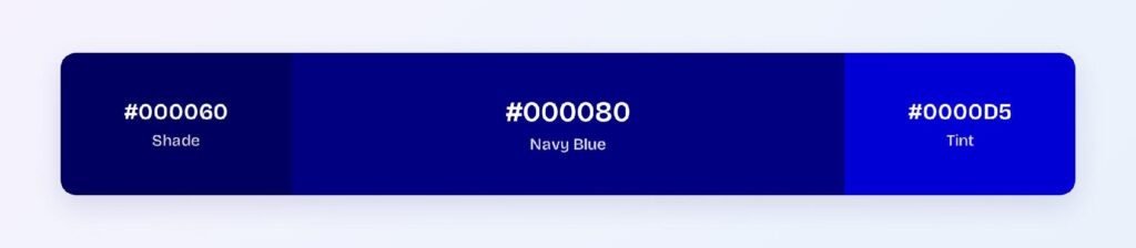
White text on #000080 passes AAA at 16.01:1. Use #000060 for hover — even darker, but the AAA margin means the darkening is visible. You can use Visily’s Theme feature to apply these token pairs across your wireframes.

Navigation Bars
A navy navbar gives you the depth of a dark theme with built-in brand identity. Active items can step up to the #0000B3 variant for a subtle selected state.

Data Visualizations
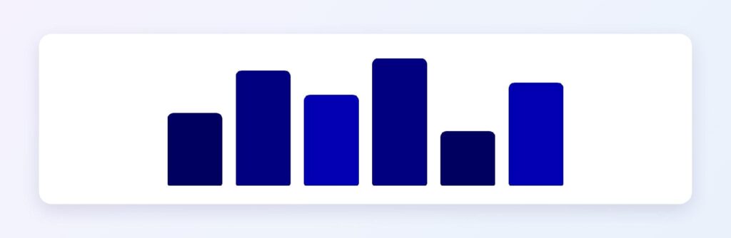
Navy is the go-to base series color in financial charts because it reads as authoritative and neutral. Its shade ramp from #000080 down to #000060 and #00004D provides sequential depth without leaving the hue.
What Are the Best Navy Blue Color Palettes for UI?
Five harmony schemes come from the navy’s position at hue 240. Every value is computed from #000080.
Monochromatic
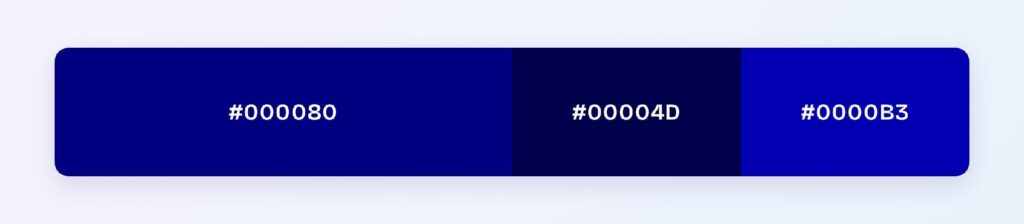
The set: #000080, #00004D, and #0000B3. One hue at three depths gives you a disciplined corporate look — fintech, legal, and enterprise products use this to stay professional.
Analogous
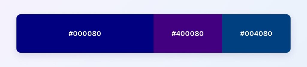
The set: #000080 with #400080 (toward purple) and #004080 (toward cyan). Neighboring hues stay calm together, making this scheme ideal for banking and insurance.
Complementary
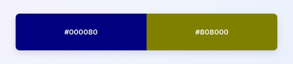
The set: #000080 against #808000 (olive/dark yellow). Maximum hue contrast makes the olive ideal for the 10% accent layer: highlights and featured content.
Triadic
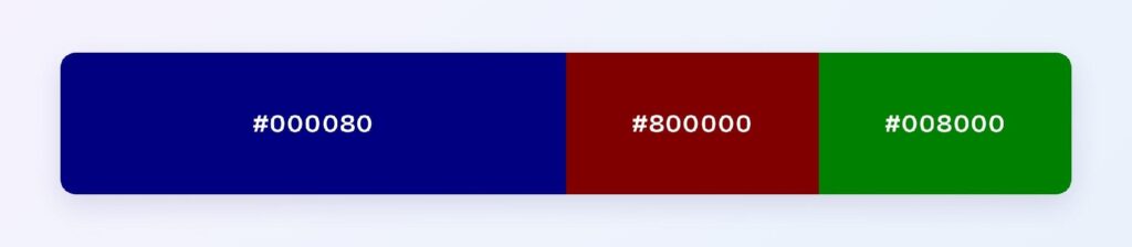
The set: #000080, #800000 (maroon), and #008000 (green). Three evenly spaced hues at matched depth suit multi-category dashboards or government portals.
Split-Complementary
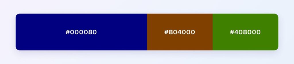
The set: #000080 with #804000 and #408000. You keep the complementary energy softened — ideal when the olive feels too dull but full complementary is too loud.
Which Colors Are Similar to Navy Blue?
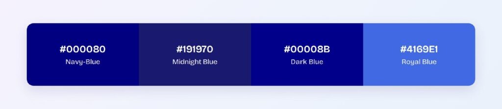
The three closest named colors are midnight blue (#191970), dark blue (#00008B), and royal blue (#4169E1). Midnight blue is barely distinguishable at normal sizes; dark blue adds a fraction more brightness; royal blue jumps two full lightness tiers and reads as a completely different color.
What Colors to Avoid with Navy Blue?
Avoid the near-neighbors #350080 and #003580. They sit 15 to 45 degrees away at the same depth, so edges between them and #000080 disappears entirely on most monitors.
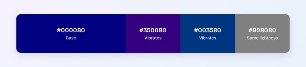
Pure black and dark brown also fail — navy already reads near-black, so any color at the same lightness merges with it.
Which Colors Pair Best with Navy Blue?
The best accent is #808000 (olive), navy’s computed complement. For neutrals, crisp white and light gray are the safest bets, and gold metallics lean into navy’s regal heritage.
Apply the 60-30-10 split: 60% light background, 30% navy for structure and containers, 10% warm accent.
Does Navy Blue Meet Accessibility Standards?
Yes, exceptionally: #000080 on white scores 16.01:1, far exceeding the WCAG AAA threshold of 7:1. Navy is one of the safest text colors on white backgrounds.
Navy is safe for color-blind users since blue is the last hue affected by red-green deficiencies. Pair any color-dependent meaning with an icon or label regardless.
How Can You Convert Navy Blue Between HEX, RGB, HSL, CMYK, and Other Color Formats?
All six formats describe the same color:
- HEX #000080 — default for CSS and design tokens.
- RGB rgb(0, 0, 128) — use RGBA for alpha overlays.
- HSL hsl(240, 100%, 25%) — programmatic shifts; lightness changes for hover states.
- HSB 240, 100, 50 — what Figma’s and Photoshop’s pickers show.
- CMYK 100, 100, 0, 50 — print translation; expect slight muting.