




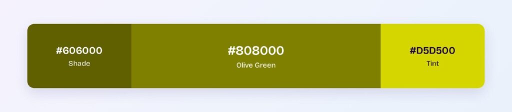
Olive green’s HEX code is #808000. Red and green run at exactly half strength while blue stays at zero, planting it at hue 60 — pure yellow territory — darkened to 25% lightness. That combination produces the muted, earthy character that made olive the color of military uniforms, utility wear, and every brand that wants ruggedness without aggression.
Below you get every olive green code format, the five computed harmony palettes, and exact WCAG contrast ratios against white, black, and dark surfaces — including one dark mode number that beats almost every color covered in this series. All values come from color math, not from eyeballing swatches.
The Exact Color Behind Olive Green
Olive green is the CSS named color olive, mapped to #808000. Its RGB is rgb(128, 128, 0): think of it as yellow with the lights turned halfway down. Full yellow (#FFFF00) screams; olive murmurs, and that restraint is its entire value in interface work.
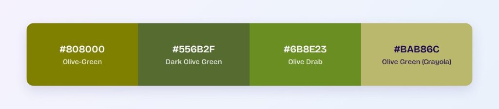
The name comes from unripe olives, and the color family stretches wider than the CSS anchor. Dark olive green (#556B2F) leans green and shadowy, olive drab (#6B8E23) is the military classic, and Crayola’s olive green (#BAB86C) lightens toward khaki. When someone says olive green, they usually mean one of these four.
In product design, olive occupies a niche few colors can: it signals outdoor, tactical, organic, and heritage all at once. Outdoor gear brands, sustainable products, and utility apps use it to feel grounded where a bright green would feel synthetic.
Is Olive Green a Rare Color?
In nature, yes — true olive pigment is uncommon outside of the fruit itself and dry-season foliage. In design, no: a century of military adoption pushed olive into mainstream fashion and, from there, into brand palettes. The rarity worth noting is digital: few interfaces use olive as a primary, which makes it a genuine differentiation play in a market saturated with blue and green SaaS palettes.
Olive Green on Digital Screens
On white, olive scores 4.2:1 — large text and icons only, just short of the 4.5:1 bar for body copy. On black it passes AA at 5.01:1. For compliant text on white, step down to the computed dark variant #606000, which reaches 6.62:1.
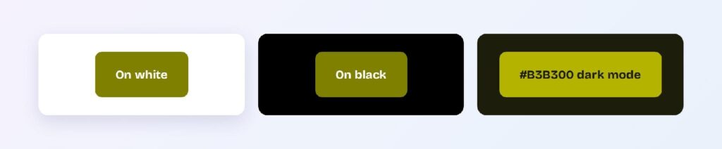
Dark mode is where olive surprises: the brightened variant #B3B300 on the olive-cast dark surface #1D1D0C hits 7.59:1 — a full AAA pass, stronger than most brand colors manage in dark themes. If your product is dark-first, olive is one of the safest earthy choices available.
Where Olive Green Works in an Interface
Olive’s muted energy suits components that need presence without urgency.
Buttons and Primary Actions
White text on #808000 sits at 4.2:1 — fine for large button labels, borderline for small ones. The safer pattern uses #606000 as the fill (6.62:1) with #808000 reserved for hover. You can use Visily’s Theme feature to apply the pair across your wireframes in one pass.

Status Badges and Tags
Olive badges read as utility and category rather than judgment: think gear types, terrain labels, and archival states. Dark olive text on a pale olive tint keeps the earthy story intact at small sizes.

Data Visualizations
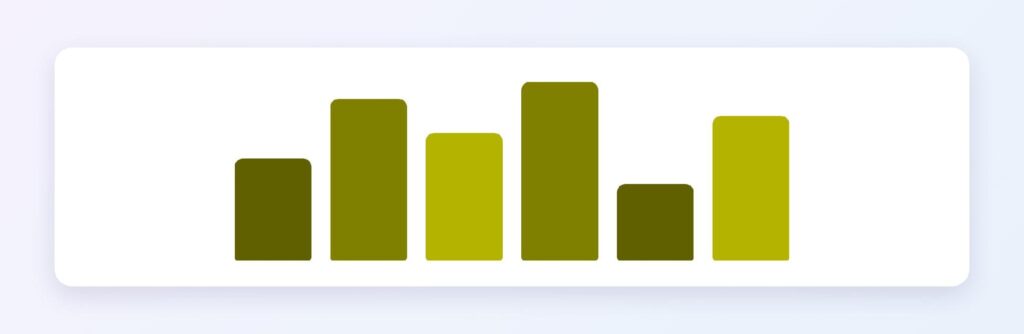
Olive’s shade ramp from #808000 down through #606000 and #4D4D00 gives sequential charts an organic, topographic feel — a natural fit for agriculture, sustainability, and logistics dashboards.
Dark Mode Surfaces
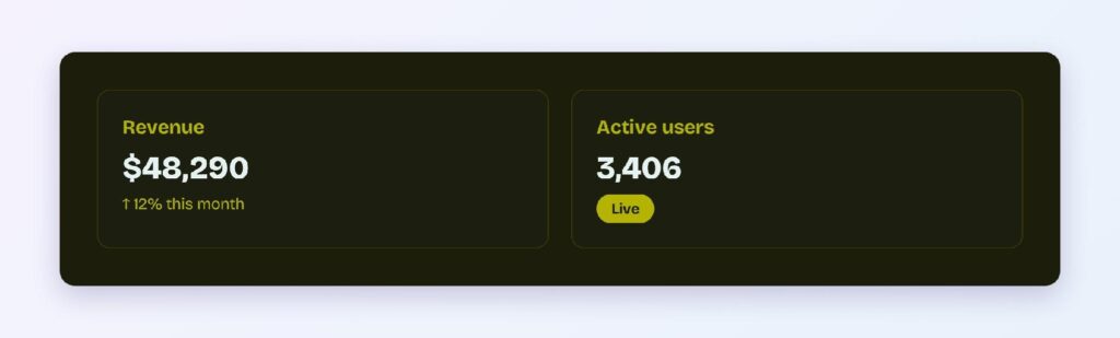
The #1D1D0C surface with #B3B300 accents delivers AAA contrast, so olive can carry body-level text in dark themes — a claim navy, purple, and most saturated hues can’t make.
Olive Green Palettes Built From Color Math
Five harmony schemes come from olive’s position at hue 60. Every value below is computed from #808000.
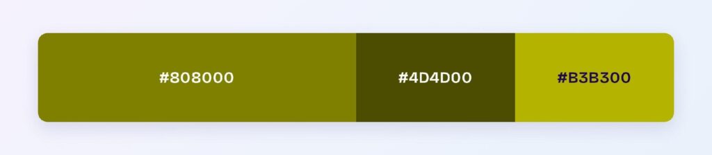
Monochromatic
The set: #808000, #4D4D00, and #B3B300. One hue at three depths builds a full interactive system — base, pressed, highlight — with a khaki-to-citron range that stays unmistakably olive.
Analogous
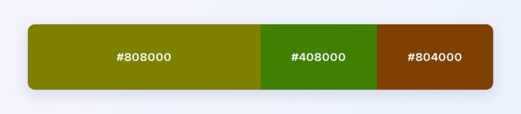
The set: #808000 with #408000 (toward green) and #804000 (toward brown). This is the camouflage palette formalized: three earth tones at matched depth for outdoor, tactical, and heritage brands.
Complementary
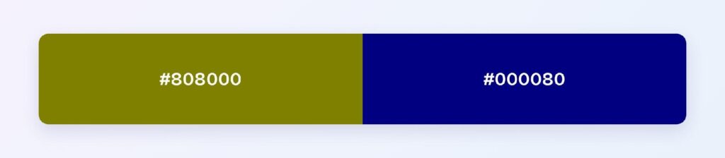
The set: #808000 against #000080 — navy, its exact opposite. The pairing balances olive’s earthiness with navy’s authority, and because both sit at 25% lightness, neither dominates. It’s one of the most usable complementary pairs in this series.
Triadic
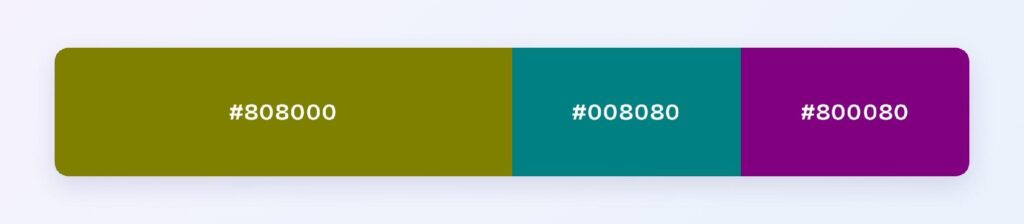
The set: #808000, #008080 (teal), and #800080 (purple). Three evenly spaced hues at identical depth suit multi-category dashboards that want richness without brightness.
Split-Complementary
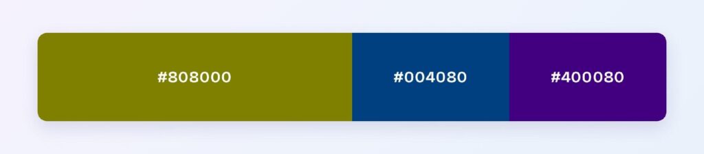
The set: #808000 with #004080 and #400080. You keep the navy-adjacent contrast with a softer landing — useful when full navy feels too corporate for an earthy brand.
Which Color Is Closest to Olive Green?
The three nearest named colors are dark olive green (#556B2F), olive drab (#6B8E23), and Crayola’s olive green (#BAB86C). Dark olive green trades yellow for shadow, olive drab brightens toward foliage, and the Crayola version lightens into khaki. Olive drab is the drop-in choice when #808000 feels too mustard for your product.
The Best Colors to Match With Olive Green
The computed answer is navy (#000080), olive’s direct complement and its most reliable partner. Beyond the math, olive pairs naturally with warm neutrals — cream, tan, camel — and with rust and burgundy for a full autumn range.
Structure it with the 60-30-10 split: 60% warm neutral surfaces, 30% olive for structure and primary components, 10% navy or rust accent for the moments that need weight.
Colors That Fight Olive Green
Avoid the near-neighbors #4B8000 and #804B00. They sit 15 to 45 degrees away at olive’s exact lightness, so edges between them and #808000 vibrate instead of separating.
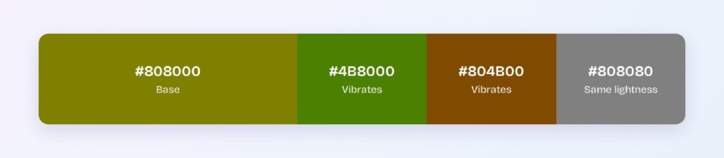
Bright neon hues also clash — their synthetic energy undercuts olive’s organic character, and mid-gray merges with it entirely because the lightness values match.
Olive Green and Accessibility Standards
Olive needs its dark variant for compliance: #808000 on white sits at 4.2:1, below the WCAG AA threshold of 4.5:1 for normal text, while #606000 clears it at 6.62:1. Reserve the base for large text and decorative roles.
One caution: olive lives in the red-green confusion range affecting roughly 1 in 12 men with color vision deficiency, and its yellow-brown character can blur toward khaki and tan for those users. Pair olive-coded meaning with icons or labels.
Converting Olive Green Across Color Formats
All six formats describe the same color:
- HEX #808000 — the default for CSS and design tokens.
- RGB rgb(128, 128, 0) — use RGBA for translucent earth-tone overlays.
- HSL hsl(60, 100%, 25%) — programmatic shifts; hover states are one lightness step away.
- HSB 60, 100, 50 — what Figma’s and Photoshop’s pickers show.
- CMYK 0, 0, 100, 50 — full yellow plus half black in print; one of the cleanest CMYK conversions a hue can have.
Wrapping Up
Olive green (#808000) earns its spot as a differentiating primary: an earthy identity almost no digital product claims, a navy complement that balances perfectly at matched depth, and a dark mode variant that clears AAA — rare air for any brand color. Every ratio above is computed, so the system behaves in production exactly as written.
Put it to work in Visily‘s Theme feature: load the olive-navy pair, roll it across your screens, and ship an interface that doesn’t look like everyone else’s today.











