




Triadic colors are three hues spaced evenly around the color wheel, each one a third of the wheel apart. Lines drawn between them form a perfect equilateral triangle. Red, yellow, and blue make up the most familiar triad.
This even spacing gives you a palette that’s bold and high-contrast, yet still balanced. You pick one color to lead and let the other two play backup, so the result feels lively instead of chaotic. Designers reach for triadic schemes when a screen needs energy without losing harmony.
In this blog, I’ll explain how triadic colors work, the four combinations on the color wheel, the 60-30-10 rule that keeps them balanced, and how to apply a triadic palette in your own app or website design.
Triadic Colors: Three Evenly Spaced Hues on the Color Wheel
A triadic color scheme uses three colors positioned at equal distances around the color wheel, 120 degrees apart. Those three points form an equilateral triangle when you connect them.
The color wheel is the map for this. Sir Isaac Newton built the first color wheel in 1666, and artists and designers have used versions of it ever since. A standard wheel holds 12 colors: three primary, three secondary, and six tertiary. A triadic scheme pulls one color from three equally spaced spots on that ring.
That even spacing is what makes the palette work. Because the three colors sit far apart, none of them blends into the others, so you get strong contrast. Because they’re spaced equally, that contrast stays balanced instead of tilting toward one color.
Design and painting tend to use the red-yellow-blue (RYB) wheel rather than the red-green-blue model your screen emits light in, since RYB is where these classic triads were first mapped. You can name a triad by its hex values too, but the wheel positions are what matter: any three colors an equal third apart read as a triad, whatever their exact shades.
The classic example is red, yellow, and blue, the three primary colors.
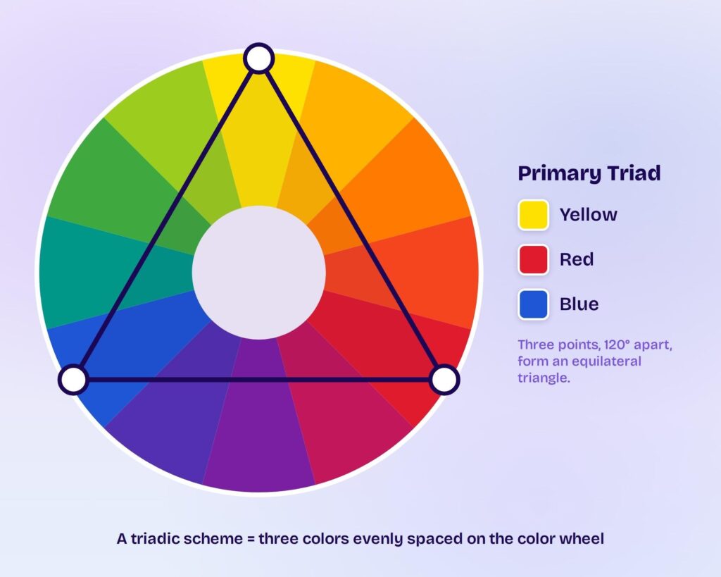
The Equilateral Triangle Rule Behind Triadic Color Schemes
The equilateral triangle is your test for a true triad. A triangle with three equal sides laid over the color wheel touches three colors, and those three form a valid triadic scheme. Rotate the triangle to any angle and you land on a different triad, but the spacing never changes. Turn it one step from red, yellow, and blue and you reach the tertiary set of red-orange, yellow-green, and blue-violet.
This rule separates triadic schemes from lookalikes. Two colors sitting opposite each other make a complementary pair, not a triad. Three colors bunched next to each other form an analogous scheme. Only three colors at equal thirds of the wheel qualify.
The 120-degree gap does something specific to your eye. It hands your brain a wide sample of the spectrum without covering the whole thing, which reads as complete and satisfying. That’s why triadic palettes look vibrant even when you tone the colors down.
4 Triadic Color Combinations on the Color Wheel
A standard 12-color wheel holds exactly four triadic combinations. Rotate the equilateral triangle around the wheel and you land on these four sets:
- Primary triad: red, yellow, and blue.
- Secondary triad: orange, green, and purple.
- Tertiary triad one: red-orange, yellow-green, and blue-violet.
- Tertiary triad two: yellow-orange, blue-green, and red-violet.
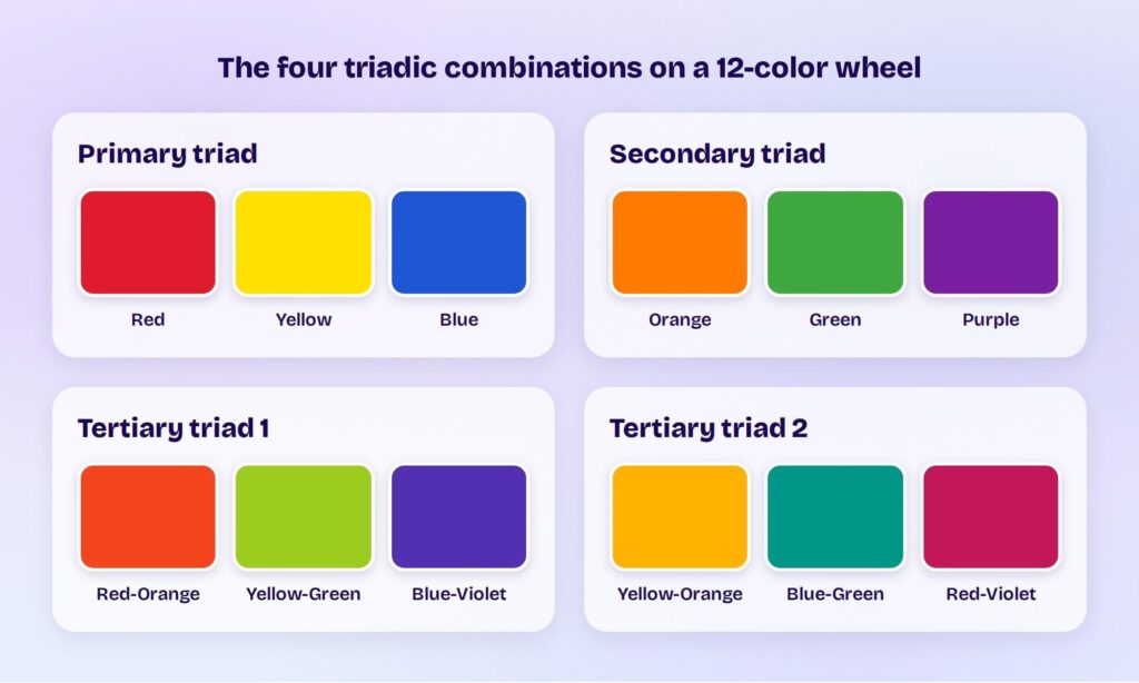
The primary triad is the boldest and most recognizable. You see it in children’s toys, building blocks, and classic comic books. It reads as playful and direct. Shift each hue toward a tint or shade and you still keep the triad, so red can become maroon and blue can become navy without breaking the scheme.
The secondary triad of orange, green, and purple feels less expected. Fewer brands use it, so a design built on it stands out.
The two tertiary triads are the subtlest of the four. Mixing a primary color with a secondary one gives you these in-between hues, and many designers prefer them for a richer, less obvious look.
The 60-30-10 Rule for Balanced Triadic Palettes
The 60-30-10 rule keeps a triadic palette balanced instead of loud. You split the three colors by proportion rather than using them in equal amounts:
- 60% goes to your dominant color, the one that sets the tone.
- 30% goes to a secondary color that supports it.
- 10% goes to an accent color for pops of contrast.
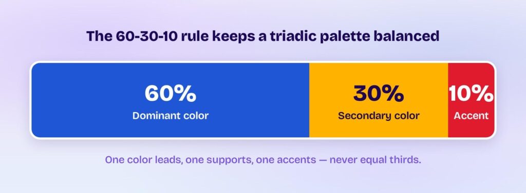
Equal thirds are the mistake to avoid. If all three colors take up the same space, they compete for attention and the design looks messy. One dominant color gives the eye a place to rest. In an interface, that dominant 60% usually lands on backgrounds and large surfaces, where a calmer color is easier on the eyes.
Saturation is your other balancing tool. Bright, fully saturated triads feel energetic and bold. Lower the saturation on your two accent colors, or reach for pastel tints, and the same palette turns calm and cohesive.
Begin with the dominant color and build out. The hue that carries your brand or message comes first, then you find the two colors sitting an equal third away on the wheel.
Triadic Colors vs Complementary vs Analogous vs Split-Complementary Schemes
Triadic sits in the middle of the color-harmony range: more contrast than analogous, more balance than complementary. Here’s how the four common schemes compare:
- Complementary uses two colors opposite each other. It gives the highest contrast, but it can feel harsh.
- Analogous uses three colors next to each other. It looks calm and unified, but low in contrast.
- Split-complementary takes one color plus the two beside its opposite. It brings strong contrast with less tension than a straight complementary pair.
- Triadic uses three evenly spaced colors. It stays vibrant and high-contrast, yet balanced.
Pick triadic when you want energy and variety without the visual overload of a complementary clash. Pick analogous when you want a quiet, harmonious look. The right scheme depends on the mood you’re after, not on which one is “best.”
Triadic Color Schemes in UI and Product Design
Triadic palettes work well in interfaces because they hand you a built-in role for every color. Your dominant color becomes the background or main surface, your secondary color handles headers and key sections, and your accent color marks the buttons and links that need to stand out.
Contrast and accessibility come first in UI, though. A palette that looks great on a mood board can fail on screen if text doesn’t separate from its background. The WCAG accessibility guidelines set a common target of a 4.5-to-1 contrast ratio between body text and its background, so check that your text and accent colors clear it, especially on buttons.
Color choices carry real weight for a product. Research in the Journal of Marketing & Social Research (2025) found that color can influence brand recognition by up to 80%.
This is where Visily fits. Visily is AI-powered UI design software built for people who aren’t designers, and its theme tools make applying a triadic palette fast.
You can build a theme four ways: generate one from a few keywords, pick a prebuilt theme, extract a theme from an image, or pull one straight from a URL.
Its Color Assistant and one-click theme generation then spread your chosen colors across every screen as consistent design tokens, so your 60-30-10 split stays intact across the whole project.
You can also fine-tune by hand. Visily’s editor lets you edit, add, or remove colors, and the eyedropper picks any hue straight off your canvas. That control matters when you’re dialing in the saturation on your accent colors.
Wrapping Up
A triadic color scheme gives you a vibrant, balanced palette from three colors spaced evenly on the wheel, held together by one dominant color and the 60-30-10 rule. Visily turns that theory into a working design by generating and applying your triadic palette across every screen with one click.
Sign up for Visily’s free plan and build your first triadic color theme today.











