




Yellow’s HEX code is #FFFF00. Red and green both run at maximum while blue sits at zero — hue 60, full saturation, 50% lightness — making it the brightest-feeling color a screen can produce. It also holds two records in this series at once: the best contrast ratio measured on black and the worst measured on white.
Below you get every yellow code format, the shade family from lemon chiffon to mustard, the five computed harmony palettes, and the exact WCAG numbers behind yellow’s split personality — plus the deployment patterns that let you use the most visible color in design without failing an audit. Everything is computed from the hex.
What Does the Yellow Color Represent?
Yellow represents optimism, energy, and attention. It’s the color of sunshine and caution tape simultaneously, which is the whole story: yellow signals positivity at low doses and warning at full intensity. The human eye resolves yellow faster than any other hue at distance — the reason school buses, taxis, and hazard signs all claim it.
In interfaces, yellow inherits both readings. As an accent it energizes; as a semantic it means caution — the middle state between green’s go and red’s stop. Products that use yellow for both jobs at once confuse users, so pick one register and hold it.
What Color Code Is FFFF00?
#FFFF00 is pure yellow — the additive mix of full red and full green light with no blue. In the RGB model yellow is a secondary color, born from two primaries; in print’s CMYK model it flips to a primary, which is why the conversion is the cleanest possible: 0, 0, 100, 0, pure yellow ink.
That dual citizenship explains yellow’s behavior. On screens it’s made of light and reads brilliantly luminous; in print it’s a single ink and reproduces almost perfectly. Few colors survive the screen-to-paper journey as faithfully.
What Are the Different Shades of Yellow?
Eight working shades cover the practical range:
- Lemon Chiffon (#FFFACD) — the palest usable surface tint
- Pastel Yellow (#FDFD96) — soft and friendly
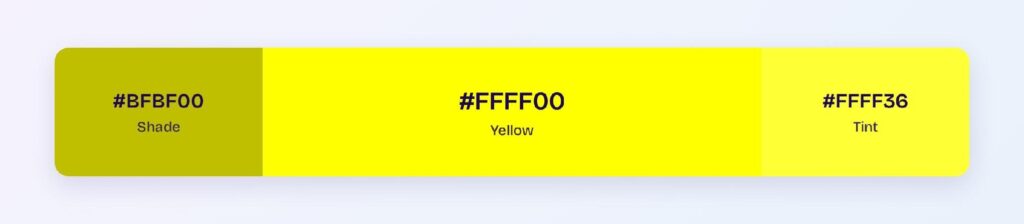
- Canary (#FFFF99) — computed as yellow’s near tint at #FFFF66
- Yellow (#FFFF00) — the pure anchor
- Gold (#FFD700) — warm and premium
- Mustard (#FFDE21 to #E1AD01) — deep and editorial
- Dark Yellow (#999900) — yellow’s computed shade, olive-adjacent
- Amber (#FFBF00) — the orange border, traffic-light territory
The family splits by job: the pale end builds surfaces, gold and mustard survive as fills, and the pure center works only as an accent.
How Does Yellow Appear on Digital Screens?
The two record numbers: on black, yellow scores 19.56:1 — the highest ratio in this entire color series, AAA with enormous margin. On white it scores 1.07:1 — the lowest, barely distinguishable from the background at all.
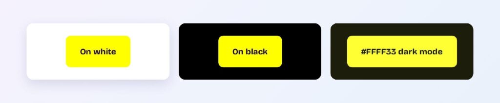
No other color splits this hard. The rule it dictates is absolute: yellow is a dark-background color. Yellow text on white, white text on yellow, and pale yellow near white all fail by an order of magnitude — even the darkened variant #BFBF00 only reaches 1.97:1 on white.
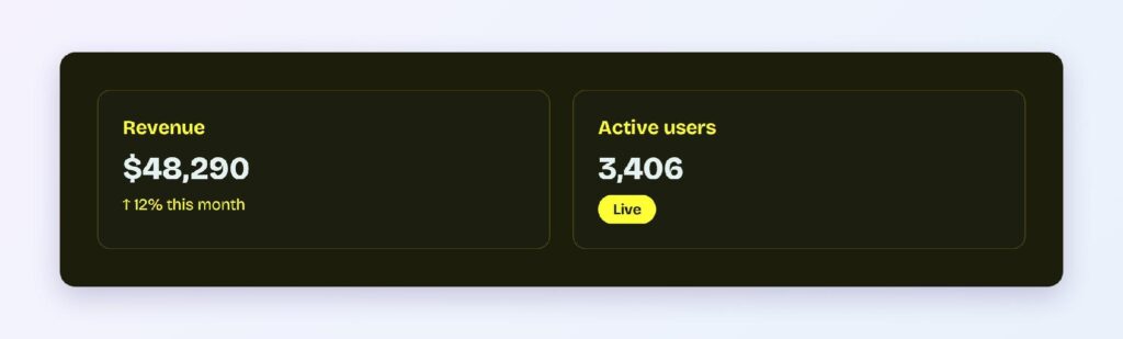
Dark mode is where yellow becomes a superpower. The bright variant #FFFF33 on the warm dark surface #1D1D0C delivers 15.9:1 — body text, icons, and fine print all clear AAA effortlessly. Terminal themes have known this since the amber-monitor era.
Where Yellow Actually Works in an Interface
Yellow succeeds where its visibility is the point and its white-adjacent weakness never comes into play.
Highlights and Attention
Yellow is the definitive highlight color: search matches, new-item flashes, and onboarding spotlights. A yellow wash behind dark text mimics a physical highlighter — familiar, instant, and compliant because the text does the contrast work.

Warning States
Yellow owns the caution semantic. Amber or mustard fills with near-black text produce warning banners that read urgently without red’s alarm. Keep the fill deep enough that the banner separates from white page backgrounds.

Dark Mode Accents
On #1D1D0C surfaces, yellow carries full body-text duty at 15.9:1. Dark-first products can run yellow as a true primary — the one context where that’s possible.
What Are the Best Yellow Color Palettes for UI?
Five harmony schemes come from yellow’s position at hue 60. Every value below is computed from #FFFF00.
Monochromatic
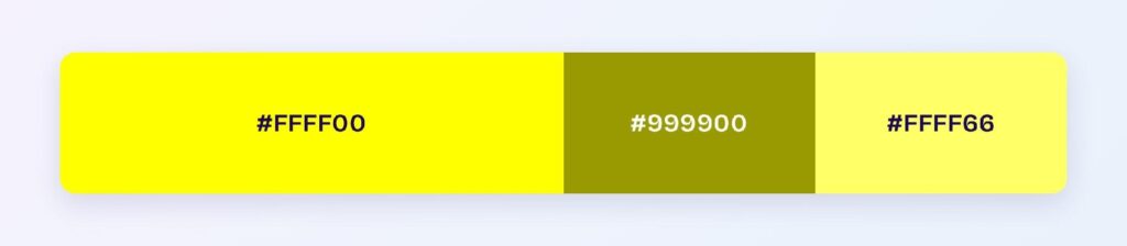
The set: #FFFF00, #999900, and #FFFF66. The olive-toned shade does the structural work, the tint builds warm surfaces, and the pure center accents. This ramp is the backbone of every caution-and-highlight system.
Analogous
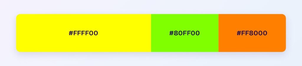
The set: #FFFF00 with #80FF00 (chartreuse) and #FF8000 (orange). The warm, high-energy neighbors make this the sports, gaming, and street-culture palette — maximum voltage, best deployed on dark grounds.
Complementary
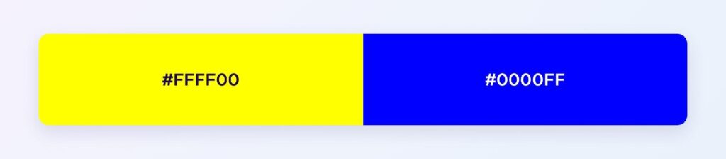
The set: #FFFF00 against #0000FF — pure blue, the strongest complementary pairing on the wheel. Blue does the structural and text work; yellow takes the 10% accent layer where its visibility converts. This is the classic conversion-button formula inside blue systems, reversed.
Triadic
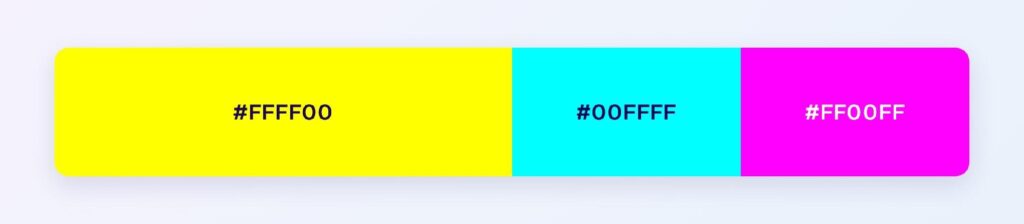
The set: #FFFF00, #00FFFF (cyan), and #FF00FF (magenta) — the printer’s primaries at full screen intensity. Loud at full strength, so production use mutes each; the structure suits creative tools and youth brands.
Split-Complementary
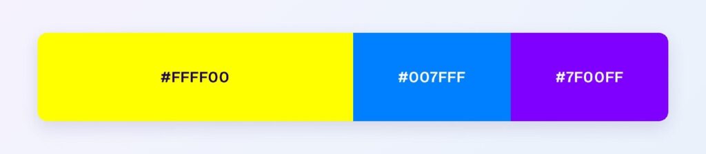
The set: #FFFF00 with #007FFF (azure) and #7F00FF (violet). You keep blue-family contrast with more range — azure for interaction, violet for premium moments, yellow for the spotlight.
What Colors Make Yellow Pop?
Dark, cool grounds: navy, charcoal, deep violet, and black. The mechanism is the 19.56:1 ratio — yellow pops hardest exactly where its contrast peaks. Against white, nothing makes yellow pop, because 1.07:1 leaves nothing to work with; the fix is always a darker frame around the yellow, never a brighter yellow.

Which Colors Are Similar to Yellow?
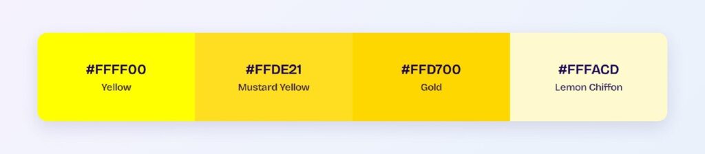
The three closest named colors are mustard (#FFDE21), gold (#FFD700), and lemon chiffon (#FFFACD). Mustard trades brightness for editorial depth, gold adds warmth and premium weight, and lemon chiffon dilutes to a surface tint. Gold is the swap when pure yellow feels too loud for the brand.
Is Yellow a Powerful Color?
Measurably, yes — in one direction. Yellow is the most visible color at distance, the fastest to register in peripheral vision, and the highest-contrast color on dark grounds in this series. Its power is attention; its weakness is structure. Yellow can’t build hierarchies, carry text on light themes, or hold large areas without fatiguing the eye.
The design translation: yellow is a spice, not a base. The strongest yellow systems use it at 10% coverage on dark or blue foundations, where every yellow pixel converts attention into action.
Which Colors Should You Avoid Pairing with Yellow?
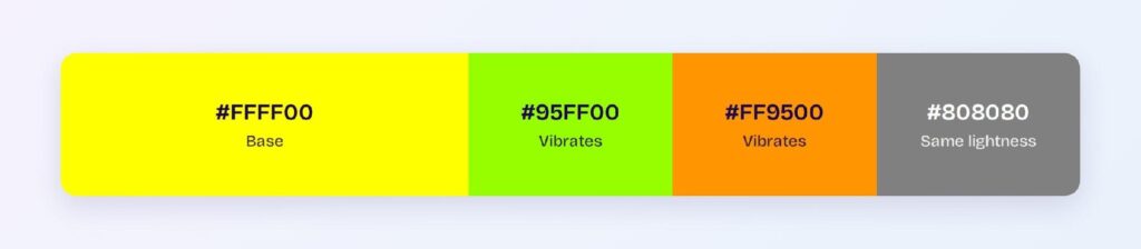
Avoid the near-neighbors #95FF00 and #FF9500. Both sit within 45 degrees at full intensity, so edges against #FFFF00 vibrate instead of separating.
White is the other measured failure at 1.07:1 — the worst pairing in this entire series. Pale grays and creams inherit the same problem. If yellow must sit near white, border it with a dark outline or deepen it toward gold.
Does Yellow Meet Accessibility Standards?
On dark surfaces, yellow is the most compliant color available: 19.56:1 on black nearly triples the WCAG AAA threshold of 7:1. On white it fails at 1.07:1 — no variant of bright yellow passes light-theme text duty, so light themes must switch to mustard or olive derivatives.
Yellow perception survives red-green color blindness well, though the yellow-to-chartreuse border compresses for some of the roughly 1 in 12 men affected. As always, pair the warning semantic with an icon — a triangle beats a hue for universal recognition.
How Can You Convert Yellow Between HEX, RGB, HSL, CMYK, and Other Color Formats?
All six formats describe the same color:
- HEX #FFFF00 — the default for CSS and design tokens.
- RGB rgb(255, 255, 0) — two channels at maximum; use RGBA for highlighter washes.
- HSL hsl(60, 100%, 50%) — exact middle lightness; gold and mustard are small negative lightness moves.
- HSB 60, 100, 100 — what Figma’s and Photoshop’s pickers show; full brightness is yellow’s signature.
- CMYK 0, 0, 100, 0 — pure process yellow; the cleanest print conversion any screen color can have.
Wrapping Up
Yellow (#FFFF00) earns its reputation as design’s attention specialist: a record 19.56:1 on black, a 15.9:1 dark mode accent, the fastest visual pickup of any hue — and one absolute rule, never near white. Frame it dark, dose it at 10%, and yellow converts visibility into action better than any color on the wheel. Every number above is computed.
Put it to work in Visily‘s Theme feature: set a dark or blue foundation, add the yellow accent layer, and ship the most visible interface on the web today.











