Make your Visily prototype feel more interactive by configuring triggers, navigation paths, overlay effects, and scroll behavior.
Access the interaction setting panel
Once a connection is created, you can access the interaction settings in Prototype mode as follows:
- Click the connection line or the element where the interaction was applied.
- If the interaction is connected from a screen: Select the screen, then click “Add interaction” or “view existing interactions”
The interaction settings menu will appear in the Prototype panel on the right.
Customize interactions
In the interaction settings, you can configure various options to customize your prototype interactions:
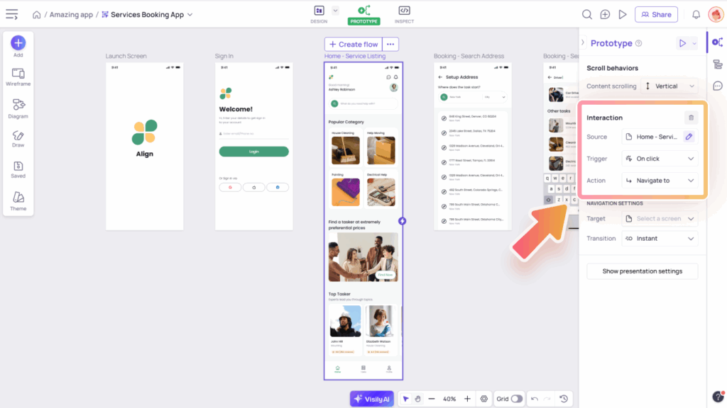
- Source: Choose the starting point of your interaction. You can select either a screen or an element within a screen as the source.
- Trigger: Defines how the action is initiated on your selected source (screen or element) to perform a behavior.
- Action: Action that the prototype performs on the Target after triggering.
Trigger Types
To control how an interaction starts, you can choose from various trigger types during configuration:
- Triggers with mouse action:
- On click: Triggered when the user clicks (desktop) or taps (mobile) on an element. Suitable for buttons, cards, or icons.
- On hover: Triggered when the cursor hovers over an element. Useful for tooltips, previews, or quick info popups.
- On long press: Triggered when the user presses and holds (desktop or mobile). Common for mobile gestures.
- On drag: Triggered by dragging actions, supporting two behaviors:
- Element drag: For free movement or drag-and-drop interactions (e.g., dragging a card to a list).
- Screen swipe: To simulate swipe-based navigation in specific directions (left, right, up, or down based on your selected Transition). Ideal for mobile flows
- Other triggers:
- On timeout: Triggered after a defined delay (in milliseconds). Ideal for timed transitions or auto-navigation.
- On keyboard shortcut: Triggered by a specific key combination. Helps simulate desktop shortcut behaviors.
- On press Enter: Triggered when pressing Enter after selecting and editing a text field component (e.g., text area, search box, dropdown, textbox). Commonly used for form submissions or searches.
Action Types
Action types help you control the behavior of your prototype after an interaction is triggered.
- Navigate to: Moves to a specific target screen. Commonly used for navigation between app sections.
- Back to previous screen: Returns to the screen visited before the current one.
- Open overlay: Displays an additional layer on top of the current screen (e.g., popup, toast).
- Close overlay: Hides the currently displayed overlay. Common for dismissing modals, popups, or notifications.
Navigation setting
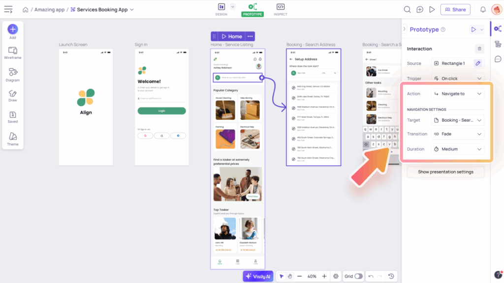
When you choose “Navigate to” as the action type, you can further customize the behavior using the navigation settings. The options below let you fine-tune how the transition between screens should happen:
- Target: Defines what the interaction affects after it’s triggered. This could be navigating to another screen.
- Transition: Determines how the prototype moves to the next screen. Options include: Instant, Fade, Slide left, Slide right, Slide up, and Slide down.
- Duration: except for the instant transition, you can set how long the transition lasts, such as Fast (100 ms), Medium (300 ms), or Slow (600 ms).
Overlay setting
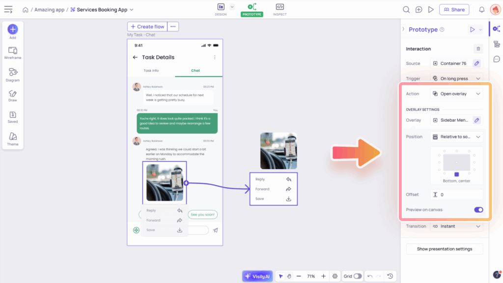
Overlays are useful for displaying elements like popups, dialogs, modals, or menus without navigating away from the current screen. When you choose “Open overlay” as the action type, you can customize how the overlay appears and interacts with the screen using the overlay settings.
- The Overlay field allows you to select a container or screen to use as an overlay.
- Overlay position options include:
- Relative to source: Anchors near the element that triggered it, best for dropdowns, tooltips, or contextual menus. There will be 12 position options around the source element to select.
- Relative to screen: Anchors based on screen layout, ideal for modals, toast messages, or panels. There will be 9 position options on a screen to select.
- Keep original position: Displays in the exact position it was designed in, useful for pre-placed tutorials or banners.
- The Offset option lets you specify the distance between the overlay and the selected element or screen boundary.
- Toggle on the Show background overlay option to add a background color behind the overlay and in front of the current screen. This option is available when the overlay position is set to Relative to screen or Keep original position.
- Toggle on the Preview on canvas option to preview the overlay position directly on the canvas without needing to present each time. This option is available when the overlay position is set to Relative to source or Relative to screen.
Scroll Behaviors
Scroll behavior allows you to enable vertical or horizontal scrolling for containers or screens, helping you create more realistic, scrollable prototypes.
Access Scroll Settings
In Prototype mode, select the screen or container where you want to apply scroll behavior. The Scroll Behaviors settings will appear in the Prototype panel.
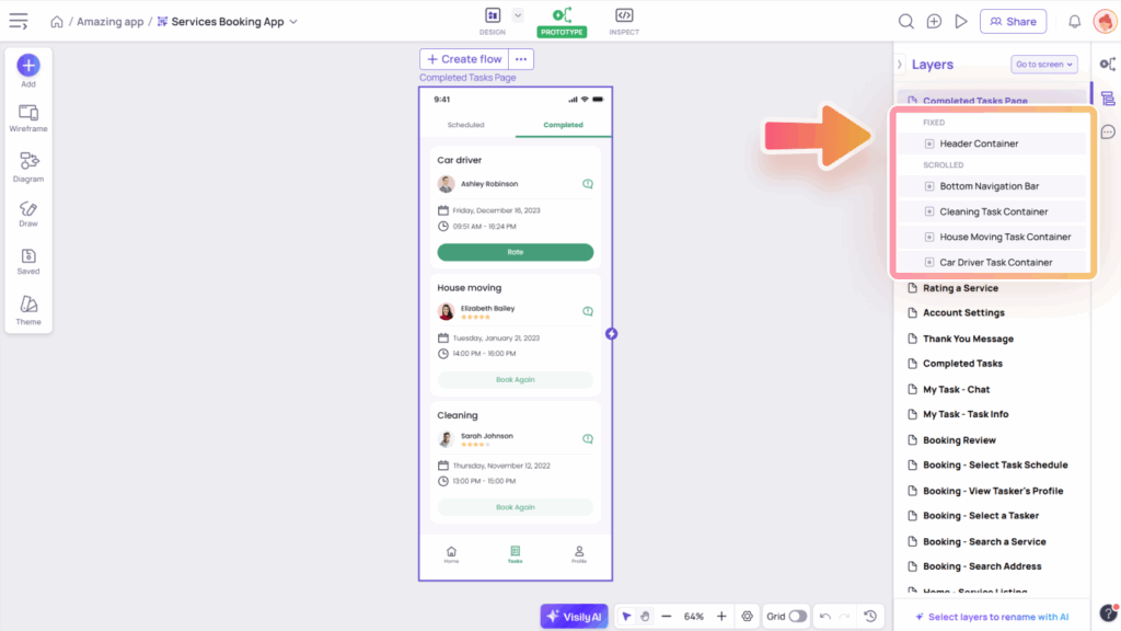
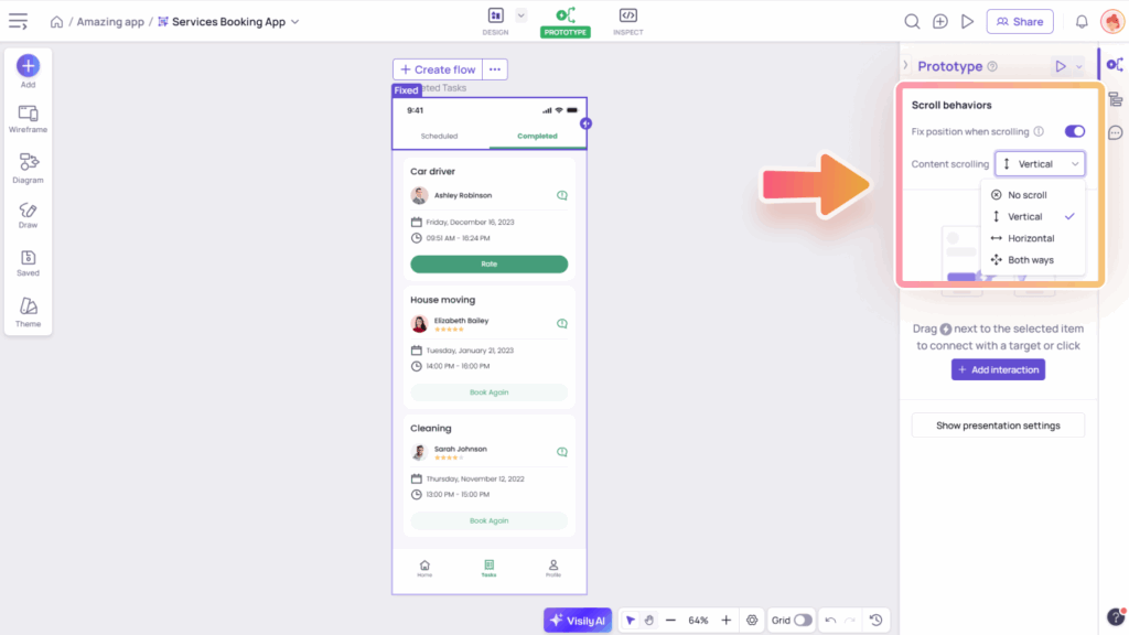
- Fix position when scrolling: Toggle this option to pin elements like headers, menus, or buttons so they stay visible while scrolling.
- Content scrolling: Determines whether the content is scrollable and sets the scroll direction. Available directions include Horizontal, Vertical, or Both.
Setting Scroll Behaviors
To set up scrolling for elements like carousels, sliders, long lists, or scrollable sections:
- Set up content scrolling:
- Select a screen or container to act as the scrollable area. This is where the scrollable content will live.
- Make sure your content goes beyond the container or screen. This creates the scroll effect.
- Choose the scroll direction (Horizontal, Vertical, or Both) in the Content Scrolling section of the Prototype panel. Ensure the content overflows in the same direction for scrolling to work properly.
- Apply “Fix position when scrolling” to elements that should stay in place (e.g., headers, menus, or sticky buttons). Make sure the fixed element is placed inside the scrollable screen or container.
- Preview the scroll behavior using quick preview or presentation mode.
