Without a consistent color system, picking colors one screen at a time can leave you with six slightly different blues and competing buttons. A color palette prevents that.
A color palette is a defined set of colors chosen to work together across a whole design, so every screen, button, and label pulls from the same short list.
Random color choices cost more than looks. They confuse people about where to click, break brand consistency, and often fail basic readability tests. A good palette gives each color a job, from a main brand color down to the neutrals behind your text, and keeps the interface coherent.
A palette also carries emotion, guides attention, and meets accessibility standards when you build it right.
As abstract artist Wassily Kandinsky famously said:
“Color is a power which directly influences the soul.
— Wassily Kandinsky
That emotional impact is one reason color palettes matter. The colors you choose don’t just make an interface look attractive—they shape how people feel, where they focus, and how they experience your product.
This blog explains what color palettes are, the color theory behind them, the 6 main types, and how to build one for your own app or website.
What is a Color Palette?
A color palette is a curated set of colors selected to work together across a design, brand, or product. Instead of choosing colors screen by screen, you commit to a short, deliberate list and reuse it everywhere.
Designers sometimes call this a color scheme. A color scheme usually refers to how the colors relate, while the palette is the colors themselves.
Most palettes stay small. Three to five core colors, backed by a few neutrals, cover the majority of projects.
The payoff is consistency. A palette becomes a single source of truth for color, so your call-to-action blue is the same blue on every page, and nobody on the team has to guess which gray goes on a form label. It also speeds up design and cuts decision fatigue, because the choices are already made.
Color Theory Explains Why Some Palettes Work
Color theory is the set of rules for how colors relate, and it’s what separates an intentional palette from a random one. Most of it traces back to the color wheel, which Isaac Newton first mapped in 1666 when he split white light into a spectrum and bent it into a circle.
The circle matters because color is relative. You never see a color alone; you see it against its neighbors, and your eye judges it by the company it keeps. The same blue reads calm next to gray and cold next to orange. Color theory turns that relationship into geometry, so you can predict how two hues will behave before you ever place them on a screen.
A working palette has to do three things, and theory covers each one:
- Harmony, so the colors look like they belong together. Hues that sit near each other or at even intervals on the wheel share a logic the eye reads as intentional.
- Contrast, so the reader can tell one element from another. Opposite hues and big jumps in lightness create the separation that guides attention.
- Hierarchy, so the most important thing stands out. One dominant color, a supporting range, and a sharp accent tell the reader where to look first.
Get the geometry right and everything downstream gets easier. You pick a base color, decide how many you need, then let the wheel’s spacing choose hues that agree or clash on purpose instead of by accident.
Three ideas drive all of it: how the wheel arranges hues, how a single color shifts in lightness and intensity, and how warm and cool tones set the mood. The next three parts break each one down.
The Color Wheel Maps How Colors Relate
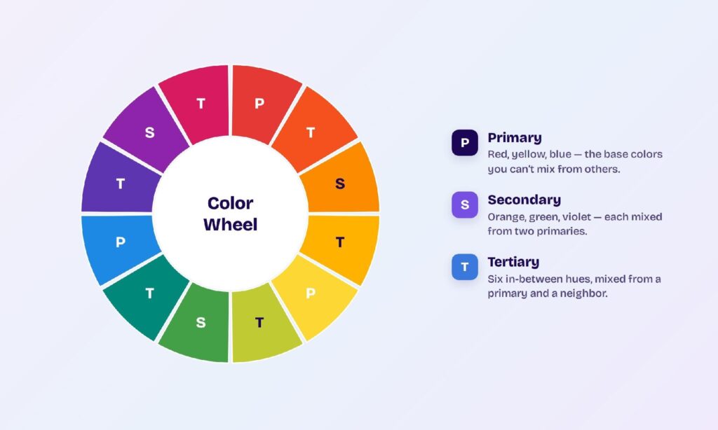
The color wheel arranges hues in a circle so you can see their relationships at a glance. It holds three groups:
- Primary colors: red, yellow, and blue. You can’t mix them with other colors.
- Secondary colors: orange, green, and violet, each mixed from two primaries.
- Tertiary colors: the six hues between a primary and its neighbor, like red-orange or blue-green.
How Hue, Tint, Shade, and Tone Define Each Color
Every color on the wheel can shift in four ways:
- Hue is the pure color itself, with nothing added.
- Tint is a hue plus white, which lightens it.
- Shade is a hue plus black, which darkens it.
- Tone is a hue plus gray, which softens it.
How Warm and Cool Colors Set the Temperature
Color temperature splits the wheel in half and steers the mood. Warm colors like reds, oranges, and yellows feel energetic and grab attention. Cool colors like blues, greens, and purples feel calm and steady. Neutrals such as black, white, gray, and brown sit outside the temperature scale and pair with anything.
Where your design lives matters too. Screens mix light with the RGB model, where colors add up toward white, while print uses CMYK inks that subtract toward black. A palette built for a screen won’t reproduce the same way on paper.
6 Palette Types Cover Almost Every Design
Six repeatable relationships on the color wheel produce most palettes. Each one sets a different level of contrast and mood.
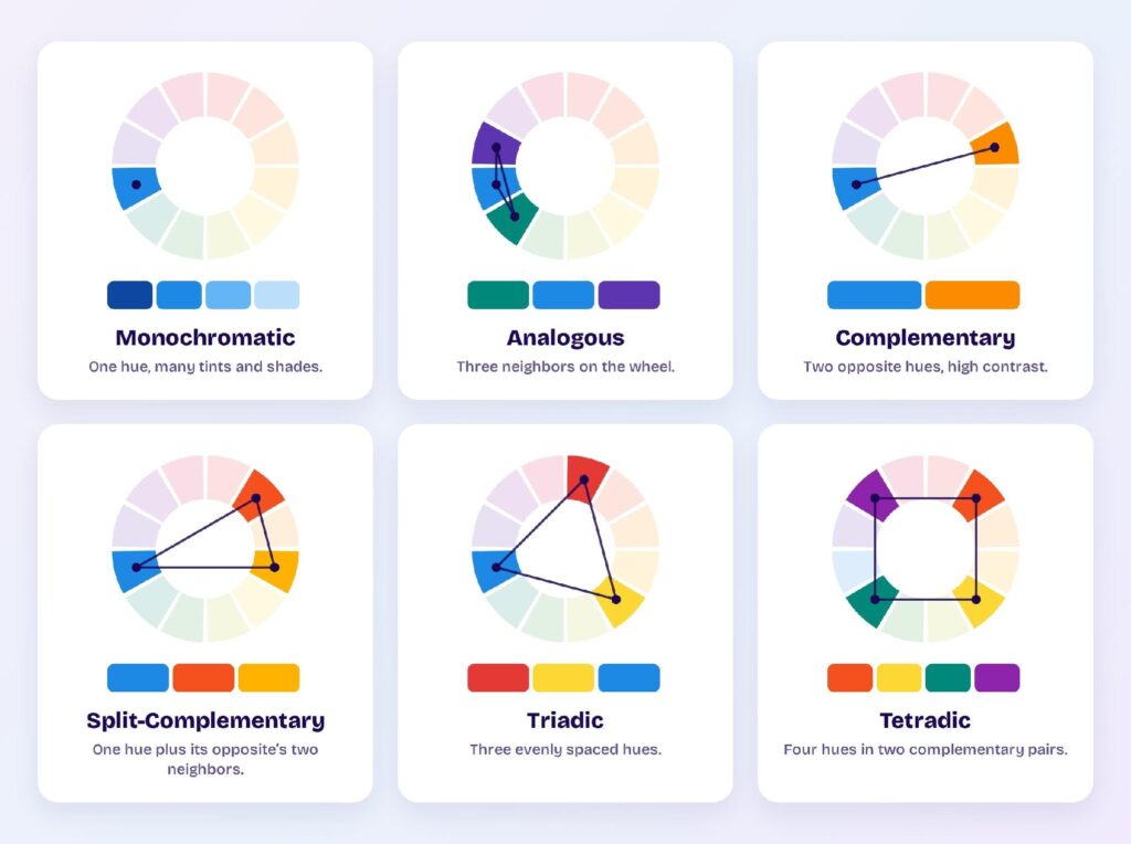
1. Monochromatic: One Hue in Many Shades
A monochromatic palette uses one hue and varies only its tints, shades, and tones. You pick a single blue, then lighten it toward white and darken it toward black to build a full range from one starting point. The result looks calm, clean, and unified, and it’s the hardest palette to get wrong because every color already shares the same root.
This makes it a safe default for dashboards, data-heavy tools, and minimalist brands where you want structure without noise. Lightness does the work that a second hue normally would: pale tints become backgrounds, mid-tones become surfaces, and the darkest values carry text and borders.
The trade-off is energy. With no opposing hue, a monochromatic scheme can read flat. You fix that with one accent color for buttons and alerts, or by widening the gap between your lightest and darkest steps so the interface still has depth.
2. Analogous: Neighboring Hues That Blend
An analogous palette uses three hues that sit side by side on the wheel, like blue, blue-green, and green. Because neighbors share undertones, the colors blend smoothly and read as warm and harmonious, the way a sunset moves from orange into pink without a visible seam.
You’ll reach for this scheme when you want a rich, comfortable look with more life than a single hue can give. It suits lifestyle brands, nature and wellness products, and any interface meant to feel relaxed rather than urgent.
The catch is contrast. Analogous colors sit so close that none of them naturally stands out, which makes calls to action easy to miss. Pick one hue as the dominant color and let the other two support it, then borrow a value jump, a light tint against a deep shade, to create the separation the hues alone won’t give you.
3. Complementary: Opposite Hues for Maximum Contrast
A complementary palette pairs two hues from opposite sides of the wheel, like blue and orange or red and green. Opposites create the strongest contrast in color, so the two hues intensify each other and each looks more vivid than it would alone.
That built-in contrast is why complementary pairs work so well for calls to action. Place an orange button on a blue interface and it jumps forward without any extra styling, which is exactly what you want the eye to catch first.
Used at full strength across large areas, though, the same pair vibrates and tires the eye fast. Keep one hue dominant and hold the second one back as an accent. A common pattern is a cool color for most of the interface, warmed up by a single saturated complement on the few elements, buttons, links, and alerts, that need to pull attention.
4. Split-Complementary: Contrast Without the Clash
A split-complementary palette starts with one base hue, then instead of its direct opposite, it borrows the two hues on either side of that opposite. Blue would pair with red-orange and yellow-orange rather than pure orange. You keep most of the punch of a complementary scheme while softening the harsh, vibrating clash.
This gives you contrast that’s bold but easier to live with, which is why it works for interfaces that need a strong accent without feeling aggressive. You get more color variety than a straight pair, so there’s room for a primary, a secondary, and an accent that still reads as one system.
It’s also more forgiving for beginners. The built-in mismatch means the colors rarely fight the way a raw complement can, so you can lean into brighter, more saturated tones and still land a palette that looks deliberate rather than loud.
5. Triadic: Three Balanced Hues That Stay Lively
A triadic palette uses three hues spaced evenly around the wheel, forming a triangle, like the red, yellow, and blue primaries. Even spacing keeps the scheme balanced, so it feels vibrant and playful while still holding together instead of pulling apart.
You’ll see triadic schemes in brands that want energy and variety: kids’ products, games, creative tools, and anything that should feel bright and confident. Three distinct hues give you plenty of room for a clear visual hierarchy across primary, secondary, and accent roles.
Balance is also the risk. Three saturated hues at equal strength compete for attention and can look chaotic. The fix is dominance: choose one hue to lead, use the second sparingly, and save the third for small accents. Muting two of the three, or dropping their saturation, lets the lead color set the tone while the others add life at the edges.
6. Tetradic: Four Hues in Two Complementary Pairs
A tetradic palette uses four hues arranged as two complementary pairs, like blue and orange alongside yellow and violet. This is the richest and most flexible scheme because it gives you two sets of opposites to work with, which means warm and cool contrast in the same system.
All that range comes with the most difficulty to balance. Four strong hues, each with a built-in opposite, easily overwhelm a layout when used at equal weight. A neutral anchor and clear dominance keep it under control: let one hue lead, treat the other three as support and accents, and tie everything together with plenty of white space or gray.
You’ll get the most from tetradic palettes on complex products with many states and categories to color-code, where the extra hues earn their place. For a simple marketing page, a lighter scheme usually reads cleaner.
A UI Palette Splits Colors Into Primary, Secondary, Accent, and Neutral Roles
In interface design, every color earns a role instead of just a spot on a swatch. Five roles cover a working UI palette.
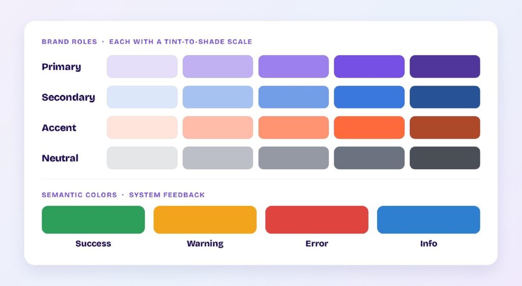
- Primary is your main brand color. It carries buttons, links, and the actions you want people to take.
- Secondary supports the primary and adds variety to headers, icons, and highlights.
- Accent is a single pop of color for emphasis, used sparingly so it keeps its punch.
- Neutrals are the grays that handle text, backgrounds, borders, and dividers. Most of a UI actually lives here.
- Semantic colors signal system states: green for success, amber for warning, red for error, and blue for info.
Each role usually comes as a scale, not a single value. You build ten to twelve steps from near-white to near-black for every hue, which gives you options for backgrounds, hover states, and readable text. Teams then map these values to named tokens, so a color can change once and update everywhere.
The 60-30-10 Rule Keeps a Palette Balanced
The 60-30-10 rule tells you how much of each color to use: 60% dominant, 30% secondary, and 10% accent. It came from interior design and moved into UI because the math still works.
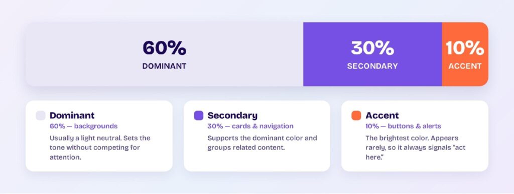
- Dominant (60%) covers backgrounds and large surfaces, usually in a light neutral.
- Secondary (30%) fills cards, sidebars, and navigation.
- Accent (10%) goes on buttons, links, and alerts.
Scarcity is the point. When your accent shows up on only one element in ten, people read it instantly as “act here.” Spread that color everywhere and it stops signaling anything.
Contrast and Accessibility Decide If a Palette Is Usable
A palette fails the moment people can’t read it. Contrast is the fix, and it’s measurable.
The Web Content Accessibility Guidelines set the bar: a contrast ratio of at least 4.5:1 for normal text and 3:1 for large text. Black text on white sits near the maximum of 21:1, while light gray on white can drop below the minimum and vanish.
Low contrast is the most common accessibility problem on the web. WebAIM found low-contrast text on 83.9% of the top one million home pages in 2026, the single most frequent failure it detects.
Color alone can also exclude people who can’t tell certain hues apart. If red means error and green means success, pair each color with an icon or a label so the meaning survives without it. Run your palette through a contrast checker before you ship.
Color Psychology Shapes How a Palette Feels
Colors carry meaning, so your palette sets a mood before anyone reads a word.
- Red signals urgency, passion, and appetite, which is why food apps lean on it.
- Blue reads as trust and calm, so banks and tech brands default to it.
- Green suggests growth, health, and “go.”
- Yellow and orange feel optimistic and energetic, and they pull the eye fast.
- Purple leans toward creativity and a sense of premium.
These associations aren’t universal. Color meaning shifts across cultures, so check what your colors say to the specific audience you’re designing for.
How to Build a Palette From Scratch in 5 Steps
You can assemble a working palette in five steps.
- Pick a primary color. Start from your brand, or from the mood you want, whether that’s calm, bold, or playful.
- Build a shade scale. Generate about ten steps from light to dark so you have room for backgrounds and text.
- Add neutrals. Choose a gray scale that pairs with your primary for the bulk of the interface.
- Add semantic colors. Set success, warning, error, and info so the UI can talk back to people.
- Check contrast, then apply the 60-30-10 split. Test the palette on a real prototype, not on isolated swatches.
Visily Generates a Full Color Palette in One Click
Visily assembles the whole design system for you instead of making you build it by hand. Its theme generation applies a consistent color palette, typography, spacing, shadows, and icons across every screen at once — the tokens that make a product feel unified.
You can seed a theme from four starting points:
- a website URL,
- a screenshot,
- a keyword, or
- a pre-made template.
Visily reads the input and suggests colors and fonts that fit.
From there, the palette stays editable. You can add, remove, or fine-tune any color, pull an exact shade from the canvas with the eyedropper, or ask AI Chat to adjust colors directly. UI Presets pair ready-made palettes with fonts so a screen looks finished in seconds, and the Color Assistant suggests combinations when you’re stuck.
The Visily Chrome extension turns a competitor’s page into your starting point. It captures any live page — a full page, a section, or a single component — on Chrome, Edge, or Firefox. Drop that capture into Visily, and it rebuilds the design as editable screens while seeding your theme from the same colors and type. You reshape it into your own design system from there, no pixel-matching required.
Every AI feature, theme generation included, is free on the Starter plan.
A design system turns scattered color and font choices into one consistent, on-brand foundation, and Visily builds that foundation across every screen in a single click.
Sign up for Visily’s free plan and generate your first design system today.