Strong contrast makes your buttons and links jump off the screen, but direct opposites like blue and orange or red and green often clash and tire the eye. A split complementary color scheme fixes that. You take one base color, find its opposite on the color wheel, then use the two colors sitting on either side of that opposite. Those three hues give you contrast with far less tension.
That small shift matters inside an interface. Instead of two colors fighting for attention, you get one dominant color and two accents that guide the eye without straining it. The result reads as bold but balanced.
This blog explains what split complementary colors are and how to use them in your UI, from the color wheel to the accent on your call-to-action button.
Split Complementary Colors on the Color Wheel
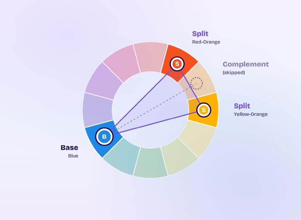
A split complementary color scheme uses one base color plus the two colors flanking its complement on the color wheel. You get three hues instead of two, and the trio keeps strong contrast while dropping the harshness of a straight opposite.
Finding the three colors takes three steps:
- Pick your base color, like blue.
- Find its complement, the color directly across the wheel, which is orange.
- Take the two colors on either side of that complement: red-orange and yellow-orange.
Your palette is now blue, red-orange, and yellow-orange. Plotted on the wheel, the three points form a narrow triangle instead of a straight line, and that offset is what softens the contrast.
The Difference Between Complementary and Split Complementary Schemes
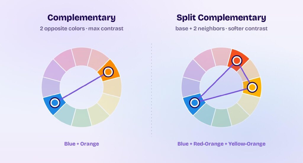
A complementary scheme uses two colors sitting directly opposite each other, which gives you the maximum contrast two hues can produce. A split complementary scheme swaps that single opposite for its two neighbors. You keep the warm-cool tension that makes a design pop, but the accents sit just off the direct clash, so the combination feels balanced instead of loud.
That difference is why split complementary palettes are easier to work with. One base color leads, and the two accents support it.
The 12 Split Complementary Color Sets
A standard 12-step color wheel gives you 12 split complementary sets, one for every base hue. Here are the six built on the primary and secondary colors:
| Base color | Split complements |
|---|---|
| Red | Yellow-green + blue-green |
| Orange | Blue-green + blue-violet |
| Yellow | Blue-violet + red-violet |
| Green | Red-orange + red-violet |
| Blue | Red-orange + yellow-orange |
| Violet | Yellow-orange + yellow-green |
The six tertiary hues, like red-orange or blue-green, fill out the rest of the twelve when you use them as your base.
Split Complementary Colors in UI and UX Design
Split complementary schemes work in interfaces because they hand you a built-in hierarchy: one dominant color and two accents. That structure does three jobs on a screen.
It guides attention. Your accent color sits far enough from the base to make a call-to-action button or an alert stand out at a glance.
It builds structure. You can assign the base to backgrounds and navigation, then use the two accents to separate cards, sections, and states without the layout feeling random.
It stays on brand. Your base color carries the brand while the two accents flex across buttons, links, and highlights, so you get variety without picking a new color every time.
The softer contrast also protects the reader. Direct complements can vibrate against each other and cause eye strain, which is why split complementary schemes are a staple of modern UX design.
Split Complementary Colors and the 60-30-10 Rule
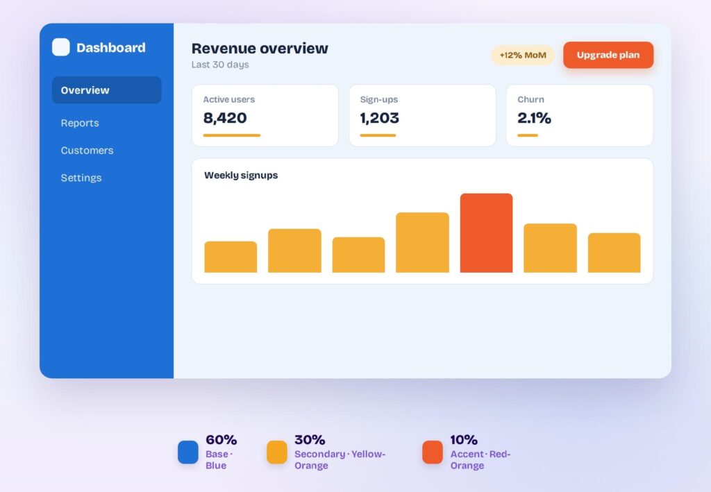
The 60-30-10 rule tells you how much of each color to use: 60% base, 30% second color, 10% accent. Map those proportions onto interface roles:
- 60% base color for backgrounds, surfaces, and navigation bars. This is the color people associate with your product.
- 30% secondary color for cards, sidebars, and section headers. It adds structure without competing with the base.
- 10% accent color for call-to-action buttons, badges, links, and alerts. This color drives clicks, so it works hardest when it’s rare.
Keeping the accent at 10% protects its signal. If every button and banner uses it, nothing stands out.
Split Complementary Colors and WCAG Accessibility
High contrast on the color wheel doesn’t guarantee accessible contrast on the screen. A muted blue-and-orange pairing can look perfectly readable and still fail the numbers.
The Web Content Accessibility Guidelines (WCAG 2.2) set the bar at 4.5:1 for normal text and 3:1 for large text and interface components. Every text-on-background pair in your palette has to clear it.
Contrast is also the most common failure on the web. Across the top one million home pages, WebAIM found low-contrast text on 83.9% of them, more than any other accessibility issue.
Run these checks before you ship a split complementary palette:
- Test every text-and-background pair against the 4.5:1 threshold, or 3:1 for large text and UI components.
- Simulate color blindness, which affects about 8% of men, to catch pairs that merge.
- Never signal a state with color alone; add an icon or a label so the meaning survives.
- Soften raw hues with tints or shades until the numbers pass.
Split Complementary Color Palette Examples for Apps
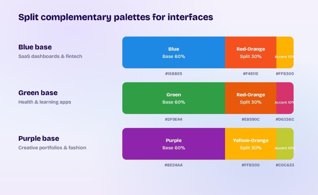
The same scheme reads very differently depending on your base color. Three combinations that work well in product design:
| Base | Split complements | Mood | Fits |
|---|---|---|---|
| Blue | Red-orange + yellow-orange | Trustworthy with energy | SaaS dashboards, fintech apps |
| Green | Red-orange + red-violet | Growth with motivation | Health and learning apps |
| Purple | Yellow-orange + yellow-green | Creative and premium | Portfolios, fashion e-commerce |
In each, the base carries the backgrounds while the two splits handle accents and calls to action.
Split Complementary Themes in Visily
Applying a palette by hand across every screen gets tedious fast. Visily, an AI-powered UI design tool for non-designers, stores your colors as a Project Theme and applies them across your whole design at once.
Your Project Theme holds the design tokens that make up a color system: colors, fonts, spacing, shadows, border radius, and icons. Set your base and two split accents once, and every component, template, and screen updates to match.
You can build the palette without mixing hues by hand:
- Generate a theme from a few keywords that describe your app.
- Extract a theme from a URL or a screenshot of an app whose colors you like.
- Sample any color straight from your canvas with the eyedropper.
- Swap the whole palette in one click with Magic Theme, or pair colors with type using UI Presets.
Then test the palette where it counts. Drop your colors onto real mockups from Visily’s library of 1,500+ templates and check how the base, secondary, and accent hold up against real text and buttons before you commit.
A split complementary scheme gives your interface strong contrast and quiet harmony from just three hues, so your call-to-action buttons pop without straining the reader’s eye or overwhelming the layout. Visily turns that palette into a Project Theme, applying your base color and two accents across every screen and component as consistent design tokens.
Sign up for Visily’s free plan and build your first split complementary theme today.