Gold is #FFD700, a fully saturated yellow at hue 51° that reads as achievement, warmth, and premium quality on screen. Here I have explored every gold code format, the palettes and pairings that hold up in real interfaces, and the contrast numbers that decide where gold can and can’t go.
What Is the Color of Gold?
Gold’s standard digital value is #FFD700, or rgb(255, 215, 0), a warm yellow with maximum red, high green, and zero blue. Browsers recognize it as the CSS named color “gold”.
The metal itself is duller. Physical gold sits closer to #D4AF37, often labeled “metallic gold,” while #FFD700 is the brighter web convention. If a design brief says “gold” without a hex, #FFD700 is the safe default and #D4AF37 is the choice for a jewelry-adjacent, muted look.
Gold carries the strongest status signal in the palette. Products use it for Pro tiers, award badges, and rating stars because people already associate it with winning and wealth, which is why a gold accent on a pricing page quietly says “this is the premium option” before the copy does.
How Does Gold Appear on Digital Screens?
Screens build gold from light, so #FFD700 glows brighter than metal ever can. The mix is 100% red, 84% green, and 0% blue, and without blue in the channel the color keeps a warm, sunlit cast on every display.

Flat #FFD700 has no shine. A metallic effect needs a gradient across two or three of gold’s shades, since shine is a lighting trick, not a color value.
Background matters more for gold than for most hues. On white it washes out at the edges with a 1.4:1 contrast ratio, while on black it hits 14.97:1 and becomes the brightest thing on the page. The computed dark surface #1D1A0C, paired with the bright variant #FFE033, keeps that glow in dark mode without halation.
What UI Elements Work Best with Gold?
Gold performs as an accent, not a workhorse. Its high luminance rules it out as body text or a light-mode background, so the elements below are the ones where the contrast math actually favors it.
Buttons and CTAs
A gold button demands dark text. Black on #FFD700 measures 14.97:1, and the deep shade #201B00 measures 12.29:1, while white text fails outright at 1.4:1.

Reserve gold for one primary action per screen. Two gold buttons split the status signal and the eye stops knowing which action matters.
Data Visualizations
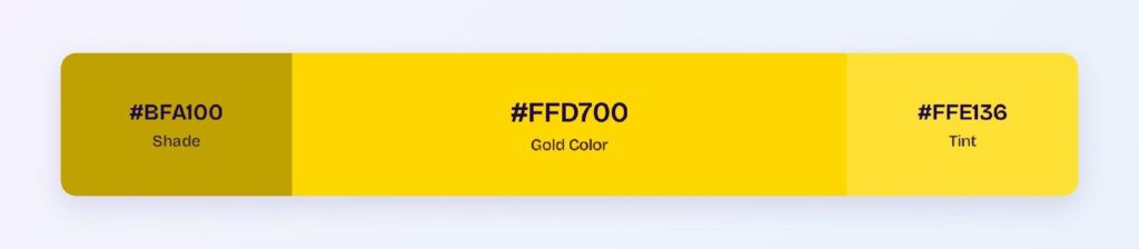
Gold anchors a chart series the way a highlighter anchors a sentence. Run the key series in #FFD700 and support it with the dark variant #BFA100 and the bright variant #FFE033 so the hierarchy stays inside one hue family.

Status Badges
Badges are gold’s natural habitat, since “gold status” is a phrase users already know. Solid #FFD700 with dark text handles active states, and a 13% tint of gold behind #BFA100 text handles quieter labels like “featured” or “in review”.

Dark Mode Surfaces
Dark mode is where gold does its best work. The bright variant #FFE033 on the dark surface #1D1A0C measures 13.24:1, passing WCAG AAA, so gold text, icons, and live indicators all stay readable while looking expensive.

What Are the Best Gold Color Palettes for UI?
Every palette below comes from color-wheel math on #FFD700, and each scheme fits a different product job.
Monochromatic
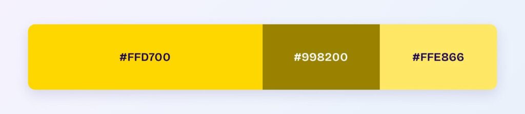
The monochromatic set is #FFD700, #998200, and #FFE866. Pick it for dashboards and settings screens that need visual hierarchy without introducing a second hue.
Analogous
The analogous set is #FFD700, #A6FF00, and #FF5900, gold’s wheel neighbors. It suits energetic marketing pages and event banners, though the lime neighbor needs care near gold itself (see the avoid section below).

Complementary
Gold’s complement is #0026FF, a deep blue from the opposite side of the wheel. Product teams pick this scheme when a blue interface needs one unmissable gold CTA, and the pair even clears 5.5:1 contrast against each other.

Triadic
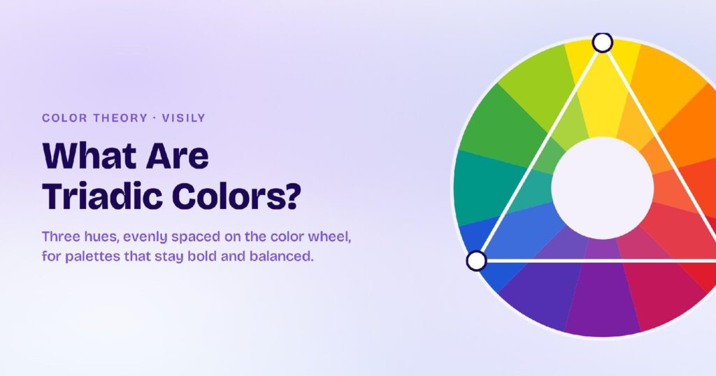
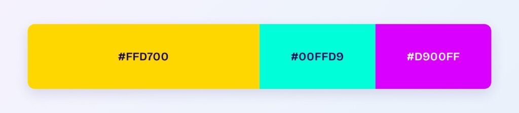
The triadic set is #FFD700, #00FFD9, and #D900FF, three hues spaced evenly at 120°. It works for category coding in data-heavy screens where three groups must stay instantly tellable apart.
Split-Complementary
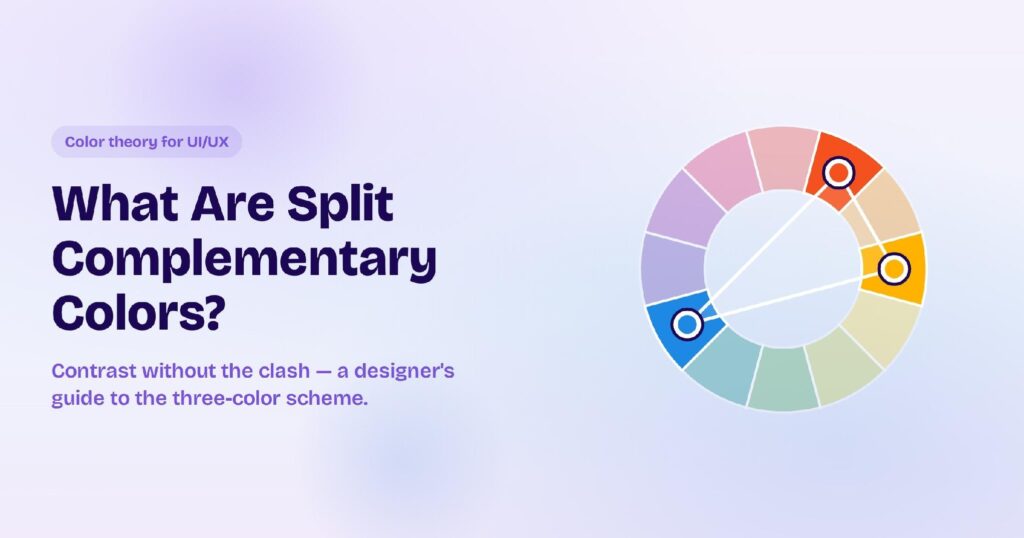
The split-complementary set is #FFD700, #00A6FF, and #5900FF. Teams choose it when they want complementary-level contrast with less vibration, which makes it the safer scheme for a full app theme. Visily’s Theme feature can apply a scheme like this across every screen of a design at once, so you see the palette in context instead of on a strip.

Which Colors Are Similar to Gold?
Three named neighbors sit closest to #FFD700:
- Golden (#EFBF04) — slightly deeper and less green; a common “realistic gold” in branding.
- Goldenrod (#DAA520) — browner and earthier; reads as autumnal rather than premium.
- Metallic gold (#D4AF37) — the metal’s own tone; pick it when the design references physical gold.
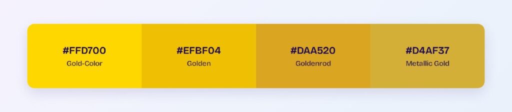
Swap toward the darker three when gold must sit on white, since each step down buys contrast that #FFD700 doesn’t have.
Which Colors Pair Best with Gold?
Deep blue #0026FF is gold’s single best accent partner, and the complementary palette above shows the pairing at full strength. For everything around that pair, lean on neutrals: the near-black #1D1A0C, a charcoal, and an off-white give gold room to signal without competing.
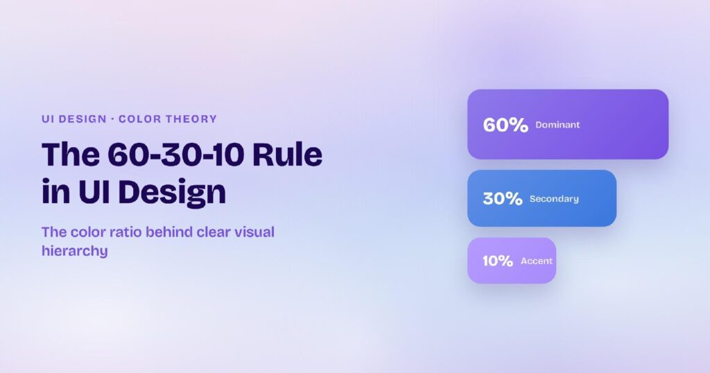
Split the layout 60-30-10. Use 60% neutral background, 30% dark structural color, and 10% gold, because gold at more than 10% of a screen stops feeling premium and starts feeling loud.
Which Colors Should You Avoid Pairing with Gold?
The riskiest partners come straight from the hue math. #BBFF00 and #FF6E00 sit 15–45° from gold at similar lightness, so their shared edges vibrate on screen, and a mid gray like #808080 matches gold’s lightness closely enough that boundaries between them lose definition.
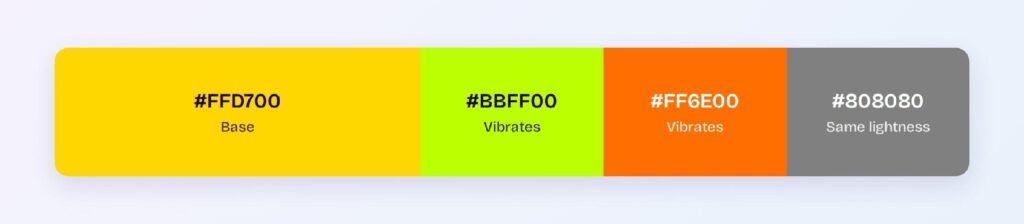
White text on gold is the third trap. At 1.4:1 it fails every WCAG level, yet it keeps appearing on gold buttons because it looks passable in a mockup viewed at full brightness.
Does Gold Meet Accessibility Standards?
Gold fails as a text color on light backgrounds and passes with room to spare on dark ones. The computed ratios:
| Pair | Ratio | WCAG verdict |
| #FFD700 on white | 1.4:1 | Fails AA and AAA |
| #FFD700 on black | 14.97:1 | Passes AAA |
| Dark variant #BFA100 on white | 2.53:1 | Fails AA |
| Bright #FFE033 on dark surface #1D1A0C | 13.24:1 | Passes AAA |
| White text on #FFD700 | 1.4:1 | Fails AA and AAA |
Even the darkened #BFA100 can’t carry text on white, so on light backgrounds gold should color shapes, fills, and borders while a dark neutral carries the words.
One color-vision note: gold’s yellow hue survives red-green color blindness better than red or green accents do, but a gold-versus-lime distinction collapses for deuteranopic users, so never make that pair carry meaning on its own.
How Can You Convert Gold Between HEX, RGB, HSL, CMYK, and Other Color Formats?
Every format below describes the same #FFD700, and each one serves a different workflow:
| Format | Gold value | Where you’d use it |
| HEX | #FFD700 | CSS, design tools, handoff specs |
| RGB | rgb(255, 215, 0) | Web styles and screen rendering |
| RGBA | rgba(255, 215, 0, 1) | Web styles with transparency |
| HSL | hsl(51, 100%, 50%) | Programmatic tints and shades in code |
| HSB | 51, 100, 100 | Color pickers in design software |
| CMYK | 0, 16, 100, 0 | Print production |
HSL earns its place in design systems because shifting only the lightness value generates gold’s whole tint-and-shade ramp from one line of code. CMYK matters the moment gold leaves the screen, since the 0-blue mix that glows on a display prints noticeably flatter on paper.