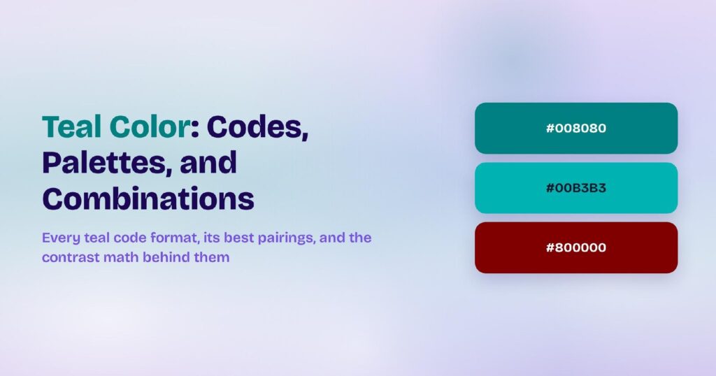
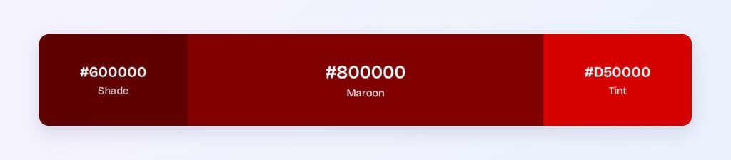
Maroon is #800000, pure red at exactly half brightness, and one of the few named colors dark enough to carry white text straight out of the box. At 10.95:1 against white, it passes WCAG AAA before you touch a single value, which puts it in a small club of brand colors that work as buttons, headers, and text without a rescue shade.
The name comes from the French marron, meaning chestnut, and the color still signals what chestnut wood does: tradition, seriousness, and quiet authority. Universities, law firms, and heritage brands lean on maroon for exactly that reason.
Below you’ll find every maroon code format, the palettes and pairings the color wheel produces from it, and the contrast numbers that map where maroon excels and where dark mode punishes it.
What Is the Color of Maroon?
Maroon’s standard value is #800000, or rgb(128, 0, 0), a dark red with its green and blue channels at zero. Browsers recognize it as the CSS named color “maroon”, which settles the dark-red-versus-dark-brown debate for screens: digitally, maroon is pure red, just half as bright.
The burgundy confusion deserves a direct answer. Burgundy is #800020, the same darkness with a purple push from its blue channel, so burgundy leans wine while maroon stays brick, and the two aren’t interchangeable in a design token even though fabric and paint often blur them.
Maroon’s associations skew formal: tradition, ambition, and controlled strength. Products use it where red’s energy is wanted without red’s alarm, which is why maroon reads as “established institution” while pure red reads as “error state”.
How Does Maroon Appear on Digital Screens?
On screen, maroon behaves like ink. At 50% brightness and full saturation, it holds its identity on light backgrounds and sinks into dark ones.
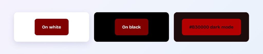
Against white it measures 10.95:1 and passes AAA, and white text on maroon returns the same 10.95:1 in reverse. Against black it manages only 1.92:1, so on dark surfaces the base value effectively disappears.
That asymmetry is the number-one thing to plan for. A maroon brand needs a lighter stand-in for dark mode, and the tint ramp supplies it: #FFACAC hits 10.58:1 on the dark surface #1D0C0C, and #FF8181 hits 7.85:1, both passing AAA.
What UI Elements Work Best with Maroon?
Maroon covers the widest element range of any color this dark because both text directions clear AAA: white on maroon and maroon on white. The four elements below are where that double pass earns its keep.
Buttons and CTAs
A maroon button with white text measures 10.95:1, comfortably past AAA, which few brand colors manage without darkening. That headroom means hover and pressed states can shift to #600000 or #B30000 and stay accessible the whole way.

Navigation Bars
A maroon navbar gives a product instant institutional weight. White labels and icons stay AAA-readable on it, and the darkness keeps the bar from competing with content the way saturated reds do.

Data Visualizations
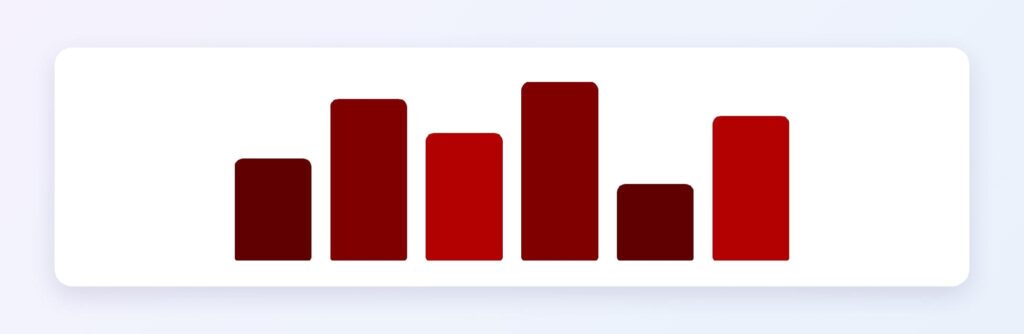
Maroon anchors the serious series in a chart. Run the headline metric in #800000 and support it with the bright variant #B30000 and the deep shade #400000, and the hierarchy stays inside one hue family while every bar stays distinct on a white chart background.
Status Badges
Maroon badges suit severity without sirens: “restricted”, “legacy”, “admin only”. Solid #800000 with white text carries the strong version, and a 13% maroon tint behind #600000 text carries the quiet one.

What Are the Best Maroon Color Palettes for UI?
Every palette below comes from color-wheel math on #800000, and because maroon sits at half brightness, each partner arrives equally deep and formal.
Monochromatic
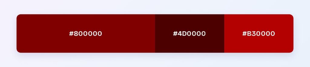
The monochromatic set is #800000, #4D0000, and #B30000. Pick it for dashboards and admin tools that need hierarchy without a second hue, with the deepest member reserved for text and the brightest for the single active state.
Analogous
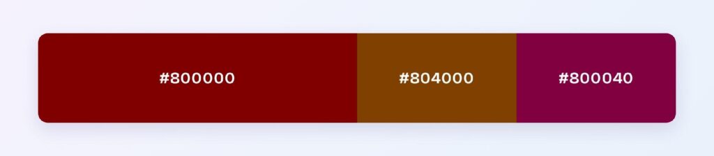
The analogous set is #800000, #804000, and #800040, maroon flanked by a dark amber-brown and a dark raspberry. It suits heritage and editorial brands, though both neighbors need spacing from maroon itself (see the avoid section below).
Complementary
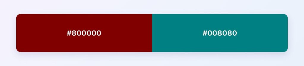
Maroon’s complement is #008080, teal. The pair measures only 2.29:1 in luminance, so the contrast is hue tension rather than light-dark, which makes the scheme a two-category color-coding system with a neutral doing the text work between them.
Triadic
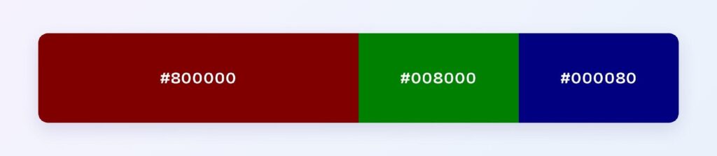
The triadic set is #800000, #008000, and #000080, three primaries all cut to half brightness. It handles category coding in data-dense products where three groups need equal visual weight.
Split-Complementary
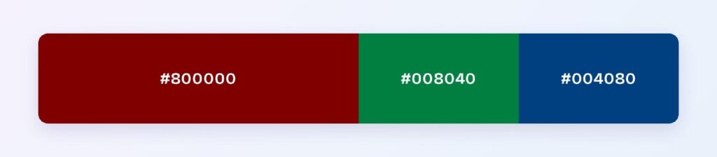
The split-complementary set is #800000, #008040, and #004080. Teams pick it for full app themes that want the maroon-teal tension with less clash, and Visily’s Theme feature can apply the scheme across every screen of a design at once so you judge it in real layouts instead of on a strip.
Which Colors Are Similar to Maroon?
Three deep reds get mistaken for #800000 most often:
- Burgundy (#800020) — identical brightness with a purple lean; the wine to maroon’s brick.
- Wine (#722F37) — softer and browner; reads aged rather than authoritative.
- Chocolate cosmos (#58111A) — darker still; the near-black take for moody editorial designs.
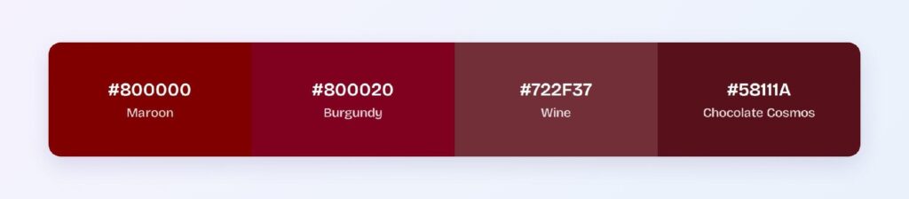
All three share maroon’s light-background strengths, so swapping between them is a tone decision, not an accessibility one.
Which Colors Pair Best with Maroon?
Teal #008080 is maroon’s single best accent partner, and the complementary palette above shows the pairing at full strength. Around that pair, warm neutrals carry the layout: cream, warm gray, and the pale tint #FFD6D6, which reads as maroon-tinted white and holds 8.26:1 contrast under maroon text.
Split the layout 60-30-10. Cream or white takes 60% as the background, maroon takes 30% for headers, navbars, and key text, and teal or metallic gold takes the final 10% as the accent that keeps the formality from turning heavy.
Which Colors Should You Avoid Pairing with Maroon?
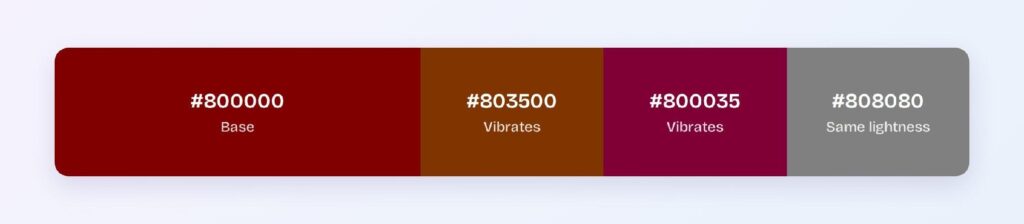
The riskiest partners come from the hue math. #803500 and #800035 sit 15–45° from maroon at identical brightness, so shared edges between them and maroon vibrate, and the mid gray #808080 sits close enough in the muddy middle that boundaries soften instead of separating.
The other trap is maroon on black. At 1.92:1 the combination fails every WCAG level, and it’s the most common maroon mistake shipped, because dark-on-dark looks rich in a static mockup and unreadable on a real screen.
Does Maroon Meet Accessibility Standards?
Maroon passes everything on light backgrounds and fails everything on dark ones, until the tint ramp steps in. The computed ratios:
| Pair | Ratio | WCAG verdict |
| #800000 on white | 10.95:1 | Passes AAA |
| White text on #800000 | 10.95:1 | Passes AAA |
| Dark variant #600000 on white | 14.02:1 | Passes AAA |
| #800000 on black | 1.92:1 | Fails AA |
| Bright #B30000 on dark surface #1D0C0C | 2.63:1 | Fails AA |
| Tint #FF8181 on dark surface #1D0C0C | 7.85:1 | Passes AAA |
| Tint #FFACAC on dark surface #1D0C0C | 10.58:1 | Passes AAA |
The rule the table produces: keep #800000 as the light-mode token and map the dark-mode token to a tint from #FF8181 up, never to the base or a brighter red alone.
One color-vision note: maroon darkens dramatically for users with protanopia, whose reduced red sensitivity pushes #800000 toward black, so maroon-on-dark layouts fail those users even harder and maroon-versus-dark-green pairs shouldn’t carry meaning on their own.
How Can You Convert Maroon Between HEX, RGB, HSL, CMYK, and Other Color Formats?
Every format below describes the same #800000, and each fits a different stage of the workflow:
| Format | Maroon value | Where you’d use it |
| HEX | #800000 | CSS, design tools, handoff specs |
| RGB | rgb(128, 0, 0) | Web styles and screen rendering |
| RGBA | rgba(128, 0, 0, 1) | Web styles with transparency |
| HSL | hsl(0, 100%, 25%) | Programmatic tints and shades in code |
| HSB | 0, 100, 50 | Color pickers in design software |
| CMYK | 0, 100, 100, 50 | Print production |
The HSL value tells maroon’s whole story in one line: hue 0 is pure red, and 25% lightness is the halving that turns alarm into authority. Raise that single number and you generate the entire dark-mode tint ramp. In print, the 50% black channel means maroon depends on ink density, so a printed maroon runs darker than its screen twin and deserves a proof before brand collateral goes out.
Wrapping Up
Maroon’s job in an interface is authority you can actually read: it’s one of the few brand-dark colors that clears AAA in both directions on light backgrounds, needs nothing but its own tint ramp to survive dark mode, and pairs off cleanly against teal, cream, and gold.
The fastest way to know if it fits your product is to see it on real screens. Open Visily, drop #800000 into the Theme feature, and apply the monochromatic or split-complementary palette from this page across your whole design in one pass. Try Visily free and test maroon in context today.