Visily’s Wireframe Library contains thousands of UI elements and templates, plus over 55,000 icons that can be easily added to your designs.
All elements and templates use the color palette and fonts specified in your Board Theme, making them a seamless part of your design system. This helps you achieve beautiful and consistent designs with minimal effort.
Access to libraries
You can access the Wireframe Library within your board from the left sidebar menu. The library opens by default when you create a new board.
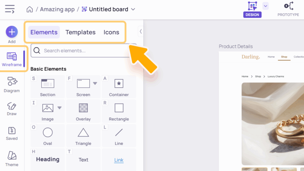
The Wireframe Library includes three main tabs:
- Elements – Contains Basic Elements and Smart Components to help you build wireframes quickly.
- Templates – Includes ready-to-use component templates for faster layout creation.
- Icons – Provides access to the full Icon Library for adding visual symbols and graphic accents.
Elements library
The “Elements” tab in Wireframe Library contains both basic elements and smart components, which are essential building blocks for any design or template.
Basic elements
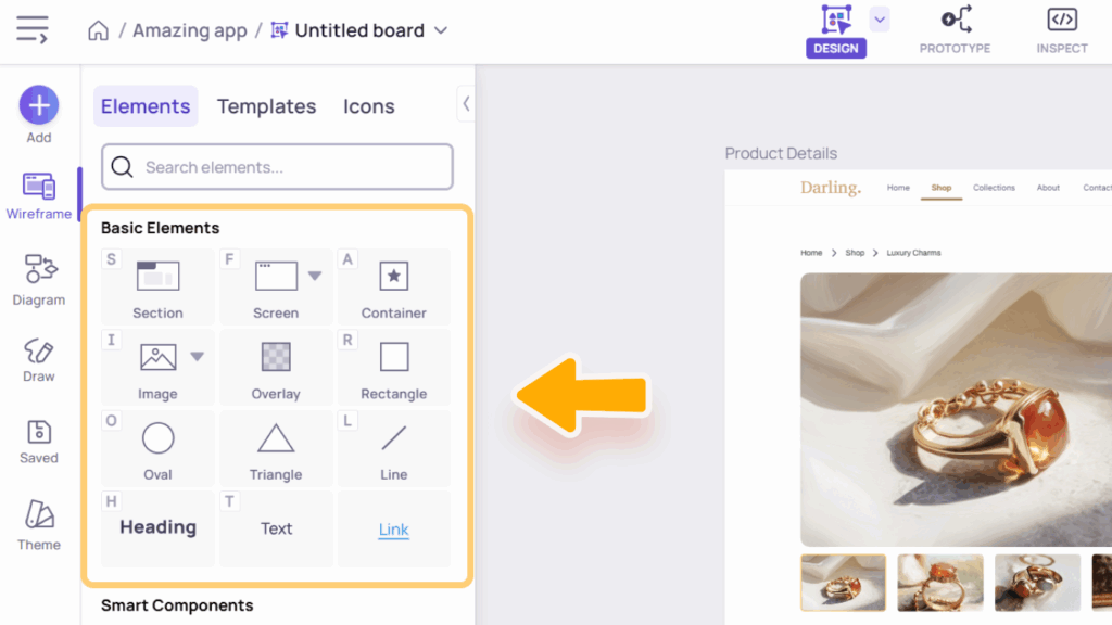
Basic Elements are the building blocks of your wireframes – simple, versatile items like text, shapes, and images.
Containing Items
- Section (S) – Defines a distinct area of your design.
- Screen (N) – Represents an entire screen layout.
- Container (A) – A special type of rectangle that automatically attaches any elements you drop inside it. Perfect for creating backgrounds for cards, forms, dialogs, and more. Learn more about Containers here.
Shapes
Shapes include Rectangle (R), Overlay, Oval (O), Line (L), and Triangle– essential elements for building structure and visual hierarchy in your wireframes.
Images (I)
By default, clicking the Image thumbnail opens the Image Library dialog. From here, you can:
- This Board tab: Upload, search, and select images that have been uploaded or previously used within the current board.
- Workspace Library tab: Upload, search, and select images from your workspace’s shared image library – available only on paid plans. Learn more about the Workspace Image Library.
- Pexels, Unsplash, and Pixabay tabs: Browse and use free stock images directly from these platforms.
- Generate with AI button: Create custom images using Visily’s built-in AI Assistant. Learn more.
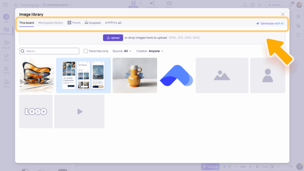
You can also click the arrow next to the thumbnail to quickly access these options, or to insert image/video placeholders.


Text
Text elements include Heading (H), Text (T), and Link, allowing you to add and style different types of text content in your wireframes.
Screen
Screen elements can be added in two ways: click the thumbnail directly to insert a default empty screen, or click the arrow next to it to open the screen size menu and choose a specific size.

Smart Components
Smart Components are pre-built interactive elements designed to help you quickly create realistic wireframes.
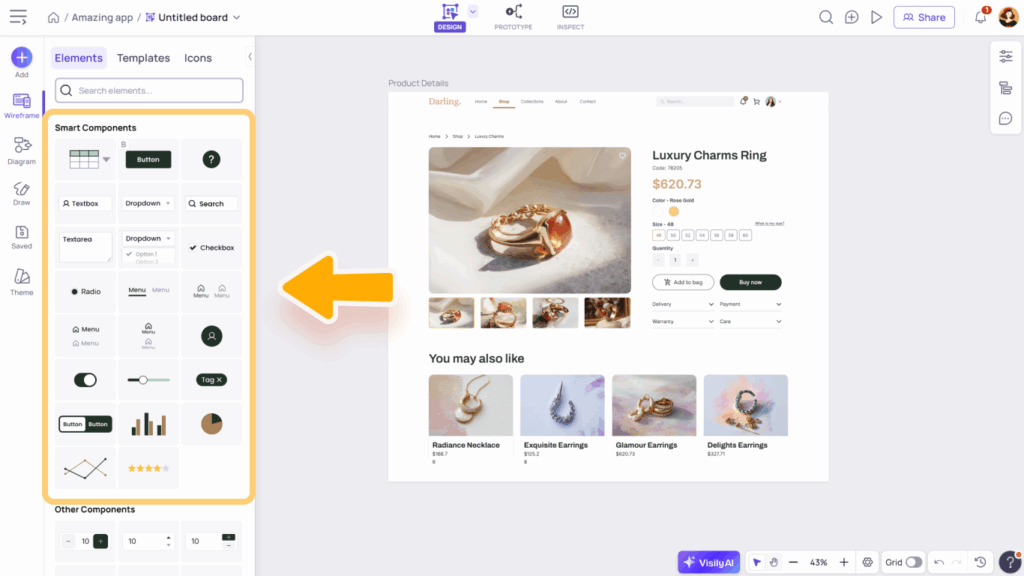
They include:
- Buttons: Button (B) and Icon Button
- Input Fields: Textbox (F), Search Box, Dropdown Button, and Textarea
- Selection Controls: Checkbox and Radio Button
- Navigation Components: Header Menu, Tab Bar Menu, Sidebar Menu, and Collapsed Sidebar Menu
- Other UI Elements: Avatar, Switch, Slider, Tag, and Button Group
- Charts: Column/Bar Chart, Pie Chart, and Line Chart
- Rating Component
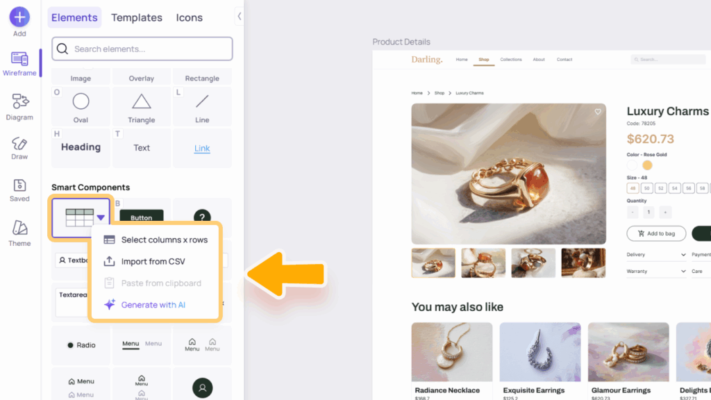
- Smart Table: Clicking the thumbnail directly adds a sample 5×5 table with placeholder data. Click the arrow next to the thumbnail to open additional options:
- Select Columns × Rows: Create a custom-sized table.
- Import from CSV: Upload data from a CSV file.
- Paste from Clipboard: Quickly paste copied table data. Visily supports pasting content directly from spreadsheets or CSV files into any table, column, or row.
- Generate with AI: Let Visily’s AI create a sample table based on your prompt.

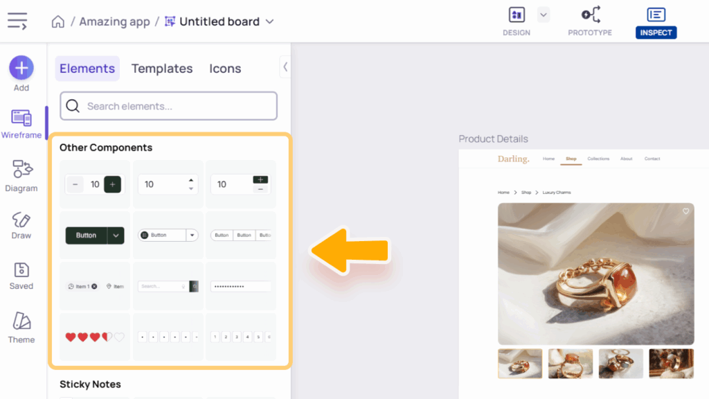
Other Components
Other Components include element-like templates that extend your design options beyond basic and smart components. Examples: Number Input, Split Button, Chips, Search Box with Button, Password Input Field, and OTP Input Field.
These components help you create richer, more detailed interface mockups that resemble real product interactions.
Sticky Notes and Connectors
Sticky Notes let you jot down ideas or comments for quick brainstorming and collaboration. Connectors link shapes and elements to show relationships and flows clearly. Use them together to organize and visualize ideas easily in Visily. Learn more about Diagram & Brainstorming in Visily.

Templates library
The Templates Library includes both Screen Templates and Component Templates to help you design faster and more efficiently.
- Screen Templates cover a wide range of layouts for both web and mobile – including categories like login/signup, admin dashboards, landing pages, and more. They provide a solid starting point for your design. When you click a Screen Template, Visily will open the Templates dialog, where you can browse, preview, and insert templates directly into your board.
- Component Templates help you build detailed interfaces quickly with ready-made elements such as cards, forms, menus, dialogs, tables, lists, charts, alerts, website blocks, and form controls.
You can access all templates from the Wireframe Library panel under the Templates tab. Use the search bar to find specific items or filter by screen size using the Web/Mobile toggle.
These templates save you time, keep your designs consistent, and speed up your workflow.
Icon library
Visily offers six built-in icon sets, providing thousands of icons for every design need. Each set includes its own styles, such as filled, outlined, two-tone, rounded, and sharp, giving you flexibility to match different design aesthetics.
- Nucleo Icons: A versatile set with clean, modern designs suitable for wireframes and polished interfaces.
- Material Icons: Google’s signature icon set, ideal for Android and web apps following Material Design guidelines.
- Phosphor Icons: A flexible, friendly set that supports multiple visual weights for both minimal and expressive styles.
- Remix Icons: A balanced collection featuring a mix of filled and outlined styles, perfect for general-purpose UI design.
- Boxicons: Simple and lightweight icons that work well for dashboards, admin panels, and data-driven apps.
- Lucide Icons: A community-driven fork of Feather Icons, offering crisp, elegant outlines great for modern interfaces.

Search Across Tabs
You can search from any tab in the Wireframe Library panel – whether you’re on Elements, Templates, or Icons.
Search results will appear across all tabs, allowing you to find and insert what you need without switching tabs. This makes browsing and adding components faster and more seamless.


