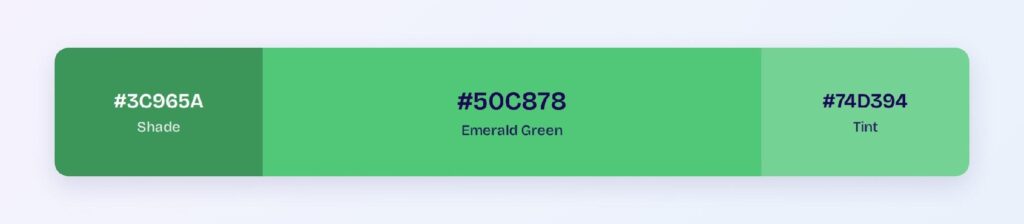
Emerald green’s HEX code is #50C878. It sits at hue 140 — green with a deliberate lean toward blue — at 52% saturation and 55% lightness, the recipe that gives it the jewel-toned brightness the gemstone is named for. Luxury brands, fintech products, and premium wellness apps reach for emerald when plain green feels too utilitarian.
Below you get every emerald code format, the five computed harmony palettes, exact WCAG contrast ratios — including one number that breaks most designers’ assumptions about emerald buttons — and the deployment patterns that keep the jewel tone compliant. Everything is computed from the hex.
What Color Is Emerald Green?
Emerald green is #50C878, with RGB rgb(80, 200, 120). Green dominates at 200, blue contributes 120, and red sits low at 80 — the bluish cast in that mix is exactly what separates emerald from grass green and gives it the cool, gem-like sparkle.
The name comes from the beryl gemstone, colored by trace chromium, and the digital color inherits its associations wholesale: luxury, vitality, prosperity, and renewal. Emerald was Pantone’s Color of the Year in 2013, which cemented its place in premium brand palettes.
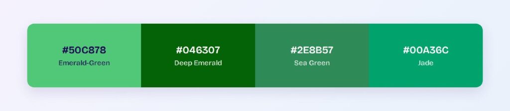
A note on codes: some references cite a deeper #046307 as emerald green. Both are real conventions — #50C878 is the bright jewel standard, and the deep version is what it becomes when products need a text-safe emerald. This article computes from #50C878 and shows where the deep variant takes over.
What Is the Difference Between Green and Emerald Green?
Web green (#008000) is pure hue 120 at 25% lightness — dark, warm, and structural. Emerald shifts twenty degrees toward blue and doubles the lightness. The result reads as precious rather than practical: green says go and grow; emerald says premium and flourish.
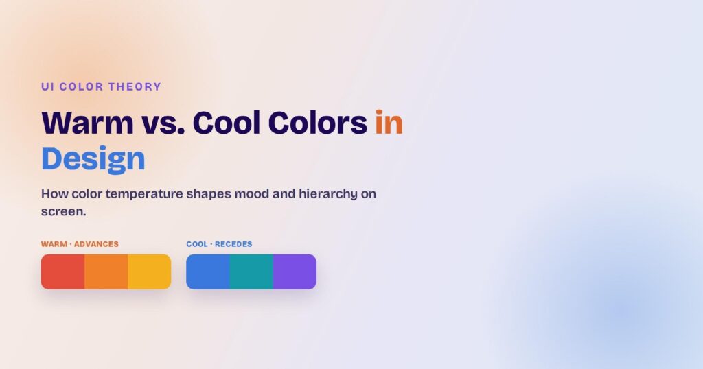
The functional difference matters for tokens: web green passes AA as a text color on white (5.14:1) while emerald fails (2.13:1). They are not interchangeable — emerald is an accent and surface color where green is a workhorse text color.
What Color Is Closest to Emerald?
Three neighbors frame it: jade (#00A36C) mutes and cools it, sea green (#2E8B57) darkens it toward the forest, and deep emerald (#046307) compresses it into text-safe territory. In gemstones, tsavorite and chrome tourmaline come closest to true emerald’s fire — on screens, jade is the nearest working substitute.
How Does Emerald Green Appear on Digital Screens?
Here’s the number that surprises: #50C878 with white text scores just 2.13:1 — a hard fail. The emerald button with white label text, one of the most common patterns in premium product design, is a measured accessibility failure.
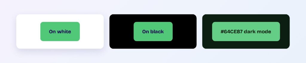
The fixes are computed and clean. On light themes, drop text-bearing fills to the dark variant #3C965A (3.68:1, large text) or further to a deep emerald for body-level compliance — or keep #50C878 fills and switch the label to dark ink. On black, emerald soars to 9.87:1, passing AAA.
Dark mode is emerald’s home field: the bright variant #64CE87 on the green-cast surface #0C1D12 reaches 8.93:1 — AAA with margin. Emerald text, icons, and data marks all work at body scale in dark themes.
What UI Elements Work Best with Emerald Green?
Emerald performs where its jewel energy is an asset and its contrast limits are respected.
Buttons and CTAs
Two compliant patterns: an emerald fill with near-black text (dark ink on #50C878 clears AA comfortably), or a deep-emerald fill with white text. Use #50C878 as the hover glow on the second pattern to keep the jewel visible. You can use Visily’s Theme feature to apply the pair across every button state.

Status Badges
Emerald owns success-with-status: payments cleared, plans upgraded, milestones hit. Deep emerald text on a pale mint tint (#A5E3BA territory) reads as achievement rather than mere confirmation.

Data Visualizations
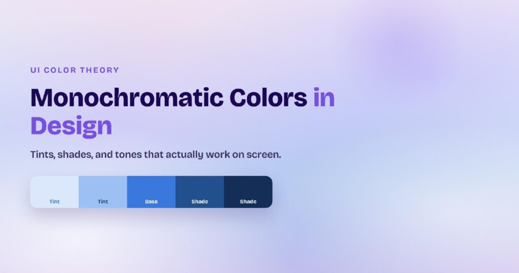
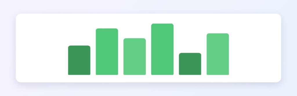
The monochromatic ramp from #A5E3BA through #50C878 down to #288045 gives sequential charts a lush, financial-growth feel. Emerald as the positive series against a neutral gray baseline is the classic wealth-app pattern.
Dark Mode Surfaces
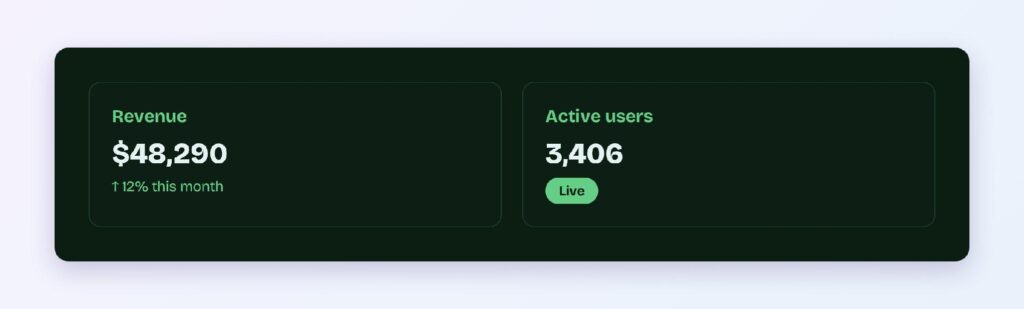
The #0C1D12 surface with #64CE87 accents delivers AAA contrast at body scale — a luxury few saturated brand colors offer. Dark-first products can run emerald as a full primary, not just an accent.
What Are the Best Emerald Green Color Palettes for UI?
Five harmony schemes come from emerald’s position at hue 140. Every value below is computed from #50C878.
Monochromatic
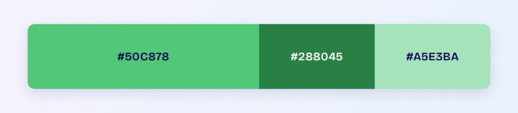
The set: #50C878, #288045, and #A5E3BA. One hue from mint to forest covers a complete system — the deep step handles text, the base handles accents, the pale step handles surfaces. This is the default luxury-green architecture.
Analogous
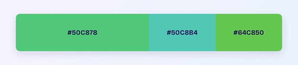
The set: #50C878 with #50C8B4 (toward teal) and #64C850 (toward lime). Three fresh neighbors at matched depth create a botanical range for wellness, sustainability, and organic-product brands.
Complementary
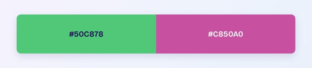
The set: #50C878 against #C850A0 — a vivid orchid pink, its computed opposite. The gemstone-against-gemstone pairing is bold and fashion-forward: reserve the orchid for the 10% accent layer where it can sparkle without exhausting the eye.
Triadic
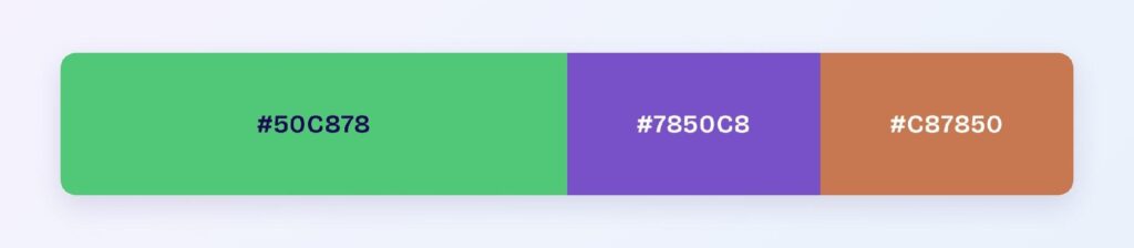
The set: #50C878, #7850C8 (amethyst violet), and #C87850 (terracotta). Three evenly spaced hues at matched saturation build a rich, editorial palette for content platforms and premium marketplaces.
Split-Complementary
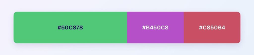
The set: #50C878 with #B450C8 and #C85064. You keep the pink-violet contrast with softer landings — the choice when full orchid feels too electric for the brand.
Which Is the Prettiest Shade of Green?
Emerald consistently tops design surveys, and the math explains why: at 55% lightness and 52% saturation it hits the vividness sweet spot — saturated enough to sparkle, light enough to stay luminous, and blue-shifted enough to feel cool and precious. Forest green reads serious, lime reads loud; emerald reads valuable.
For interfaces, prettiest still has to pass contrast. The working answer is a pair: #50C878 for the sparkle, its deep variant for the text — beauty and compliance split across two tokens.
Which Colors Pair Best with Emerald Green?
The computed best partner is #C850A0, the orchid complement. Beyond it, emerald’s classic companions are gold, cream, charcoal, and navy — the palette of every luxury package design. Gold in particular amplifies the gemstone story.
Structure it with the 60-30-10 split: 60% cream or charcoal surfaces, 30% emerald for structure and key components, 10% gold or orchid for the flourish. Emerald-on-charcoal with gold accents is the strongest premium dark theme available.
Which Colors Should You Avoid Pairing with Emerald Green?
Avoid the near-neighbors #50C8AA and #5AC850. They sit within 45 degrees at emerald’s exact lightness, so boundaries shimmer instead of resolving.
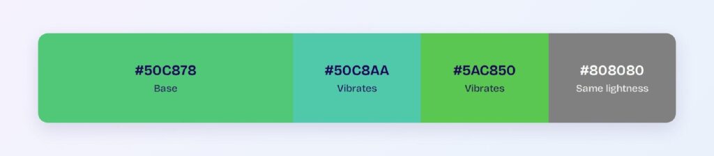
White text on emerald is the other measured failure at 2.13:1 — the single most common emerald mistake in production interfaces. Mid-grays at emerald’s lightness also merge with it.
Does Emerald Green Meet Accessibility Standards?
As deployed by most teams, no — but the fix is simple. #50C878 fails white-text duty at 2.13:1 against the WCAG AA threshold of 4.5:1. Compliance comes from the split-token pattern: deep emerald for text roles, bright emerald for fills with dark labels, and either on dark surfaces where the ratios flip to AAA.
Emerald sits inside the red-green confusion range affecting roughly 1 in 12 men with deuteranopia or protanopia, and its blue lean only partially protects it. Never let emerald alone separate success from failure states — pair the color with icons or labels.
How Can You Convert Emerald Green Between HEX, RGB, HSL, CMYK, and Other Color Formats?
All six formats describe the same color:
- HEX #50C878 — the default for CSS and design tokens.
- RGB rgb(80, 200, 120) — use RGBA for translucent jewel overlays.
- HSL hsl(140, 52%, 55%) — programmatic shifts; the deep text variant is a lightness move away.
- HSB 140, 60, 78 — what Figma’s and Photoshop’s pickers show.
- CMYK 60, 0, 40, 22 — heavy cyan in print; expect emerald to dull slightly on paper, so proof before committing.
Wrapping Up
Emerald green (#50C878) earns its jewel reputation with numbers attached: AAA contrast on dark surfaces at 9.87:1, an 8.93:1 dark mode accent, harmony palettes that stretch from botanical to editorial — and one hard rule, no white text on the bright base. Split the token, respect the ratio, and emerald delivers luxury that passes an audit.
Put it to work in Visily‘s Theme feature: load the emerald ramp, add the gold accent, and ship a jewel-toned interface today.