Skeuomorphism is a design style where digital elements imitate the look, texture, and feel of real-world objects, so a note-taking app looks like a paper notepad and a save button looks like a floppy disk. Those familiar cues help people understand a new interface fast, because it looks like something they’ve already used.
The style defined the early smartphone era, then fell out of fashion when Apple switched to flat design in 2013. It never fully left, though, and a more restrained version is making a comeback in 2026.
In this blog, I’ll cover what skeuomorphism is, where it came from, its pros and cons, how it compares to flat design and neumorphism, and when it still earns a place in a modern UI.
What Is Skeuomorphism in Design?
Skeuomorphism is a design approach that gives digital objects the appearance of their physical counterparts, using texture, shadow, and three-dimensional detail. It’s one of the older principles of design in software, because it borrows meaning from the physical world so users don’t have to learn a new visual language from scratch.
The core idea: digital mimics physical
At its heart, skeuomorphism copies the visual traits of a real object onto a screen. Wood grain, leather stitching, metal sliders, and drop shadows all signal that a thing behaves like its real-world version. The closer the resemblance, the less explaining an interface needs.
The Greek roots
The word comes from the Greek skeuos, meaning tool or vessel, and morphe, meaning shape. Put together it means “tool shape,” an object that keeps the form of the thing it replaced. You pronounce it skew-uh-more-fizm.
Skeuomorphs as affordances
A skeuomorph works because it creates an affordance, a visual hint about how to use something. A raised, glossy button looks pressable, so people press it. The style turns appearance into instruction.
What Are Some Examples of Skeuomorphism?
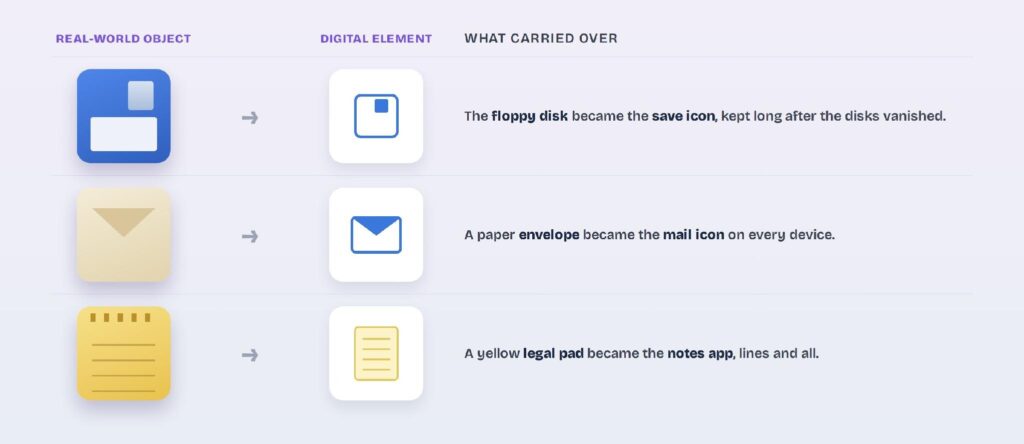
The most famous example of skeuomorphism is the save icon, still shaped like a floppy disk decades after the disks disappeared. Once you spot the pattern, skeuomorphs are everywhere in the interfaces you use daily.
The floppy-disk save icon
The save icon is the textbook case: a tiny floppy disk that many users have never physically held. It survives because the shape now means “save,” not “floppy disk,” so plenty of app icons still lean on the trick. The metaphor outlived the object.
Apple’s early mobile apps
Apple’s first iOS apps were the high point of the style. Notes looked like a yellow legal pad, Calendar wore stitched leather, and the calculator used plastic keys that pressed inward. Each app copied the object it replaced.
Everyday digital skeuomorphs
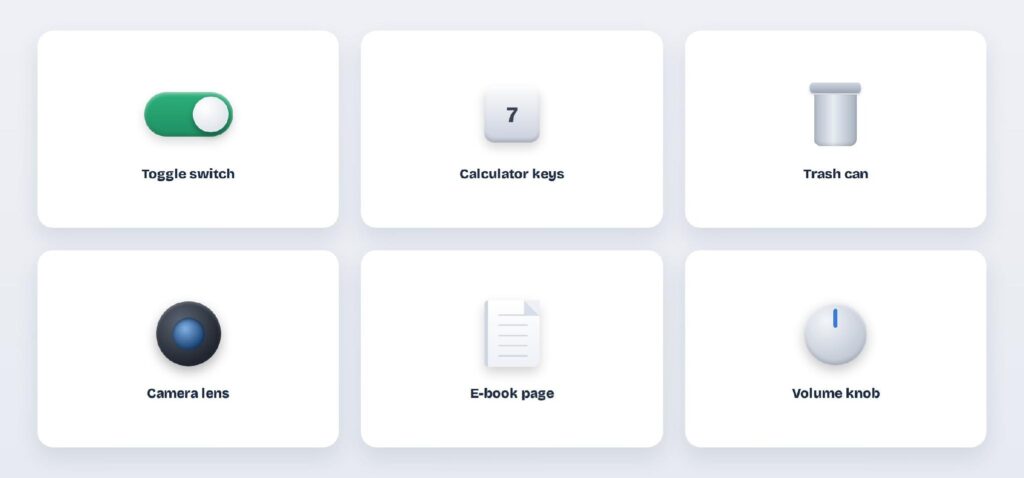
Beyond Apple, the pattern is constant. Toggle switches mimic light switches, the trash can holds deleted files, e-readers flip pages, and a camera app plays a shutter sound with no shutter. The digital world keeps borrowing from the physical one.
Where Did Skeuomorphism Come From?
Skeuomorphism came from a simple need: early digital interfaces had to teach people who had never used them. Making software look like familiar objects lowered that learning curve, and Apple pushed the approach further than anyone.
Apple and Steve Jobs
Steve Jobs was a strong advocate for realistic, tactile interfaces, and Apple built the philosophy into early iOS. Rich textures and lifelike icons made the first iPhone approachable to people new to touchscreens, and the approach shaped how designing iPhone apps looked for years. Realism was a teaching tool.
The iOS 7 flat turn
In 2013, Apple announced iOS 7 and dropped the heavy realism for flat design, a moment often called the death of skeuomorphism. Screens had grown bigger and sharper, users had learned the conventions, and the textures started to feel dated. Flat took over the industry.
Why it never fully disappeared
Even after the flat turn, the core skeuomorphs stayed. The save icon, the trash can, and toggle switches all survived because their meanings had stuck. The style receded, but its most useful pieces remained.
What Are the Pros and Cons of Skeuomorphism?
Skeuomorphism’s biggest strength is instant familiarity, and its biggest weakness is clutter. The Nielsen Norman Group notes that realistic cues lower the learning curve for unfamiliar interactions, which is exactly where the style pays off, and exactly why it becomes redundant once users know their way around.
| Pros | Cons |
| Instantly familiar, so there’s less to learn | Adds visual clutter to the screen |
| Clear affordances: things look pressable | Takes up more space than flat elements |
| Warm, tactile, human feel | Can look dated as conventions shift |
| Great for onboarding new users | Redundant once users learn the app |
The learning-curve payoff
Familiarity is the whole point: a control that looks like its real-world twin needs no instructions. That taps straight into psychology in UI/UX design, where recognition beats recall every time. For first-time users and unfamiliar interactions, that head start is worth a lot.
The clutter cost
Realistic textures eat screen space and attention, and they age badly as visual conventions move on. Heavy skeuomorphism can also fight readability and UI design best practices, since decoration competes with content. Once people have learned the app, the ornament is pure overhead.
How Does Skeuomorphism Compare to Flat, Neumorphism, and Neo-Skeuomorphism?
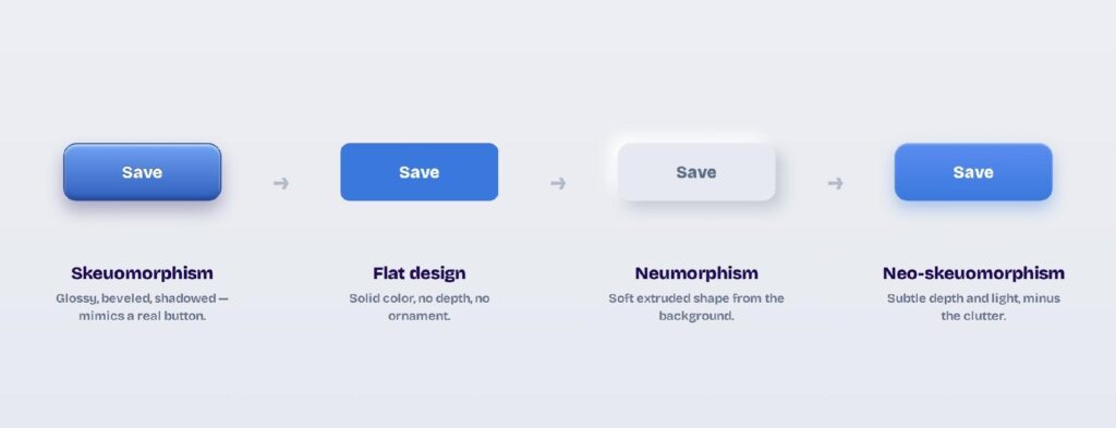
Skeuomorphism, flat design, neumorphism, and neo-skeuomorphism are points on a spectrum from full realism to none and back to subtle depth. Where a style sits on that visual design scale decides how much the interface leans on real-world cues.
Skeuomorphism vs. flat design
Flat design strips away texture, shadow, and gradient, leaving solid color and clean shapes. Where skeuomorphism imitates the real world, flat design ignores it and relies on labels and layout for clarity. Flat scales better across screen sizes; skeuomorphism explains itself better to newcomers.
Skeuomorphism vs. neumorphism
Neumorphism is a softer descendant, where elements look gently extruded from the background using two-tone shadows. It keeps a hint of skeuomorphism’s depth without the literal textures. The catch is contrast: neumorphic controls can be hard to see and often fail accessibility checks.
The rise of neo-skeuomorphism
Neo-skeuomorphism blends the two eras: real-world depth and tactility applied with flat design’s restraint. Think subtle gradients, soft shadows, and light physical hints instead of leather and wood. It’s the version quietly returning to modern interfaces.
Here’s how the four styles line up side by side:
| Style | Look | Depth and realism | Best for |
| Skeuomorphism | Textures, gradients, real-world detail | High | Onboarding, tactile and audio apps |
| Flat design | Solid color, clean shapes, no ornament | None | Content-heavy, responsive UIs |
| Neumorphism | Soft shapes extruded from the background | Low, often low-contrast | Minimal, single-accent dashboards |
| Neo-skeuomorphism | Subtle depth and light, restrained | Medium | Modern tactile UIs that still feel clean |
Is Skeuomorphism Still Relevant?
Yes, skeuomorphism is still relevant and used today, just more selectively. The full-leather look is gone, but its principles show up wherever a UI needs to feel familiar or tactile, and a restrained revival is underway.
Relics that never left
The most useful skeuomorphs are still everywhere: the save icon, toggle switches, the trash can, and drag-and-drop cards that mimic paper. Users rely on these metaphors without noticing them. They stuck because they work.
The neo-skeuomorphism revival
A subtler realism is trending again in 2026, driven by better screens, spatial interfaces, and a reaction to years of flatness. Designers are reintroducing depth, soft shadows, and tactile detail in measured doses, and it shows up across current design trends. Depth is back, minus the kitsch.
Tasteful skeuomorphism today
The rule now is restraint: use a real-world cue when it teaches something, and skip it when it’s just decoration. Realism earns its place in onboarding, audio and music apps, games, and controls people don’t expect. Everywhere else, clarity wins.
How Do You Design Skeuomorphic UI in Visily?
You design skeuomorphic touches in Visily by starting from a theme, then adding the depth cues, shadows, and rounded surfaces that make elements feel tactile. Visily is an AI UI design tool, so you can apply a consistent level of realism across every screen at once.
Start from a theme and set the depth
Generate a project theme, then decide how much realism the product needs. Visily’s theme covers colors, shadows, border radius, and more, so you can dial depth up for a tactile feel or down for a flatter one. Set the tone once and it carries across the app.
Add shadow, gradient, and rounded depth
Use shadows, subtle gradients, and generous corner radius to give buttons and cards a soft, pressable quality. That’s the neo-skeuomorphic sweet spot: enough depth to feel physical, not so much it clutters. Preview it on real components as you go.
Prototype and export the design
Turn the design into a clickable prototype to test whether the tactile cues actually help users. When it’s ready, export to Figma, PDF, PNG, or code, and everything starts on the free plan.
Wrapping Up
Skeuomorphism is a tool, not a relic. Borrow from the real world when a familiar cue makes an interface easier to grasp, and drop it when it only adds weight. Neo-skeuomorphism is the modern balance: depth and tactility without the clutter.
Visily makes that easy to apply. Generate a full project theme from a keyword, screenshot, or URL, then use design tokens, Magic Theme, and adjustable shadows and corner radius to dial realism up or down across every screen at once.
When it’s ready, prototype the flow and export to Figma, PDF, PNG, or code. Open Visily’s free Starter plan and start designing today.