Analogous colors are three to five hues that sit side by side on the color wheel, like blue, blue-green, and green, and they give a UI variety without the clash. Most multi-color interfaces look noisy because the hues get picked at random, so nothing ties them together.
Analogous palettes fix that by staying in one neighborhood of the wheel.
The hues share an undertone, so they blend into a calm, natural flow while still letting you color-code sections, states, and data. An analogous color scheme uses one dominant hue plus its immediate neighbors, kept in balance so no single color fights for attention.
In this blog, I’ll show you how analogous colors sit on the color wheel, how to build a harmonious palette for a UI, when to pick analogous over other schemes, and how to ship one in minutes.
What Are Analogous Colors in Design?
Analogous colors are groups of three to five hues that sit next to each other on the color wheel and share a common undertone. You take one hue, step a little in each direction, and every color you land on belongs to the same family.
That shared undertone is why analogous palettes read as calm and natural instead of busy. The colors differ enough to separate elements, but not enough to clash.
Neighbors on the color wheel
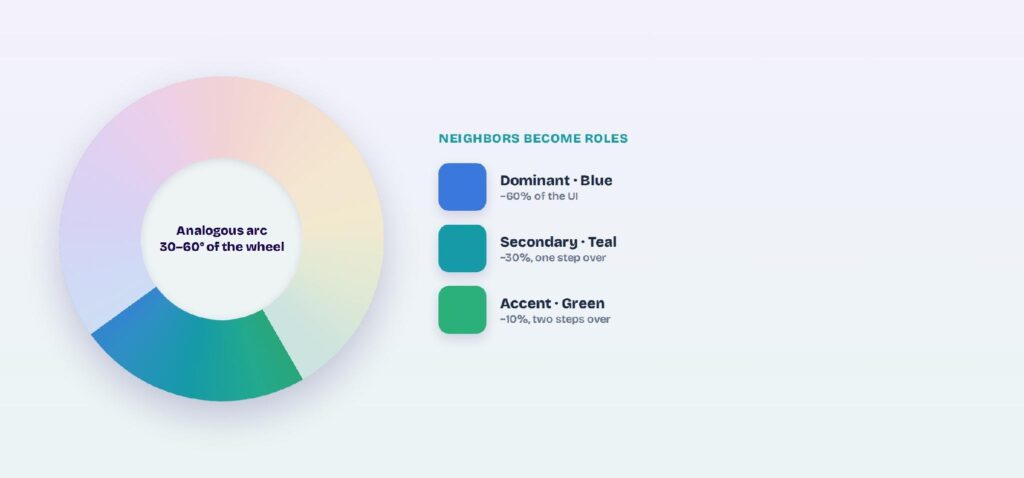
The color wheel arranges hues in a circle, and analogous colors are any run of adjacent slices on it. A typical analogous set spans 30 to 60 degrees, three neighbors like blue, blue-green, and green. Step too far and the colors stop sharing an undertone, which is where harmony breaks.
Dominant, secondary, and accent
Every analogous palette needs a hierarchy, not three equal colors. Pick one hue as the dominant, one neighbor as the secondary, and a third as the accent. That structure keeps the palette from looking like three colors competing for the same job.
Warm and cool analogous sets
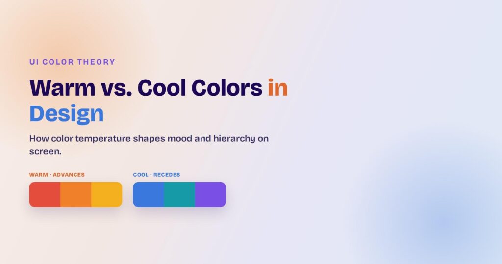
Analogous sets usually lean fully warm or fully cool, which sets the mood before any content loads. Warm runs like red, red-orange, and orange feel energetic; cool runs like blue, blue-green, and green feel calm and professional. Stay on one side of the wheel so the undertone holds.
How Do You Build an Analogous Palette for a UI?
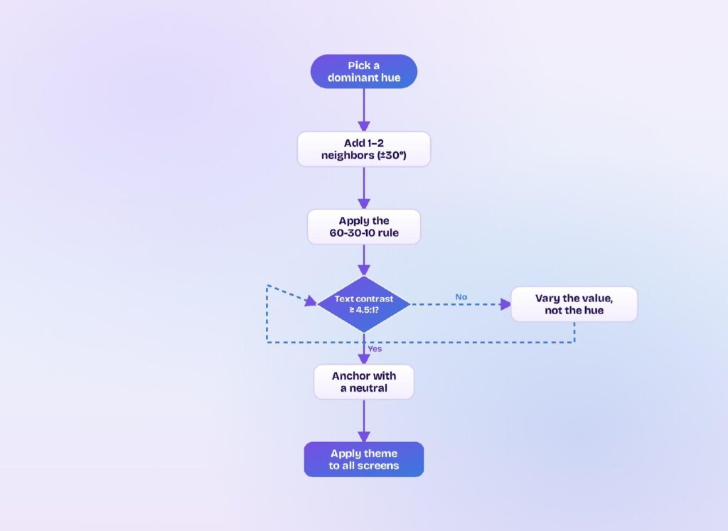
You build an analogous palette by picking one dominant hue, stepping to one or two neighbors on the wheel, then splitting them by the 60-30-10 rule. Three related hues is plenty; add a fourth or fifth only if you keep most of the screen on the dominant.
A UI palette also needs value contrast the hue shift alone can’t give you, so plan light tints and dark shades of each hue for text and surfaces.
Pick a dominant hue
Choose the hue that carries your brand and most of the interface, then set it as the base everything else steps away from. This dominant hue should cover roughly 60% of the screen, so pick the one you want users to feel first. Everything downstream inherits its warm or cool bias.
Add one or two neighbors
Step about 30 degrees along the wheel in one or both directions to grab your neighbors. One neighbor gives a tight, subtle palette; two give more range for charts and categories. Keep every hue on the same warm or cool side so the shared undertone stays intact.
Balance with the 60-30-10 rule
Split the palette 60% dominant, 30% secondary, and 10% accent so one hue clearly leads. The 60-30-10 rule is what stops an analogous scheme from turning into three colors shouting at once. Reserve the 10% accent for the primary action and nothing else.
What Does an Analogous Palette Look Like on Screen?
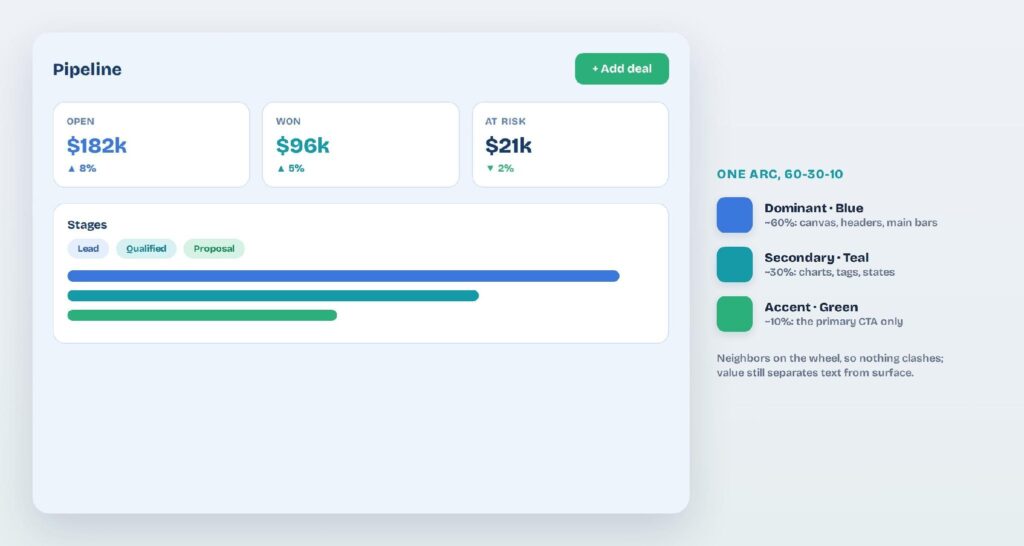
On screen, an analogous palette gives the dominant hue to the canvas and main elements, the neighbor to secondary elements like charts and tags, and the accent to the single most important action. The hues shift, but value still does the heavy lifting for text and surfaces.
Analogous works especially well for dashboards and data, where you need several colors that read as one family. Here are three sets you can copy, dominant to accent:
- Cool (blue → teal → green): #3A78DD #159AA8 #2BB07A
- Warm (red → orange → amber): #E24D3C #F0812A #F4B01E
- Fresh (green → yellow-green → yellow): #2FA36A #86B93C #E7C21E
Cool blue-to-green UI
Cool analogous runs suit finance, analytics, and productivity tools that need calm authority. Blue leads, teal handles secondary charts and tags, and a green accent marks the primary action. Because all three share a cool undertone, dense dashboards stay readable instead of frantic.
Warm sunset UI
Warm runs from red through orange to amber bring energy, which fits food, social, and lifestyle products. Orange leads as the dominant, red-orange backs it, and amber accents. Warm hues dim faster on light backgrounds, so lean on deeper shades for text.
Fresh green-to-yellow UI
Green anchors a green-to-yellow set that reads as natural and optimistic, common in wellness, sustainability, and learning apps. Yellow-green supports it, and yellow accents sparingly since it strains at small sizes. Pair the run with plenty of neutral space so it doesn’t feel loud.
Why Do Analogous Palettes Feel So Harmonious?
Analogous palettes feel harmonious because neighboring hues share wavelengths and an undertone, so the eye reads them as one connected family instead of separate colors. You get variety and cohesion at the same time, which is exactly what a multi-section UI needs.
Natural, low-contrast flow
Colors that sit together on the wheel appear together in nature, from sunsets to forests, so the brain accepts them as belonging. That low-contrast flow feels restful, which is why analogous schemes suit content-heavy screens people stare at for a long time.
Built-in color coding
Three related hues let you label categories, statuses, and data series without dropping in a jarring color. Users tell a teal chart from a blue one at a glance, yet the screen still feels unified. You get functional color coding without the visual noise.
Cohesive, on-brand mood
One warm or cool family keeps every screen tied to the same mood and brand feeling. It removes the guesswork of whether two colors go together, since neighbors are guaranteed to harmonize. Your product looks intentional across every view.
When Should You Choose Analogous Over Other Color Schemes?
Choose analogous when you want more than one color but still need harmony, and pick a higher-contrast scheme when elements have to pop apart. Analogous trades contrast for cohesion, so it wins for calm, unified interfaces and loses where you need loud separation.
Analogous vs. monochromatic
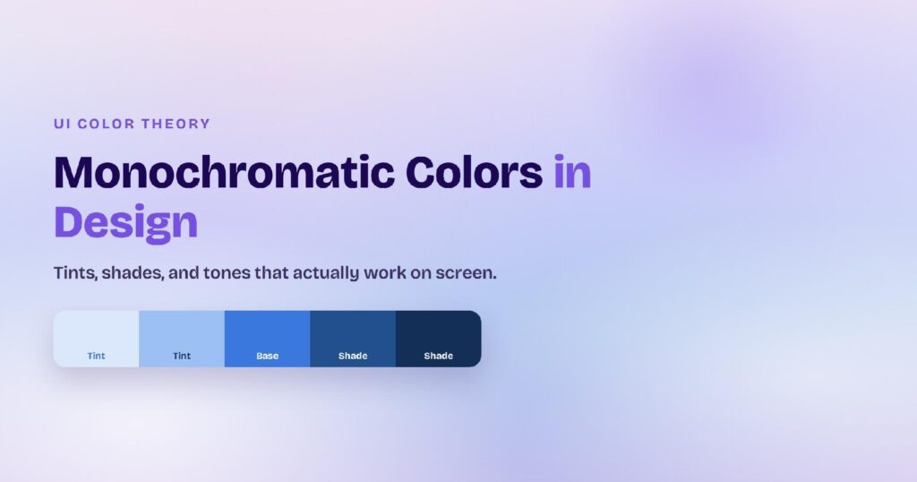
Monochromatic uses one hue across its tints, shades, and tones; analogous uses several neighboring hues. Reach for analogous when a single hue feels too flat and you want gentle variety across sections, while keeping much of the harmony a one-hue palette gives you.
Analogous vs. complementary
Complementary schemes pair opposite hues on the wheel for maximum contrast, which reads as bold but can feel harsh across a whole UI. Analogous is the calmer choice; use complementary colors instead when a single element has to stand out sharply, like a warning or a hero CTA.
Analogous vs. triadic and split-complementary
Triadic schemes spread three hues evenly around the wheel for vivid, high-energy interfaces. Pick analogous when you want a serene, unified feel rather than that spread.
Split-complementary schemes pair your hue with the two neighbors of its opposite for contrast that’s bold but less harsh. Pick these when distinct sections each need a loud, separate identity.
Where Do Analogous Palettes Break, and How Do You Fix Them?
Analogous palettes break when the neighboring hues sit too close in value, so text smears into its background and sections blur together. Neighboring hues can’t really clash; the risk is low contrast, not disharmony, and three fixes handle it.
Fix low text contrast
Low contrast is the built-in risk of analogous colors, since neighbors share lightness as well as hue. The WCAG accessibility standard sets a minimum 4.5:1 contrast ratio for normal text and 3:1 for large text, a foundational benchmark you can measure against. Put text on a much darker or lighter value than its background, never on an adjacent hue at the same value.
Vary value, not just hue
Shift lightness across the palette so the hues don’t all read at the same weight. Give each hue its own light tint and dark shade, then rank elements by value instead of color. This is the fix for the “everything looks the same” complaint analogous schemes attract.
Anchor the palette with a neutral
Add a neutral like white, gray, or near-black to give the eye a resting place. Neutrals stop three related hues from feeling busy and carry your body text and backgrounds. One strong neutral does more for an analogous UI than a fourth hue.
How Do You Create Analogous Themes in Visily?
You create an analogous theme in Visily by generating a project theme from your dominant hue, then editing the palette so its neighbors and accent land in the right roles. Visily is an AI UI design tool, so the palette applies across every screen at once instead of swatch by swatch.
Generate a theme from a hue or keyword
Visily builds a full project theme, covering colors, fonts, spacing, shadows, border radius, and icon set, that auto-applies to every screen. You can generate one four ways:
- From keywords that describe your app.
- From a prebuilt theme in the library.
- From a screenshot you upload.
- From the URL of an app or site you like.
Feed it your dominant hue, and Visily returns a starting palette you can nudge toward its neighbors.
Fine-tune the analogous palette
Edit, add, or remove colors, then pull from Visily’s color recommendations and pre-made palettes to set your dominant, secondary, and accent. Magic Theme reskins the whole app in one click, so you can test a warmer or cooler neighbor in seconds.
Apply and export the theme
Visily applies your theme’s design tokens across the entire project at once, so the 60-30-10 split stays consistent on every screen. Export straight to Figma, PDF, PNG, or code, or pull the theme into Tailwind and inspect the CSS variables. Everything starts on the free plan.
An analogous palette gives you several colors that still feel like one family, so a UI reads as varied and calm at the same time. Visily turns that into a few clicks: generate a theme from your dominant hue, balance the neighbors with the 60-30-10 rule, and apply it across every screen. Sign up for Visily’s free Starter plan and build your first analogous theme today.