Monochromatic colors are one base hue stretched across its tints, shades, and tones, and in an interface they decide whether a screen feels calm or just flat. Most single-color UIs fail the same way: every element lands at nearly the same lightness, so buttons, cards, and text blur into one wash.
Space those values wrong and the palette reads as a gray smear with no hierarchy. Space them right and one hue can carry a whole product: background, surface, primary action, and text, all pointing the same direction. A monochromatic scheme uses a single hue from the color wheel, varied only by lightness (tints and shades) and saturation (tones), never by mixing in a second hue.
In this blog, I’ll show you how tints, shades, and tones actually behave on screen, what a monochromatic palette looks like on real UI, when to pick it over other color schemes, and how to build one in minutes.
What Are Monochromatic Colors in Design?
Monochromatic colors are variations of a single hue, changed only by how much white, black, or gray you mix in. You hold the hue fixed and move its value and saturation. One hue, many values: that’s the whole rule.
A monochromatic color scheme applies that rule to a design. Instead of pairing different colors, you assign each value of one hue a different job on the screen.
The base hue
Your hue is the pure color you start from, its position on the color wheel before any white or black touches it. In UI terms, it’s your brand’s primary color, usually stored as a hex or HSL token. Lock the H value in HSL and every swatch after it stays in the same family.
Tints, shades, and tones
Three moves turn one hue into a full ramp:
- Tint — hue plus white, so the color gets lighter (a pale blue page background).
- Shade — hue plus black, so the color gets darker (a deep navy header).
- Tone — hue plus gray, so the color gets muted (a softer, desaturated surface).
Tints, shades, and tones are the only levers you pull. The hue never changes; only its lightness and saturation do.
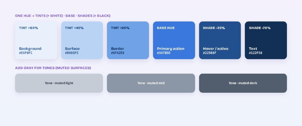
Monochrome vs. monochromatic
“Monochrome” and “monochromatic” get swapped constantly, but they aren’t the same word. Monochrome usually means grayscale or a single flat color, with black-and-white photography as the classic case. Monochromatic means one hue expressed across many tints, shades, and tones.
Every monochromatic palette starts from one hue. Not every monochrome image has a hue at all.
How Do You Build a Monochromatic Palette for a UI?
You build a monochromatic palette by locking one hue and generating a ramp of five to seven values from it, light tints down to dark shades. The ramp is the palette. Each step becomes a role: background, surface, border, text, action.
A usable ramp needs visible gaps between steps so a button never sinks into its background.
Pick a base hue
Choose the one hue everything else derives from, usually your brand primary. Set its H value in HSL so it can’t drift as you generate lighter and darker steps. This single decision fixes the mood of the entire interface before you place a single component.
Match the hue to the mood
Your base hue sends an emotional signal before a single word gets read, so pick it for the feeling your product should carry. Color psychology gives you a quick map:
- Blue signals calm, trust, and focus, which is why finance and productivity apps lean on it.
- Green reads as growth, health, and nature, a fit for wellness and sustainability products.
- Purple feels premium and creative, common in beauty and design tools.
- Red and orange carry energy and urgency, useful for deals, food, and alerts.
- Gray stays professional and timeless, the safe pick for enterprise dashboards.
Choose the hue that matches the job first. You’ll shape its tints and shades next.
Generate tints, shades, and tones
Mix white into the base for lighter tints and black for darker shades. A clean starter ramp is five swatches: two tints, the base, and two shades. Those five are your “five monochromatic colors,” the minimum set most UIs need to separate background, surface, action, and text. Add one or two gray-muted tones for calmer surfaces where you don’t want full saturation.
Space the value steps
Even spacing separates a usable ramp from a muddy one. Put a clear lightness gap between each step so text, surfaces, and actions stay distinct at a glance. If two neighboring swatches look identical when you squint, delete one and widen the gap.

What Does a Monochromatic Palette Look Like on Screen?
On screen, a monochromatic palette gives each value a job: darkest for text, mid-range for primary actions, lightest for backgrounds. One hue ends up doing the work of a whole color system.
A monochromatic scheme isn’t two hues. When people ask about “monochromatic for two colors,” they usually mean one hue shown in two values, like a light-blue card with a dark-blue label. Both swatches share the same H; only lightness changes.
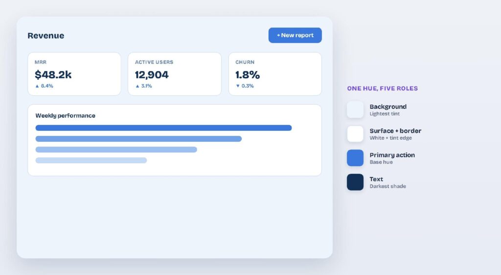
A monochromatic blue dashboard: a single hue handles background, surface, primary action, and text, with a legend mapping each value to its role.
Blue monochromatic UI
Blue is the safest starting hue because it stays legible across a wide value range. A dashboard might use a pale blue canvas, mid blue for primary buttons, and navy blue for headings, letting value alone rank every element. Blue also earns the trust signal covered under Match the hue to the mood.
Neutral grayscale UI
Neutrals like gray, off-white, and near-black are monochrome in the truest sense, which answers what colors count as monochrome. A grayscale UI signals hierarchy through elevation, spacing, and weight instead of color. Add one accent later and the whole interface snaps into focus.
Green and warm-hue UIs
Green, teal, and earthy hues suit content-first screens where you want a softer read than blue. The value logic stays identical: light tints for surfaces, deep shades for text. Warm hues like terracotta or olive lower the contrast ceiling, so lean harder on your darkest shade for legible text.
Three monochromatic ramps you can copy, light tint to dark shade:
- Blue: #E8F0FC #B9D3F5 #3A78DD #22508F #122F56
- Slate: #F1F3F6 #CBD2DC #8B96A6 #525D6E #1F2733
- Green: #E9F5EE #B7E0C6 #3F9E68 #2A6B47 #163A27
Why Do Monochromatic Interfaces Feel So Cohesive?
Monochromatic interfaces feel cohesive because every element shares one hue, so nothing clashes and the eye reads the screen as a single system. Designers reach for a single hue whenever consistency and calm matter more than variety, from branding to data-heavy dashboards.
Built-in visual hierarchy
Value does the ranking when the hue is fixed. Darker elements read as more important, lighter ones recede into the background, and your ramp hands you that hierarchy for free. You spend zero effort deciding whether two colors “go together.”
Brand consistency and focus
One hue keeps a product consistent from screen to screen and ties every view back to your brand color. It also removes the constant “do these clash?” question, so you ship faster and the interface stays recognizable.
Calm, low-noise screens
A single hue lowers visual noise, which helps on data-dense dashboards, reading apps, and focus tools. Users process one screen at a time without competing colors fighting for attention. Less chrome, more content.
When Should You Choose Monochromatic Over Other Color Schemes?
Choose a monochromatic scheme when cohesion and calm matter more than separating content by color. Every other scheme adds hues, which buys variety at the cost of the effortless unity one hue gives you. The main alternatives each trade that unity for a different payoff.
Analogous color schemes
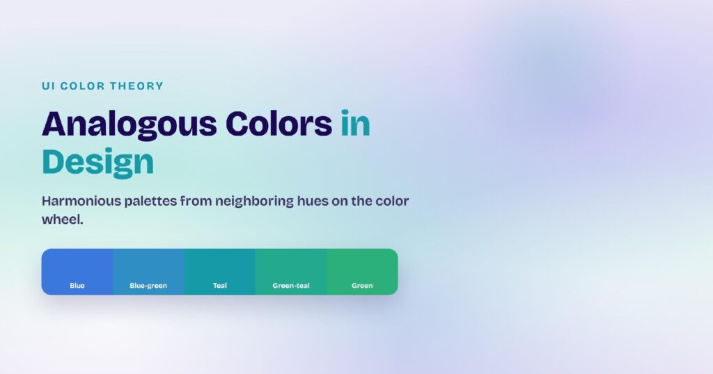
Analogous schemes use three hues that sit next to each other on the color wheel, like blue, blue-green, and green. They keep much of a single hue’s harmony while adding gentle variety. Pick analogous over monochromatic when a UI needs to separate a few content types but still feel unified.
Complementary color schemes
Complementary schemes pair your hue with the one opposite it on the wheel for maximum contrast. That contrast is loud across a whole interface, so complementary colors work best as a single accent inside a monochromatic palette, which is exactly the move in Add one accent color below.
Triadic and split-complementary schemes
Triadic schemes spread color across three evenly spaced points on the wheel for vivid, high-energy interfaces. They suit playful, category-heavy products, not the restrained look monochromatic delivers.
Split-complementary schemes soften that by pairing your hue with the two neighbors of its opposite. Pick a monochromatic scheme when you want one calm system; pick these when distinct sections each need their own color.
But where does a single-hue palette break down?
Where Do Monochromatic Palettes Break, and How Do You Fix Them?
Monochromatic palettes break when the values sit too close together: text loses contrast, sections go flat, and the UI reads as one blur of color. Four fixes handle almost every case.
Fix weak contrast
Low contrast between text and background is the most common failure. The WCAG accessibility standard sets a minimum 4.5:1 contrast ratio for normal text and 3:1 for large text, a foundational benchmark for readable interfaces. Widen the lightness gap between your text shade and your background tint until the pair clears it.
Add one accent color
A strict monochromatic scheme can bury the primary action, so break the rule on purpose. Add a single accent hue for calls to action and alerts. The 60-30-10 rule keeps it disciplined: 60% base hue, 30% secondary value, 10% accent. A complementary accent, covered under Complementary color schemes above, gives the sharpest contrast.
Warm or cool the undertone
A pure gray or a cold hue can feel lifeless, so shift its undertone to set the mood. Mix a trace of red or yellow into a neutral to warm it, or a touch of blue to cool it. The hue barely moves, yet the whole palette reads warmer or calmer. Test the shift first, since even a small undertone change alters how the interface feels.
Break up flat sections with texture
Add depth without adding hue when a screen goes flat. Shadows, borders, and generous spacing separate a card from its background even when both share the same color. Elevation and a one-pixel border do more for a monochromatic layout than any extra swatch.
How Do You Create Monochromatic Themes in Visily?
You create a monochromatic theme in Visily by generating a project theme from one hue, then editing its palette until every value has a job. Visily is an AI UI design tool, so the whole ramp applies to your screens at once instead of swatch by swatch.
Generate a theme from a keyword or URL
Visily builds a full project theme, covering colors, fonts, spacing, shadows, border radius, and icon set, that auto-applies to every component and screen. You can generate a theme four ways:
- From keywords that describe your app.
- From a prebuilt theme in the library.
- From a screenshot you upload.
- From the URL of an app or site you like.
Feed it a single hue or a reference you admire, and it returns a starting palette you can shape.
Fine-tune the color palette
Edit, add, or remove colors in the palette, then pull from Visily’s color recommendations and pre-made palettes to complete your tint-to-shade ramp. Magic Theme reskins the entire app in one click, so you can test a second hue in seconds without touching a single frame.
Apply and export the theme
Visily applies your theme’s design tokens across the whole project at once, so one palette change updates every screen. When you hand off, export straight to Figma, PDF, PNG, or code, or pull the theme into Tailwind and inspect the CSS variables. Everything starts on the free plan.
A monochromatic palette hands you hierarchy, cohesion, and calm from a single hue, as long as your tints, shades, and tones are spaced for real contrast. Visily turns that into one step: generate a project theme from your base color, fine-tune the ramp, and apply it across every screen at once. Sign up for Visily’s free Starter plan and build your first monochromatic theme today.