Dark blue’s HEX code is #00008B. Only the blue channel is active, at 139 of 255 — hue 240, full saturation, 27% lightness — placing it a precise step above navy on the same pure-blue axis. It’s the color of authority with a pulse: deep enough for institutional trust, bright enough to stay visibly blue where navy verges on black.
Below you get every dark blue code format, the exact relationship between dark blue, navy, and midnight that search results never quantify, the five computed harmony palettes, and WCAG contrast numbers — including a 15.3:1 headline figure and the dark mode trap shared by the whole deep-blue family. Everything is computed from the hex.
What Is the Color of Dark Blue?
Dark blue is the CSS named color darkblue, mapped to #00008B with RGB rgb(0, 0, 139). Like navy, it’s a single-channel color — pure blue with red and green silenced — which gives it the clean, unmixed authority that blended blues can’t quite reproduce.
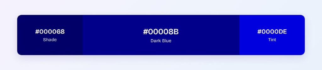
Its associations are the deep end of blue’s: intelligence, seriousness, stability, and institutional weight. Where bright blue says interactive and navy says formal, dark blue occupies the deliberate middle — the color of uniforms, evening skies, and enterprise software that wants gravity without going black.
Dark blue’s practical role in design systems is the blue-800 slot: darker than the interaction blue, lighter than the near-black navy anchor, and the natural choice for headers, hero panels, and primary text in blue-branded products.
Dark Blue vs Navy: What Is the Actual Difference?
Eleven points of blue channel. Navy is #000080 (blue at 128); dark blue is #00008B (blue at 139). Both sit at hue 240 with full saturation — dark blue is simply about 8% brighter, at 27% lightness versus navy’s 25%. Side by side, dark blue shows a faint luminous edge; apart, most viewers can’t name which is which.
CSS treats them as separate named colors, which trips up teams who assume navy and darkblue are aliases. For design tokens, the guidance is to pick one as your deep-blue anchor and derive the other tier from it programmatically, rather than shipping both named values and hoping nobody notices the seam.
What Are Dark Blue Colors Called?
The deep-blue register has a name for every step: navy (#000080) and midnight blue (#191970) below, indigo (#4B0082) on the violet border, Oxford blue (#002147) on the green-shifted heritage side, and sapphire, cobalt, and Prussian blue filling the brighter flanks. Delft blue names the Dutch ceramic tradition; space cadet and cool black cover the near-black extremes.
As always, the poetry belongs in marketing and the hex belongs in tokens: blue-800 anchored to #00008B communicates what midnight whispers can’t.
What Are the Darkest Shades of Blue?
Five commonly referenced steps run the bottom of the family:
- Midnight Blue (#191970) — purple-shifted and moody
- Dark Blue’s computed shade (#000054) — the near-black floor of the pure hue
- Navy (#000080) — the CSS classic
- Dark Blue (#00008B) — the anchor of this article
- Its computed bright variant (#0000C3) — where dark blue hands over to full blue
Together they form a five-step ladder on one hue — a ready-made elevation system for dark-themed blue products.
How Does Dark Blue Appear on Digital Screens?
On white, dark blue delivers 15.3:1 — deep AAA territory, and enough headroom to survive any tint of off-white background. The computed darker step #000068 pushes to 17.5:1.
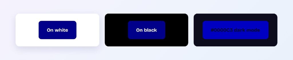
On black the story inverts: 1.37:1, a total failure. And the family trap follows — even the brightened variant #0000C3 on the blue-cast dark surface #0C0C1D only reaches 1.65:1. Pure-hue deep blues cannot carry dark mode by getting brighter; the fix is a hue-family swap to royal (#4169E1) or dodger blue for dark-theme accents, keeping one brand identity across two physically different tokens.
That two-token pattern — dark blue for light themes, royal for dark themes — is the single most important deployment note for this entire color family.
What UI Elements Work Best with Dark Blue?
Dark blue performs where authority and legibility need to coexist.
Primary Text and Headings
At 15.3:1 on white, dark blue replaces black as body text with a full AAA margin — the entire reading experience turns brand-colored without a compliance cost. It’s one of very few saturated colors that can make this claim.

Buttons and CTAs
White labels on #00008B pass AAA at 15.3:1, with #000068 as a pressed state at 17.5:1. Both states clear the strictest tier, which makes the pair audit-proof. You can use Visily’s Theme feature to roll the two-token set across every button in your wireframes at once.

Data Visualizations
The monochromatic ramp from #0000C3 through #00008B to #000054 gives sequential charts institutional depth, and dark blue’s neutrality makes it the default first series where red or green would imply judgment.

Hero Panels and Dark Surfaces
A dark blue hero with white type is the classic enterprise opening move: 15:1 text contrast, instant authority, and a natural stage for a warm accent button. Just remember the surface itself needs light-theme context — on true black pages it sinks.
What Are the Best Dark Blue Color Palettes for UI?
Five harmony schemes come from dark blue’s position at hue 240. Every value below is computed from #00008B.
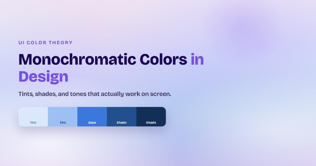
Monochromatic
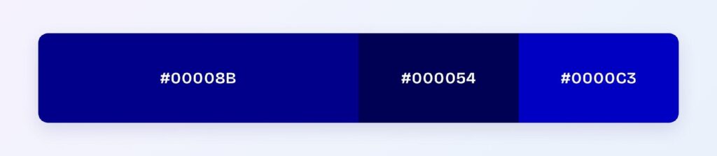
The set: #00008B, #000054, and #0000C3. One pure hue at three depths builds the complete fintech look — hierarchy from lightness alone, zero hue risk, maximum discipline.
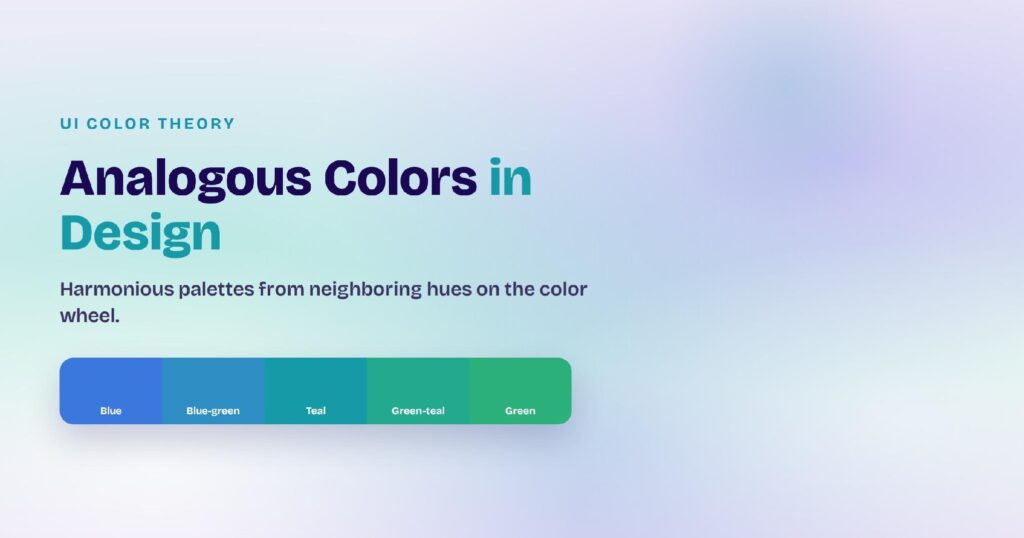
Analogous
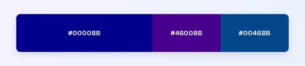
The set: #00008B with #46008B (toward violet) and #00468B (toward cerulean). The violet edge adds premium depth and the cerulean edge adds approachability — a range that covers everything from legal to consumer fintech without leaving the cool register.
Complementary
The set: #00008B against #8B8B00 — dark olive-gold, its exact opposite at matched depth. The pairing balances perfectly because neither side outweighs the other; the olive slot converts naturally into gold accents for premium and financial brands.

Triadic
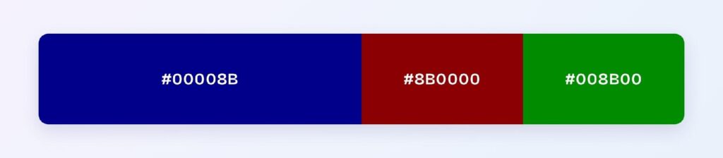
The set: #00008B, #8B0000 (deep red), and #008B00 (deep green). Three evenly spaced hues at identical depth suit multi-category dashboards, government portals, and any product where categories need equal visual authority.
Split-Complementary
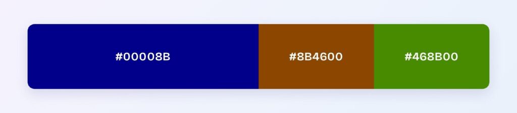
The set: #00008B with #8B4600 (russet) and #468B00 (moss). You keep the warm contrast with two earthier landings — the palette for heritage, publishing, and institutions that want warmth without gold’s flash.
Which Colors Are Similar to Dark Blue?
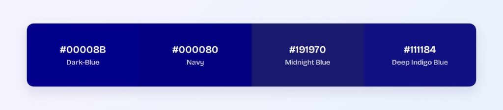
The three closest named colors are navy (#000080), midnight blue (#191970), and the deep indigo-leaning #111184 that some references cite for dark blue. Navy is the near-twin one step down, midnight adds a purple cast and drops saturation, and the indigo variant nudges red into the mix. Navy is the interchange most products actually make — and most users never detect.
Which Colors Pair Best with Dark Blue?
The computed answer is #8B8B00, the olive-gold complement — and its brightened cousin, true gold, is dark blue’s most famous partner across banking, law, and luxury. Beyond the math: crisp white for maximum contrast, warm gray for softness, and coral or orange when the brand needs energy.
Run the 60-30-10 split: 60% white surfaces, 30% dark blue for structure, text, and primary components, 10% gold or orange for conversion moments. Inverted — dark blue dominant with white text panels — it becomes the classic enterprise hero architecture.
Which Colors Should You Avoid Pairing with Dark Blue?
Avoid the near-neighbors #3A008B and #003A8B. Both sit within 45 degrees at dark blue’s exact depth, so edges between them and #00008B vibrate instead of resolving.
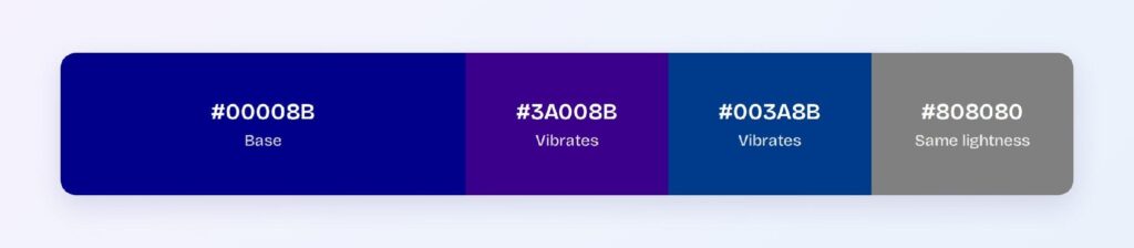
Black is the measured failure at 1.37:1 — dark blue components on black backgrounds lose their boundaries entirely. Deep purples at matched lightness create the same mud, which is why the violet analogous partner works as a gradient companion but not as an adjacent fill.
Does Dark Blue Meet Accessibility Standards?
Among the best in the entire palette: #00008B on white scores 15.3:1 against the WCAG AAA threshold of 7:1, and the darker #000068 reaches 17.5:1. Both text and interactive uses clear the strictest tier on light surfaces without adjustment.
Blue perception survives every common form of color vision deficiency — red-green color blindness, affecting roughly 1 in 12 men, leaves the blue axis intact. The only compliance work dark blue demands is the dark mode hue swap described above.
How Can You Convert Dark Blue Between HEX, RGB, HSL, CMYK, and Other Color Formats?
All six formats describe the same color:
- HEX #00008B — the default for CSS and design tokens; distinct from the navy keyword.
- RGB rgb(0, 0, 139) — one channel active; use RGBA for deep-blue scrims.
- HSL hsl(240, 100%, 27%) — two lightness points above navy; the whole family is one slider.
- HSB 240, 100, 55 — what Figma’s and Photoshop’s pickers show.
- CMYK 100, 100, 0, 45 — full cyan and magenta over heavy black; proof prints, as deep blues shift toward purple on paper.
Wrapping Up
Dark blue (#00008B) earns its place as the authoritative middle of the blue family: 15.3:1 AAA text on white, an audit-proof button pair, a perfectly balanced olive-gold complement, and one clear rule — swap to royal blue when the lights go down. Eleven channel points from navy, a full personality of its own. Every number above is computed.
Put it to work in Visily‘s Theme feature: set the dark blue ladder, add the gold accent, and ship an interface with institutional weight today.