Cream’s HEX code is #FFFDD0. Red and green run at or near maximum while blue drops to 208 — hue 57, full saturation, 91% lightness — which makes cream exactly what color theory says it is: the pastel of yellow, the way pink is the pastel of red. That whisper of warmth is why cream reads as softer, kinder, and more expensive than clinical white.
Below you get every cream code format, the definitive answer to the cream-versus-beige-versus-ivory question, the five computed harmony palettes, and the WCAG numbers that split cream into two colors — a near-invisible tint on light themes and one of the strongest text colors available on dark ones. Everything is computed from the hex.
What Color Is a Cream Color?
Cream is #FFFDD0, with RGB rgb(255, 253, 208): red and green essentially maxed, blue pulled down by 47 points. Removing blue from white is what injects yellow — cream is literally white with the cool channel dimmed, the digital equivalent of milk enriched by butterfat.
The name comes straight from dairy, and the associations follow: comfort, warmth, softness, and quiet luxury. Cream is the color of linen, candlelight, and letterpress paper — the warm neutral that premium brands reach for when pure white feels too cold and gray feels too corporate.
In interface terms, cream is a surface color first: the background that makes a product feel calm and editorial rather than clinical. Its 91% lightness locks it out of text duty on light themes, and unlocks something better on dark ones — more on both below.
Is Cream Beige or White?
Neither — cream sits precisely between them, and the hex values prove it. White (#FFFFFF) has zero yellow; beige (#EDE8D0) is darker and grayer with an earthy lean; cream (#FFFDD0) keeps white’s brightness while carrying beige’s warmth. On the lightness axis: white at 100%, cream at 91%, beige at roughly 87% with saturation muted.
The reflection difference is the practical one — cream bounces more light than beige, which is why cream rooms and cream interfaces feel larger and airier while beige ones feel cozier and more grounded. Choose by the feeling, but token by the hex.
What Is Another Name for Cream Color?
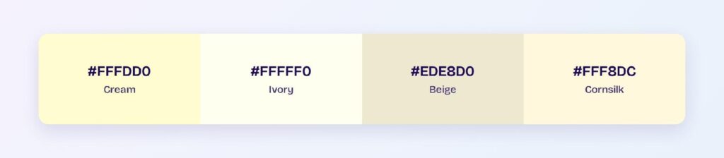
The warm-white register runs deep: ivory (#FFFFF0) is lighter and barely yellow, cornsilk (#FFF8DC) is cream’s near-twin with a touch more polish, and vanilla, eggshell, antique white, and champagne fill the gaps between cream and beige. Lemon chiffon (#FFFACD) crosses into pastel-yellow territory.
Two conventions coexist in the wild: the Wikipedia-standard #FFFDD0 used here, and a slightly whiter #FDFBD4 some tools cite. They differ by a few points of blue; pick one for your tokens and let the name follow the hex.
What Are the Shades of Cream?
Six working steps cover the family:
- Ivory (#FFFFF0) — the lightest, one step off white
- Cornsilk (#FFF8DC) — polished and faintly golden
- Cream (#FFFDD0) — the anchor
- Lemon Chiffon (#FFFACD) — the pastel-yellow border
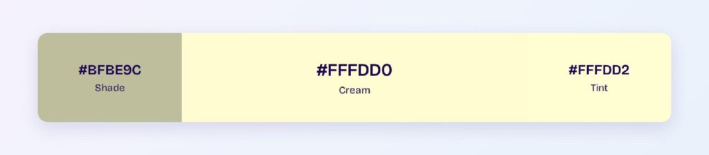
- Dark Cream (#BFBE9C) — cream’s computed shade, sliding toward khaki
- Beige (#EDE8D0) — the earthy floor of the warm-white range
Together they form a warm neutral ramp — the light-theme surface system for editorial, hospitality, and premium wellness products.
How Does Cream Appear on Digital Screens?
The split personality, in numbers: cream on white scores 1.04:1 — functionally invisible, the second-lowest ratio in this entire series. On black it scores 20.21:1 — AAA with room to spare, within half a point of white’s own 21:1 maximum.

Read those two figures together and cream’s rulebook writes itself: on light themes cream is a background, never a foreground; on dark themes cream is a first-class text color that most teams overlook. Even the darkened variant #BFBE9C fails white-background text duty at 1.9:1, so no light-theme cream text exists at any depth.
Cream text on near-black is the secret of warm dark modes: at 20:1 it matches white for compliance while killing the halation glare pure white causes. Reading apps and code editors have shipped exactly this pairing for years under names like solarized and sepia-dark.
What UI Elements Work Best with Cream?
Cream performs wherever warmth is the message and its contrast limits are respected.
Page Backgrounds and Surfaces
A cream canvas with espresso or charcoal text is the editorial classic: contrast lands near 15:1 with dark inks while the page glows warm instead of glaring. Premium content products use this instead of white almost by default.

Cards and Sections
Cream cards on white pages — or ivory cards on cream pages — create soft elevation with zero shadows. The trick is keeping at least one full step of the family ladder between layers, since adjacent steps merge at these lightness levels.

Badges and Labels
Cream fills with deep brown or olive text read as artisanal and heritage — the natural badge treatment for organic, handmade, and premium categories. You can use Visily’s Theme feature to apply the cream-and-espresso pair across all badge states at once.

Dark Mode Text and Accents
The underused superpower: cream text on the warm dark surface #1D1C0C, with the computed bright variant #FFF533 reaching 15:1 for accents. Warm dark themes built this way feel like candlelight instead of terminal.

What Are the Best Cream Color Palettes for UI?
Five harmony schemes come from cream’s position at hue 57. Because the base is pale, every companion below arrives in the same pastel register.
Monochromatic
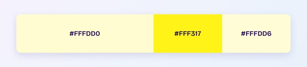
The set: #FFFDD0, #FFF317, and #FFFDD6. The saturated yellow core supplies the accent energy, the pale pair builds surfaces — proof that cream is yellow wearing a white coat.
Analogous
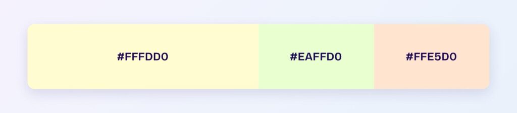
The set: #FFFDD0 with #EAFFD0 (pale spring green) and #FFE5D0 (pale peach). Three warm pastel neighbors at matched lightness make the softest gradient territory in this series — hero washes for wellness and lifestyle brands.
Complementary
The set: #FFFDD0 against #D0D2FF — a pale periwinkle, its computed opposite. Warm cream against cool lavender-blue at identical lightness is the sophisticated two-surface system: warm sections for content, cool sections for interaction.

Triadic
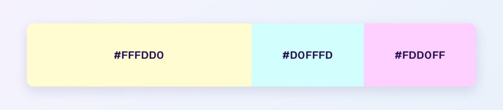
The set: #FFFDD0, #D0FFFD (pale aqua), and #FDD0FF (pale orchid). Three evenly spaced pastels suit category systems — calendars, tags, kanban lanes — where groups need identity without weight.
Split-Complementary
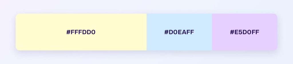
The set: #FFFDD0 with #D0EAFF (powder blue) and #E5D0FF (pale violet). You keep the cool contrast with two gentler landings — the palette when full periwinkle feels too decisive.
Which Colors Are Similar to Cream?
The three closest named colors are ivory (#FFFFF0), beige (#EDE8D0), and cornsilk (#FFF8DC). Ivory lightens toward white, beige deepens toward earth, and cornsilk is the near-twin with a golden polish. Beige is the swap when cream needs more grounding; ivory when it needs more air.
Which Colors Pair Best with Cream?
The computed best partner is #D0D2FF, the periwinkle complement — and beyond the math, cream’s classic companions are espresso brown, burgundy, forest green, navy, and gold. Cream is the standard-issue warm neutral of every luxury palette in this series precisely because it flatters deep colors without competing.
Run the 60-30-10 split: 60% cream surfaces, 30% a deep anchor like navy or espresso for text and structure, 10% gold or burgundy for the premium moments. Inverted — deep surfaces with cream text — the same three tokens become a complete warm dark theme.
Which Colors Should You Avoid Pairing with Cream?
Avoid the near-neighbors #EEFFD0 and #FFE9D0. Both sit within 45 degrees at cream’s exact lightness, so edges dissolve into a single warm wash.
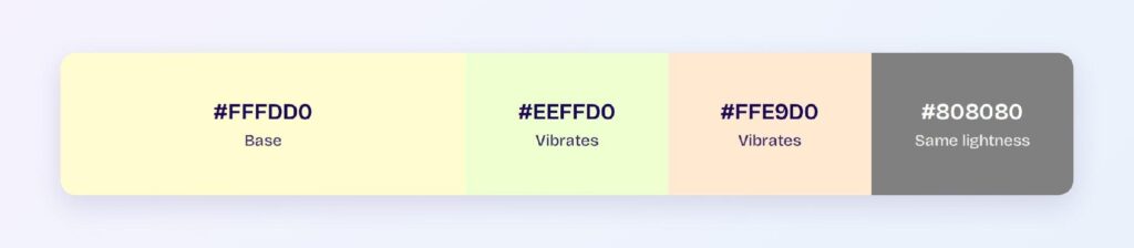
White is the other measured trap at 1.04:1 — cream elements on white backgrounds simply vanish, which is why cream cards need a border or a genuinely white page needs a genuinely deeper cream. Every pale color in this series shares the failure: pastels never separate from pastels.
Does Cream Meet Accessibility Standards?
As a dark-surface text color, exceptionally: 20.21:1 on black clears the WCAG AAA bar nearly three times over. On white it fails at 1.04:1, so light themes must treat cream as surface-only and source their text from the espresso and charcoal end of the wheel.
Cream survives color vision deficiency cleanly — its identity is lightness-based warmth rather than a contested hue, so the roughly 1 in 12 men with red-green color blindness perceive cream surfaces essentially as designed. Just never let cream-versus-ivory differences carry meaning; at these lightness levels, nobody resolves them reliably.
How Can You Convert Cream Between HEX, RGB, HSL, CMYK, and Other Color Formats?
All six formats describe the same color:
- HEX #FFFDD0 — the default for CSS and design tokens.
- RGB rgb(255, 253, 208) — the dimmed blue channel is the warmth; use RGBA for warm scrims.
- HSL hsl(57, 100%, 91%) — a yellow hue at pastel lightness; drop lightness and cream reveals its yellow core.
- HSB 57, 18, 100 — what Figma’s and Photoshop’s pickers show; full brightness, gentle saturation.
- CMYK 0, 1, 18, 0 — nearly pure paper with a breath of yellow ink; cream prints beautifully.
Wrapping Up
Cream (#FFFDD0) earns its quiet-luxury reputation with numbers attached: a 20.21:1 AAA dark mode text color hiding inside a light-theme background, the warm bridge between white and beige, a periwinkle complement most designers never compute, and pairings that flatter every deep color in this series. Remember its one law — cream is never text on light — and the rest is warmth for free. Every number above is computed.
Put it to work in Visily‘s Theme feature: set the cream surface ladder, anchor it with espresso, and ship a warmer interface today.