Blue’s HEX code is #0000FF. The blue channel runs at maximum while red and green sit at zero — hue 240, full saturation, 50% lightness — making it the purest blue a screen can physically display. It’s also the most used hue in interface design, anchoring the trust-heavy palettes of banks, social networks, and enterprise software everywhere.
Below you get every blue code format, the shade families designers actually deploy, the five computed harmony palettes, and exact WCAG contrast ratios — including the dark mode failure that trips up pure blue and how to route around it. Every value comes from color math.
What Is Blue Color?
Blue signals trust, stability, and competence — the safest emotional territory a brand can occupy, which is exactly why so many occupy it. The associations run deep: sky and ocean make blue feel permanent, and decades of institutional use make it feel credible.
In interfaces, blue carries an extra convention: it’s the default color of links and interactive elements, a habit inherited from the earliest browsers. Users tap blue text expecting navigation, which is a superpower when you honor it and a trap when you use blue decoratively on non-interactive text.
What Two Colors Make Blue?
None — blue is a primary in every model that matters to screens. In RGB it’s one of the three source channels, produced by light alone rather than mixture. In print’s CMYK model, the blue you see combines full cyan and full magenta, which is why #0000FF converts to CMYK 100, 100, 0, 0.
The practical consequence: blue is mixable outward but not inward. You can build violets, teals, and navies from it, but no combination of other digital primaries produces it.
The 4 Types of Blue Designers Reach For
The blue family clusters into four working types:
- Pure and electric — #0000FF and its neighbors; maximum energy, used sparingly
- Deep and institutional — navy (#000080) and midnight; authority and dark surfaces
- Bright and friendly — royal (#4169E1) and dodger (#1E90FF); the SaaS mainstream
- Pale and atmospheric — sky and powder blues; backgrounds and empty states
Most products deploy at least three of the four: a deep blue for structure, a bright blue for interaction, and a pale blue for surfaces.
What Are the 10 Shades of Blue?
Ten commonly referenced shades span the family: navy (#000080), midnight blue (#191970), dark blue (#00008B), blue (#0000FF), royal blue (#4169E1), dodger blue (#1E90FF), deep sky blue (#00BFFF), cornflower (#6495ED), sky blue (#87CEEB), and powder blue (#B0E0E6). Together they form a ready-made lightness ramp from near-black to near-white without leaving the hue.
Blue on Digital Screens
On white, pure blue scores 8.59:1 — an AAA pass that explains why blue links have survived thirty years of readability scrutiny. On black it fails at 2.44:1, sinking into the background.
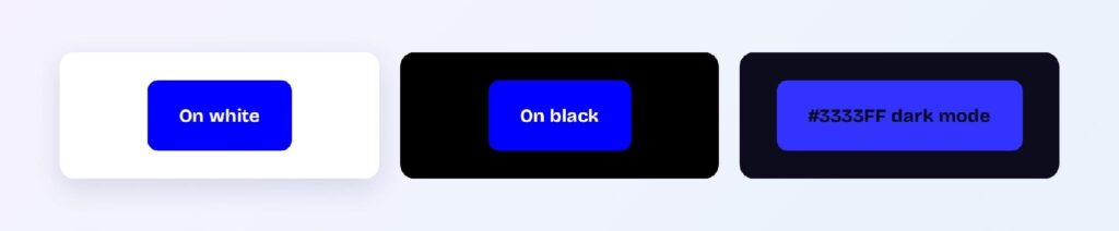
Dark mode is pure blue’s weak spot: even the brightened variant #3333FF only reaches 2.82:1 on the dark surface #0C0C1D — a fail. The fix is a hue-family swap: dark themes should hand blue’s duties to royal (#4169E1) or dodger blue (#1E90FF), which carry the identity at usable contrast. One brand, two tokens, two themes.
Interface Elements Where Blue Leads
Blue’s conventions and contrast numbers make it the default structural hue of the web.
Links and Interactive Text
Blue text on white at 8.59:1 passes AAA, and the dark variant #0000BF pushes to 11.98:1. Honor the convention: reserve blue text for things users can tap, and pick a different hue for emphasis.

Primary Buttons
White labels on #0000FF clear AAA, with #0000BF as a natural pressed state. Most design systems soften toward royal blue for large fills — pure blue at button scale can feel electric — but the compliance math works at either intensity. You can use Visily’s Theme feature to apply the pair across your wireframes.

Data Visualizations
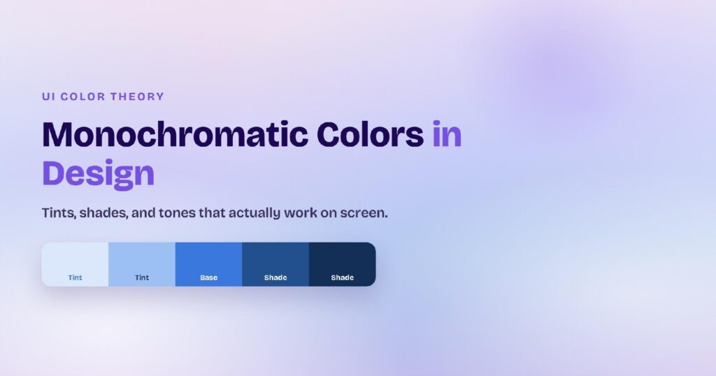
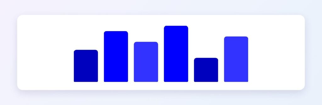
Blue is the default first series in nearly every charting library because it reads as neutral-professional. The monochromatic ramp from #6666FF through #0000FF to #000099 gives sequential scales depth without changing hue.
Dark Mode Surfaces
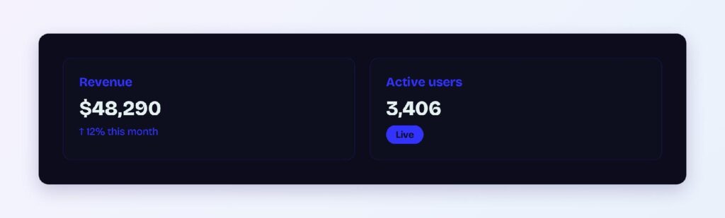
Blue-cast dark surfaces like #0C0C1D read richer than pure black. Pair them with royal or dodger accents rather than pure blue — the 2.82:1 failure above is the number to remember.
Blue Palettes Computed From #0000FF
Five harmony schemes come from blue’s position at hue 240.
Monochromatic
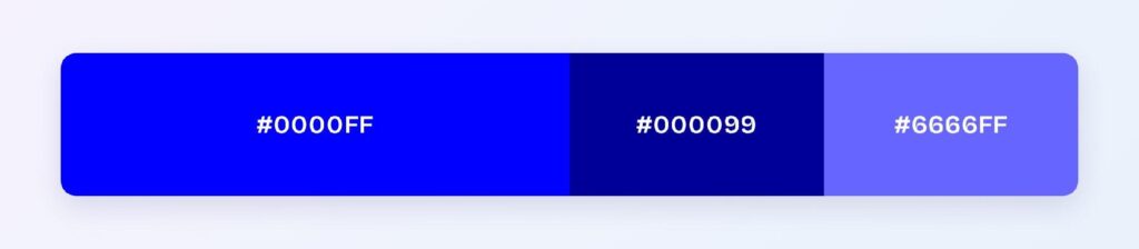
The set: #0000FF, #000099, and #6666FF. One hue at three depths is the fintech standard — hierarchy from lightness alone, zero hue risk.
Analogous
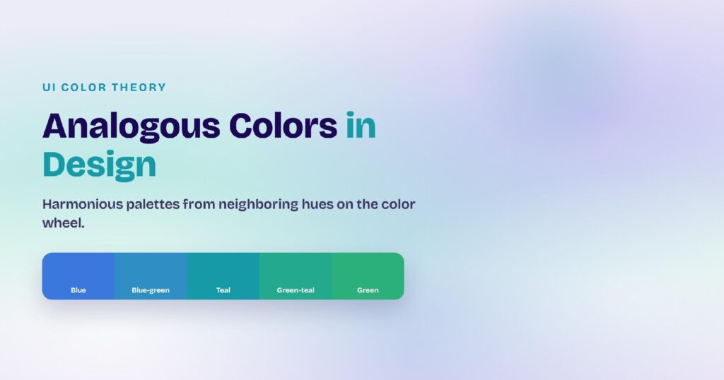
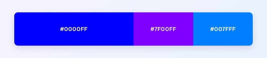
The set: #0000FF with #7F00FF (toward violet) and #007FFF (toward azure). Neighboring hues keep the cool, technological character while adding range — the default palette of developer tools and AI products.
Complementary
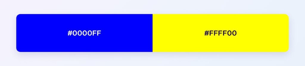
The set: #0000FF against #FFFF00 — yellow, the maximum-contrast pairing on the wheel. Reserve yellow for the 10% accent layer: highlights, warnings, and the single element per screen that must be seen first.
Triadic
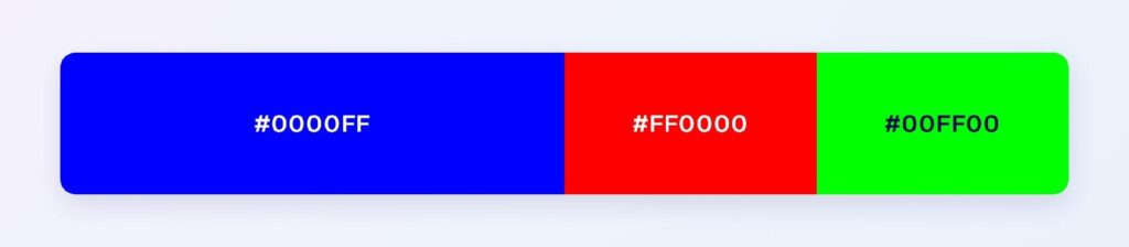
The set: #0000FF, #FF0000, and #00FF00 — the RGB primaries themselves. At full intensity this trio is loud, so production use drops each to a muted variant; the structure suits games, kids’ products, and brands built on primary-color energy.
Split-Complementary
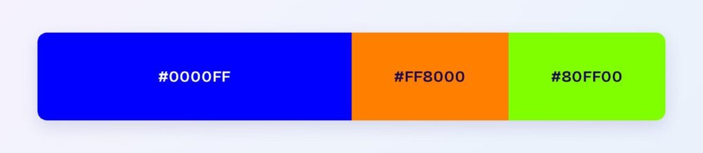
The set: #0000FF with #FF8000 (orange) and #80FF00 (chartreuse). You keep yellow-adjacent warmth with more flexibility — orange in particular is the classic call-to-action accent inside blue systems.
Colors Closest to Blue
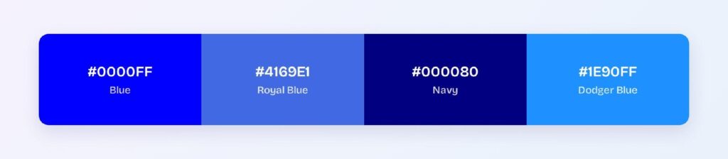
The three nearest named colors are royal blue (#4169E1), navy (#000080), and dodger blue (#1E90FF). Royal lifts lightness and softens the voltage, navy halves the brightness into authority, and dodger adds a cyan freshness. Between the three, you can keep one blue identity across every theme and component weight.
What Pairs Best With Blue
The computed answer is yellow (#FFFF00), blue’s true complement, with orange (#FF8000) as the split-complementary workhorse most products actually ship. For neutrals, white and cool grays are frictionless, and warm sand tones soften enterprise blues.
Apply the 60-30-10 split: 60% white or pale blue surfaces, 30% blue for structure and interaction, 10% orange or yellow for conversion moments.
Combinations to Avoid with Blue Color
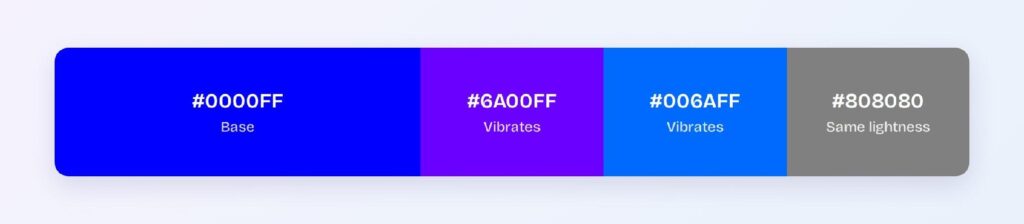
Avoid the near-neighbors #6A00FF and #006AFF. They sit 15 to 45 degrees from pure blue at the same intensity, so edges vibrate rather than resolve.
Pure black backgrounds are the other measured failure at 2.44:1, and saturated red at full intensity creates chromatic aberration against blue — the two hues focus at different depths in the eye, making borders shimmer.
Blue and Accessibility Standards
Blue is among the most compliant hues available: #0000FF on white passes WCAG AAA at 8.59:1, and #0000BF reaches 11.98:1. The only compliance trap is dark mode, where the royal-blue swap restores usable contrast.
Blue is also the hue least affected by color blindness — red-green deficiencies, which cover the vast majority of cases including roughly 1 in 12 men, leave blue perception intact. That reliability is one more reason blue anchors so many systems.
Blue Across Color Formats
All six formats describe the same color:
- HEX #0000FF — the default for CSS and design tokens.
- RGB rgb(0, 0, 255) — one channel at maximum; use RGBA for overlay tints.
- HSL hsl(240, 100%, 50%) — the exact middle lightness; shades and tints are symmetrical moves.
- HSB 240, 100, 100 — what Figma’s and Photoshop’s pickers show.
- CMYK 100, 100, 0, 0 — full cyan plus full magenta in print; expect a slightly duller result than the screen version.
Wrapping Up
Blue (#0000FF) earns its dominance honestly: AAA contrast on white at 8.59:1, the strongest interaction convention on the web, immunity to the most common forms of color blindness, and a shade family that covers every theme — provided you remember the one failure, pure blue on dark surfaces, and swap to royal when the lights go down. Every number above is computed.
Put it to work in Visily‘s Theme feature: set your blue ramp, assign the orange accent, and ship the most trusted color on the web today.