Burgundy’s HEX code is #800020. Red runs at 128 with a measured 32 points of blue and zero green — hue 345, full saturation, 25% lightness — the recipe for a dark red that leans perceptibly toward purple. It’s named for the wine of the Burgundy region of France, and the color has spent centuries meaning exactly what the wine does: depth, maturity, and quiet expense.
Below you get every burgundy code format, the definitive burgundy-versus-maroon verdict with hex evidence, the five computed harmony palettes, and WCAG contrast numbers that make burgundy one of the strongest luxury text colors available — plus the one dark mode trap that catches nearly every wine-toned brand. Everything is computed from the hex.
What Color Is Burgundy Exactly?
Burgundy is #800020, with RGB rgb(128, 0, 32). That 32-point blue channel is the entire story: it drags the hue from pure red at 0 degrees back to 345, into purplish-red territory. Without it you’d have maroon; with more of it you’d reach wine’s plum cousins.
The name entered English from the French bourgogne — the wine, then the color of the wine. The cultural loadout followed the bottle: sophistication, ambition, refinement, and understated wealth. Burgundy is what red becomes when it stops shouting.
In current design language, burgundy is the definitive quiet-luxury color — the shade fashion and interiors press keep crowning because it signals expense without logo-level volume. For digital products, that semantic arrives with unusually good contrast math attached.
Is Burgundy a Purple or Maroon Color?
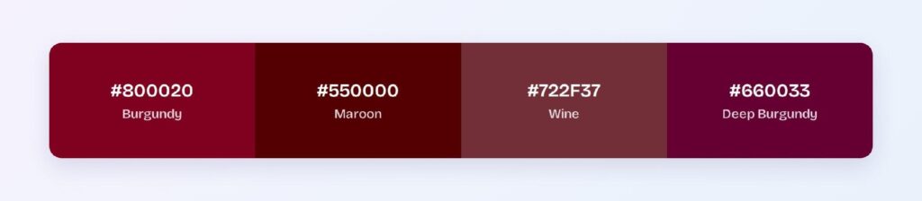
Neither, and the hexes settle it. Maroon (#550000) is pure red darkened — zero blue, hue 0, a brown-leaning earth red. Purple (#800080) balances red and blue equally at hue 300. Burgundy (#800020) sits at hue 345: three-quarters of the way from purple back to red, carrying just enough blue to look cooler and dressier than maroon while remaining unmistakably red.
The quick field test: next to maroon, burgundy looks refined and wine-like; next to purple, burgundy looks red. Some references — including Figma’s #660033 — push burgundy further toward purple; this article computes from the Wikipedia-standard #800020, and either convention works so long as your tokens commit to one.
What Color Is Burgundy Closest To?
Three neighbors frame it: wine (#722F37) mutes it toward brown-rose, maroon (#550000) strips its blue and darkens, and the purple-leaning deep burgundy (#660033) doubles its blue. Claret, oxblood, and mulberry all name points inside the same small region — a reminder that wine words describe a range, and only hex values describe a color.
Is Burgundy a Luxury Color?
Measurably in usage, yes: burgundy dominates premium leather goods, wine labels, law and finance branding, and the quiet-luxury fashion cycle. The psychology is inherited — deep reds historically cost more to dye, wine culture attached age and refinement, and dark saturated colors read as heavier and more serious than their bright parents.
For interfaces the luxury translates directly: burgundy delivers red’s confidence at a tenth of red’s alarm. A burgundy CTA reads as premium invitation where a fire-engine red reads as warning — same hue family, opposite emotional register.
How Does Burgundy Appear on Digital Screens?
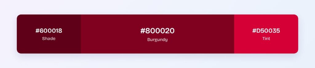
The headline number: white text on #800020 scores 10.83:1 — a full AAA pass, putting burgundy in the elite group of brand colors that clear the strictest tier as button fills. The computed dark variant #600018 reaches 13.9:1 for pressed states and headings.
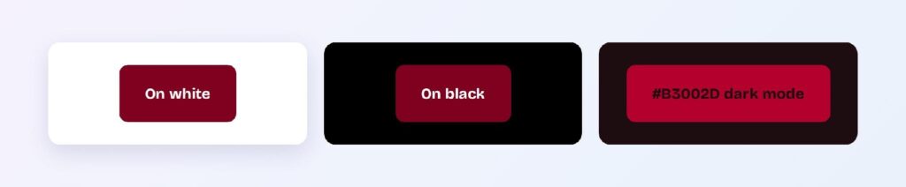
On black, burgundy fails at 1.94:1 — and here’s the family trap: even the brightened variant #B3002D on the wine-cast dark surface #1D0C10 only manages 2.66:1. Deep wine reds cannot brighten their way into dark mode legibility.
The fix inverts the palette: in dark themes, burgundy becomes the surface and cream or gold becomes the foreground. Burgundy panels with cream text recreate the exact contrast geometry of a wine label — which is why that pattern has centuries of proof behind it.
What UI Elements Work Best with Burgundy?
Burgundy performs wherever premium weight is the message.
Buttons and CTAs
White on #800020 at 10.83:1, deepening to #600018 at 13.9:1 for hover and press — a two-state interactive set that clears AAA end to end. Few luxury-coded colors offer an audit-proof button pair straight from the wheel. You can use Visily’s Theme feature to roll the pair across every button state at once.

Headings and Brand Text
At nearly 11:1 on white and cream, burgundy carries headings and even body text at AAA — the whole editorial voice of a site can run wine-dark without a compliance cost.

Status Badges
Burgundy owns the premium and reserved semantics: VIP tiers, limited editions, aged and archival labels. Burgundy text on a blush tint reads as certificate rather than alert.
Data Visualizations
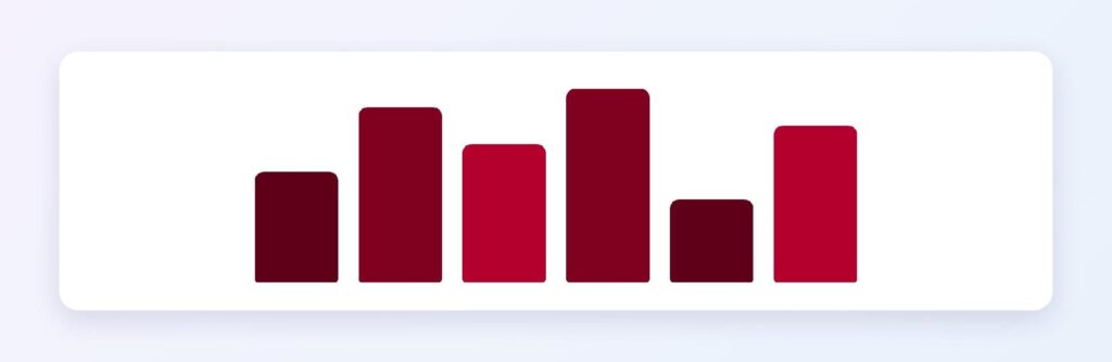
The ramp from #B3002D through #800020 to #4D0013 gives sequential charts a vintner’s depth, and burgundy as the emphasis series against warm grays is the signature look of wealth-management dashboards.
Dark Mode Surfaces
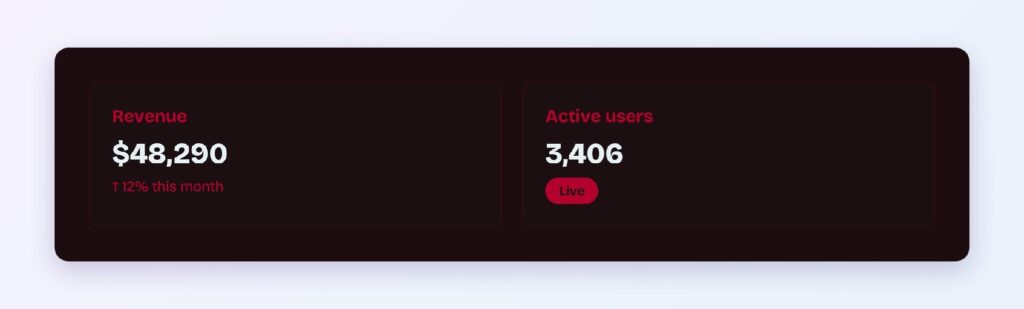
The #1D0C10 surface with burgundy panels and cream or gold foregrounds delivers the wine-label pattern at interface scale — warm, intimate, and unmistakably premium.
What Are the Best Burgundy Color Palettes for UI?
Five harmony schemes come from burgundy’s position at hue 345. Every value below is computed from #800020.
Monochromatic
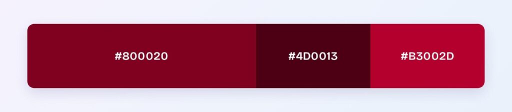
The set: #800020, #4D0013, and #B3002D. Wine, black cherry, and bright claret — one hue at three depths builds the complete luxury system with hierarchy from lightness alone.
Analogous
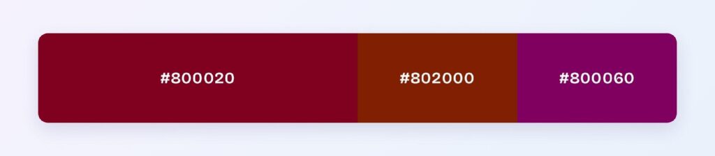
The set: #800020 with #802000 (russet) and #800060 (deep magenta-plum). Three rich neighbors at matched depth formalize the autumn-luxury palette — heritage fashion, wine clubs, and editorial mastheads.
Complementary
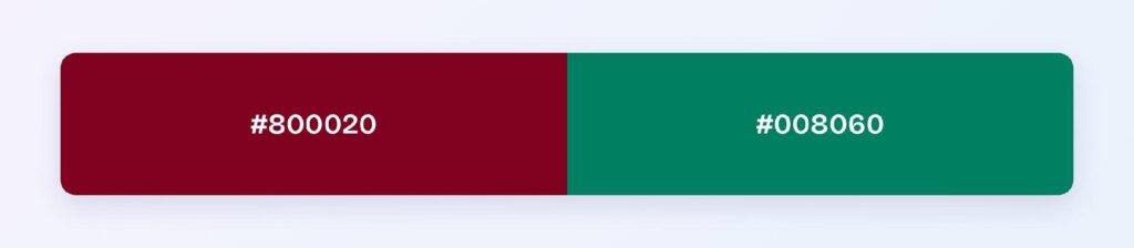
The set: #800020 against #008060 — a deep teal-green, its exact opposite at matched depth. Wine against spruce is one of the most balanced dark complementary pairs available, and the teal slot hands a burgundy brand its trustworthy interaction color.
Triadic
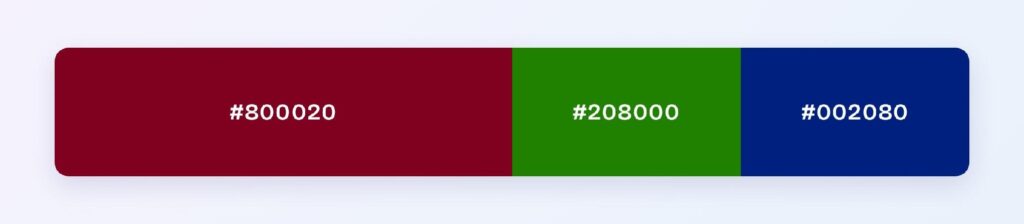
The set: #800020, #208000 (forest green), and #002080 (deep royal blue). Three evenly spaced hues at identical depth suit rich multi-category products — libraries, marketplaces, and legacy institutions.
Split-Complementary
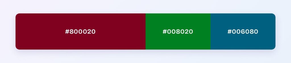
The set: #800020 with #008020 (emerald-leaning green) and #006080 (petrol blue). You keep the cool contrast with two softer landings — green for growth semantics, petrol for authority, burgundy holding the warm center.
Which Colors Pair Best with Burgundy?
The computed best partner is #008060, the teal complement — and burgundy’s classic entourage is gold, cream, navy, sage, and charcoal, the palette of every luxury package and heritage label. Gold amplifies the expense; cream supplies the breathing room; navy matches its depth for formal balance.
Run the 60-30-10 split: 60% cream or warm white surfaces, 30% burgundy for structure, headings, and key components, 10% gold for the flourish. That exact ratio is the wine-label formula, and it transfers to interfaces intact.
Which Colors Should You Avoid Pairing with Burgundy?
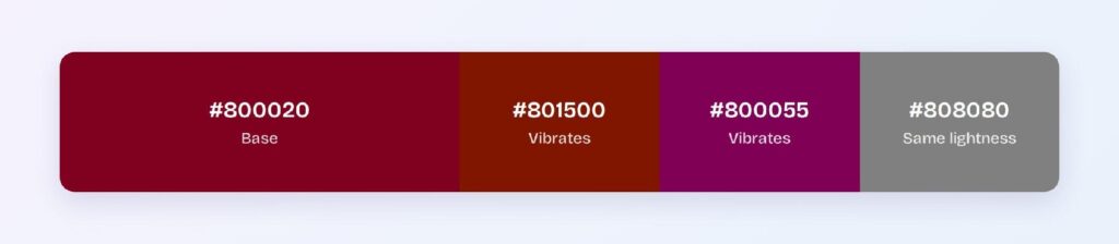
Avoid the near-neighbors #801500 and #800055. Both sit within 45 degrees at burgundy’s exact depth, so edges against #800020 smear instead of separating.
Black is the measured failure at 1.94:1 — burgundy sinks into black backgrounds, which is why the dark mode pattern flips it into the surface role. Bright fire reds beside burgundy create a different problem: the pairing reads as an error state rather than a family.
Does Burgundy Meet Accessibility Standards?
Exceptionally, on light themes: #800020 scores 10.83:1 with white text against the WCAG AAA threshold of 7:1, and the deep variant #600018 pushes to 13.9:1. Burgundy is one of the few luxury-coded colors whose entire interactive set clears the strictest tier without adjustment.
Burgundy sits in the red band affected by red-green color vision deficiency — for roughly 1 in 12 men with protanopia, deep reds darken further and can drift toward brown or gray. Burgundy-versus-green distinctions need labels or icons, and burgundy-versus-black boundaries need a lightness cushion.
How Can You Convert Burgundy Between HEX, RGB, HSL, CMYK, and Other Color Formats?
All six formats describe the same color:
- HEX #800020 — the default for CSS and design tokens; the Wikipedia-standard burgundy.
- RGB rgb(128, 0, 32) — the 32-point blue channel is the purple lean; use RGBA for wine scrims.
- HSL hsl(345, 100%, 25%) — fifteen degrees shy of pure red; every burgundy shade is a lightness move on hue 345.
- HSB 345, 100, 50 — what Figma’s and Photoshop’s pickers show.
- CMYK 0, 100, 75, 50 — full magenta over heavy black; proof prints carefully, as wine tones shift fast on paper.
Wrapping Up
Burgundy (#800020) earns its quiet-luxury crown with numbers attached: a 10.83:1 AAA button color, a 13.9:1 deep tier, a teal complement that balances perfectly at depth, and the wine-label inversion that solves dark mode. Fifteen degrees of blue separate it from maroon — and that small lean carries the entire meaning. Every number above is computed.