Pink’s HEX code is #FFC0CB. It sits at hue 350 — a red-shifted rose — with 100% saturation and 88% lightness, which makes it the lightest named color in the CSS palette. You’ll find it in beauty apps, wellness products, and any brand that wants to feel approachable without being loud.
Below you get every pink code format, the five computed harmony palettes, and exact WCAG contrast ratios. Every value is computed from the hex so you can drop the numbers into design tokens without rounding.
What Is the Color of Pink?
Pink is the CSS named color pink, mapped to #FFC0CB. Its RGB is rgb(255, 192, 203) — the red channel is maxed, green provides the bulk of the lightness, and blue adds just enough warmth to push it from salmon toward rose.
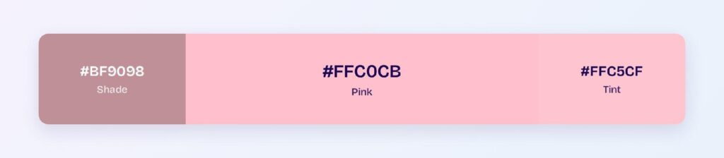
Pink is technically a tint of red: it’s red with white mixed in. In design, it signals softness, approachability, and optimism, making it the default for lifestyle, beauty, and wellness brands.
How Does Pink Appear on Digital Screens?
On white, pink fails at 1.54:1 — it’s too light for any text role. On black it passes AAA at 13.65:1, making pink text on dark backgrounds a strong pairing.
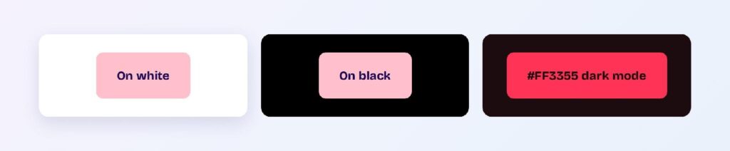
Pink’s primary accessibility role is as a background, not a text color. Dark text on a pink surface is the reliable pattern.
What UI Elements Work Best with Pink?
Pink’s high lightness makes it a background and accent color, not a text color. It performs where its softness adds personality without hurting readability.
Backgrounds and Cards
A #FFC0CB background with dark text (e.g., #1D0C0F) creates a warm, inviting surface for cards, modals, and onboarding screens. The contrast is high enough for body copy.
Status Badges
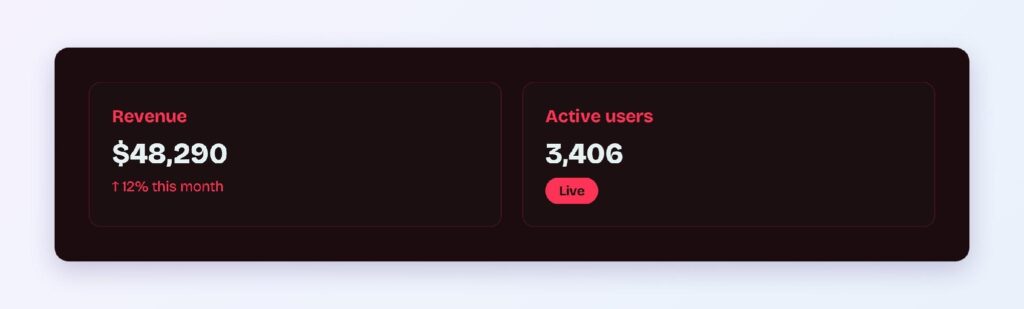
Pink badges work for soft categories: new features, promotional labels, and informational tags that don’t need the urgency of red or the weight of blue.

Data Visualizations
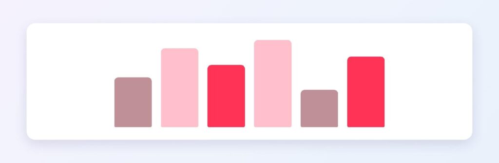
Pink’s tint ramp from #FFC0CB through #FFD6DD provides a sequential scale for positive, nurturing metrics — user growth, engagement, and wellness indicators. You can use Visily’s Theme feature to apply these consistently.
Buttons and CTAs
For buttons, use the saturated variant #FF3355 (bright variant) instead of the base pink — it hits 5.27:1 against the dark surface #1D0C0F, passing AA.

What Are the Best Pink Color Palettes for UI?
Five harmony schemes come from pink’s position at hue 350. Every value is computed from #FFC0CB.
Monochromatic
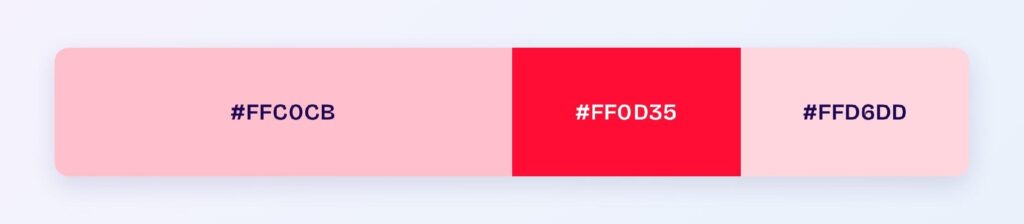
The set: #FFC0CB, #FF0D35, and #FFD6DD. One hue at three values spans from the saturated accent to the palest background — beauty, wellness, and dating apps use this for a unified warm look.
Analogous
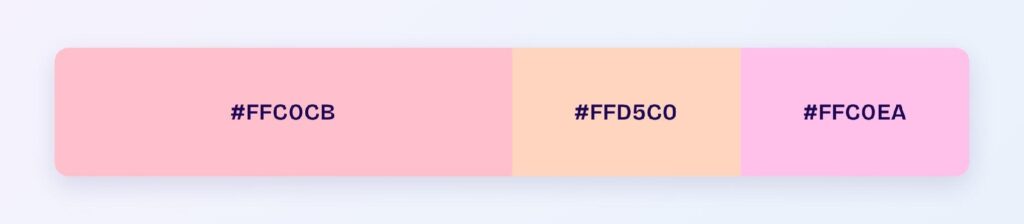
The set: #FFC0CB with #FFD5C0 (toward peach) and #FFC0EA (toward lavender). Neighboring hues stay soft together, ideal for lifestyle and skincare products.
Complementary
The set: #FFC0CB against #C0FFF4, its direct opposite (light teal). Maximum hue contrast at high lightness creates a fresh, spa-like pairing.

Triadic
The set: #FFC0CB, #CAFFC0 (light green), and #C0CAFF (periwinkle). Three pastel hues at matched lightness suit playful, youthful interfaces.

Split-Complementary
The set: #FFC0CB with #C0FFD5 and #C0EAFF. You keep the complementary freshness softened — this is the default safe palette for brands that want pink without committing to teal.

Which Colors Are Similar to Pink?
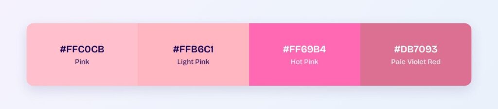
The three closest named colors are light pink (#FFB6C1), hot pink (#FF69B4), and pale violet red (#DB7093). Light pink is barely distinguishable; hot pink is much more saturated; pale violet red adds blue depth.
Which Colors Pair Best with Pink?
The single best accent partner is #C0FFF4 (light teal), pink’s computed complement. For neutrals, white, light gray, and soft gold work. Deep charcoal provides contrast when pink needs grounding.
Apply the 60-30-10 split: 60% white or light neutral, 30% pink for accents and surfaces, 10% teal or deep accent.
Which Colors Should You Avoid Pairing with Pink?
Avoid the near-neighbors #FFD0C0 and #FFC0E5. They sit 15 to 45 degrees away at the same lightness, so edges between them and #FFC0CB blur into one pastel wash.
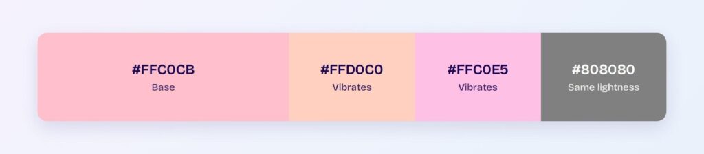
Bright neon green also clashes — the lightness gap is small and the hue contrast creates visual vibration.
Does Pink Meet Accessibility Standards?
Pink (#FFC0CB) fails as a text color on white at 1.54:1, well below the WCAG AA threshold of 4.5:1. Use it as a background only, with dark text.
On black, pink passes AAA at 13.65:1, so pink text on dark backgrounds is fully accessible. Color blindness rarely affects pink perception since it’s a lightness-driven color.
How Can You Convert Pink Between HEX, RGB, HSL, CMYK, and Other Color Formats?
All six formats describe the same color:
- HEX #FFC0CB — default for CSS and design tokens.
- RGB rgb(255, 192, 203) — use RGBA for alpha overlays.
- HSL hsl(350, 100%, 88%) — programmatic shifts; lightness changes for depth variants.
- HSB 350, 25, 100 — what Figma’s and Photoshop’s pickers show.
- CMYK 0, 25, 20, 0 — for print; pink reproduces well in CMYK.
Wrapping Up
Pink (#FFC0CB) earns its place in UI as a warm, high-lightness accent: AAA contrast on dark backgrounds, a built-in approachability that softens any interface, and pastel harmony palettes that stay cohesive at scale. Every number above is computed from color math.