Gray’s HEX code is #808080. All three RGB channels sit at exactly 128 — half strength, zero hue, 50% lightness — making gray the only color in this series with no color in it at all. That achromatic status is precisely why gray does more work in interfaces than any hue: it builds the text hierarchies, borders, and surfaces every other color performs against.
Below you get every gray code format, the tonal ramps that replace hue harmonies for an achromatic color, and exact WCAG contrast ratios — including the one that trips up more design systems than any other value in this series. Every number is computed from the hex.
What Is the Color of Gray?
Gray is the CSS named color gray, mapped to #808080. Its RGB is rgb(128, 128, 128): perfectly equal channels, which in HSL terms means 0% saturation. Gray has lightness and nothing else — no hue, no temperature, no lean.
That neutrality is the point. Gray never competes with brand colors, never carries accidental meaning, and never shifts a palette warm or cool on its own. It’s the silence that makes every other color audible.
In practice, most product grays aren’t pure #808080 — designers tint them a few points toward the brand hue for cohesion. But the achromatic center is the reference every tinted gray is measured against.
Is It Grey or Gray?
Both spellings name the same color. Gray dominates American English; grey dominates British English. The CSS specification accepts both — gray and grey resolve to the identical #808080 — so your stylesheets work either way.
For design systems, consistency beats correctness: pick the spelling that matches your codebase’s locale and enforce it in token names, because a system holding both gray-500 and grey-500 will eventually ship a bug.
What Are the Different Shades of Gray?
Gray’s family is a lightness ladder rather than a hue spread. The commonly referenced rungs:
- Charcoal (#36454F) — near-black with a blue whisper, the dramatic end
- Dim Gray (#696969) — dark and dependable, a strong secondary-text color
- Gray (#808080) — the achromatic center
- Dark Gray (#A9A9A9) — confusingly named lighter than gray, a CSS quirk
- Silver (#C0C0C0) — light with a metallic association
- Gainsboro (#DCDCDC) — the border-and-divider zone
- White Smoke (#F5F5F5) — the palest step before white
Add greige (gray warmed with beige) and slate (gray cooled with blue) and you have the vocabulary of nearly every neutral system shipping today.
How Is the Color Gray Created?
On screens, gray is created by setting all three RGB channels to the same value: equal red, green, and blue at any level between 0 and 255 produces an achromatic gray, with the shared value controlling only how light it is. #808080 is the exact midpoint of that scale.
In paint, gray comes from mixing black and white, or from combining complementary colors that cancel each other’s hue. The digital version is cleaner: perfect neutrality is one line of code, something no pigment can promise.
What Are the Best Gray Color Palettes for UI?
Gray is achromatic, so traditional hue harmonies collapse: the complement of gray is gray, and rotating a hue that doesn’t exist returns the same value every time. The computed harmonies confirm it — every scheme resolves back to #808080. Gray’s palettes are therefore built on two different axes: lightness and tint.
The Tonal Ramp
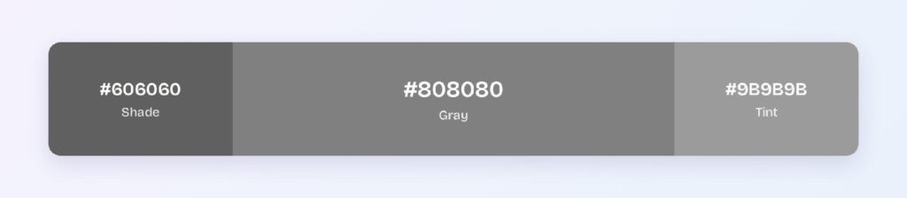
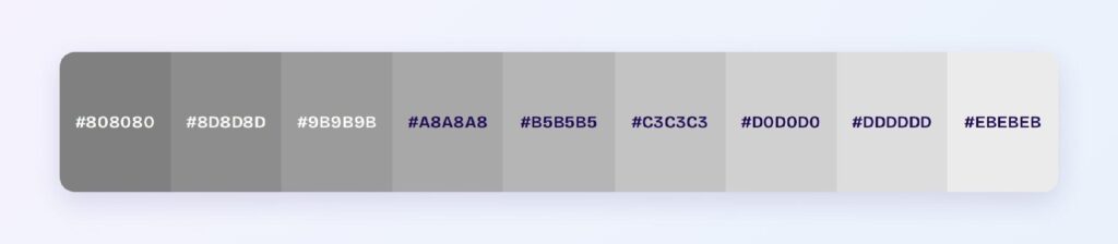
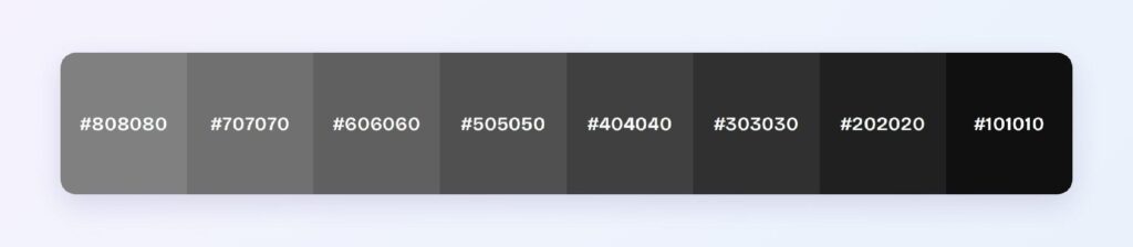
The monochromatic set is the one classical harmony that survives: #4D4D4D, #808080, and #B3B3B3. Extended into a nine-step ramp from near-white to near-black, this is the gray scale every mature design system ships — the axis that encodes hierarchy, elevation, and state.

Tinted Grays
The second axis nudges gray toward a hue: two or three points of blue saturation yield cool slate grays, a touch of yellow-red yields warm greige. Tinted grays let the neutral system echo the brand color, which is why most polished products use them over the pure achromatic center.
Gray as the Stage
The third pattern pairs the gray ramp with any single accent hue. Because gray carries no hue of its own, it’s the only base that works identically with every accent — swap the brand color and the neutral system needs zero changes. That interchangeability is gray’s structural advantage over every tinted alternative.
Which Colors Are Similar to Gray?
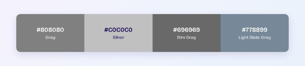
The three closest named colors are silver (#C0C0C0), dim gray (#696969), and light slate gray (#778899). Silver is two steps lighter, dim gray is one step darker, and light slate gray shows what a blue tint does to the neutral base — it’s the bridge between gray and the cool slate family.
Which Color Looks Best with Gray?
Every color, which is the honest answer and the reason gray anchors so many systems. For specific pairings: mustard and amber create the classic warm-against-neutral contrast, teal and blue read as composed and technical, and blush pink softens gray for lifestyle products.
The 60-30-10 split works with gray in the 60 slot: gray surfaces and text structure, a brand hue at 30 for identity and interaction, and a sharp accent at 10. Gray’s neutrality means the other two slots can be anything.
Which Colors Should You Avoid Pairing with Gray?
Avoid any hue at gray’s exact lightness. A mid-blue, mid-green, or mid-red sitting at 50% lightness against #808080 produces mud — the hues differ but the values match, so edges lose definition. This is the same-lightness trap, and gray at dead-center lightness triggers it with half the palette.
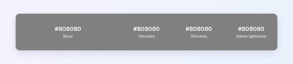
The fix is always a lightness offset: push the companion color two or three steps lighter or darker than the gray it touches, and the boundary snaps back.
Does Gray Meet Accessibility Standards?
Only with care. #808080 on white fails normal-text AA at 3.95:1 against the WCAG threshold of 4.5:1 — reserve it for large text, icons, and decorative elements. Use #606060 (6.29:1) as your compliant gray for body-level secondary text on white.
Gray is the one color unaffected by every form of color blindness, since it carries no hue to confuse. That makes lightness-based gray hierarchies the most universally readable structure an interface can have.
How Can You Convert Gray Between HEX, RGB, HSL, CMYK, and Other Color Formats?
All six formats describe the same color:
- HEX #808080 — the default for CSS and design tokens.
- RGB rgb(128, 128, 128) — equal channels; use RGBA for translucent scrims and overlays.
- HSL hsl(0, 0%, 50%) — the 0% saturation is the achromatic signature; only lightness matters.
- HSB 0, 0, 50 — what Figma’s and Photoshop’s pickers show; hue value is meaningless at zero saturation.
- CMYK 0, 0, 0, 50 — pure 50% black in print; the cleanest CMYK conversion any color can have.
Wrapping Up
Gray (#808080) earns its place as the structural core of interface design: an achromatic center that builds text hierarchies, borders, and surfaces compatible with every brand hue, a tonal ramp that replaces hue harmonies with something more useful, and one hard-won lesson — mid-gray text on white fails AA, so compliant systems build on #606060 instead. Every number above is computed, not estimated.
Put them to work in Visily‘s Theme feature: set your gray ramp once, pair it with any accent, and ship a cleanly structured interface today.