Light blue’s HEX code is #ADD8E6. It sits at hue 195 — the border territory between cyan and blue — with 53% saturation and 79% lightness, which makes it the airy, sky-toned member of the blue family. Healthcare portals, wellness apps, and finance products all lean on it for the same reason: it carries blue’s trust without blue’s weight.
Below you get every light blue code format, the shade family from ice to sky, the five computed harmony palettes, and exact WCAG contrast ratios against white, black, and dark surfaces. Every value is computed from the hex through color math, so you can copy the numbers into design tokens without rounding or guesswork.
What Color Is Light Blue?
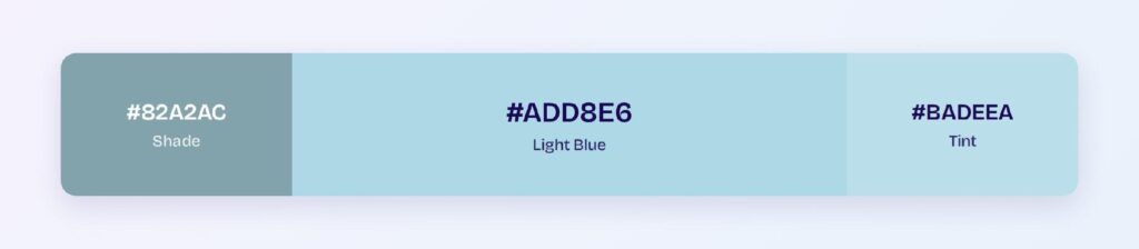
Light blue is the CSS named color lightblue, mapped to #ADD8E6. Its RGB is rgb(173, 216, 230): all three channels run high, with blue leading, green close behind, and red trailing. That near-white base with a cool cast is what gives light blue its atmospheric, open-sky character.
The hue position matters more than most designers realize. At 195, light blue leans toward cyan rather than pure blue, which is why it reads as fresher and more aquatic than a lightened royal blue would. Lighten #0000FF directly and you get periwinkle; light blue’s greenish tilt is its own identity.
In interface work, light blue is a surface-and-atmosphere color: hero backgrounds, empty states, info banners, and the calm layers that sit behind content. Its trust associations — inherited from blue, softened by lightness — make it the default in healthcare and childcare products.
What Is a Light Blue Color Called?
The family has a name for nearly every step. Baby blue (#89CFF0) is the softest and most nostalgic, sky blue (#87CEEB) is brighter and clearer, powder blue (#B0E0E6) adds a gray whisper, and ice blue pushes almost to white. Pale cerulean, azure mist, and Columbia blue fill the gaps between them.
For design tokens, skip the poetry: name the family blue-100 through blue-300 and anchor each to a hex. Two people’s mental image of powder blue can differ; #B0E0E6 can’t.
What Are the Different Shades of Light Blue?
Seven working shades cover the practical range:
- Ice Blue (#E0F0F5) — the palest step before white, computed as light blue’s tint
- Powder Blue (#B0E0E6) — gray-softened and elegant
- Light Blue (#ADD8E6) — the CSS anchor
- Baby Blue (#89CFF0) — soft with a touch more saturation
- Sky Blue (#87CEEB) — the bright, clear middle
- Maya Blue (#73C2FB) — vivid and tropical
- Steel Blue Light (#82A2AC) — light blue’s computed shade, muted toward slate
Together they form a ready lightness ramp for backgrounds, borders, and hover states without ever leaving the family.
What Two Colors Make Light Blue?
In paint, blue plus white. On screens, the recipe is additive: light blue is blue light at high intensity with red and green raised almost as far, which is exactly what rgb(173, 216, 230) encodes. The high red and green values are the digital equivalent of the white in the paint mix.
The practical takeaway for designers: you can generate the entire light blue family from one saturated blue token by raising HSL lightness. That’s how mature design systems build their blue-50 to blue-300 range — one hue, programmatic tints.
How Does Light Blue Appear on Digital Screens?
On white, light blue manages only 1.53:1 — a hard fail for any text duty, which is the fate of every 79%-lightness color. On black it delivers 13.74:1, a wide AAA pass.
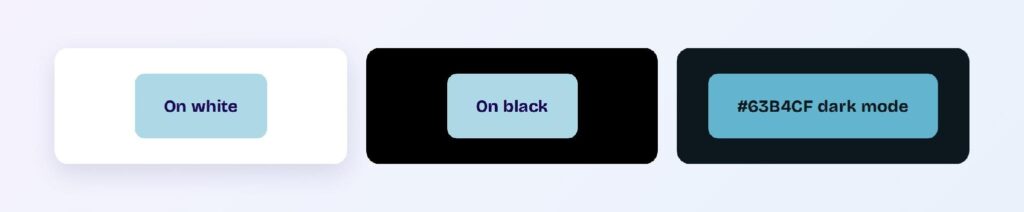
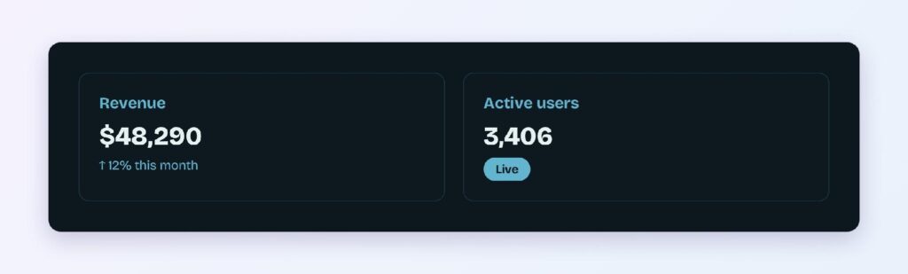
Those two numbers assign light blue’s jobs: background and dark-surface text, never light-surface text. The computed bright variant #63B4CF carries the hue at working depth, and on the blue-cast dark surface #0C181D it reaches 7.7:1 — AAA territory, and one of the strongest dark mode results in this series.
That dark mode number deserves emphasis: light blue text on near-black surfaces is both beautiful and compliant, which is why terminal themes and developer tools have used exactly this pairing for decades.
What UI Elements Work Best with Light Blue?
Light blue performs where softness is an asset and contrast comes from its partners.
Backgrounds and Cards
A #ADD8E6 or ice-blue surface with dark slate text creates the calm, clinical-but-warm atmosphere healthcare and wellness products want. Dark text at #0C181D hits well past AAA against it, so body copy stays effortless.
Info Banners and Status Badges
Light blue owns the informational semantic: tips, notices, and neutral system messages. A light blue fill with deep blue text reads as helpful rather than alarming — the exact register an info banner needs.

Data Visualizations
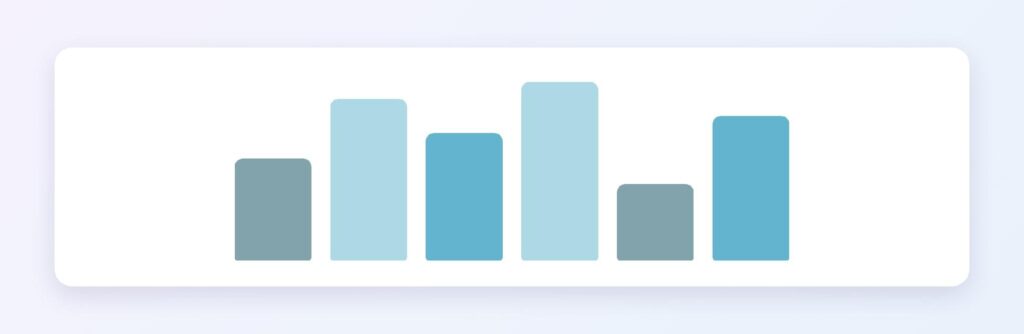
Light blue is the natural low-end of a sequential blue scale. Run #E0F0F5 through #ADD8E6 down to #3999B9 and you get a heatmap ramp that stays legible and calm. You can use Visily’s Theme feature to apply the ramp across all chart components at once.
Buttons and CTAs
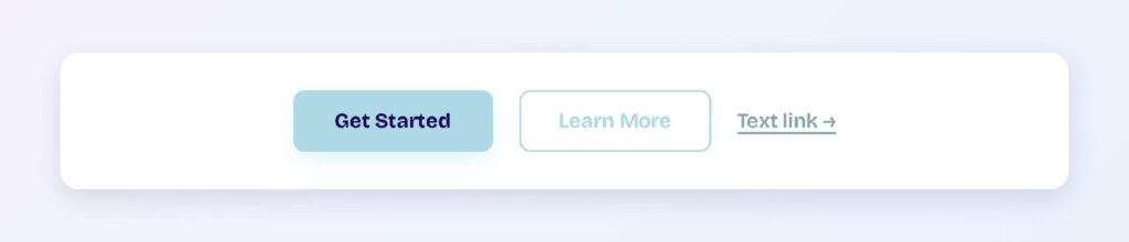
Base light blue fails as a button fill with white text (1.53:1), so flip the pattern: use #ADD8E6 with dark text for secondary buttons, and reserve the saturated #3999B9 with white text for primary actions. The family resemblance holds while every state passes.
What Are the Best Light Blue Color Palettes for UI?
Five harmony schemes come from light blue’s position at hue 195. Because the base is pale, every companion below shares its pastel register.
Monochromatic
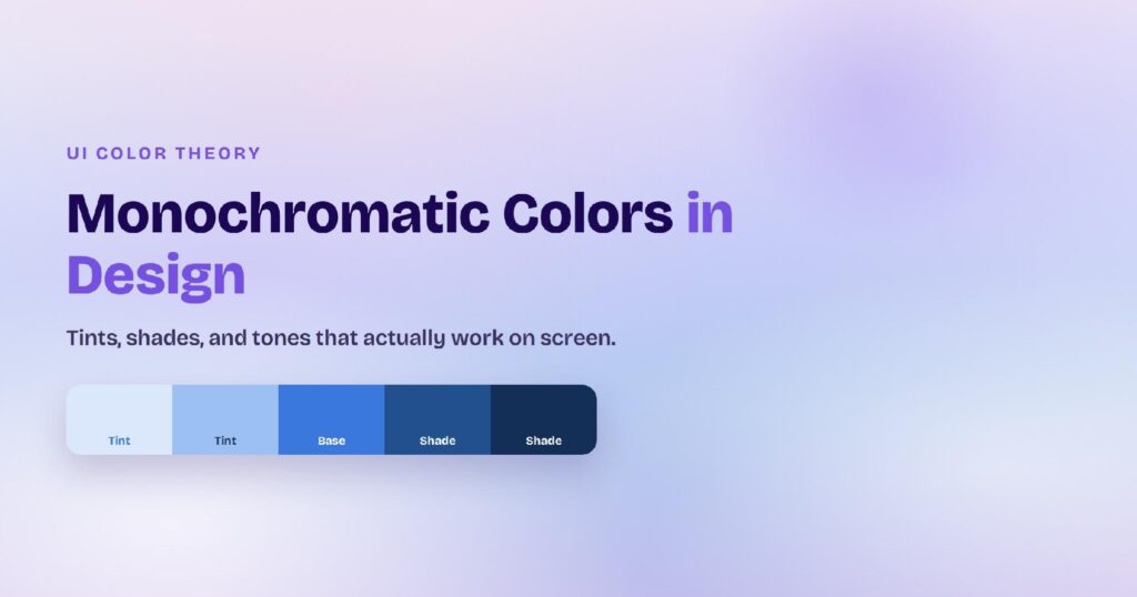
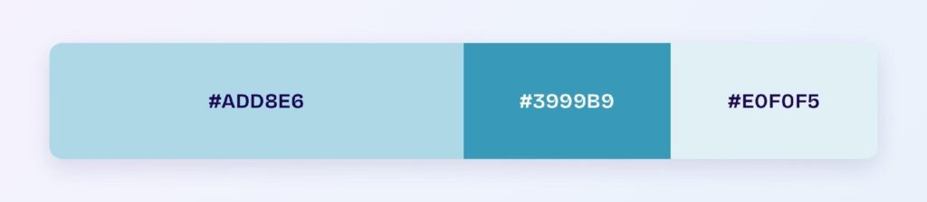
The set: #ADD8E6, #3999B9, and #E0F0F5. This is the workhorse: the saturated teal-blue supplies interaction contrast, the pale pair builds surfaces. Healthcare and SaaS products can ship an entire interface from these three values plus a dark ink.
Analogous
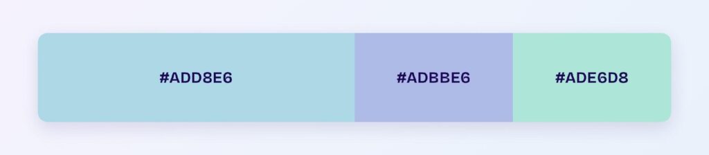
The set: #ADD8E6 with #ADBBE6 (toward periwinkle) and #ADE6D8 (toward mint). Three cool neighbors at matched lightness create the softest gradient territory available — hero washes, skeleton loaders, ambient section breaks.
Complementary
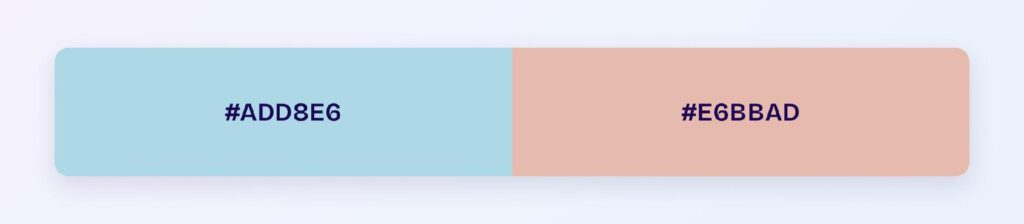
The set: #ADD8E6 against #E6BBAD — a soft peach, its computed opposite. The warm-cool pairing at matched lightness is the classic nursery and lifestyle palette: fresh without contrast violence.
Triadic
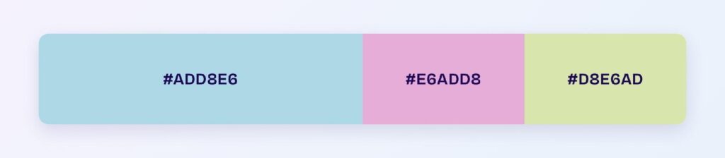
The set: #ADD8E6, #E6ADD8 (pale orchid), and #D8E6AD (pale lime). Three evenly spaced pastels suit category systems — calendars, tags, kanban lanes — where groups need identity without hierarchy.
Split-Complementary
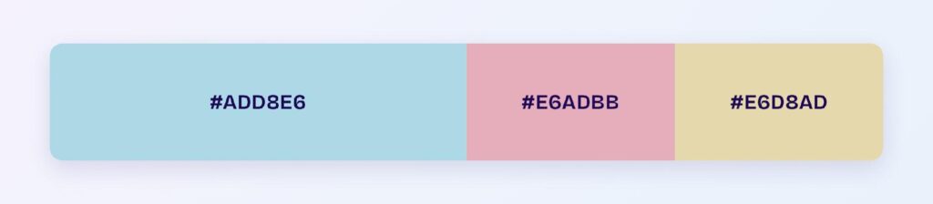
The set: #ADD8E6 with #E6ADBB (rose) and #E6D8AD (sand). You keep the warm contrast with two softer landings, which makes accent placement forgiving across large surfaces.
Which Colors Are Similar to Light Blue?
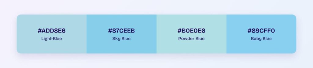
The three closest named colors are sky blue (#87CEEB), powder blue (#B0E0E6), and baby blue (#89CFF0). Sky blue adds saturation and clarity, powder blue mutes toward gray, and baby blue splits the difference. Sky blue is the step up when light blue feels too faint for a component.
Which Colors Pair Best with Light Blue?
The computed best partner is #E6BBAD, the peach complement — and beyond the math, light blue thrives with navy, charcoal, warm sand, and metallic gold. Navy in particular is the power pairing: same hue family, maximum lightness gap, so the combination reads as one coherent brand with built-in contrast.
Run the 60-30-10 split: 60% white or ice-blue surfaces, 30% light blue for structure and atmosphere, 10% navy or peach for the moments that need weight. Inverting to a navy-dominant scheme with light blue accents produces the classic fintech dark theme.
Which Colors Should You Avoid Pairing with Light Blue?
Avoid the near-neighbors #ADC0E6 and #ADE6DC. They sit within 45 degrees at the same lightness, so edges between them and #ADD8E6 dissolve into one pale wash.
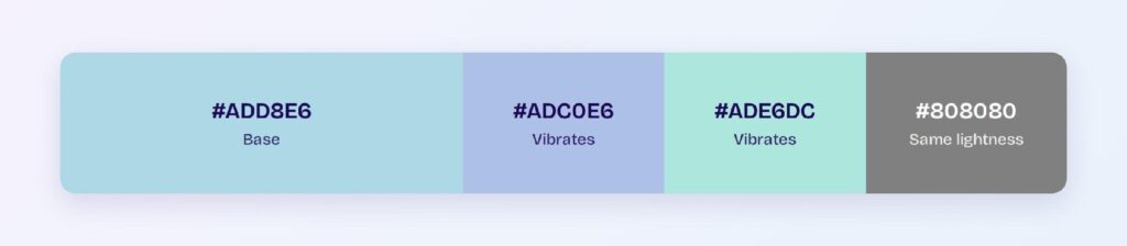
White is the other measured trap: at 1.53:1, light blue components on white backgrounds lose their boundaries entirely without a border or shadow. Every avoid call here is a contrast measurement, not a taste judgment.
Does Light Blue Meet Accessibility Standards?
As text on dark surfaces, emphatically: 13.74:1 on black clears the WCAG AAA bar with double the required margin. On white it fails at 1.53:1, so light blue never carries text duty on light themes — that job belongs to its saturated relatives.
Blue hues survive color vision deficiency better than any other family: red-green color blindness, which affects roughly 1 in 12 men, leaves blue perception intact. Pair meaning with icons or labels anyway — lightness differences within the blue family can still compress for some users.
How Can You Convert Light Blue Between HEX, RGB, HSL, CMYK, and Other Color Formats?
All six formats describe the same color:
- HEX #ADD8E6 — the default for CSS and design tokens.
- RGB rgb(173, 216, 230) — use RGBA for translucent sky washes and overlays.
- HSL hsl(195, 53%, 79%) — the format for programmatic tints; the whole family is one lightness slider.
- HSB 195, 25, 90 — what Figma’s and Photoshop’s pickers show.
- CMYK 25, 6, 0, 10 — a light ink load in print; light blue reproduces faithfully on paper.
Wrapping Up
Light blue (#ADD8E6) earns its place as the atmosphere color of the blue family: AAA contrast as text on dark surfaces at 13.74:1, a dark mode accent that clears 7.7:1, a shade family that covers ice to sky from one hue, and a navy pairing that hands you a complete brand system. Every ratio and palette above is computed, so production will match the page.
Put them to work in Visily‘s Theme feature: load the monochromatic ramp, set navy as the anchor, and ship a light blue interface today.