Light gray carries the hex code #D3D3D3, which resolves to rgb(211, 211, 211) and hsl(0, 0%, 83%), with all three channels set to the same value. Equal channels are what make it achromatic: no hue, no saturation, just a lightness reading near the top of the scale.
That high lightness is also light gray’s biggest constraint, since it reaches only 1.5:1 against white and fails every text contrast requirement in the spec. You’ll get every code format, the shades that actually differ, the palettes that work when a color has no hue to rotate, and the four places light gray belongs in an interface.
What Is the Color Light Gray?
Light gray sits at 83% lightness on the neutral axis, roughly five-sixths of the way from black to white. The CSS keyword lightgray maps to #D3D3D3 exactly, and lightgrey with an e resolves to the same value, so both spellings are valid in every browser.
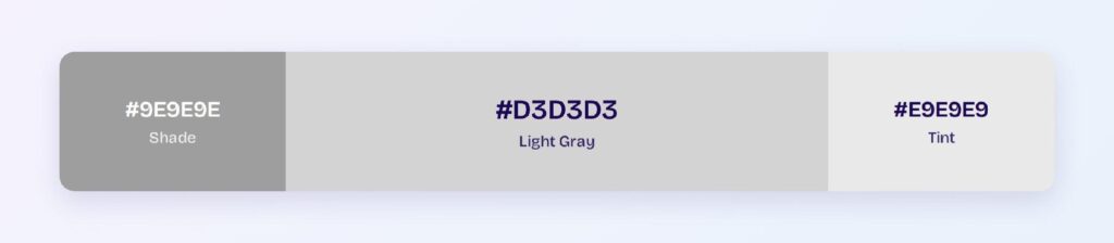
The full code set for #D3D3D3:
- HEX: #D3D3D3
- RGB: rgb(211, 211, 211)
- RGBA: rgba(211, 211, 211, 1)
- HSL: hsl(0, 0%, 83%)
- HSB: 0, 0, 83
- CMYK: 0, 0, 0, 17
Hue reports 0° only because an achromatic color has no hue to report. Saturation reads 0%, which means rotating the color wheel around #D3D3D3 returns #D3D3D3 every time, and the classic harmony schemes have nothing to work with.
CMYK exposes what light gray really is. At 0, 0, 0, 17 it’s pure black ink at 17% coverage, with no cyan, magenta, or yellow involved at all.
What Is Light Gray Called, and What Are Its Other Names?
Light gray is the standard name in the CSS specification, but the same tonal region carries at least four other labels depending on who’s naming it. The distinction matters because most of those names point at slightly different hex values, not synonyms.
Here’s what each name actually refers to:
- LightGray / LightGrey: both CSS keywords for #D3D3D3 exactly
- Gainsboro: a separate CSS keyword at #DCDCDC, nine steps lighter
- Platinum: a design-industry name for #E5E4E2, lighter and faintly warm
- Silver: the CSS keyword for #C0C0C0, noticeably darker
- Timberwolf: #DBD7D2, the warmest of the group
Gainsboro causes the most confusion, since designers use the two interchangeably in conversation while the values differ by a visible step. At 1.09:1 against each other, they’re indistinguishable side by side and distinguishable when either sits next to white.
Fancier names carry no technical meaning. Platinum, ash, and pearl are marketing labels rather than specified values, so pin them to a hex in your tokens before they drift across a design system.
How Does Light Gray Appear on Digital Screens?
Light gray behaves as an almost-white on most displays, and that’s the source of nearly every problem with it. Its contrast against white is 1.5:1, well under the 3:1 floor that any perceptible boundary needs.
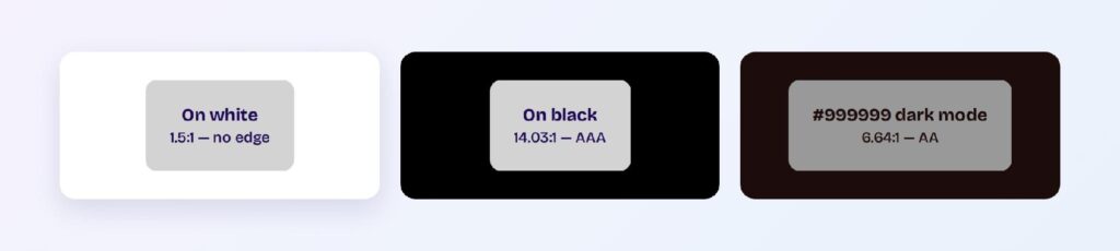
The numbers split hard by background:
- #D3D3D3 on white: 1.5:1, fails everything
- #D3D3D3 on black: 14.03:1, passes AAA
- White text on #D3D3D3: 1.5:1, fails everything
- #9E9E9E on white: 2.68:1, still fails AA
- #999999 on #1D0C0C: 6.64:1, passes AA in dark mode
Light gray flips from useless to excellent the moment the background goes dark. On a near-black surface it reads as a comfortable secondary text color, which is why the same token behaves so differently across a light and dark theme.
Panel calibration makes it worse in light mode. A #D3D3D3 divider that’s visible on a well-calibrated monitor can vanish entirely on a dim laptop screen or under bright ambient light.
Screenshot compression finishes the job. JPEG artifacts land hardest in low-contrast regions, so light gray borders often survive design review and disappear in the marketing asset.
What Are the Different Shades of Gray?
Shades of gray come from lowering lightness along the neutral axis while holding saturation at zero. Starting from #D3D3D3, the computed ramp gives you seven darker steps:
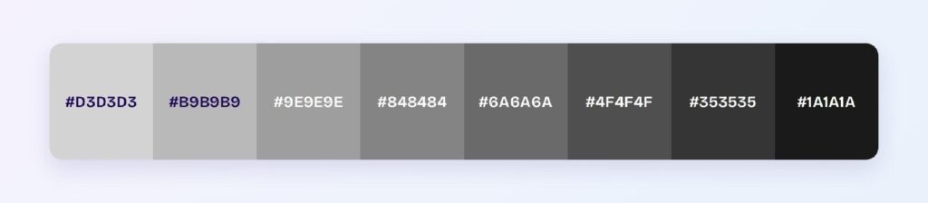
- #B9B9B9
- #9E9E9E
- #848484
- #6A6A6A
- #4F4F4F
- #353535
- #1A1A1A
Tints run the other way toward white: #D6D6D6, #D9D9D9, #DCDCDC, #DFDFDF, #E2E2E2, #E5E5E5, #E8E8E8, and #EBEBEB. Those steps are close enough that most interfaces need only three of them, typically a page background, a surface, and a hover state.
The practical dividing line sits around #767676. Below it, gray passes AA as text on white; above it, gray is a surface color and nothing more.
Warm and cool grays break the achromatic rule on purpose. A warm gray nudges red and yellow channels upward while a cool gray lifts blue, and mixing the two families in one interface produces a mismatch that reads as sloppy even when nobody can name it.
What UI Elements Work Best with Light Gray?
Light gray belongs on elements that structure a layout rather than communicate through it. At 1.5:1 against white it can’t carry text, can’t host text, and can’t define a boundary that WCAG considers perceptible.
That rules out buttons with labels, navigation bars, status badges, and chart series, all of which need contrast light gray doesn’t have. Four element types are where it genuinely performs.
Backgrounds and Surface Layers
Light gray earns its keep as the layer beneath white. A #D3D3D3 page background with white cards floating on top creates depth without a shadow, and the 1.5:1 difference is exactly enough to read as separation while staying quiet.
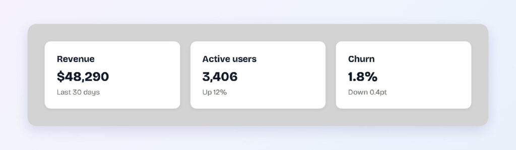
Reverse the usual instinct about contrast here. You want the surface difference to be barely perceptible, because a strong boundary between a page and its cards makes the layout feel choppy.
Step down to #E9E9E9 or #F4F4F4 for large areas. Full #D3D3D3 across an entire viewport reads as heavy, and the lighter tints give the same effect with less visual weight.
Dividers, Borders, and Outlines
Dividers are light gray’s most common job and its most misunderstood one. A #D3D3D3 rule on white sits at 1.5:1, which falls under the 3:1 non-text contrast requirement, and that’s acceptable only when the divider is decorative.
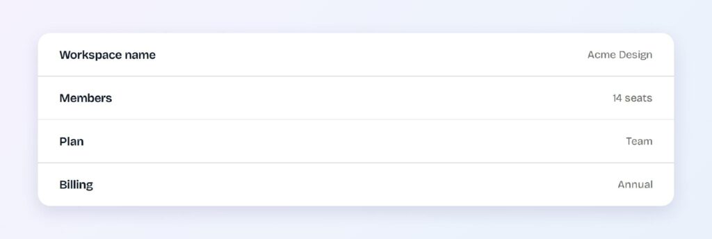
The spec draws the line at function. WCAG 1.4.11 applies to visual information needed to identify a component or its state, so a purely ornamental separator between list rows is exempt while an input field’s border isn’t.
Use #767676 or darker for anything functional. Form field outlines, focus rings, and selected-state borders all need 3:1, and light gray doesn’t come close.
Disabled States
Disabled controls are the one place where light gray’s failing contrast is explicitly allowed. WCAG exempts inactive components from contrast requirements, so a #D3D3D3 button with #8E8E8E label text is compliant despite being hard to read.

Low contrast is the signal here. A disabled button should look unavailable, and the same washed-out quality that disqualifies light gray elsewhere communicates the state instantly.
Never rely on gray alone to convey unavailability. Pair it with a cursor change, a tooltip, or helper text explaining what would enable the control.
Skeleton Loaders and Placeholders
Skeleton screens want a color that suggests content without asserting it, and #D3D3D3 does that precisely. The shapes register as pending rather than empty, which reduces perceived wait time compared with a spinner.

Animate between two tints rather than fading opacity. A shimmer running from #D3D3D3 to #E9E9E9 keeps the placeholder visible while signaling activity, and it stays consistent over any background.
Match the skeleton to the real layout. Placeholder blocks sized to the incoming text prevent the layout shift that happens when content loads into differently shaped containers.
What Are the Best Light Gray Color Palettes for UI?
Light gray has no hue, so the five classic harmony schemes collapse into a single value when you rotate the wheel around it. The working method is to anchor light gray as the neutral and derive the harmony from an accent hue instead.
Every palette below uses #5B21B6 as that accent, chosen because it holds 6.0:1 against #D3D3D3 and 8.98:1 against white. Substitute your own brand hue and the structure stays the same.
Monochromatic
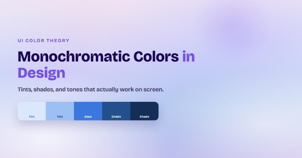
Monochromatic is the one scheme light gray computes natively, running on lightness alone: #F4F4F4, #E9E9E9, #D3D3D3, #B7B7B7, and #6A6A6A. Product teams reach for this when the interface is content-first and color would only distract.
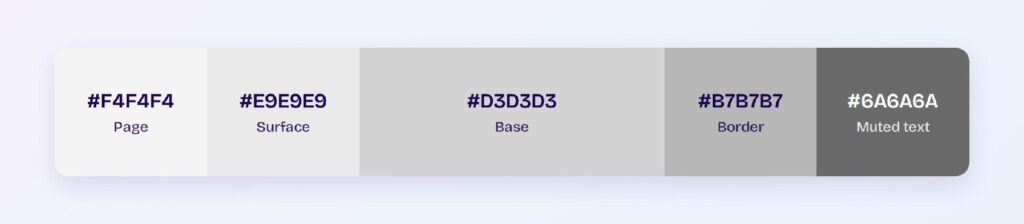
Map the five values to page, surface, base, border, and muted text in order. That gives you a complete neutral system with no hue decisions required.
Analogous
Analogous pulls the accent’s neighbors 30° in each direction: #5B21B6, #A521B6, and #2133B6, anchored on light gray. Cohesive and calm, this palette suits products where several related states need distinguishing without competing.
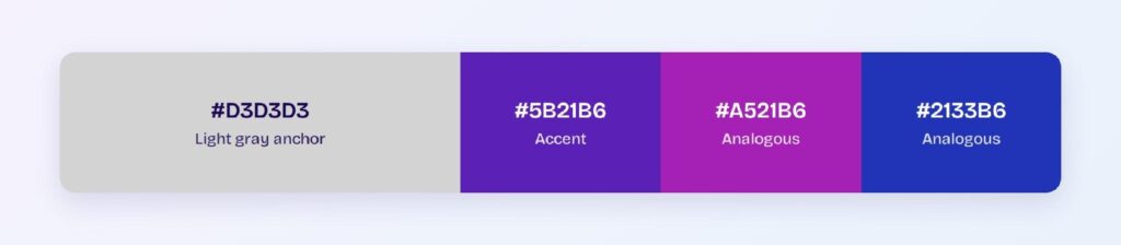
Light gray does the separating. Three analogous violets that would blur into each other on a saturated background stay distinct when a neutral sits between them.
Complementary
The complementary scheme pairs the accent with its opposite: #5B21B6 against #7DB621, over a light gray base. Maximum tension from two hues, with the neutral keeping them from fighting directly.
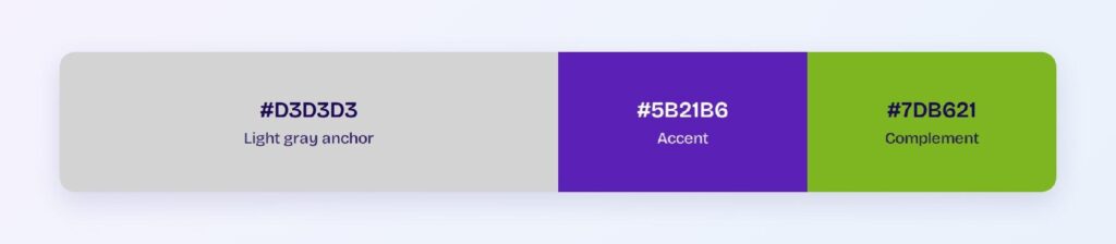
The green at #7DB621 is a caution. It reads well as a fill and poorly as text, so darken it before putting words on top.
Triadic
Triadic gives you three evenly spaced hues on the light gray anchor: #5B21B6, #B65A21, and #21B65A. Useful for categorical charts where each series needs its own identity against a neutral background.
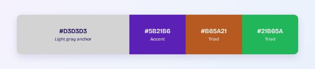
Test each series color against your actual surface. A palette that separates cleanly on white can lose one of its members against #D3D3D3, since the neutral raises the floor every series has to clear.
Split-Complementary
Split-complementary softens the direct opposition: #5B21B6 with #B6A521 and #33B621, over light gray. You keep the contrast of a complementary pairing and gain a third value for warnings or secondary actions.
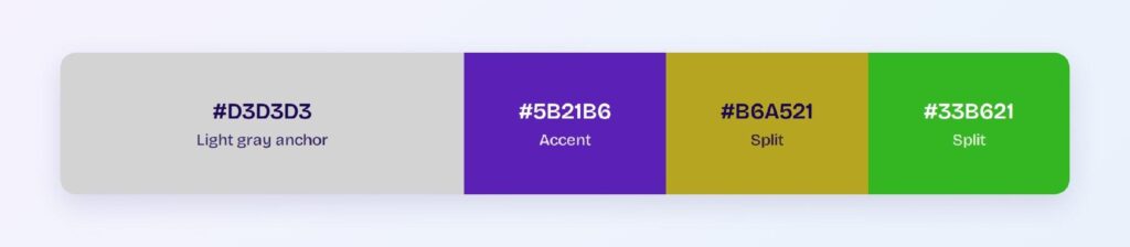
This is the most flexible of the five for product work. Visily’s theme tools can generate the tint and shade ladder for each value, so hover and active states come out accessible instead of hand-mixed.
Which Colors Are Similar to Light Gray?
Five named colors sit close enough to #D3D3D3 to substitute for it, and all of them fail against white for the same reason the base does:
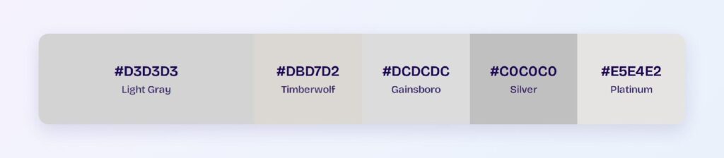
- Timberwolf (#DBD7D2): the nearest neighbor, warm-leaning, 1.05:1 from the base
- Gainsboro (#DCDCDC): neutral and slightly lighter, 1.09:1 from the base
- Platinum (#E5E4E2): lighter with a faint warm cast, 1.18:1 from the base
- Silver (#C0C0C0): noticeably darker at 1.22:1 from the base
- Light steel blue (#B0C4DE): the only one with real saturation, reading as pale blue
Silver is the useful substitution when a divider needs slightly more presence. At 1.82:1 on white it’s still short of the 3:1 requirement, but it survives dim screens and compression better than #D3D3D3 does.
Light steel blue is the odd one out. It carries genuine blue saturation, so it behaves like a tinted neutral and will clash with a warm gray family, as covered in the shades section above.
Which Colors Pair Best with Light Gray?
Deep violet #5B21B6 is light gray’s strongest accent partner in product work. At 6.0:1 against the base and 8.98:1 against white, it stays legible on both surfaces, which is rare for a saturated hue.
Any accent above roughly 4.5:1 against #D3D3D3 will work. That threshold rules out most pastels and mid-tones and leaves you with deeply saturated jewel tones, dark navies, and near-blacks.
Charcoal and near-black carry the text. Body copy at #1A1A1A on a light gray surface reaches well past AAA, and the pairing is the backbone of most content-heavy interfaces.
Apply the 60-30-10 split when light gray is your base:
- 60% light gray and its tints: page backgrounds and surface layers
- 30% near-black: text, icons, and functional borders
- 10% accent: the saturated hue carrying interactive meaning
Light gray holds the 60% slot comfortably because it never competes for attention. That’s the entire argument for using it: a neutral this quiet lets a 10% accent do the work of a 30% one.
Which Colors Should You Avoid Pairing with Light Gray?
White is the pairing that fails most often. At 1.5:1, a #D3D3D3 element on a white background has no perceptible edge, and every border, divider, and disabled outline built that way disappears on half the screens it reaches.
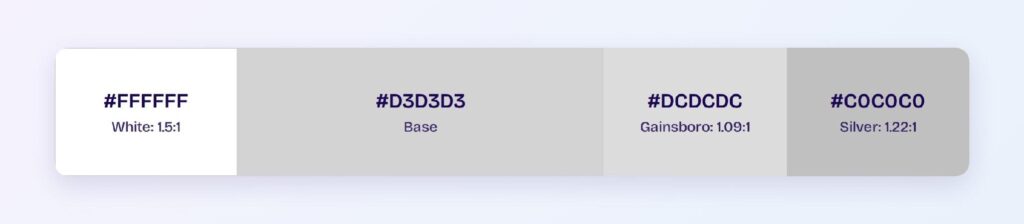
Adjacent neutrals fail for the same reason. Gainsboro sits at 1.09:1 and silver at 1.22:1 against the base, so stacking two of them expecting a visible boundary produces nothing at all.
Pastels are the third trap. Any color at similar lightness, regardless of hue, loses its edge against light gray, because the eye separates these two by luminance and there’s no luminance difference to work with.
Mid-tones sit in the awkward middle. A mid gray at #808080 reaches only 2.64:1 against the base, which is enough to look intentional and not enough to pass a contrast check, so you get a boundary that fails review while looking fine in the mockup.
Does Light Gray Meet Accessibility Standards?
Light gray fails WCAG contrast requirements against white in every category. The measured ratio is 1.5:1 against a 4.5:1 AA threshold for body text and a 3:1 threshold for large text and non-text elements, per the W3C.
Here’s where light gray lands across the common pairings:
- #D3D3D3 on white: 1.5:1, fails AA and the 3:1 non-text floor
- White on #D3D3D3: 1.5:1, fails
- #D3D3D3 on black: 14.03:1, passes AAA
- #9E9E9E on white: 2.68:1, fails AA
- #999999 on #1D0C0C: 6.64:1, passes AA
Two exemptions save light gray in practice. Disabled controls are exempt from contrast requirements entirely, and decorative elements that carry no required information fall outside 1.4.11.
Color vision deficiency doesn’t affect light gray at all. Because the color has no hue, it renders identically under protanopia, deuteranopia, and tritanopia, so its only accessibility variable is luminance.
Contrast sensitivity is the real concern. Older users and readers with low vision lose low-contrast boundaries first, so a design that depends on #D3D3D3 dividers to communicate structure will read as an undifferentiated block to them.
How Can You Convert Light Gray Between HEX, RGB, HSL, CMYK, and Other Color Formats?
Light gray converts cleanly across formats because its three channels are identical, so nothing shifts between color spaces:
- HEX #D3D3D3: the default in design files and CSS, with the repeating pattern that marks any neutral
- RGB rgb(211, 211, 211): the same value in decimal, needed for runtime calculation
- RGBA rgba(211, 211, 211, 1): adds alpha for overlays and hover fills
- HSL hsl(0, 0%, 83%): hue is undefined, saturation is zero, lightness carries everything
- HSB 0, 0, 83: the picker model in most design tools
- CMYK 0, 0, 0, 17: black ink at 17% coverage
HSL is the format that makes neutral ramps trivial. Because saturation stays at zero, you generate the entire gray scale by stepping one number, which is why design systems specify neutrals in HSL and export them to HEX.
Equal RGB channels are also the fastest achromatic test you have. If the three values match, the color is a true neutral; if they differ by even a few points, you’re holding a warm or cool gray that will clash with the rest of your neutral family.
CMYK holds fewer surprises here than for saturated colors. At 17% key coverage, light gray prints close to what the screen shows, though paper stock will shift the warmth slightly.
Wrapping Up
Light gray is a structural color, not a communicative one. Use #D3D3D3 for surfaces, decorative dividers, disabled states, and skeleton loaders, then switch to #767676 or darker the moment a border has to identify a component or a piece of text has to be read.
Stop hand-checking those ratios one at a time. Open Visily and use its AI-powered design tools to build your neutral ramp, apply accessible accent pairings, and generate every component state across your design in a single pass.