Orange carries the hex code #FFA500, which resolves to rgb(255, 165, 0) and hsl(39, 100%, 50%), sitting between red and yellow on the spectrum. It’s a secondary color built from the two warmest primaries, and it occupies the wavelength band from roughly 585 to 620 nanometers.
Orange also fails against white at 1.97:1, worse than red, worse than most designers expect from a color this loud. You’ll get every code format, the computed palettes, the four places orange belongs in an interface, and the numbers that explain why it can’t carry text on a light background.
What Is the Color Orange?
Orange sits at 39° on the color wheel, roughly a third of the way from red toward yellow. The CSS keyword orange maps to #FFA500 exactly, which is unusual among the named web colors because it’s noticeably lighter than the pure color-wheel orange most people picture.
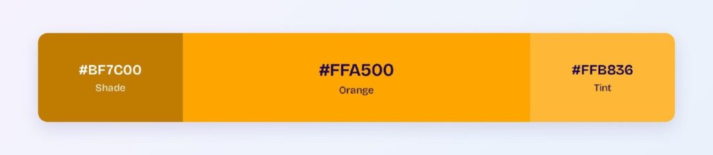
Here’s the full code set for #FFA500:
- HEX: #FFA500
- RGB: rgb(255, 165, 0)
- RGBA: rgba(255, 165, 0, 1)
- HSL: hsl(39, 100%, 50%)
- HSB: 39, 100, 100
- CMYK: 0, 35, 100, 0
Saturation reads 100% and lightness reads 50%, which puts orange at the outer edge of the gamut. The green channel at 165 is what separates it from red, and shifting that single number by 30 points moves you from a red-orange to an amber.
Orange is the brightest of the warm hues in perceptual terms. Its relative luminance sits far above red’s, which is exactly why it fails contrast tests that red squeaks past.
What Does Orange Mean, and Why Does It Grab Attention?
Orange reads as caution and energy at once, and interfaces exploit both. It sits one step below red in the standard severity ladder, so warning states, pending actions, and degraded-but-working systems all land on orange by convention.
The high-visibility use case explains the rest. Safety equipment, traffic cones, and life jackets use orange because it separates cleanly from natural backgrounds in fog and low light, which is the same property that makes it hard to ignore on a dashboard.
Its cultural readings vary more than most colors. Western contexts tie orange to autumn and affordability, Buddhist traditions attach it to monastic robes and detachment, and Dutch national identity claims it outright.
None of that transfers to product work. What does transfer is the severity ordering, and breaking it confuses users fast.
Keep orange one rung below red. If your error state and your warning state are both orange, you’ve collapsed two levels of urgency into one.
How Does Orange Appear on Digital Screens?
Orange renders bright on every panel because it drives two subpixels hard, with red at maximum and green at 65%. That combined output is why its luminance runs high and its contrast against white runs low.
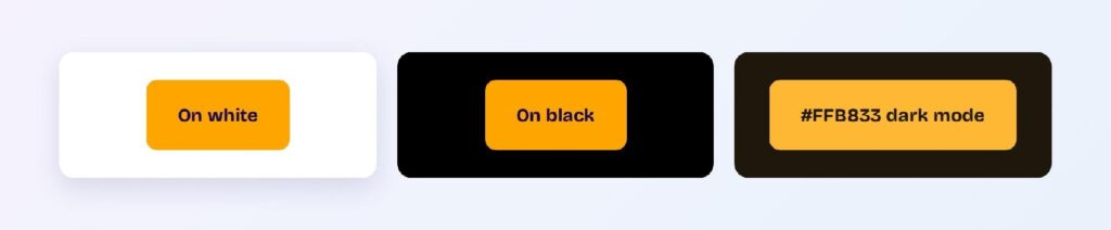
The measured values:
- #FFA500 on white: 1.97:1, fails everything
- #FFA500 on black: 10.63:1, passes AAA
- Dark variant #BF7C00 on white: 3.44:1, large text only
- Bright variant #FFB833 on #1D170C: 10.3:1, passes AAA
- White text on #FFA500: 1.97:1, fails everything
Orange is a dark-background color that most teams try to use on light backgrounds. On black it clears AAA with room to spare, and in dark mode it’s one of the most legible accents available.
Even the dark variant struggles in light mode. Dropping to #BF7C00 only reaches 3.44:1, which covers large text and non-text elements and still fails body copy.
Push to #9F6700 or darker when orange text has to sit on white. Below that point the hue starts reading as brown, which is the trade you accept for legibility.
What Are the Shades of Orange Called?
Shades of orange come from mixing black into #FFA500 while holding hue at 39°. The computed ramp:
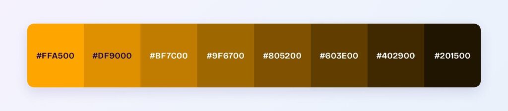
- #DF9000
- #BF7C00
- #9F6700
- #805200
- #603E00
- #402900
- #201500
Tints move the other way and carry the friendlier end of the family: #FFAF1B, #FFB836, #FFC250, #FFCB6B, #FFD586, #FFDEA1, #FFE7BB, and #FFF1D6. Those pale steps are where orange becomes usable as a background for warning banners.
Named oranges cluster tightly around the base:
- Dark orange (#FF8C00): the nearest neighbor, pushed slightly toward red
- Amber (#FFBF00): shifted toward yellow
- Tangerine (#F28500): marginally deeper and warmer
- Goldenrod (#DAA520): desaturated toward brown
- Coral (#FF7F50): pulled well toward pink
Every one of them fails on white except orange red at 3.44:1. That consistency is the useful takeaway: no named orange solves the light-mode text problem, so stop hunting for one and reach for a shade instead.
What UI Elements Work Best with Orange?
Orange belongs on elements that need attention without carrying small text on light surfaces. The 1.97:1 ratio against white rules out anything text-bearing in light mode, and the 10.63:1 against black opens up everything in dark mode.
That eliminates navigation bars, body text, and link colors in light themes. Four element types are left where orange genuinely performs.
Buttons and CTAs with Dark Labels
Orange buttons work when the label is dark, not white. Black text on #FFA500 reaches 12.6:1, while white text on the same fill fails at 1.97:1, and reversing that pairing is the single most common orange mistake in production.

Use the base value as the fill and set the label to near-black. The button reads as high-energy and stays fully legible.
Outline variants need the dark shade. A #FFA500 border on white sits at 1.97:1 and misses the 3:1 non-text minimum, so switch the stroke to #BF7C00 or deeper.
Warning Banners and Status Badges
Warning states are orange’s clearest semantic job. Degraded service, expiring trial, pending review, and action-required all sit one severity step below error, which is exactly where orange lives.

Build the banner from a tint, not the base. A #FFF1D6 fill with #805200 text and a #FFA500 left border gives you a readable banner where a solid orange fill would not.
Never rely on the hue alone. Orange and red separate poorly under protanopia, so pair each severity level with a distinct icon or label.
Data Visualizations
Charts use orange as a mid-severity marker and as a warm categorical series. It separates cleanly from blues and greens, which covers most two-and-three-series comparisons.
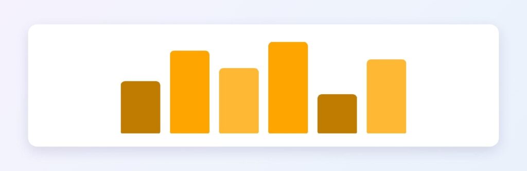
Keep it away from red and yellow in the same chart. All three sit within 40° of each other and blur into one warm band at small sizes.
Orange also works well for the “in progress” segment of a funnel or status breakdown, where red marks failed and green marks complete.
Use the darker shades for line charts. A #BF7C00 line reads clearly against a white plot area where the base value disappears into the gridlines.
Dark Mode Accents
Dark mode is where orange stops being a compromise. The bright variant #FFB833 on the computed dark surface #1D170C reaches 10.3:1 and clears AAA, so orange can carry small text, icons, and links that fail entirely in light mode.
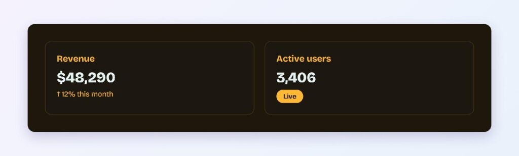
Raise lightness rather than saturation when you move the token. Orange is already at 100% saturation, so the only lever left is the tint ramp.
Orange links work in dark mode and nowhere else. That asymmetry means a single shared token won’t serve both themes, so define the light-mode and dark-mode values separately rather than deriving one from the other.
What Are the Best Orange Color Palettes for UI?
Every palette below comes from rotating hue around #FFA500 at fixed saturation and lightness, so each scheme is computed rather than curated. Pick by how much contrast your product needs, then check the accent against your actual background.
Monochromatic
Monochromatic holds hue at 39° and moves lightness: #FFA500, #996300, and #FFC966. Teams reach for this when orange is the brand color and a second hue would dilute it.
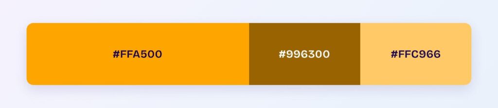
Map #996300 to text, the base to fills, and #FFC966 to hover surfaces. That split gives you an accessible set straight out of the scheme.
Analogous
Analogous pulls neighbors 30° in each direction: #FFA500, #D9FF00, and #FF2600. Warm and high-energy, this palette suits marketing pages more than product surfaces.
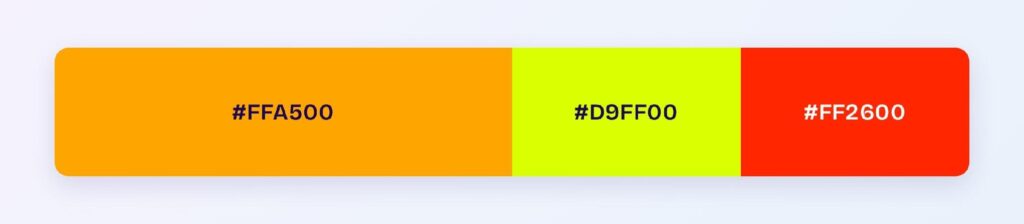
The risk is real here. Yellow-green at #D9FF00 sits at 1.1:1 against white and reads as almost invisible in light mode, so treat it as a dark-background value only.
Complementary
Orange’s complement sits opposite at 219°: #FFA500 paired with #0059FF. This is the highest-utility pairing of the five, because the blue carries interactive meaning while orange carries warning meaning and neither competes.
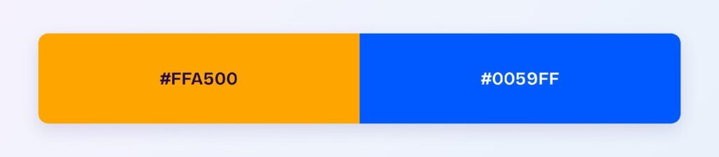
Blue at #0059FF reaches 5.6:1 on white and passes AA, so it can do the text and link work orange can’t. Visily’s theme tools can generate the tint and shade ladder for both values so the hover and active states stay accessible.
Triadic
Triadic lands on #FFA500, #00FFA6, and #A600FF. Balanced in theory and loud in practice, since all three sit at full saturation.
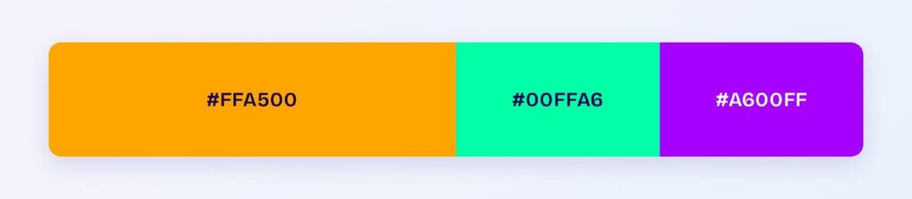
Mute two of the three into tones before shipping. Left at maximum, the combination reads as a color test rather than a product.
Split-Complementary
Split-complementary softens the head-on pairing: #FFA500, #00D9FF, and #2600FF. You keep the warm-cool opposition and gain a third value for secondary actions.
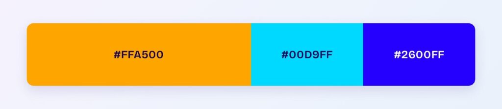
The deep blue at #2600FF is the workhorse. At high contrast on white it handles links and primary buttons while orange stays reserved for warnings.
Which Colors Are Similar to Orange?
Five named colors sit close enough to #FFA500 to be mistaken for it, and their contrast behavior is nearly identical:
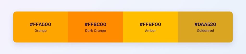
- Dark orange (#FF8C00): the nearest neighbor at 2.33:1 on white
- Amber (#FFBF00): lighter and more yellow, 1.65:1 on white
- Tangerine (#F28500): slightly deeper, 2.58:1 on white
- Goldenrod (#DAA520): desaturated toward brown, 2.24:1 on white
- Coral (#FF7F50): pulled toward pink, 2.5:1 on white
Every one fails AA on white, and none clears the 3:1 non-text floor. Swapping between named oranges never solves an accessibility problem, as covered in the shades section above.
Tangerine is the useful substitute when orange looks too yellow next to your brand. It holds the same energy with a marginally better ratio.
Which Colors Pair Best with Orange?
Deep blue #0059FF is orange’s strongest partner in product work. As the computed complement it produces maximum separation, and it clears AA on white where orange doesn’t, so the two divide the labor cleanly.
Neutrals matter more than usual here. Warm off-whites like #FFFBF5 keep orange looking deliberate, while cool grays make it look accidental, and near-black at #1A1A1A gives you the text color orange can never provide.
Navy is the safer version of the same idea. A deep navy background lets #FFA500 sit at high contrast without the vibration that saturated blue can produce.
Brown and orange share a family line worth exploiting. The lower shades of the computed ramp read as brown rather than orange, so #603E00 and #402900 give you an earthy neutral that already matches your accent by construction.
Apply the 60-30-10 split:
- 60% neutral: warm off-white or near-black surfaces
- 30% blue: navigation, links, and primary actions
- 10% orange: warnings, highlights, and the one CTA that matters
Orange rarely earns more than 10% in a product interface. Past that share it stops signaling and starts shouting.
Which Colors Should You Avoid Pairing with Orange?
Two computed near-clashes cause the most trouble: #EEFF00 and #FF3C00. Both sit 25° from orange at identical lightness, so the boundary between them shimmers and the eye can’t settle on an edge.
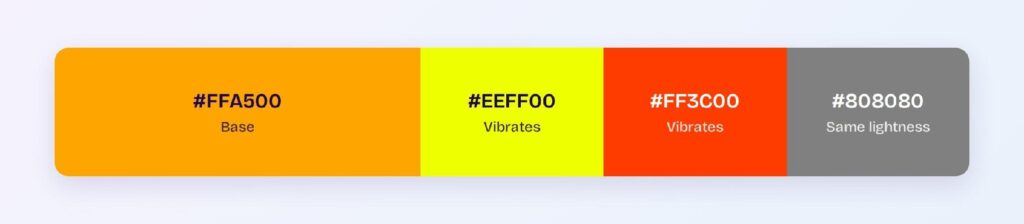
Yellow is the worst of the two. At similar lightness and adjacent hue, orange and yellow lose their separation entirely at small sizes and in compressed screenshots.
Red is the second problem, and it’s semantic rather than visual. Orange and red mean adjacent things in a severity ladder, so placing them side by side removes the distinction you built the ladder for.
Avoid white text on any orange fill. At 1.97:1 the label is unreadable, and no amount of font weight fixes a luminance problem.
Does Orange Meet Accessibility Standards?
Orange at #FFA500 fails WCAG AA against white in every category. The measured 1.97:1 falls far below the 4.5:1 body-text threshold and below the 3:1 large-text and non-text floors set by the W3C.
Where orange lands across the common pairings:
- #FFA500 on white: 1.97:1, fails AA and the 3:1 non-text floor
- White on #FFA500: 1.97:1, fails
- #BF7C00 on white: 3.44:1, large text and non-text only
- #FFA500 on black: 10.63:1, passes AAA
- #FFB833 on #1D170C: 10.3:1, passes AAA
Black text on an orange fill is the exception that saves the color. At 12.6:1 it clears AAA, which is why orange buttons and badges work when the label is dark.
Color vision deficiency is the second constraint. Under protanopia and deuteranopia, orange shifts toward yellow-brown and converges with red, so a red-versus-orange severity system collapses into one color for those users.
Pair every orange signal with a second cue. An icon, a label, or a position in a ranked list preserves the meaning when the hue doesn’t survive.
How Can You Convert Orange Between HEX, RGB, HSL, CMYK, and Other Color Formats?
Each format describes the same orange differently, and which one you reach for depends on what you’re doing:
- HEX #FFA500: the default in design files and CSS
- RGB rgb(255, 165, 0): the same channels in decimal, needed for runtime calculation
- RGBA rgba(255, 165, 0, 1): adds alpha for tinted overlays and hover fills
- HSL hsl(39, 100%, 50%): separates hue from saturation and lightness
- HSB 39, 100, 100: the picker model in most design tools
- CMYK 0, 35, 100, 0: subtractive ink percentages for print
HSL is what makes the orange ramp manageable. Since orange is already at 100% saturation, lightness is the only variable left, and stepping it generates the entire tint and shade ladder from one number.
CMYK holds up better for orange than for red. The 0, 35, 100, 0 mix is reachable with standard process inks, so the printed result tracks the screen more closely than most saturated colors.
Convert to HSL to build the scale, then export HEX for handoff. That order keeps the math legible and the tokens portable.
Wrapping Up
Orange is a dark-background color and a warning color, and treating it as either a light-mode text color or a stand-in for red is where teams go wrong. Set button labels in near-black, build warning banners from the #FFF1D6 tint with #805200 text, and let the bright variant #FFB833 carry the load in dark mode where it clears AAA.
Stop checking those ratios one pairing at a time. Open Visily and use its AI-powered design tools to generate your orange tint ramp, accessible warning states, and matched blue accents across the whole interface in one pass.