Visual design principles are the rules that decide how a UI looks and how easily people can use it. The Nielsen Norman Group calls them the foundational rules that organize elements on a screen, guide the eye, and make information easy to understand.
Count them and you’ll get a different number everywhere: some lists say five, others say seven, ten, or thirteen. Those are all slices of the same set, so this guide gathers the complete list and groups it by the job each principle does.
You’ll get every principle with its sub-types and a short explanation of each, a concrete UI example or two, and then how to apply the whole set in Visily. By the end you’ll have a working vocabulary for every part of a screen.
Designers slice the principles of design in different ways, but they cluster into five jobs: structuring the layout, directing attention, creating cohesion, supplying the raw materials, and the perception laws underneath. Here’s the full set at a glance before we take each one in turn:
| Principle | What it does | Key sub-types |
| Hierarchy | Ranks elements by importance | Visual, typographic, spatial, color |
| Balance | Distributes visual weight | Symmetrical, asymmetrical, radial, mosaic |
| Alignment | Lines elements to a shared edge | Edge, center, grid, optical, baseline |
| Proximity | Groups related items | Grouping, separation, common region |
| Grid & spacing | Sets the underlying structure | Column, modular, baseline, 4/8-point |
| Contrast | Makes elements stand apart | Color, size, weight, shape, texture |
| Emphasis | Draws the eye to one thing | Contrast, isolation, placement, size |
| Scale & proportion | Signals importance by size | Relative, typographic, proportional systems |
| White space | Creates focus and breathing room | Micro, macro, active, passive |
| Repetition & consistency | Makes the UI cohesive | Visual, functional, internal, external |
| Unity & harmony | Ties parts into one whole | Via proximity, repetition, alignment |
| Rhythm | Creates a visual beat | Regular, flowing, progressive, alternating |
| Movement & flow | Guides the eye’s path | F/Z patterns, leading lines, motion |
| Color | Carries mood, grouping, and state | Theory, proportion, psychology, roles |
| Typography | Structures the text | Scale, pairing, readability, weight |
| Gestalt | Explains why grouping works | Proximity, similarity, closure, continuity |
The principles that structure a UI layout
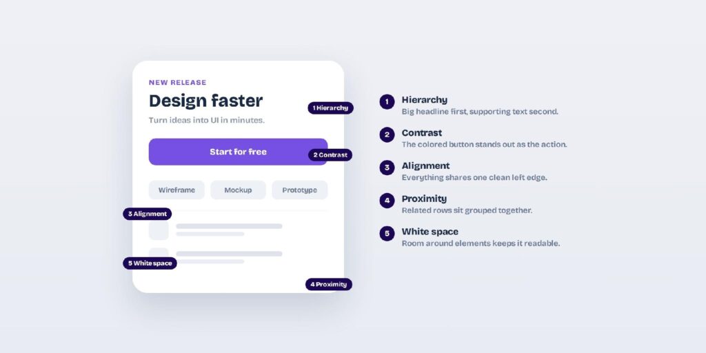
These principles decide where everything sits on the screen. They’re the backbone of visual design, the rules that turn a pile of elements into a layout the eye can read in order. Get them right and users never notice the structure; get them wrong and even good content feels broken. Master this group first, because attention and cohesion have nothing to organize until the structure holds.
Hierarchy
Hierarchy ranks elements so the eye lands on the most important thing first. You build it with size, weight, color, and position, and it’s the single most important principle in any UI.

Without hierarchy, every element competes for attention and the user has to hunt for the point. With it, a screen answers “what matters here?” before anyone reads a word. A pricing page that makes the recommended plan bigger, bolder, and colored is hierarchy telling you exactly where to look.
The quickest fix for a flat screen is to exaggerate the difference between the levels.
- Visual hierarchy: size, weight, color, and position set the rank of each element.
- Typographic hierarchy: heading, subhead, body, and caption levels give text a clear order.
- Spatial hierarchy: placement and what sits above the fold decide what’s seen first.
- Color hierarchy: primary, secondary, and accent colors mark relative importance.
Balance
Balance spreads visual weight across the layout so no area feels heavier than the rest. It can be even and formal or uneven and dynamic, a split designers call symmetrical and asymmetrical balance.
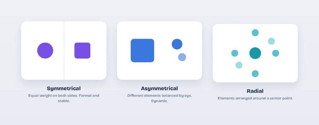
A balanced screen feels stable and calm, even when it’s packed with content. An unbalanced one feels like it’s tipping, and users sense it before they can name it. A dashboard with a heavy chart on one side needs weight on the other, whether that’s a stat block or deliberate empty space.
When a screen feels heavy on one side, add weight opposite it or trim the heavy element itself.
- Symmetrical: equal weight on both sides, which reads as formal and stable.
- Asymmetrical: different elements balanced by eye, which feels dynamic and modern.
- Radial: elements arranged around a central point.
- Mosaic: even, all-over weight with no single focus.
Alignment
Alignment lines elements up to shared edges or a grid so the interface looks ordered and intentional. Nothing should sit on the screen without a reason for its position.

Alignment is the cheapest way to make a design look professional. A single strong edge running down a form or a card list reads as careful, while ragged edges read as sloppy even when everything else is right. When a layout feels off but you can’t say why, misalignment is usually the cause.
Cutting the number of alignment lines is often the fastest way to tidy a busy layout.
- Edge alignment: left, right, top, or bottom edges line up.
- Center alignment: elements share a central axis.
- Grid alignment: everything snaps to an underlying grid.
- Optical alignment: nudging by eye where the math looks slightly off.
- Baseline alignment: text sits on a shared line across columns.
Proximity
Proximity groups related items close together and pushes unrelated ones apart, so structure reads without a single label. Space does the explaining.

Grouping by distance is how users parse a screen at a glance. A label sitting close to its input clearly belongs to it, while the same label floating between two fields is ambiguous. Proximity turns a wall of controls into a set of clear sections.
If two things belong together, move them closer before you reach for a divider line.
- Grouping: related items pulled together into a unit.
- Separation: unrelated items pushed apart so groups stay distinct.
- Common region: a shared container or background groups whatever’s inside it.
Grid and spacing systems
A layout grid and a spacing system give every other structural principle something to hang on. They keep alignment, balance, and rhythm consistent across screens.
A grid removes guesswork, since every element snaps to the same columns and gutters instead of being eyeballed. A spacing scale in steps of 4 or 8 points does the same for the gaps between things. Together they’re why a mature design system feels tidy on every page rather than only the ones you fussed over.
Pick one spacing scale early, and every later layout decision gets easier.
- Column grids: vertical columns that structure the layout.
- Modular grids: columns plus rows for more complex content.
- Baseline grids: consistent vertical spacing for text.
- Spacing systems: 4-point or 8-point steps between elements.
The principles that direct attention
Once the layout holds together, these principles decide where the eye goes first. They create focus, so users see the one thing that matters before everything else. Attention is a limited budget, and these rules spend it on purpose. Miss this group and users stall on every screen, unsure where to click next.
Contrast
Contrast sets elements apart through difference, and it’s how you make a button or a headline stand out. No contrast means no focus.

Contrast is also an accessibility requirement, not just a style choice. Text needs enough contrast against its background to stay readable, and a primary action needs to look clearly different from a secondary one. A “Buy now” button in a bold color on a calm page is contrast doing its job.
Check your text contrast against the background before you ship, never after.
- Color contrast: differences in hue, value, and saturation.
- Size contrast: large set against small.
- Weight contrast: bold set against light.
- Shape contrast: round set against square.
- Texture and directional contrast: smooth against rough, horizontal against vertical.
Emphasis and focal point
Emphasis makes one element the clear focal point, usually the primary action. You create it by making that element break from everything around it.

Every screen should have one obvious next step, and emphasis is how you signal it. Too many emphasized elements cancel each other out, so restraint matters as much as the technique itself. A single bright call-to-action in a sea of neutral UI is emphasis at its simplest.
If everything is emphasized then nothing is, so give each screen a single hero element.
- By contrast: a different color, size, or weight.
- By isolation: extra space around the element.
- By placement: a natural focal point along the eye path.
- By size or color: the boldest element wins attention.
Scale and proportion
Scale and proportion use relative size to signal importance and keep relationships legible. Bigger reads as more important, so scale carries meaning on its own.

Proportion keeps those size jumps feeling intentional instead of random. A consistent ratio between your heading, subhead, and body text creates a scale users can trust. When a single number in a dashboard is the point, making it large tells the story before the label does.
Jump between sizes by a clear step so the ranking reads at a glance.
- Relative scale: one element sized against another.
- Typographic scale: a consistent ratio between text sizes.
- Proportional systems: the golden ratio or the rule of thirds.
White space
White space is the empty room around and between elements, and it’s an active tool, not wasted space. It creates focus, groups content, and makes text readable.

Cramped screens feel stressful and hard to scan, while generous ones feel calm and premium. White space is also how you signal quality, which is why high-end brands leave so much of it. Adding room around a single card often does more for it than any decoration could.
When a screen feels cramped, try removing elements before you rearrange them.
- Micro white space: the gaps between letters, lines, and small elements.
- Macro white space: the gaps between major blocks and sections.
- Active white space: space added on purpose for emphasis.
- Passive white space: incidental margins and padding.
The principles that create cohesion and flow
These principles make a UI feel like one product instead of a pile of screens. They tie the parts together and move the eye through them. Cohesion is what separates a designed product from an assembled one. This is the group that makes ten separate screens feel like one product.
Repetition and consistency
Repetition reuses colors, type, spacing, and icons so the product feels cohesive and predictable. Consistency is what lets users learn your interface once and trust it everywhere.

When a button looks and behaves the same on every screen, users stop thinking about it and just use it. Inconsistency breaks that trust and makes a product feel unfinished. A design system exists mostly to enforce this one principle at scale.
Reuse a component instead of rebuilding it, and consistency mostly takes care of itself.
- Visual consistency: repeated color, type, and iconography.
- Functional consistency: controls that behave the same way each time.
- Internal consistency: matching patterns within your own product.
- External consistency: matching the platform conventions users expect.
- Component reuse: a design system of shared, repeatable parts.
Unity and harmony
Unity is the sense that every part belongs to one whole. It’s the payoff when the other principles agree with each other.

A unified screen feels intentional, as if one person designed every pixel with the same idea in mind. You reach it by repeating styles, aligning to one grid, and grouping related parts. When unity is missing, a UI feels stitched together from different sources.
When a layout feels off, hunt for the one element that does not share the system.
- Through proximity: grouped elements feel related.
- Through repetition: repeated styles tighten the whole.
- Through alignment: a shared grid connects everything.
Rhythm
Rhythm is a repeated visual beat, created by consistent spacing or patterns down a screen. It makes long layouts feel predictable instead of random.

Rhythm is what carries a user smoothly down a landing page or a long feed. Even spacing between sections sets a pace the eye can follow, while a deliberate break in that pace signals something new. A feed of cards with identical gaps has a rhythm you feel without noticing.
Keep the gaps between repeating blocks equal unless you mean to signal a change.
- Regular rhythm: even, repeated spacing.
- Flowing rhythm: organic, varied intervals.
- Progressive rhythm: steadily changing size, spacing, or color.
- Alternating rhythm: two motifs that trade off.
Movement and flow
Movement guides the eye along an intended path through the screen. You steer it with direction, lines, and placement so users read things in the right order.
People don’t read screens evenly; they scan in patterns like the F and the Z. Designing with those patterns puts your key message and action where the eye already goes. A hero that runs headline, then subtext, then button from top to bottom is guiding movement on purpose.
Put your headline and primary action along the path the eye already travels.
- Reading patterns: the F-pattern and Z-pattern the eye follows.
- Leading lines: visual cues that point the way.
- Visual path: the order in which elements are noticed.
- Motion: animation and transitions that direct attention.
The visual toolkits the principles act on
Color and typography aren’t layout principles, but every principle above acts through them. They’re the raw materials, so they get their own rules. Master these two and the rest get easier. Both reward restraint far more than variety.
Color
Color is the most powerful tool in the set: it carries hierarchy, mood, grouping, and state at once. Few decisions shape a screen as much as color in UI design.
Color sets the emotional tone before a user reads anything, and it signals meaning like success, warning, or error. Used with restraint, a single accent color can carry an entire interface. Used carelessly, too many colors compete and the hierarchy collapses.
Start with one accent and a set of neutrals before you introduce a second color.
- Color theory: warm and cool, complementary, analogous, and triadic relationships.
- Color proportion: the 60-30-10 rule that keeps a palette balanced.
- Color psychology: the meaning and mood each hue carries.
- Palette roles: primary, secondary, accent, neutral, and state colors.
Typography
Typography is a structural tool, not decoration; type sets hierarchy, rhythm, and readability. The right scale and pairing carry a layout on their own.
Most of a UI is text, so type choices shape the whole experience. A clear scale separates headings from body, while comfortable line length and spacing keep long content readable. Two well-paired fonts can give a product a voice without a single graphic.
Hold yourself to two typefaces and a short set of sizes to keep the type clean.
- Type scale: a consistent set of text sizes.
- Font pairing: a heading and body face that work together.
- Readability: line length, line height, and letter spacing.
- Weight and case: bold, regular, and capitalization used for emphasis.
Gestalt principles: the psychology underneath
Gestalt principles are the perception rules that explain why grouping, proximity, and hierarchy actually work. They sit alongside the broader laws of UX design and describe how the eye automatically organizes what it sees. German psychologists mapped them a century ago, and they still govern how users read every screen today.
- Proximity: close items read as a group, with no border required.
- Similarity: items that share color, shape, or size feel related.
- Closure: the eye completes a shape even when parts are missing.
- Continuity: we follow the smoothest line or curve through a layout.
- Figure and ground: we separate a subject from its background instantly.
- Common region: a shared container groups whatever sits inside it.
- Common fate: items that move together seem connected.
- Symmetry and order: balanced, orderly arrangements feel intentional and calm.
Proximity and common region show up twice here, as layout principles and as Gestalt laws. That’s expected, since these perception rules are the psychology beneath several of the principles above.
How to Apply Visual Design Principles in Visily
You apply these principles in Visily by starting from a structured theme, then reusing components so consistency holds by default. Visily is an AI UI design tool, so hierarchy, spacing, type, and color come pre-organized instead of built from scratch. That head start lets you spend your effort on the content instead of rebuilding the fundamentals each time.
Start from a structured theme
Generate a project theme and Visily sets your color, typography, spacing, shadows, and corner radius as one system. That bakes in hierarchy, contrast, and consistency before you place a single element. You adjust the theme once and it applies across every screen, so the structural principles hold automatically.
Reuse components for consistency
Build with Visily’s components and design tokens so repetition and alignment hold without manual effort. Reused parts keep spacing, color, and type identical everywhere, which is exactly what consistency asks for. Magic Theme can reskin the whole app in one click when you change direction, and the principles stay intact through the switch.
Prototype and pressure-test the hierarchy
Turn the design into a clickable prototype and check that the eye lands where you intended. If the primary action doesn’t win attention, adjust contrast and scale until it does. Export to Figma, PDF, PNG, or code once the layout reads the way you planned.
Wrapping Up
Visual design principles work as one system, not a checklist. Hierarchy, contrast, balance, and the rest reinforce each other, and a strong UI usually gets most of them right at once. Learn them as a group and you’ll spot what’s off in any screen. No single rule saves a weak layout, but together they rarely fail.
Visily builds the system in for you. Generate a project theme that sets hierarchy, color, type, and spacing together, reuse components and design tokens so consistency holds, and reskin everything in one click with Magic Theme.
When the layout reads the way you want, prototype it and export to Figma, PDF, PNG, or code. Open Visily’s free Starter plan and start designing today.