Neumorphism, also called soft UI, is a design style where buttons, cards, and toggles look pressed out of the background instead of placed on top of it. It uses one background color and two soft shadows, a light highlight and a darker shadow, to make elements look gently extruded.
The style went viral around 2020 as a fresh middle ground between flat design and skeuomorphism. It’s beautiful on a concept screen, but it carries a real accessibility problem that decides where it belongs.
In this blog, I’ll cover what neumorphism is, how the effect works, where you’ll see it, its pros and cons, how it compares to other styles, and how to use it without breaking usability.
What Is Neumorphism in UI Design?
Neumorphism is a visual design style that makes on-screen elements look softly extruded from the surface behind them. Rather than sitting on the background, a neumorphic button appears molded from the same material, lifted only by light and shadow.
Soft UI, extruded from the background
The signature look is a soft, plastic-like surface with rounded corners and no hard edges. Elements share the background color and gain shape from shadows alone, so the whole interface feels quiet and monochrome. That’s why it earned the nickname soft UI.
A blend of skeuomorphism and flat design
Neumorphism sits between two older styles: it borrows the tactile depth of skeuomorphism and the clean simplicity of flat design. It keeps the real-world feel of a pressable surface without the literal textures like leather or wood. The result is depth stripped down to its simplest form.
Where the name comes from
The name is a portmanteau of “new” and “skeuomorphism,” coined around 2019 as the style spread from a viral concept design. It signals exactly what it is: a modern take on making digital things feel physical. The look took off across design communities almost overnight.
How Does the Neumorphism Effect Work?
The whole effect comes from one rule: keep the element the same color as the background, then fake depth with shadows.
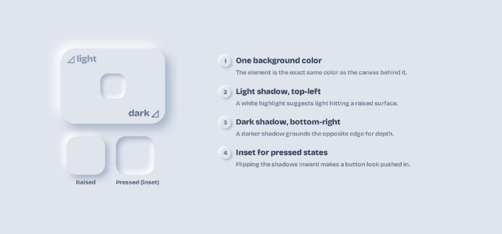
It’s a lesson in the principles of design, where light and shadow alone can imply a third dimension on a flat screen.
One background color
Neumorphism is strictly monochromatic: the button, the card, and the canvas all share the same fill. Muted, pastel tones work best, which makes it a careful exercise in color in UI design. Because there’s no color contrast, every bit of definition has to come from shadow.
Dual shadows: light and dark
Two shadows create the lift: a light highlight on the top-left and a darker shadow on the bottom-right, as if a soft light source sits above the screen. Matching the shadow color to the background keeps the surface looking like one continuous material. Get the balance right and the element seems to rise out of the page.
Raised versus inset states
Outer shadows make an element look raised, while moving those shadows inward makes it look pressed into the surface. That inset style is how neumorphism shows an active or toggled-on state. Simple, rounded shapes read most clearly, so the style sticks to squares, circles, and soft corners.
What Are Some Examples of Neumorphism?
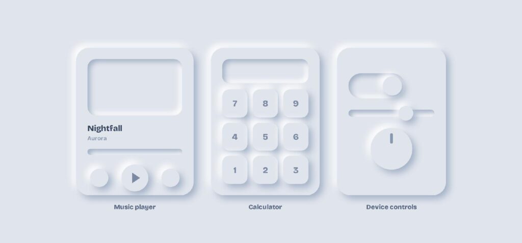
Neumorphism shows up most on small, self-contained interfaces where the soft look can shine without overwhelming the user. Think tactile instruments rather than full websites: a single screen with a few clear controls.
Buttons, toggles, and cards
At the component level, neumorphism suits buttons, toggles, sliders, and cards that benefit from a pressable feel. Soft, rounded app icons and switches are the most common building blocks. Each one invites a tap because it looks physically raised.
Music players and calculators
The style is a favorite for music players and calculators, where a tight grid of soft keys feels satisfying to press. These single-purpose tools have few elements and little text, so the low contrast matters less. That’s the sweet spot for soft UI.
Smart-home and device controls
Neumorphism also fits smart-home dashboards, thermostats, and audio controls that mimic real dials and switches. The tactile look suits a screen meant to feel like a physical device. Fewer controls means the soft shadows stay readable.
What Are the Pros and Cons of Neumorphism?
Neumorphism’s strength is a calm, tactile beauty, and its weakness is poor accessibility. The same low contrast that makes it elegant also makes it hard to use, which is why it clashes with UI design best practices.
| Pros | Cons |
| Clean, calm, modern aesthetic | Low contrast fails WCAG accessibility |
| Soft, tactile, and satisfying to press | Buttons are hard to spot as interactive |
| Cohesive, single-color palette | Text on the surface is hard to read |
| Great on single-purpose concept screens | Breaks down on dense, full-scale UIs |
The soft, tactile appeal
Done well, neumorphism looks clean, modern, and quietly premium. The soft shadows feel calm and cohesive, and the pressable surfaces are genuinely satisfying to interact with. On a focused concept screen, few styles look as polished.
The accessibility problem
The catch is contrast. Because elements share the background color, buttons and text can fall well below the WCAG minimum 4.5:1 ratio, leaving low-vision users unable to tell what’s clickable. Users can’t act on controls they can’t see, so pure neumorphism fails as a full interface.
How Does Neumorphism Compare to Skeuomorphism, Flat, and Material Design?
Neumorphism is easiest to understand next to the styles it borrows from and competes with. Each one handles depth differently, and that difference decides where each belongs.
Neumorphism vs. skeuomorphism
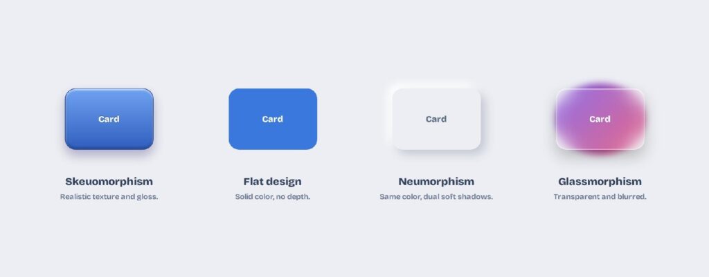
Skeuomorphism copies real-world textures like leather, wood, and metal in full detail. Neumorphism keeps only the sense of a raised, physical surface and drops the literal materials. It’s skeuomorphism’s tactile feel, reduced to light and shadow.
Neumorphism vs. flat and material design
Flat design uses solid color and no depth, the clean base neumorphism builds on. Material Design adds a single drop shadow so elements float above the surface, while neumorphic elements sit within the surface and extrude from it. Material separates layers; neumorphism molds them from one piece.
Neumorphism vs. glassmorphism
Glassmorphism uses transparency and a background blur so panels look like frosted glass floating over color. Neumorphism is the opposite: fully opaque, monochrome, and shaped by shadow rather than blur. One floats over a scene; the other rises out of a solid surface.
Here’s how the four styles line up side by side:
| Style | Look | Depth cue | Best for |
| Skeuomorphism | Realistic textures and gloss | Mimics real objects | Onboarding, tactile apps |
| Flat design | Solid color, no ornament | None | Dense, content-heavy UIs |
| Neumorphism | Same color, dual soft shadows | Extruded from the surface | Single-purpose tactile screens |
| Glassmorphism | Transparent, blurred, light border | Floats over color | Colorful, media-rich screens |
Is Neumorphism Still Used in 2026?
Neumorphism never became the default, but it never disappeared either. It settled into a niche: a striking look for the right screen, used with care to sidestep its accessibility flaws.
The rise and fall
Neumorphism exploded across design communities around 2020, then cooled quickly once the accessibility problems became clear. It now lives on as a recurring accent rather than a dominant trend, resurfacing whenever soft, tactile looks come back into design trends. The hype faded; the aesthetic stayed.
Where it still works
The style still shines on single-purpose, low-density screens: music players, calculators, smart-home panels, and concept dashboards. With few elements and little body text, the soft look stays usable. Matching the interface to the style is what keeps it alive.
How to use it accessibly
You can keep the soft look and still pass accessibility if you compensate for the low contrast. A few rules make neumorphism safe to ship:
- Deepen the shadows or add a subtle border so controls read as interactive.
- Keep text on a higher-contrast surface, not on the soft panel itself.
- Reserve the style for key controls, and pair it with clearer states elsewhere.
How Do You Design Neumorphism in Visily?
You design neumorphism in Visily by setting one background color, then adding the paired light and dark shadows that create the soft, extruded look. Visily is an AI UI design tool, so you can apply that shadow treatment consistently across every screen.
Set a single background color
Start with one muted, pastel background and give your elements the exact same fill. Generate a theme so the color, spacing, and corner radius stay consistent, then lean on soft, rounded shapes. The monochrome base is what makes the shadows read.
Add the light and dark shadows
Give each element a light shadow on the top-left and a darker one on the bottom-right to lift it off the surface. Flip the shadows inward for pressed and toggled states. Keep the radius generous so the surface stays soft.
Prototype and export the design
Turn the screens into a clickable prototype to check that every control still reads as tappable. When it’s ready, export to Figma, PDF, PNG, or code, and everything starts on the free plan.
Wrapping Up
Neumorphism is a soft-UI style that shapes elements from one background color using a light and a dark shadow. It looks calm and tactile, but its low contrast fails accessibility, so it works best on single-purpose screens and needs care to stay usable.
Visily makes it easy to try safely. Generate a full project theme from a keyword, screenshot, or URL, set a monochrome background from pre-made palettes, tune the shadows and corner radius, and reskin the whole app in one click with Magic Theme, applied across every screen at once.
When it’s ready, prototype the flow, check your contrast, and export to Figma, PDF, PNG, or code. Open Visily’s free Starter plan and start designing today.