White’s HEX code is #FFFFFF. All three RGB channels run at their maximum of 255 — full red, full green, full blue — producing the brightest value a screen can emit. White is achromatic: zero hue, zero saturation, pure lightness, and it holds a distinction no other color can claim, because every contrast ratio on the web is ultimately measured against it.
Below you get every white code format, the off-white family designers actually deploy, the contrast mathematics that make white the reference point of the WCAG system, and the one dark mode mistake pure white causes. Because white is achromatic, hue harmonies collapse — so this article covers what replaces them: undertones, tonal structure, and white as the stage every palette performs on.
What Is the Color White?
White is the CSS named color white, mapped to #FFFFFF, with RGB rgb(255, 255, 255). In additive light, white is what you get when red, green, and blue all fire at full strength — the sum of every visible wavelength rather than the absence of color. Screens don’t have white pixels; they have three sub-pixels shouting at once.
In HSL terms, white is hsl(0, 0%, 100%): the hue value is meaningless at zero saturation, and lightness is pegged to its ceiling. That achromatic status means white never clashes with anything, never carries a temperature of its own, and never shifts a palette — which is exactly why it hosts nearly every interface on the web.
Philosophically and practically, white in design is space. It’s the silence between elements, the margin that gives type room to breathe, and the default answer to the question of what goes behind the content.
What Is the Opposite Color of White?
Black — #000000, the point where all three channels drop to zero. The white-to-black axis is the lightness spine of every color system, and the pair produces the maximum possible contrast ratio in the WCAG formula: exactly 21:1. No color pairing on any screen can exceed it; every other ratio in this entire series lives somewhere between 1:1 and that ceiling.
That mathematical fact makes white-and-black the reference pairing of accessibility work. When a guideline says text must reach 4.5:1, it’s asking your pairing to achieve roughly a fifth of what white-on-black delivers for free.
What Are the Different Shades of White?
White’s family is a set of near-whites distinguished by faint undertones:
- Pure White (#FFFFFF) — the mathematical ceiling
- Snow (#FFFAFA) — a whisper of red warmth
- Ivory (#FFFFF0) — yellow-warmed classic elegance
- Floral White (#FFFAF0) — warm with a peach lean
- Ghost White (#F8F8FF) — cool with a blue breath
- White Smoke (#F5F5F5) — the neutral workhorse surface
- Off-White (#EBEBEB) — white’s computed near-tint, the card-on-white standard
The differences look trivial in isolation and decisive in composition: warm whites make interfaces feel human and editorial, cool whites read as technical and precise, and the neutral smokes do the structural layering in between.
Is White Even a Color?
It depends on the model, and both answers are useful. In physics, white light is the combination of all visible wavelengths — a mixture, not a single spectral color. In design and perception, white is absolutely a color: it occupies space, carries cultural meaning, and does compositional work no other value can.
The practical resolution for product teams: treat white as your most important color, precisely because it covers more pixels than any other value in your system. The color you think about least is the one users see most.
How Does White Behave on Digital Screens?
The two boundary numbers: white on black scores a perfect 21:1 — the highest ratio the WCAG formula can produce — while white on white is, by definition, 1:1, total invisibility. Every design decision about white is about where between those poles its partners sit.

The subtler issue is white as light source. A #FFFFFF page at full brightness emits more light than any other surface, which is why long reading sessions on pure white tire eyes faster than on #FAFAFA or warm paper tones. Most mature reading products quietly ship off-white.
Dark mode reverses the caution: pure white text on true black creates halation — a glow effect that blurs letterforms for many readers, especially those with astigmatism. The professional pattern is #EBEBEB-to-#F5F5F5 text on very dark gray surfaces, keeping contrast above 15:1 while killing the glow.
Where White Works in an Interface
White works everywhere, which is exactly why it needs discipline. Its jobs divide into four.
The Canvas
White is the default page. Content-first products — docs, search, commerce — use pure or near-white canvases because every content color reads against them at its measured best. The entire contrast column of this article series assumes this canvas.

Cards and Elevation
On a white-smoke page, pure white cards read as elevated without a single shadow. The #F5F5F5-page-plus-#FFFFFF-card pattern is the quiet backbone of modern SaaS layout — elevation through lightness, not decoration.

Text on Dark and Colored Surfaces
White is the universal label color for saturated fills. Across this series, white text passes on navy at 16:1, purple at 9.4:1, burgundy at 10.8:1, and brown at 6.4:1 — one text token serving every dark brand color.

Whitespace as a Component
The most valuable white in any interface is the white with nothing in it. Margin, padding, and line spacing do the hierarchy work that borders and rules would otherwise fake — the difference between a cramped screen and a premium one is usually measured in white pixels.

What Replaces Color Palettes for White?
White is achromatic, so the computed harmonies collapse — complementary, analogous, and triadic all return #FFFFFF. The math confirms what theory predicts: you can’t rotate a hue that doesn’t exist. White’s palettes are built on three other axes.
The Tonal Ladder
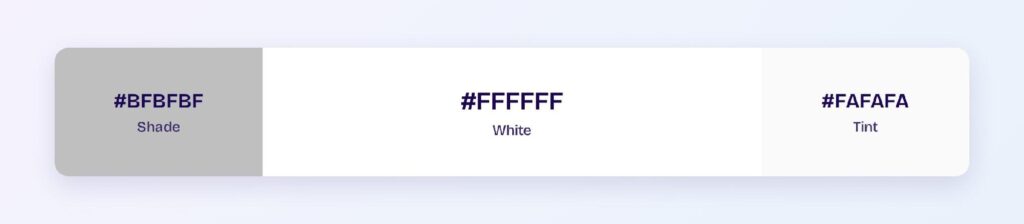
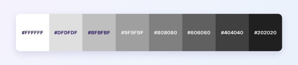
The surviving harmony is monochromatic: #FFFFFF, #EBEBEB, and #999999. Extended into a full ramp toward black, this ladder is the surface-and-elevation system of every design library — background, card, border, divider, and disabled state, all from one axis.

Undertoned Whites
The second axis tints white a few points toward a hue: ivory and floral white warm a brand, ghost white cools it. Undertoned whites let the empty space echo the brand color so subtly that users feel it without seeing it.

White as the Stage
The third pattern is white’s superpower: pair the white-to-gray ladder with any accent system and it works unchanged. Every palette in this color series — teal, purple, burgundy, olive — performs against the same white stage. Swap the brand hue and the neutral system needs zero edits.
Which Colors Are Similar to White?
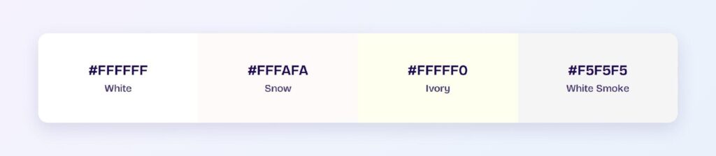
The three closest named colors are snow (#FFFAFA), ivory (#FFFFF0), and white smoke (#F5F5F5). Snow and ivory are undertone plays — red and yellow respectively — while white smoke steps down the lightness ladder into surface duty. Ivory is the swap when pure white feels sterile for a warm brand.
Which Colors Pair Best with White?
All of them — white is the one partner every color in this series tests well against, because maximum lightness guarantees maximum lightness gap with anything saturated. The strongest pairings are the darkest: navy, charcoal, burgundy, and forest green all clear AAA as text or fills on white.
The 60-30-10 split with white in the 60 slot is the default architecture of the modern web: white surfaces, one brand hue for structure, one accent for conversion. Its universality is why breaking it — a colored canvas with white as the accent — instantly reads as bold.
Which Pairings Should You Avoid with White?
Anything above roughly 85% lightness. The measured failures from this series: yellow at 1.07:1, cream at 1.04:1, lavender at 1.23:1, pink at 1.54:1, and light blue at 1.53:1. Pale-on-white is the most common contrast failure on the web because both parties look fine alone.
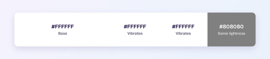
The fix is never a slightly-less-pale pastel — it’s a border, a shadow, or a full lightness tier of separation. If a component must be pastel on white, its edge needs to come from somewhere other than the fill.
Does White Meet Accessibility Standards?
White defines the standard: the WCAG contrast formula tops out at exactly 21:1 for white on black, and white text passes AAA on any surface darker than roughly 42% lightness. As a background, white is the yardstick every foreground color in this series was measured against.
White is unaffected by every form of color vision deficiency — with no hue to confuse, lightness-based white hierarchies read identically for all users, including the roughly 1 in 12 men with red-green color blindness. The one perceptual caution is halation: keep dark mode text just below pure white.
How Can You Convert White Between HEX, RGB, HSL, CMYK, and Other Color Formats?
All six formats describe the same color:
- HEX #FFFFFF — the default for CSS and design tokens; #FFF is the legal shorthand.
- RGB rgb(255, 255, 255) — all channels at maximum; use RGBA for scrims and glass effects.
- HSL hsl(0, 0%, 100%) — hue is meaningless at zero saturation; only the 100% lightness matters.
- HSB 0, 0, 100 — what Figma’s and Photoshop’s pickers show.
- CMYK 0, 0, 0, 0 — white is the absence of ink; in print, white is the paper itself.
Wrapping Up
White (#FFFFFF) earns its invisible dominance: the 21:1 ceiling of the entire contrast system, a universal stage that hosts every brand palette unchanged, an off-white family that tunes warmth without stealing attention, and one perceptual rule — step just below pure white for dark mode text. The color you design with most deserves the same rigor as any hue. Every number above is computed.
Put it to work in Visily‘s Theme feature: set your white ladder, choose your undertone, and ship the cleanest interface in your category today.