Purple’s HEX code is #800080. It sits at hue 300 — the exact midpoint between red and blue — with 100% saturation and 25% lightness, which gives it the depth of a serious brand color and the historical weight of a shade once reserved for royalty. Product teams reach for it when they want premium, creative, or imaginative without saying any of those words out loud.
Below you get every purple code format, the five computed harmony palettes, and exact WCAG contrast ratios against white, black, and dark surfaces. Every value is computed from the hex through color math, so the numbers go into your design tokens without rounding or guesswork.
What Is the Color of Purple?
Purple is the CSS named color purple, mapped to #800080. Its RGB is rgb(128, 0, 128): red and blue sit level at exactly half strength while green stays at zero. That perfect red-blue balance is what distinguishes web purple from violet, which leans blue, and magenta, which runs both channels at full.
In interfaces, purple carries a distinct set of associations: creativity, premium tiers, and imagination. It’s the default for AI features, pro-plan badges, and brands that want to stand apart from the blue-saturated SaaS landscape.
Purple also has an accessibility superpower most designers miss: at 25% lightness it delivers dark-color contrast on white while keeping an unmistakable hue identity, something navy and charcoal can’t claim.
What Are the 7 Shades of Purple?
Seven commonly referenced shades cover the purple family’s practical range:
- Purple (#800080) — the CSS standard at perfect red-blue balance
- Violet (#EE82EE) — lighter and brighter, closer to the spectral color
- Indigo (#4B0082) — deep and blue-leaning, near the navy border
- Lavender (#E6E6FA) — the palest member, almost a tinted white
- Plum (#8E4585) — muted with a warm, red-shifted cast
- Magenta (#FF00FF) — full-intensity red and blue, electric
- Dark Violet (#9400D3) — vivid with a strong blue lean
Each occupies a different job: indigo for depth, magenta for energy, lavender for surfaces, and web purple for the structural middle.
What Does the Color Purple Symbolize?
Purple symbolizes royalty, luxury, creativity, and wisdom. The associations trace back to Tyrian purple, a dye so expensive to produce from sea snails that Mediterranean law reserved it for emperors and nobles — scarcity became status, and the meaning stuck for two thousand years.
Modern interfaces inherit that history selectively. Purple now signals premium tiers, creative tools, and imaginative features. It’s also the de facto color of AI in current product design, which gives purple-branded features an instant this-is-the-smart-part reading.
What Is a Purple Color Called?
Purple goes by many names depending on shade and context: violet for the spectral blue-leaning version, amethyst for jewel-toned mid-purples, mauve for grayed pastels, orchid for pink-leaning brights, and eggplant or aubergine for near-black depths. Tyrian purple and royal purple name the historical dye tradition.
For design tokens, skip the poetry and anchor names to values: purple-900 through purple-50 keeps a team aligned in a way that plum and orchid never will.
What Is the Rarest Shade of Purple?
Tyrian purple holds the title historically — producing a single gram required thousands of murex snails, making it the most expensive color of the ancient world. In digital terms, no purple is rare, but true spectral violet remains the hue screens struggle with most: RGB monitors approximate violet light rather than reproduce it, so the deepest violets you see on screen are always a compromise.
How Does Purple Appear on Digital Screens?
On white, purple delivers 9.42:1 — a comfortable AAA pass that few saturated colors can match. On pure black it manages only 2.23:1, a fail that rules out purple text on true-black surfaces.
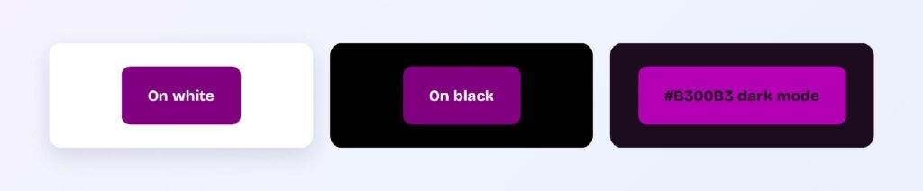
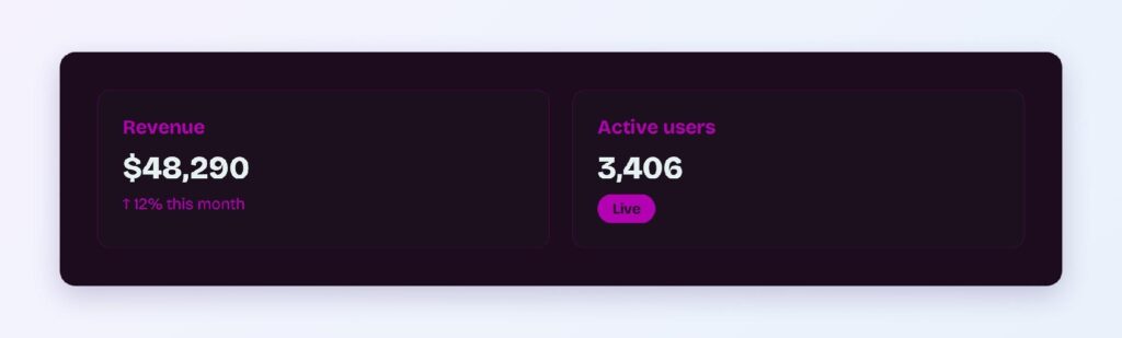
Dark mode needs the brightened variant #B300B3 on the purple-cast dark surface #1D0C1D, where it reaches 3.18:1 — large text and icons only. Purple’s dark mode story therefore splits duties: keep body text white or light gray, and let the bright purple carry headings, icons, and data marks.
What UI Elements Work Best with Purple?
Purple’s AAA contrast on white and its premium semantic make it one of the strongest primaries available for light-theme products.
Buttons and CTAs
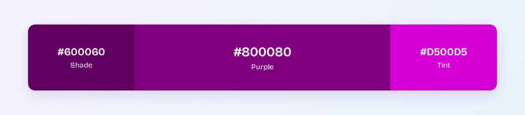
White text on #800080 passes AAA at 9.42:1, rare territory for a brand color. Use #600060 for hover states — it deepens to 12.6:1 while staying unmistakably purple. You can use Visily’s Theme feature to apply the pair across every button state in your wireframes.

Status Badges
Purple badges own the premium and special categories: pro plans, beta features, AI-powered labels. Deep purple text on a pale purple tint background reads instantly and stays clear of the semantic territory owned by green, red, and yellow.

Data Visualizations
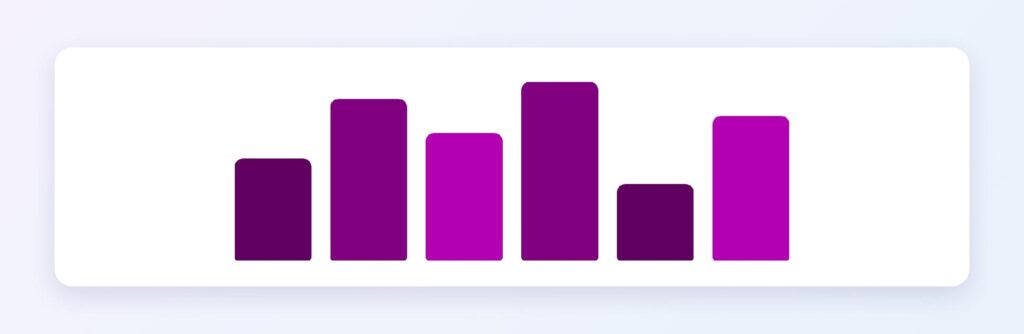
Purple’s shade ramp from #800080 through #600060 and #4D004D gives you a sequential scale that reads as sophisticated rather than alarming, which suits engagement metrics, usage tiers, and any dimension where red would wrongly imply danger.
Dark Mode Surfaces
The #1D0C1D surface with #B300B3 accents keeps purple’s identity alive at night. Hold the bright variant to large text, icons, and chart marks — the 3.18:1 ratio won’t carry body copy.
What Are the Best Purple Color Palettes for UI?
Five harmony schemes come from purple’s position at hue 300. Every value below is computed from #800080.
Monochromatic
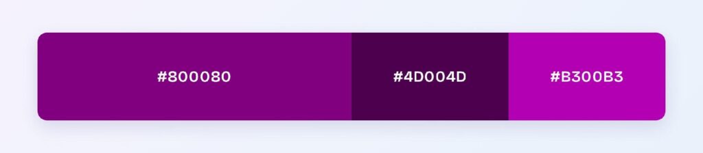
The set: #800080, #4D004D, and #B300B3. One hue at three depths gives you a complete interactive system — base, pressed, and highlight — without leaving the purple story. Creative tools and premium SaaS products default to this.
Analogous
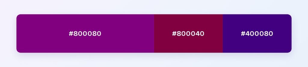
The set: #800080 with #800040 (toward wine) and #400080 (toward indigo). Neighboring hues at matched depth create a rich, jewel-toned range for luxury brands, and the indigo end doubles as a natural link color.
Complementary
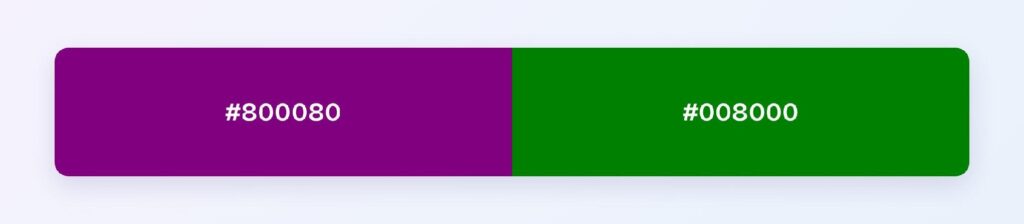
The set: #800080 against #008000, its exact green opposite. Maximum hue contrast makes the green ideal for the 10% accent layer — success states and confirmations in a purple-primary system arrive with built-in clarity.
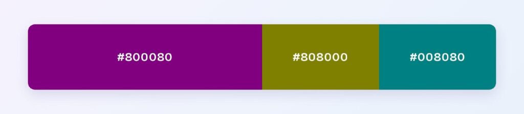
Triadic
The set: #800080, #808000 (olive), and #008080 (teal). Three evenly spaced hues at identical depth suit multi-category dashboards where every category needs equal visual weight.
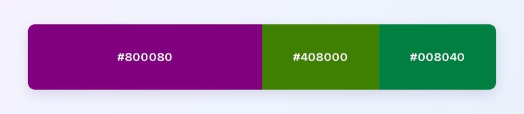
Split-Complementary
The set: #800080 with #408000 and #008040. You keep complementary energy with a softer landing — the two greens flank purple’s opposite, which makes accent placement more forgiving across a full product surface.
Which Colors Are Similar to Purple?
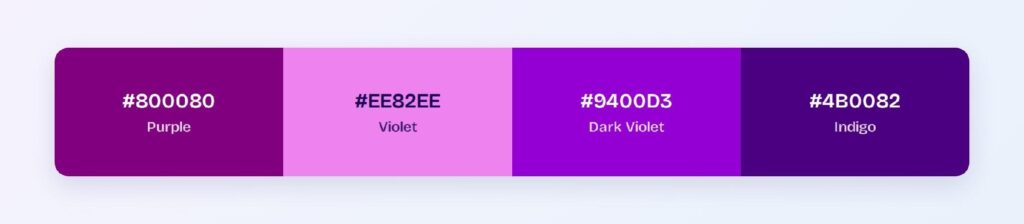
The three closest named colors are violet (#EE82EE), dark violet (#9400D3), and indigo (#4B0082). Violet is far lighter and pinker, dark violet adds vividness with a blue lean, and indigo trades brightness for depth. Indigo is the drop-in choice when web purple needs to darken without losing family identity.
Which Colors Pair Best with Purple?
The single best accent is #008000 (green), purple’s computed complement. For neutrals, warm off-whites and light grays give purple room to command, and gold leans into the royal heritage for premium products.
Apply the 60-30-10 split: 60% neutral background, 30% purple for structure and primary components, 10% green or gold accent for the moments that need attention.
Which Colors Should You Avoid Pairing with Purple?
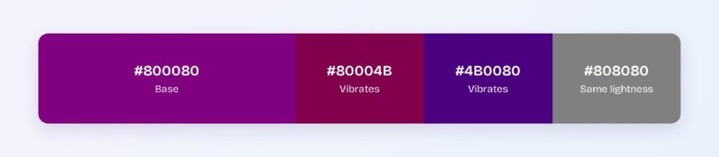
Avoid the near-neighbors #80004B and #4B0080. They sit 15 to 45 degrees away at the same lightness, so edges between them and #800080 vibrate instead of separating cleanly.
Pure black is the other measured failure: at 2.23:1, purple sinks into black backgrounds and component boundaries disappear. These are contrast facts, not style opinions.
Does Purple Meet Accessibility Standards?
Yes, exceptionally on light surfaces: #800080 on white scores 9.42:1, clearing the WCAG AAA threshold of 7:1 with room to spare. The dark variant #600060 pushes to 12.6:1 for maximum-compliance contexts.
Purple survives red-green color blindness better than either of its parent hues because both channels contribute to it, but tritanopia can shift its appearance. Pair color-coded meaning with icons or labels as standard practice.
How Can You Convert Purple Between HEX, RGB, HSL, CMYK, and Other Color Formats?
All six formats describe the same color:
- HEX #800080 — the default for CSS and design tokens.
- RGB rgb(128, 0, 128) — use RGBA for alpha overlays.
- HSL hsl(300, 100%, 25%) — programmatic shifts; hover states are one lightness change away.
- HSB 300, 100, 50 — what Figma’s and Photoshop’s pickers show.
- CMYK 0, 100, 0, 50 — print translation; pure magenta plus black, expect a slightly warmer print result.
Wrapping Up
Purple (#800080) earns its place as a UI primary: AAA contrast on white at 9.42:1, a premium semantic no other hue matches, and harmony palettes that stretch from jewel-toned luxury to clean multi-category dashboards. Every number above comes from computed color math, so what you read is what production renders.