Glassmorphism is a UI design style that makes on-screen panels look like frosted glass, using transparency, a background blur, and a thin light border so colorful backgrounds glow through. The effect adds depth and hierarchy, letting cards float above the background like panes of glass.
The style surged around 2020, became the look of macOS and Windows 11, and refuses to fade. In 2026 it’s evolving again, with Apple’s Liquid Glass material pushing the frosted look further.
In this blog, I’ll cover what glassmorphism is, the ingredients that create it, where you’ll see it, its drawbacks, how it compares to neumorphism and flat design, and how to build it in a UI.
What Is Glassmorphism in Design?
Glassmorphism is a visual design style that layers semi-transparent, blurred panels over a background to imitate frosted glass. Each panel lets color bleed through while blurring the detail behind it, so the interface feels layered and light.
The frosted-glass effect
The look copies real frosted glass: you see color and shape through the panel, but the detail is softened. The Nielsen Norman Group describes it as using translucency to build depth and separate foreground from background. That sense of depth is the whole appeal.
Where the name comes from
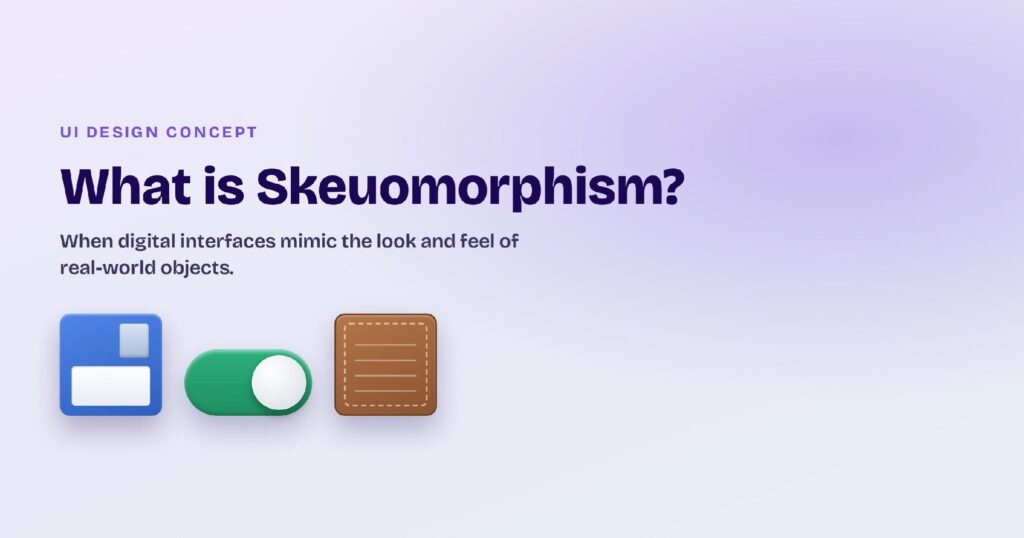
Glassmorphism joins “glass” with the “-morphism” suffix that design trends borrow, the same family as skeuomorphism and neumorphism. The name describes exactly what it does: shape an interface to look like glass. It caught on around 2020 and stuck.
Why designers reach for it
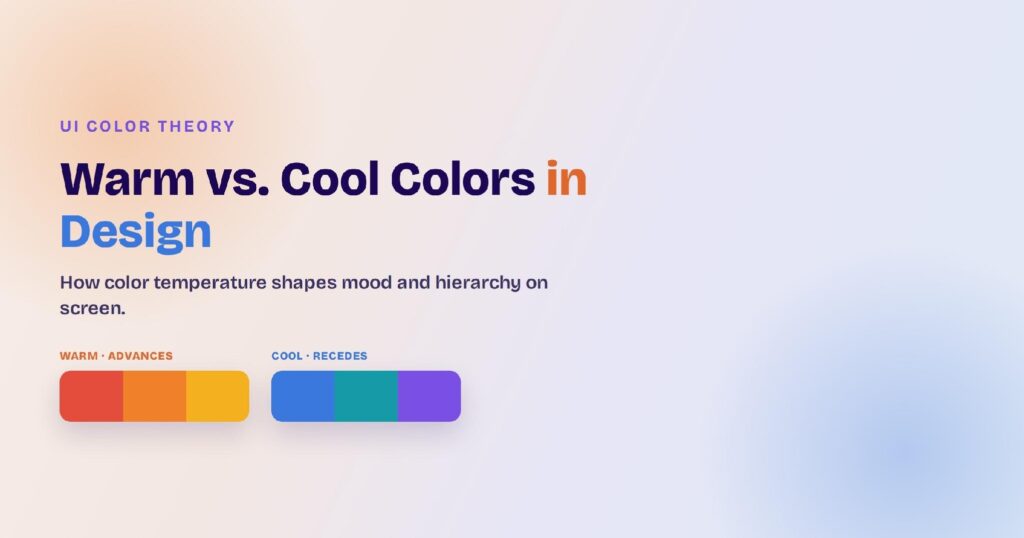
Glass panels create instant depth and a modern, premium feel without heavy graphics. They organize a busy screen into clear layers and pair well with the bold gradients common in current color in UI design. Used well, they make an interface feel light and futuristic.
What Are the Key Ingredients of Glassmorphism?
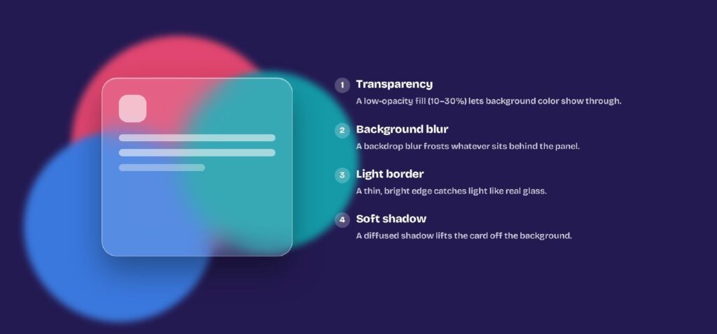
Four ingredients create the glass effect: transparency, a background blur, a light border, and a soft shadow. Miss one and the illusion breaks, so a convincing glass panel needs all four working together.
1. Transparency and low opacity
The panel uses a low-opacity fill, usually white or dark at 10% to 30%, so the background color shows through. Too opaque and it looks like a plain card; too transparent and the content floats without a surface. The sweet spot keeps color visible but the panel legible.
2. Background blur
A background blur, set in CSS with backdrop-filter: blur(), frosts whatever sits behind the panel. The blur is what separates glassmorphism from plain transparency, turning a see-through card into frosted glass. A larger blur radius reads as thicker glass.
3. Light borders and soft shadows
A thin, semi-transparent white border catches the light like the edge of a real pane, and a soft, diffused shadow lifts the card off the background. Together they mark where the glass starts and ends. Without them, the panel melts into the backdrop.
What Are Some Examples of Glassmorphism?
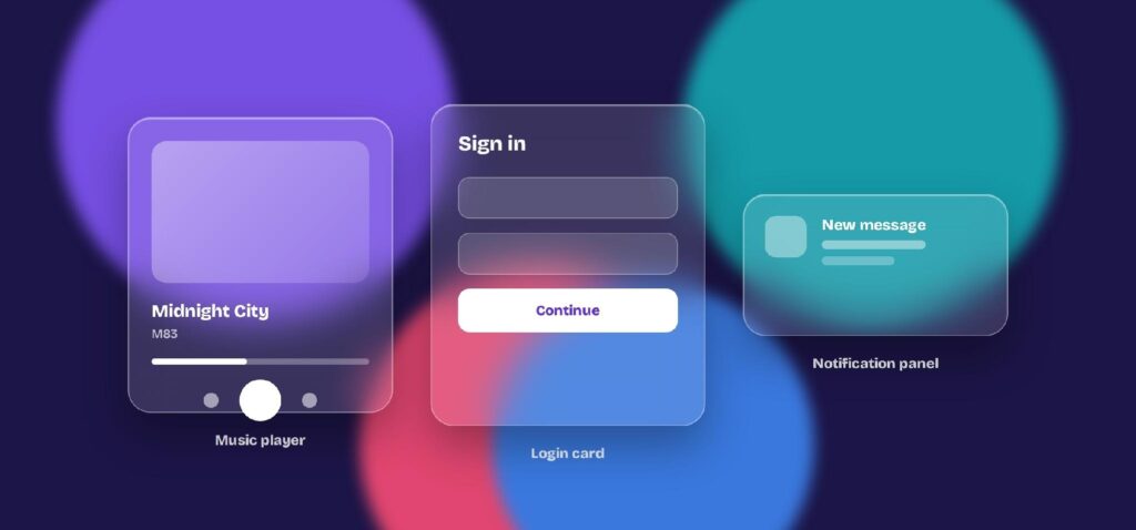
You’ll find glassmorphism most in operating systems and modern app UIs: control panels, notifications, music players, and login cards all lean on the frosted look. The effect needs a colorful or busy background to show, which is why it thrives on media-rich screens.
Operating systems
Apple’s macOS and Microsoft’s Windows 11 use frosted panels throughout, from the Control Center to the taskbar and notifications. Translucent system layers let your wallpaper and windows glow through. The OS layer is where most people see glassmorphism every day.
Web and app interfaces
On the web and in apps, glass shows up on dashboards, music players, and product landing pages that want a clean, futuristic feel. A frosted player card over album art is the classic example. It’s a favorite for hero sections and pricing cards too.
Cards, modals, and navigation
At the component level, glassmorphism suits cards, modals, and sticky navbars that sit over scrolling content. A frosted navbar keeps context visible while the page moves behind it. Any element meant to float benefits from the effect.
What Are the Drawbacks of Glassmorphism?
Glassmorphism’s biggest risk is readability: text on a semi-transparent, blurry panel can fail contrast and hurt accessibility. It can also cost performance and behave differently across platforms, so it takes care to meet UI design best practices.
| Drawback | How to fix it |
| Low text contrast on the panel | Add a darker scrim or a more solid layer behind text, and hit 4.5:1 |
| Hard to read over busy areas | Simplify or darken the background directly behind the glass |
| Blur slows older devices | Limit blurred layers; avoid stacking many glass panels |
| Looks different across platforms | Test fallbacks for browsers without backdrop-filter support |
Readability and contrast
The blur and transparency that make glass pretty also make text hard to read. The WCAG standard sets a minimum 4.5:1 contrast ratio for normal text, which a busy background can easily break. Add a darker scrim or a more solid layer behind the text to hold that contrast.
Performance and consistency
Background blur is expensive to render, so stacking many glass layers can slow older devices. Blur support and appearance also vary across browsers and platforms, so the effect isn’t identical everywhere. Limit the number of blurred layers and test with fallbacks.
How Does Glassmorphism Compare to Neumorphism, Flat, and Liquid Glass?
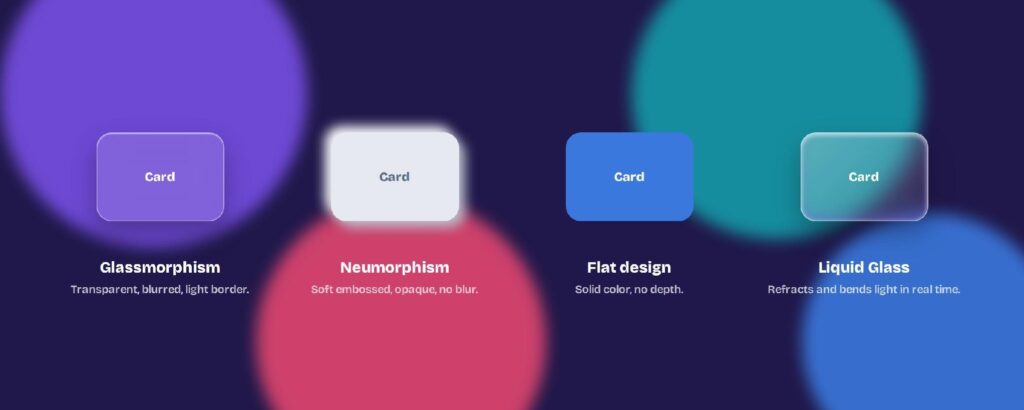
Glassmorphism, neumorphism, flat design, and Apple’s Liquid Glass are related but distinct, differing mostly in how much depth and transparency they use. Knowing where each sits among these principles of design helps you pick the right one instead of chasing a trend.
Glassmorphism vs. neumorphism
Neumorphism makes elements look softly embossed from the background using two-tone shadows, with no real transparency. Glassmorphism is see-through and blurred; neumorphism is opaque and solid. Both add depth, but glass floats over color while neumorphism sinks into it.
Glassmorphism vs. flat design
Flat design uses solid color and no depth at all, the opposite of glass. Where flat relies on layout and labels, glassmorphism relies on layering and light. Flat is safer for dense, text-heavy screens; glass shines on visual, media-rich ones.
Glassmorphism vs. Apple’s Liquid Glass
Liquid Glass is Apple’s 2025 evolution of the idea, a material that bends and refracts light in real time across iOS 26 and macOS. Where glassmorphism is a static frosted card, Liquid Glass reacts to motion and the content beneath it. It’s the same instinct, taken dynamic.
Here’s how the four styles line up side by side:
| Style | Look | Transparency | Best for |
| Glassmorphism | Frosted, blurred, light border | Semi-transparent | Colorful, media-rich screens |
| Neumorphism | Soft, embossed from the background | Opaque | Minimal, single-accent dashboards |
| Flat design | Solid color, no depth or ornament | Opaque | Dense, text-heavy interfaces |
| Liquid Glass | Glass that refracts and bends light | Dynamic, translucent | Apple platforms, motion-rich UIs |
Is Glassmorphism Still in Style?
Yes, glassmorphism is still in style in 2026, and arguably bigger than ever now that Apple has doubled down on glass. It stopped being a fad and settled into a standard tool for adding depth.
Still going strong in 2026
Far from outdated, the frosted look keeps showing up across new products and OS releases. Better screens and faster GPUs make the blur cheaper than it was in 2020, so it reads as current across today’s design trends rather than dated.
Does Apple still use it?
Apple uses glass more than anyone, from macOS translucency to the Liquid Glass material across its 2026 systems. The look has long shaped how designing iPhone apps feels. When the biggest platform leans in, the style stays relevant.
When to use it, and when to skip
Reach for glass when the screen has color or imagery worth showing through and depth worth communicating. Skip it on dense, text-first interfaces where contrast matters more than mood. The style is a tool, not a default.
How Do You Design Glassmorphism in Visily?
You design glassmorphism in Visily by setting a colorful background, then layering a translucent, blurred panel with a light border on top. Visily is an AI UI design tool, so you can apply the same glass treatment consistently across every screen.
Start with a colorful background
Glass only reads over color, so begin with a vivid gradient, photo, or bold shapes. Generate a theme and pull a background from Visily’s color recommendations and pre-made palettes. The busier the color, the more the frosted effect pops.
Layer a translucent, blurred panel
Add a card, drop its fill opacity, and apply a blur so the background shows through softly. Give it a thin light border and a soft shadow to complete the glass. Keep text on a more solid area so it stays readable.
Prototype and export the design
Turn the screens into a clickable prototype to check that the glass holds up in motion and stays legible. When it’s ready, export to Figma, PDF, PNG, or code, and everything starts on the free plan.
Wrapping Up
Glassmorphism is a frosted-glass style built from four ingredients: transparency, background blur, a light border, and a soft shadow. Used with care it adds depth and a modern feel; used carelessly it costs readability. The trick is keeping contrast underneath the glass.
Visily makes it easy to try. Generate a full project theme from a keyword, screenshot, or URL, then set backgrounds from pre-made palettes, layer translucent blurred panels, and reskin the whole app in one click with Magic Theme, applied across every screen at once.
When it’s ready, prototype the flow and export to Figma, PDF, PNG, or code. Open Visily’s free Starter plan and start designing today.