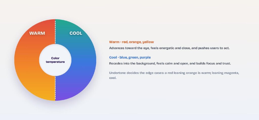
Warm colors and cool colors split the color wheel into two temperatures: warm hues like red, orange, and yellow feel energetic and push toward you, while cool hues like blue, green, and purple feel calm and pull back. That temperature does two jobs in a UI at once, setting the mood and steering the eye.
Most interfaces ignore it. Designers pick colors by taste, so a finance app ends up feeling frantic or a food app ends up feeling cold, and the primary button never quite pops. Temperature is the lever that fixes both, because warm advances and cool recedes.
In this blog, I’ll show you how to tell warm from cool, how each temperature shapes mood, how warm and cool build visual hierarchy, and how to set the right temperature in your UI in minutes.
What’s the Difference Between Warm and Cool Colors?
Warm colors sit on the red-orange-yellow side of the wheel and feel hot and energetic; cool colors sit on the blue-green-purple side and feel calm and distant. The split traces back to what the colors remind us of: fire and sun versus water and ice.
In a UI, that difference is practical, not poetic. Warm hues draw attention and urge action; cool hues settle a screen and hold focus.
Warm colors: red, orange, yellow
Warm colors run from red through orange to yellow, the hues of fire, sunlight, and autumn. They feel close, bright, and full of energy on screen. Here’s what each one signals in an interface:
- Red: urgency, energy, and appetite; the go-to for sale badges, alerts, and error states.
- Orange: friendly and active without red’s alarm; works for CTAs, highlights, and playful brands.
- Yellow: optimism and attention; best in small doses for accents and notifications, since it strains at length.
Cool colors: blue, green, purple
Cool colors run from green through blue to purple, the hues of water, sky, and ice. They feel calm, open, and a little distant, which is why finance, health, and productivity products lean on them. Here’s what each one signals in an interface:
- Blue: trust, calm, and focus; the workhorse of finance, healthcare, and productivity UIs.
- Green: growth, health, and success; natural for wellness, fintech, and positive or confirming states.
- Purple: calm yet premium and creative; common in design tools and upmarket SaaS.
The neutral middle ground
Neutrals like gray, white, beige, and brown aren’t temperature-free; they lean warm or cool through their undertone. A gray with a blue undertone reads cool, while a beige with a yellow undertone reads warm. Even your background quietly picks a side.
What are the Key Differences Between Warm and Cool Color?
Here’s how the two temperatures compare across the things that matter in a UI:
| Attribute | Warm colors | Cool colors |
| Hues | Red, orange, yellow | Blue, green, purple |
| Feels like | Fire, sun, autumn | Water, sky, ice |
| Mood | Energetic, urgent, cozy | Calm, focused, trustworthy |
| Depth cue | Advances, feels close | Recedes, feels distant |
| Best UI use | CTAs, alerts, food and social apps | Backgrounds, finance, health, SaaS |
| In 60-30-10 | Usually the 10% accent | Usually the 60% base |
How Do You Tell If a Color Is Warm or Cool?
You tell a color’s temperature by its undertone, not its name, because temperature is relative. The fastest read is to see which way the hue leans, since a single color like orange can look warmer or cooler depending on what’s mixed in.
Orange is almost always warm, but the harder calls, like greens, purples, and grays, come down to the undertone.
Check the undertone
Look at what the hue leans toward. A red that leans orange is warm; a red that leans magenta is cool. A yellow with orange in it is warm; a yellow with green in it is cool. The undertone, not the base name, sets the temperature.
Compare colors side by side
Put two versions of the same hue next to each other and the warmer one jumps out. Two greens tell the story fast: an olive green leans warm, while a blue-based teal reads cool. Side-by-side comparison is how designers settle every borderline case.
Read the hue’s angle on the wheel
On the color wheel, warm hues cluster on one side and cool hues on the other, split roughly through yellow and violet. If a hue sits between red and yellow, it’s warm; between green and purple, it’s cool. When a color falls near the border, the undertone breaks the tie.
How Does Color Temperature Shape Mood in a UI?
Color temperature shapes mood because warm and cool hues trigger different responses: warm colors raise energy and urgency, while cool colors lower it and build calm. Pick the temperature that matches the feeling your product should create before you pick the exact hue.
Color psychology backs this up across interfaces, from the CTA color to the overall brand feel.
Warm hues energize and urge action
Warm colors raise arousal, appetite, and a sense of urgency, which is why sales, food, and social apps lean on them. Red signals alertness, orange feels friendly and active, and yellow reads as optimistic. Reach for warm when you want users to feel and do something now.
Cool hues calm and build trust
Cool colors lower stress and read as stable and trustworthy, the reason finance, health, and productivity tools lean on them. Blue signals trust and focus, green suggests health and growth, and purple can feel calm and premium. Reach for cool when the job is confidence and concentration.
Temperature and the CTA
The button is where temperature earns its keep. A warm CTA on a cool screen advances and gets clicked, while an all-cool interface can leave the primary action feeling flat. Match the base temperature to the mood, then let the opposite temperature carry the call to action.
How Does Temperature Build Visual Hierarchy?
Temperature builds hierarchy because warm colors advance toward the eye and cool colors recede from it, so you can rank elements by temperature instead of size or contrast alone. This advance-and-recede effect is one of the most underused tools in color in UI design, and it costs nothing to apply.
Warm advances, cool recedes
Warm hues appear closer than they are, and cool hues appear farther, a depth cue the eye reads instantly. A warm badge on a cool card pops forward without a drop shadow. You get layering from temperature alone.
Foreground and background layering
Assign warm to foreground elements like active states, alerts, and primary actions, and cool to backgrounds, surfaces, and inactive items. The screen gains depth because the temperatures separate the layers. Users read the structure before they read a single label.
Focus without extra contrast
Temperature guides the eye without cranking up contrast everywhere, which keeps a screen calm. One warm element on a cool field draws focus more gently than a high-contrast block. You direct attention while the interface stays restful.
When Should You Use a Warm or a Cool Palette?
Use a cool palette when the job is calm, focus, or trust, and a warm palette when the job is energy, appetite, or urgency. Most products lead with one temperature and borrow the other for accents.
The safest pattern for interfaces is a cool base with a warm accent, but the reverse works when the brand is meant to feel hot.
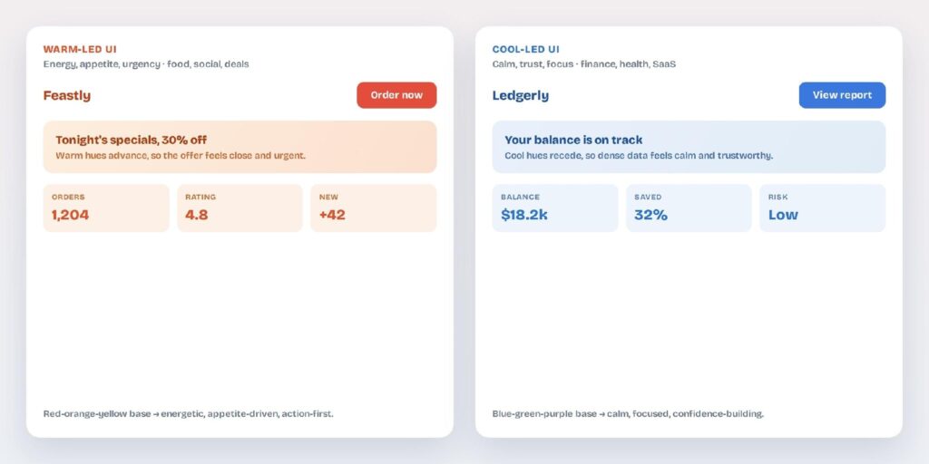
Warm-led interfaces
Warm-led palettes suit food, social, kids’, and deal-driven products that run on energy and appetite. Red and orange dominate, and the whole screen feels active and close. Balance the heat with plenty of neutral space so it doesn’t tire the eye.
Cool-led interfaces
Cool-led palettes suit finance, healthcare, SaaS, and productivity tools that run on trust and focus. Blue or green dominates, and dense screens stay calm and readable. This is why so much of the software you use leans cool.
Mixing warm and cool
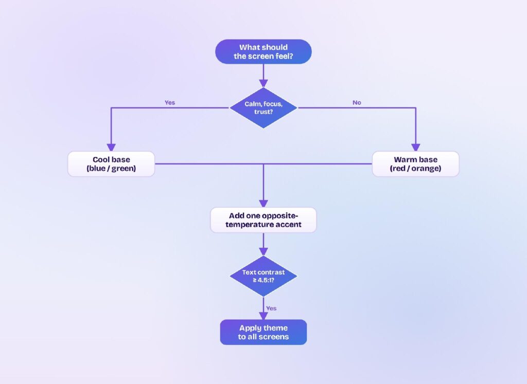
The strongest interfaces combine both: a cool base for calm plus a warm accent that advances on the one action that matters. Split them by proportion with the 60-30-10 rule so the accent stays an accent. A single warm button on a cool screen is the classic, reliable move.
Where Does Color Temperature Go Wrong, and How Do You Fix It?
Temperature goes wrong at the extremes: an all-cool UI turns sterile, an all-warm UI turns loud, and either can fail readability if you lean on temperature instead of contrast. Three fixes keep it in balance.
Fix a cold, clinical UI
An all-cool interface can read as distant or lifeless, especially in healthcare and finance. Add one warm accent, a button, a highlight, or a chart line, to bring it back to human. A little heat signals approachability without breaking the calm.
Fix a frantic, hot UI
An all-warm interface can feel aggressive and exhausting after a few minutes. Cool the base or mute the warm hues with a neutral, and reserve full-strength warmth for the action that matters. The screen keeps its energy without shouting.
Keep contrast accessible
Temperature guides the eye, but it isn’t contrast, so warm-on-warm or cool-on-cool text can still fail. The WCAG accessibility standard sets a minimum 4.5:1 contrast ratio for normal text and 3:1 for large text, a foundational benchmark to hit regardless of temperature. Rank by value for readability, and let temperature handle mood and depth.
How Do You Set Warm or Cool Themes in Visily?
You set a warm or cool theme in Visily by generating a project theme from a temperature-led keyword, then nudging the palette warmer or cooler until the mood fits. Visily is an AI UI design tool, so the temperature applies across every screen at once instead of swatch by swatch.
Generate a theme from a warm or cool keyword
Visily builds a full project theme, covering colors, fonts, spacing, shadows, border radius, and icon set, that auto-applies to every screen. Describe the mood you want and it returns a matching palette. You can generate a theme four ways:
- From keywords like “calm” or “energetic.”
- From a prebuilt theme in the library.
- From a screenshot you upload.
- From the URL of an app or site you like.
Adjust the temperature of your palette
Edit, add, or remove colors to shift the palette warmer or cooler, then pull from Visily’s color recommendations and pre-made palettes to fill it out. Magic Theme reskins the whole app in one click, so you can flip a cool UI to warm and compare in seconds.
Apply and export the theme
Visily applies your theme’s design tokens across the entire project at once, so the temperature stays consistent on every screen. Export straight to Figma, PDF, PNG, or code, or pull the theme into Tailwind and inspect the CSS variables. Everything starts on the free plan.
Warm and cool aren’t just a color label; they’re a lever for how a UI feels and where the eye goes. Match the base temperature to the mood you want, use the opposite temperature to advance the one action that matters, and keep contrast accessible underneath. Visily lets you set that temperature once and apply it everywhere: generate a theme, nudge it warmer or cooler, and ship it across every screen.
Sign up for Visily’s free Starter plan and set your interface’s temperature today.